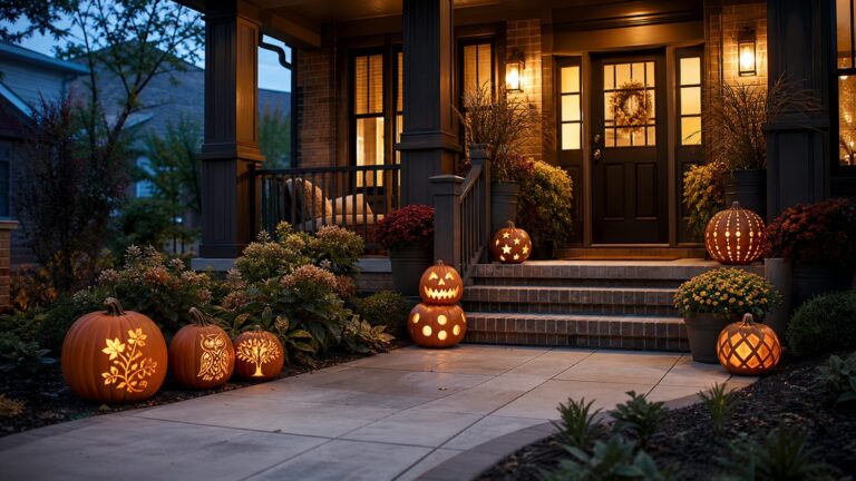
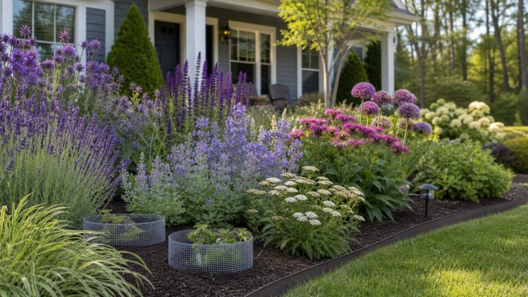
To mix patterns in a room, start with one print you like, connect other patterns through a shared color palette, vary their scale or visual density, and leave quieter areas for the eye to rest. These are flexible design tools, not rules: a floral can work with stripes or geometrics when the colors, proportions, and placement feel balanced together.
How to mix patterns: a simple sequence
- Choose a starting pattern. Begin with a textile, rug, wallpaper, or other print you already want in the room. Identify one or two colors in it that could help connect additional patterns.
- Add a pattern that changes the scale. If the first print is large or visually dominant, try a smaller or quieter pattern. Sherwin-Williams recommends using a variety of small and large patterns to create balance and scale, and notes that smaller patterns can repeat colors from a larger geometric or floral design. Read Sherwin-Williams’ guide to incorporating patterns.
- Connect the palette. Look for a color shared by both prints, or choose tones that sit comfortably together. ELLE Decor’s account of textile designer Rebecca Atwood’s advice emphasizes both scale and a unifying palette. See ELLE Decor’s discussion of mixing patterns.
- Give the prints room to breathe. Use solid-color furnishings, neutral surfaces, or less patterned areas between assertive prints. The aim is not to eliminate contrast, but to make each pattern easy to read.
- Check the combination in context. Put the patterns together in the room or alongside the furnishings they will share. Consider how much area each print will cover and where the quieter surfaces fall before committing to a large expanse of wallpaper or fabric.
What makes two patterns work together?
Judge a pair by how the elements interact, rather than by the names of the motifs. A floral and a stripe are not automatically compatible or incompatible; their colors, scale, visual density, and distribution in the room matter more.


- Scale: A large motif paired with a small one usually creates more contrast than two prints of similar size.
- Palette: A repeated color can make different motifs feel related. The colors do not need to match exactly if their overall tones feel coordinated.
- Visual density: A detailed, busy print may need a simpler companion or more solid space around it.
- Distribution: Consider how much of the room each print occupies. Two small accents have a different effect from covering walls and large furnishings in competing patterns.
Pottery Barn also frames pattern mixing around palette consistency and scale; its guidance is another useful reference when comparing prints. Read Pottery Barn’s guide to mixing and matching patterns.
How to pair florals, stripes, and geometrics
Floral with stripe
Try a stripe that picks up a color from the floral, while changing the stripe’s width or visual weight from the floral’s motif. If both patterns feel equally prominent, introduce a solid or neutral element between them.
The Tool Desk
Outbyte PC Repair FREERepair Windows errors before they cause bigger problemsFix Now →Outbyte Driver Updater FREEFix the driver behind crashes, sound loss and screen glitchesFind Drivers →#1 Best Overall
Floral with geometric
A geometric can provide structure alongside a more organic floral. Keep the palette connected and avoid placing two highly detailed, similarly sized prints next to each other unless the rest of the room gives them enough visual space.
Two geometrics or two florals
Repeating a broad motif family can still work if the prints differ in scale, density, or color emphasis. One can lead while the other plays a supporting role; they do not need equal visual prominence.
Where to try pattern mixing first
Patterned pillows are a manageable way to explore a combination before using it across a larger surface. Try two or three covers together with the sofa or bedding, then assess the colors and scale in the room. This is a lower-commitment application of the design guidance, not a guarantee that every set of prints will suit every space.
For a broader room-balance framework, Williams Sonoma presents a 60/30/10 method as one approach to distributing pattern and other visual elements. Treat it as a heuristic rather than a tested requirement or universal standard. See Williams Sonoma’s pattern-mixing guidance.
Recommended Free Tools
There is no compulsory formula
Pattern mixing is a design choice, not a pass-or-fail exercise. Cooper Hewitt’s discussion places print mixing in design and historical context, a reminder that combinations can be interpreted rather than judged against one mandatory formula. Read Cooper Hewitt’s discussion of mixing prints.
Quick Recap
Best Value
- Used Book in Good Condition
Product prices and availability are accurate as of the date/time indicated and are subject to change. Any price and availability information displayed on Amazon at the time of purchase will apply.