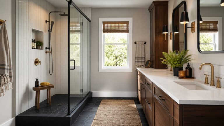
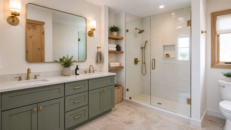
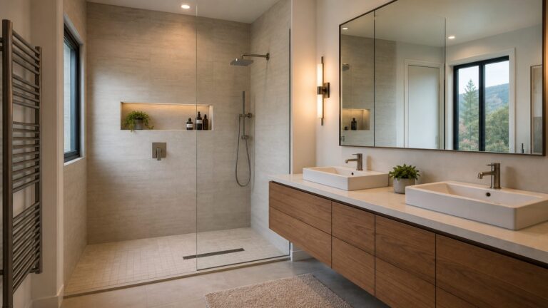
Bathroom color can be crisp and quiet, softly colorful, or deliberately dramatic. The 27 ideas below pair paint shades into usable palettes and show where to place them—on every wall, against pale tile, or on trim, ceilings, and vanities—so you can choose a direction that works with your room rather than selecting a color in isolation.
Clean whites and flexible neutrals
White and neutral paint can make tile, stone, and fixtures the visual focus. Check undertones against those fixed surfaces: a warm white beside cool gray tile can look noticeably creamier, while a cool white may sharpen a warm wood vanity.
1. Crisp white with dark accents
Benjamin Moore’s Chantilly Lace OC-65 is a clean white option for walls or trim. Pair it with dark hardware or a black-framed mirror for definition without adding another wall color. Benjamin Moore describes Chantilly Lace as a bathroom choice.
2. Soft white with warm wood
White Dove OC-17 offers a softer-looking alternative to a crisp white. Use it across the walls with a wood vanity, woven accents, or warm metal finishes to keep the room from feeling stark. Benjamin Moore includes it among its bathroom recommendations. See White Dove OC-17.
#1 Best Overall
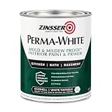
- Self-Priming formula - requires no sanding
- Mold & Mildew-Proof paint film - guaranteed for 5 years
- Resists dirt and moisture on film coating
- Finish is washable and scrubbable with soap and water
- Product contains a mildewcide to prevent the growth of mold and mildew on the paint film only
3. Creamy white against cool tile
Ballet White OC-9 can bring a warmer note to a bathroom dominated by cool stone or gray tile. Sample it beside the tile first; a warm neutral may read more pronounced when surrounded by cooler materials. Benjamin Moore features Ballet White for bathrooms.
4. Greige with white trim
Revere Pewter HC-172 sits in the flexible neutral family and works as a middle ground when neither a stark white nor a clearly colored wall feels right. Keep trim light to outline mirrors, doors, and cabinetry. View Revere Pewter HC-172.
5. Warm gray in a compact bathroom
Edgecomb Gray HC-173 is a warm neutral Benjamin Moore suggests for smaller bathrooms. Use it across the walls for a cohesive backdrop, then let the mirror, vanity, and towels provide contrast. Its effect will depend on the room’s actual lighting and adjacent finishes. See Edgecomb Gray HC-173.
Greens and blue-greens
Green can read gentle and botanical or saturated and jewel-like. Sage and eucalyptus shades suit a subdued palette; blue-greens can bridge green cabinetry and blue or white tile. Compare a sample with grout, vanity color, and metal finish before choosing how much of the room to paint.
Recommended Free Tools
6. Italian Ice Green with white and teal
Use Italian Ice Green 2035-70 on the walls, Super White OC-152 on trim, and Aegean Teal 2136-40 on a vanity or small accent. This coordinated palette balances a pale green base with a stronger focal color. Benjamin Moore lists Italian Ice Green in its bathroom color guidance.
7. Muted green with soft white and blue
Van Alen Green HC-120, White Dove OC-17, and Van Courtland Blue HC-145 form a three-color combination. Keep the green on the walls, reserve white for trim, and use blue selectively on cabinetry or an accessory so the room has a clear hierarchy. View Van Alen Green HC-120.
8. Historic green on walls or vanity
Louisburg Green HC-113 brings a more defined green presence than a pale sage. Use it on walls when you want the color to anchor the room, or limit it to the vanity if existing tile already carries a strong pattern. See Louisburg Green HC-113.
Rank #2

- 【Acrylic Formula】Our tub paint boasts an advanced water-based acrylic formula designed for durability and longevity. The high-quality acrylic resin ensures a strong, resistant finish that combats flaking and wear, providing a lasting transformation for your tiles
- 【Low Odor】Breathe easy while renovating! Our water-based sink paint minimizes harsh fumes and volatile organic compounds (VOCs), making it safe for indoor use in bathrooms, kitchens, and living spaces, ideal for homes with children, pets, or allergy sufferers
- 【Effortless Cleanup】Our tub and tile paint can be cleaned up in seconds! Accidental drips or spills? Just wipe with water. No solvents, scrubbers, or specialized cleaners needed. This feature saves time, reduces mess, and eliminates exposure to chemicals during and after application
- 【Wide Coverage】Maximize efficiency with a 16.5oz bottle covering 25–30 sq.ft. per coat (2 or more coats recommended for dark tiles). The tub refinishing paint cures to a walkable state in 24 hours and fully hardens within 7 days, ensuring scratch-resistant results
- 【Versatile Application】Choose from 5 colors: white, black, light/dark gray, and vanilla white to complement your space. Our semi-gloss tile refinishing paint is suitable for bathtubs, sinks, countertops, floors, backsplashes, etc., adding sophistication, complementing both modern and traditional decor
9. Landscape green with natural materials
Landscape 430 is a green option to pair with natural stone, wood, and simple white fixtures. Let the materials supply texture, and avoid adding several competing accent colors in a small space. Benjamin Moore includes Landscape 430 among its bathroom colors.
Quick wins for a faster PC:
Scan for outdated or missing drivers - takes under a minuteDriver Scan →Clear out junk files and repair common Windows errorsFree Scan →Fix the driver behind crashes, sound loss and screen glitchesFind Drivers →10. Sage with a traditional feel
Saybrook Sage HC-114 is a restrained green choice for walls, cabinetry, or both when the room’s other finishes are quiet. White trim gives the color a crisp edge; warm metals and wood bring out a more grounded feel. View Saybrook Sage HC-114.
11. Eucalyptus green for a softer palette
Fresh Eucalyptus SW 9658 offers a muted green direction for a calm-feeling bathroom. Use it across the walls with white fixtures, or keep it to a vanity to introduce color without covering existing tile. See Fresh Eucalyptus SW 9658.
12. Pale blue-green with white
Window Pane SW 6210 is a light blue-green possibility when plain white feels too cool or empty. Pair it with white trim and pale surfaces for a low-contrast look, or use darker hardware to sharpen the outline. View Window Pane SW 6210.
Pale and deeper blues
Blue ranges from airy and understated to nearly inky. Pale blue can blend with white fixtures; deeper blue works best when you want stronger contrast or a concentrated accent. Consider whether the room’s tile and stone lean warm or cool before pairing them.
13. Breath of Fresh Air with white trim
Breath of Fresh Air 806 is a light blue choice for walls in a bathroom with white trim and simple fixtures. Keep the rest of the palette restrained to preserve its airy character. Benjamin Moore features Breath of Fresh Air 806.
14. Palladian Blue with a warm accent
Pair Palladian Blue HC-144 with Elmira White HC-84 and Persimmon 2088-40. The blue and soft white establish a calm base, while persimmon is best used sparingly on a small accent or accessory. See Palladian Blue HC-144.
Rank #3

- TUB & TILE REFINISHING KIT: Renews ceramic tile, porcelain, fiberglass, acrylic, cast iron, and steel tubs and sinks without costly replacement.
- TWO-PART EPOXY ACRYLIC: Combine the base and activator to create a durable coating with excellent adhesion and color retention.
- IDEAL FOR HIGH-MOISTURE AREAS: Provides a durable, washable finish designed to refresh worn bathroom surfaces.
- SMOOTH, EVEN APPLICATION: Apply with a fine-bristle brush or 1/4-inch short-nap roller; use two coats for a uniform, porcelain-like appearance.
- DRY & RECOAT TIME: Dries to the touch in 1 hour, can be recoated after at least 1 hour, and must cure for 3 days before water exposure.
15. November Skies for a stronger blue wall
November Skies 2128-50 makes a more pronounced blue statement than a whisper-pale shade. Use it on the walls with white trim, or test it on a single wall if your tile already has strong color or pattern. View November Skies 2128-50.
16. Mysterious blue for depth
Mysterious AF-565 is a deeper blue direction that can frame white fixtures and pale tile with more contrast. It can also work on a vanity when full-room color would compete with the existing finishes. See Mysterious AF-565.
Windows Errors? Fix Them Before They Spread
Repair common Windows errors and clear accumulated junk for a smoother, more stable PC - no reinstall needed.Free scan · no reinstallCrashes, No Sound, or Screen Glitches?
Random freezes, missing sound and display glitches usually trace back to one bad driver. Find and replace yours safely.Free scan · under a minute17. Periwinkle as a playful accent
Perfect Periwinkle SW 9065 brings a more playful blue-violet cast to a bathroom palette. Because it is a distinct color, try it first on cabinetry, trim, or a limited wall area alongside plain white surfaces. View Perfect Periwinkle SW 9065.
18. Adriatic Sea for saturated contrast
Adriatic Sea SW 6790 is a saturated blue option for a vanity or accent wall. Pair it with white or pale tile so the color has room to stand out, rather than placing it next to several competing saturated finishes. See Adriatic Sea SW 6790.
Soft pinks
Pink can be a barely-there warm neutral or an unmistakable color. In a bathroom with fixed stone or tile, a pale pink may add warmth while leaving those materials in focus; stronger pinks are easier to control on a vanity or as a limited accent.
19. First Light for a gentle blush
First Light 2102-70 is a soft pink direction for walls or a ceiling. Pair it with white trim and simple finishes to keep the room light rather than sugary. Benjamin Moore includes First Light 2102-70 in its bathroom ideas.
Free tools Windows power users keep installed
One-click scans. No signup required.
20. Cream Puff with white fixtures
Cream Puff 2174-70 is a very light pink option that can sit close to a neutral in a restrained palette. Use it on the walls with white fixtures and avoid assuming it will look the same under every bulb or window exposure. View Cream Puff 2174-70.
Rank #4

- Use for a variety of indoor and outdoor project surfaces including wood, metal, plaster, masonry or unglazed ceramic
- Water-based acrylic formula is low odor, resist chips and provides long-lasting protection
- Covers up to 120 sq ft and dries to touch in 30 minutes for quick project completion
- Semi-gloss finish minimizes surface imperfections, goes on smoothly and provides excellent hide
- Prior to application sand surfaces with 180/200 grit sandpaper, then wash with a degreaser, allow the surface to dry and apply paint
21. Dream Whip as a warmer pink
Dream Whip 2174-60 offers a more visible pink note than a near-white blush. It can add warmth to a simple bathroom, especially when repeated in towels or artwork rather than paired with multiple new colors. See Dream Whip 2174-60.
22. Tissue Pink with dark hardware
Tissue Pink 1163 can soften a room while dark hardware, a dark mirror frame, or a dark vanity supplies definition. Sample it with those elements in place so the contrast feels intentional. View Tissue Pink 1163.
Independent reader supportYour contribution helps us test, update, and keep practical guides available for everyone.Earthy hues, jewel tones, and burgundy
Warm terracotta, persimmon, and burgundy bring a stronger sense of color than most neutrals. They can complement warm wood and brass-toned finishes, but their relationship with existing tile matters: use a concentrated accent when a full wall treatment would overwhelm the room.
The Tool Desk
Outbyte PC Repair FREEClear out junk files and repair common Windows errorsFree Scan →Outbyte Driver Updater FREEScan for outdated or missing drivers - takes under a minuteDriver Scan →23. Etruscan as an earthy accent
Etruscan AF-355 is a warm, earth-toned choice for a vanity or a focused wall treatment. Pair it with quiet white or neutral surfaces so the color reads as the intended feature. See Etruscan AF-355.
24. Persimmon with pale blue
Persimmon 2088-40 can enliven a blue-and-white palette. Benjamin Moore pairs it with Palladian Blue HC-144 and Elmira White HC-84; keep persimmon to a small dose if you want the blue to remain the dominant wall color. View Persimmon 2088-40.
25. Burgundy for concentrated drama
Dark Burgundy 2075-10 creates a deep, dramatic accent. Consider it on cabinetry or a limited wall rather than every surface when the room is already visually busy. White fixtures and pale tile can provide a strong counterpoint. See Dark Burgundy 2075-10.
26. Hot Lips as a small, bold detail
Hot Lips 2077-30 is a vivid option for a vanity, niche, or other contained feature. Keep adjacent walls and trim simple so this accent has a clear boundary. View Hot Lips 2077-30.
Do these 3 things before closing this tab:
1Repair Windows errors before they cause bigger problems2Fix the driver behind crashes, sound loss and screen glitches3Clear out junk files and repair common Windows errorsBest Value

- WHAT'S IN THIS 10 PIECE PAINT KIT FOR WALLS: includes one plastic paint tray; one 9 inch roller frame; one 4 inch mini roller frame; two 9 inch microfiber roller covers (1/2 inch nap); two 4 inch microfiber roller covers (1/2 inch nap); one 1 inch flat brush; one 1.5 inch angle sash brush; one 2 inch angle sash brush
- Versatile Application: Perfect for any project, this set includes paint rollers 9 inch for large surfaces and smaller brushes for detail work
- All-in-One Kit: This paint brush set and paint tray combo ensures you have all the paint supplies needed for any home improvement task
- Professional Grade: Get a smooth, even finish with our high-quality paint roller set; ideal for applying interior paint gallon or smaller quantities
- Cost-Effective: This paint brush and roller set provides unbeatable value; includes paint pan and paint trays for easy cleanup and reuse
Dark contrast and architectural color
Dark colors are not reserved for large bathrooms. They are a deliberate style choice: they can make a room feel intimate and dramatic, especially when balanced by pale tile, white fixtures, or bright trim. Conversely, if you want the room to feel visually open, a pale wall color may better fit that goal. Color can also be placed on the ceiling, trim, or cabinetry instead of every wall.
27. Charcoal with blue and soft white
Charcoal Slate HC-178, Blue Danube 2062-30, and Swiss Coffee OC-45 make a high-contrast palette. Use charcoal on walls or vanity, reserve Swiss Coffee for trim or another light surface, and add blue selectively. Pale tile or a white sink can keep the darker colors from swallowing every focal point. See Charcoal Slate HC-178.
Use the ceiling, trim, or vanity as the color field
If the walls are largely tile or you want to avoid repainting the whole room, use color on a ceiling, trim, or vanity. Benjamin Moore presents colored ceilings and accents alongside coordinated main, trim, and accent palettes. A ceiling color changes the room’s balance; a colored vanity creates a smaller, easier-to-isolate focal point. Benjamin Moore’s bathroom color collection includes these kinds of ideas.
How to choose and test a bathroom palette
Start with the finishes that will stay
Identify the fixed tile, grout, countertop, vanity, and metal finishes first. Decide whether the palette should harmonize with their undertones or contrast with them. Then choose one main color and add trim and accent colors only where they have a job to do.
What’s actually slowing this PC down?
Pick the symptom - the matching free tool is one click away.
Compare samples in the actual room
Benjamin Moore recommends observing selected paint samples in the bathroom because room lighting affects how they appear. Its guidance describes brush-on samples, removable peel-and-stick samples, display chips, and larger swatches. Put finalists near the tile and vanity, and look at them under the lighting conditions in which the bathroom is used. See Benjamin Moore’s sampling guidance.
Choose paint finish separately from color
Color does not determine whether a finish suits the room. Benjamin Moore says gloss and semi-gloss have traditionally been used because they are easier to clean, and promotes Aura Bath & Spa matte paint for high-humidity bathrooms as a mildew-resistant option. The company labels that product low VOC and its technical data sheet lists bathroom and sauna applications. Sherwin-Williams describes Duration Home as moisture-resistant and says it repels stains, blocks moisture, and resists mildew. These are manufacturers’ claims, not an independent comparison; check the current product label and application directions for your project. Benjamin Moore Aura Bath & Spa product information, Aura Bath & Spa technical data sheet, and Sherwin-Williams Duration Home information.
As Benjamin Moore Color & Design Expert Molly Lynch puts it: “Think about the type of feeling you’d like to enhance in the bathroom–use softer hues for a spa-inspired en suite, or opt for something more saturated to create a dramatic powder room.” The useful choice is the one that fits the room’s existing materials and the atmosphere you want—not a universal rule about which bathroom colors are best.
Quick Recap
Product prices and availability are accurate as of the date/time indicated and are subject to change. Any price and availability information displayed on Amazon at the time of purchase will apply.