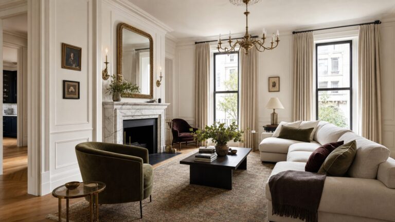
Anthracite is a deep charcoal gray—usually darker than ordinary gray but softer than true black. The clearest standardized reference is RAL 7016 Anthracite Grey, although products sold under the name anthracite can vary by material, finish, manufacturer, and lighting.
Anthracite is a deep charcoal gray—usually darker and more dramatic than ordinary gray, but softer and less absolute than true black. In interiors, the most useful standardized reference is RAL 7016 Anthracite Grey. It is a strong choice for adding depth, architectural definition, and a sophisticated contrast without the visual severity of a pure black finish.
| # | Preview | Product | Price | |
|---|---|---|---|---|
| 1 |

|
RAL K7 Color Chart, 216 Colors, Gloss, 5 Languages | $26.13 | Buy on Amazon |
| 2 |

|
RAL D2 Color Chart, 1,825 Colors, Semi-Matte, 5 Languages | $159.52 | Buy on Amazon |
| 3 |
|
RAL K5 Color Chart, 215 Full Page Color Swatches, Gloss, 8 Languages | $57.12 | Buy on Amazon |
| 4 |

|
RAL E4 EFFECT colour fan glossy metallic | $51.13 | Buy on Amazon |
As an Amazon Associate I earn from qualifying purchases.
That definition comes with an important qualification: “anthracite” is not one universal paint formula. The color name is used for paint, powder coating, metal, plastic, tile, upholstery, and other products, and the result can vary by manufacturer, material, sheen, and lighting. If you need an exact match, compare a physical sample in the room rather than relying on a phone or monitor.
What does anthracite look like?
Anthracite generally looks like a blackened gray, charcoal, graphite, or very deep neutral gray. It retains enough gray character to avoid looking completely black, although it may appear nearly black in a shaded corner or beside a pale color.
#1 Best Overall
- Features 216 timeless hues from the RAL CLASSIC collection with five colors per page - fan size 15.0 x 5.0 x 2.0, color display 2.0 x 5.0 cm
- Crafted with low-solvent, low-odour water-based paints for eco-friendly use
- Enhanced UV resistance provides long-lasting color protection
- Cover made from 100% recyclable post-industrial polypropylene waste
- Compact and portable design, ideal for precise color matching on the go
Its appearance changes with the surface and finish:
- Matte anthracite tends to look soft, velvety, and architectural.
- Eggshell or satin anthracite reflects more light and can appear slightly lighter or sharper.
- Gloss anthracite looks more graphic and may emphasize blue, green, or other undertones.
- Textured anthracite can look less severe because the weave, grain, or surface variation breaks up the dark color.
RAL 7016 is the clearest reference when a specification is required. However, a RAL reference is not a guarantee that a paint, textile, powder-coated frame, or plastic component will look identical. The same nominal color can change noticeably between substrates and finishes.
Anthracite compared with similar colors
| Color | How it usually differs from anthracite |
|---|---|
| Charcoal | A broad commercial description that often overlaps with anthracite. “Anthracite” is more useful when a standard such as RAL 7016 is specified. |
| Graphite | Often suggests a cooler, more mineral or blue-gray appearance, although brands do not use the term consistently. |
| Slate | Usually implies a more obvious blue or blue-gray cast. Slate can be lighter or bluer than anthracite. |
| Black | Usually deeper and more absolute. Anthracite keeps a visible gray quality and can provide contrast with less visual weight. |
These are practical decorating distinctions rather than universal laboratory boundaries. When matching products, use the manufacturer’s color code and a physical sample—not the name alone.
The Tool Desk
Outbyte PC Repair FREEClear out junk files and repair common Windows errorsFree Scan →Outbyte Driver Updater FREEScan for outdated or missing drivers - takes under a minuteDriver Scan →Does anthracite have warm or cool undertones?
Anthracite is often treated as a neutral, but not every anthracite is truly neutral. Depending on its pigments and surroundings, it may lean:
- Blue or blue-gray: cooler, more mineral, and more contemporary.
- Green: particularly noticeable beside warm whites or pink-based neutrals.
- Brown or taupe: warmer and generally easier to combine with oak, beige, leather, and brass.
- Violet: more apparent under some artificial lighting and beside certain pale colors.
Value matters as well as undertone. A dark color with a low Light Reflectance Value (LRV) reflects relatively little light, so it can make a room feel intimate and dramatic. In a room with very little natural light, it may also feel heavy unless the lighting plan provides enough illumination and contrast.
How lighting changes anthracite
Natural daylight, warm bulbs, cool bulbs, and reflected colors can all alter how anthracite reads. Warm lamps may make a gray appear browner or softer. Cooler light may emphasize blue or green undertones. A nearby wood floor, colorful rug, or painted wall can also reflect color onto an anthracite surface.
Before buying paint or a large furnishing, test the actual product:
Windows Errors? Fix Them Before They Spread
Repair common Windows errors and clear accumulated junk for a smoother, more stable PC - no reinstall needed.Free scan · no reinstallOutdated Drivers Are Slowing You Down
One free scan finds every outdated or missing driver and matches the right update for your exact hardware.Free scan · exact hardware match- Place the sample on more than one wall or surface.
- View it in morning, afternoon, and evening light.
- Turn on the lamps that will normally be used in the room.
- Compare it with the flooring, trim, counters, furniture, and fabrics that will remain.
- Look at it both beside a white surface and beside a warm neutral such as cream or beige.
If exact matching matters across paint, cabinetry, flooring, upholstery, or metal, a RAL 7016 color swatch or official physical color card is a sensible starting point. It gives you a consistent reference, but it still should be viewed beside the finished materials and under the room’s lighting.
Rank #2
- The RAL chart D2 DESIGN SYSTEM plus is a comprehensive color chart displaying 225 color pages with a total of 1,825 RAL color swatches
- The RAL color fan deck size measures 29 x 5cm, and each color field measures 2.5 x 5cm
- Offers a quick overview of the RAL DESIGN SYSTEM plus with colors organized systematically into 40 separate color wheel palettes with a semi-matte finish
- Swatches within this RAL color chart have a 7-digit code as well as their color name, which is translated into 5 languages, including English, German and French
- Packaged within a high-quality embossed box to keep your RAL color chart protected
How to decorate with anthracite
1. Create an anthracite accent wall
An accent wall is the least permanent way to introduce a dark neutral. Anthracite works particularly well behind a bed, sofa, fireplace, dining table, desk, or built-in shelving.
Balance the wall with lighter upholstery, pale bedding, warm white trim, light oak, woven materials, or reflective details. The goal is not simply to make the wall lighter; it is to prevent the room from becoming a single flat field of dark gray.
2. Use anthracite on cabinetry and built-ins
Anthracite is effective on kitchen islands, lower cabinets, bathroom vanities, bookcases, mudroom storage, media units, and utility-room cabinetry. It gives cabinetry more definition than a medium gray while remaining less stark than black.
For a crisp modern scheme, combine it with white or soft white, pale stone, brushed nickel, or restrained black hardware. For a warmer room, use cream, mushroom, oak, walnut, aged brass, terracotta, or tan leather.
3. Highlight doors, trim, and architectural details
Anthracite doors, window frames, baseboards, stair components, and fireplace surrounds can create a strong outline around lighter walls. This is useful when a room needs definition but a fully dark treatment would be too intense.
Repeat the color across several related details—such as the door, skirting, and window trim—rather than scattering isolated dark objects around the room. Repetition makes the choice look intentional and architectural.
4. Introduce it through furniture and textiles
If paint feels too permanent, use an anthracite sofa, occasional chair, rug, curtains, duvet, throw, cushions, lampshade, or dining chairs. Textiles are especially helpful because linen, wool, bouclé, velvet, and woven fabric soften the hard visual impression that a flat dark surface can create.
Recommended Free Tools
Mix matte and tactile surfaces with leather, rattan, timber, stone, glass, or aged metal. Texture is as important as color contrast when a room contains a large amount of anthracite.
Rank #3
- The RAL chart K5 CLASSIC includes 215 colors with a simple 4-digit color code system for easy color selection
- Color swatches are rendered on a large format with 1 per page measuring 5 x 15cm
- This RAL color fan has a high gloss finish and is the ideal color chart for all kinds of designers
- Every swatch has a RAL color name that is translated into 8 languages: English, French, German, Spanish, Italian, Russian, Chinese, and Dutch
- Encased within a convenient u-shaped protective cover that houses all the color swatches making it easy to transport
Colors that work well with anthracite
Warm white and cream
Warm whites create a high-contrast but comfortable scheme. They are particularly effective when the room already contains oak, brass, beige, tan, or other warm elements. A cooler white gives a sharper, more graphic result.
Natural wood
Pale oak, ash, maple, walnut, and reclaimed wood bring organic warmth. Light timber keeps the scheme airy and contemporary; walnut and darker wood create a moodier, more enveloping effect. Check both materials together because warm lighting can change the apparent color of each.
Beige, taupe, and mushroom
These soft neutrals make anthracite feel residential rather than stark. They are particularly useful in living rooms and bedrooms where the desired atmosphere is sophisticated and comfortable rather than high-contrast.
Quick wins for a faster PC:
Repair Windows errors before they cause bigger problemsFix Now →Scan for outdated or missing drivers - takes under a minuteDriver Scan →Brass, bronze, and copper
Warm metals add small, reflective points of warmth. Aged brass and bronze suit traditional, transitional, and moody interiors; polished brass and copper produce a brighter decorative effect. Repeat the chosen metal in at least two or three places for cohesion.
Muted greens
Sage, olive, eucalyptus, and forest green create a natural layered palette. Pale sage is the safer partner for a small or dim room. Forest green suits a more deliberate, dark-maximalist scheme. Keep one color dominant so the combination does not become muddy.
Dusty blue and blue-gray
Muted blue reinforces anthracite’s cool mineral character. Add warm wood, cream, or tan if the room begins to feel cold. A brighter blue is usually most effective as a controlled accent rather than the main companion color.
Terracotta, rust, ochre, and cognac
Small doses of rust, terracotta, ochre, caramel, or cognac prevent a charcoal palette from becoming one-dimensional. Use them in artwork, cushions, ceramics, rugs, or leather rather than applying every warm color at once.
What’s actually slowing this PC down?
Pick the symptom - the matching free tool is one click away.
Pink, plum, and burgundy
Dusty rose, mauve, plum, and burgundy can make anthracite feel more luxurious. Keep the other neutrals restrained and rely on texture to prevent the result from becoming overly theatrical.
Rank #4
- The RAL chart E4 EFFECT includes 70 colors from the RAL EFFECT collection, each with a unique 3-digit color code for easy selection
- Full-page color illustrations with each RAL color swatch measuring 12.8 x 5cm
- This RAL color chart has a gloss finish and is the ideal tool for creators who are looking to design with metallic shades
- Every swatch has a RAL color name that is translated into English and German
- The RAL color fan comes in a protective box covered with high quality, embossed glossy film
Using anthracite room by room
- Living room: Try one wall, a fireplace, built-in shelving, a sofa, or a rug. Add natural wood, warm lamps, lighter seating, and a pale or patterned textile.
- Bedroom: Use it behind the headboard or across the walls and woodwork for a cocooning effect. Balance it with oatmeal or soft-white bedding, warm bedside lighting, and natural fibers.
- Kitchen: Apply it to lower cabinets, an island, appliances, stools, or a backsplash. Light counters and warm wood prevent the cabinetry from dominating.
- Bathroom: Use it on a vanity, floor tile, shower tile, or feature wall with white sanitaryware, pale stone, warm brass, or light oak. In a small bathroom, a concentrated application can look more intentional than dark material on every surface.
- Home office or study: Anthracite creates a quiet background for books, art, timber, and brass. Provide task lighting so the desk and reading areas remain comfortable.
- Entryway or hallway: Use it to give a narrow space architectural character. Mirrors, lighter flooring, pale artwork, and layered lighting help prevent a tunnel-like effect.
Choosing the right finish
Matte or eggshell emphasizes anthracite’s soft charcoal quality and reduces glare. Depending on the product, however, a low-sheen finish may reveal wall imperfections, so preparation still matters.
Satin or higher sheen reflects more light and can make doors, trim, cabinetry, and millwork look sharper. It also tends to highlight dents, unevenness, and poor preparation more readily.
Choose a product rated for the actual surface and location. Interior wall paint, cabinet coating, exterior metal finish, tile, plastic, and textile products are not interchangeable simply because they share the word “anthracite.” Follow the manufacturer’s primer, coverage, drying, and recoat instructions.
Common anthracite decorating mistakes
- Choosing from a screen alone. Digital color is not dependable enough for exact matching.
- Assuming every anthracite matches. Confirm the manufacturer, color code, material, and finish.
- Ignoring artificial light. Test the color with the bulbs and fixtures that will actually be used.
- Using one flat texture everywhere. Add timber, fabric, stone, glass, metal, or woven materials.
- Making every contrast equally strong. Anthracite with pure white and glossy black is much sharper than anthracite with cream, oak, and aged brass.
- Skipping the lighting plan. Dark colors can work in small or north-facing rooms, but layered lighting is more reliable than a single overhead fixture.
A practical sampling checklist
- Confirm whether the product is intended for the surface you are covering.
- Record the exact color code, brand, sheen, and finish.
- Test a physical sample at full enough size to judge undertone and depth.
- View it beside fixed elements such as flooring, counters, windows, and trim.
- Check both daylight and artificial light.
- For an accent wall or cabinet project, use sample boards so you can move the color around the room.
- Do not purchase large quantities until the sample works in the finished lighting and material context.
For a DIY painting project, a sample board, painter’s tape, an appropriate angled brush, roller, drop cloth, and the manufacturer’s recommended primer can make testing and application more controlled. The tools matter, but the color decision should come first.
Frequently Asked Questions
What color is anthracite?
Anthracite is a deep charcoal gray that often appears nearly black. It is generally softer and less absolute than true black while retaining a visible gray character.
Is anthracite always RAL 7016?
RAL 7016 Anthracite Grey is the most useful standardized reference for the color. Products labeled anthracite can still vary by manufacturer, material, finish, and lighting.
How can I tell whether anthracite will look right in my room?
Yes. Sample it on more than one wall or surface and view it in daylight and under the room’s actual lamps. A physical sample is more dependable than a phone or monitor.
Do these 3 things before closing this tab:
1Scan for outdated or missing drivers - takes under a minute2Repair Windows errors before they cause bigger problems3Fix the driver behind crashes, sound loss and screen glitchesWhat colors go well with anthracite?
Warm white, cream, natural wood, beige, taupe, mushroom, brass, bronze, muted green, dusty blue, terracotta, rust, cognac, plum, and burgundy can all work. The best choice depends on the anthracite’s undertone and the room’s lighting.
The Bottom Line
Anthracite is a deep charcoal gray, commonly represented by RAL 7016, and it decorates like a softer alternative to black. Use it for accent walls, cabinetry, doors, trim, furniture, and textiles; balance it with warm whites, wood, beige, warm metals, or carefully chosen color; and verify the exact product with a physical sample before committing.
Quick Recap
Product prices and availability are accurate as of the date/time indicated and are subject to change. Any price and availability information displayed on Amazon at the time of purchase will apply.