Pantone’s 2026 Color of the Year is PANTONE 11-4201 Cloud Dancer, a lofty white that the company presents as a call for calm, focus and creative breathing room. For construction and interiors, it is a design reference—not, by itself, a paint specification or a guarantee that a white finish from another brand will match.
What is Pantone’s 2026 Color of the Year?
Cloud Dancer is Pantone’s chosen Color of the Year for 2026. Pantone describes the shade as a billowy white and frames it as a response to an overstimulating environment. The announcement was published on December 4, 2025, according to Pantone’s article library.
As an Amazon Associate I earn from qualifying purchases.
Pantone associates Cloud Dancer with relaxation, focus, clarity, simplification and room for creativity. Those are the institute’s interpretations of the color, not established effects that a particular white finish will have on occupants.
Recommended Free Tools
What does Cloud Dancer mean for a construction or renovation project?
It can serve as a visual reference when discussing a light, restrained palette with a client or design team. But the Pantone identifier alone does not specify a coating, building material, or finish. The official material identifies the shade as PANTONE 11-4201; it does not establish an equivalent paint formula or a match across different products and surfaces.
#1 Best Overall

- INDUSTRY-STANDARD DIGITAL-TO-PRINT COLOR GUIDE The essential Pantone color book for translating color across workflows—trusted by designers, agencies, and print professionals to align digital and print using the Pantone Matching System.
- COMPLETE COLOR BRIDGE SYSTEM Features 2,359 Pantone coated colors, including 200+ new trend-driven additions, each displayed with PMS, CMYK, RGB, and HTML values for accurate cross-media color matching.
- SEE HOW CMYK MATCHES PANTONE COLORS Quickly visualize how CMYK process printing compares to Pantone spot colors—ideal for digital designers, packaging teams, and marketing professionals working across print and screen.
- PRINT ACCURACY WITH G7 CALIBRATION Printed to G7 CRPC6 standards to match real production conditions—ensuring consistent color reproduction for printers, agencies, and production teams.
- COATED PRINT SIMULATION Printed on 100 lb (148 gsm) coated paper to reflect final output; for coated and uncoated comparison, choose the Color Bridge Guide Set.
- For paint selection: request a sample or manufacturer-confirmed match in the coating system you intend to use. Assess it on the actual substrate and finish, under the project’s lighting.
- For other materials: compare physical samples in context. A white can appear different across materials, surfaces and lighting conditions, so do not assume a digital white or a consumer product is an exact match.
- For project documents: record the selected manufacturer, product, finish and approved sample alongside the Pantone reference. This makes the specified buildable finish clear without treating the color identifier as a complete material specification.
How does Pantone present the shade?
Pantone’s “Light & Shadow” palette places Cloud Dancer alongside softened colors that fade into shadowy shades. Its page also describes a separate atmospheric palette featuring cloudy blues and aqueous blue-greens. These palettes provide a starting point for color coordination, but they do not prescribe a construction finish or set of materials.
Leatrice Eiseman, executive director of the Pantone Color Institute, described the choice this way: “At this time of transformation, when we are reimagining our future and our place in the world, PANTONE 11-4201 Cloud Dancer is a discrete white hue offering a promise of clarity. The cacophony that surrounds us has become overwhelming, making it harder to hear the voices of our inner selves. A conscious statement of simplification, Cloud Dancer enhances our focus, providing release from the distraction of external influences.”
Rank #2

- Over 1,879 coated and 1,653 uncoated colours that have no close Pantone Spot Colour equivalent (≥ 2.0 ΔE 2000), unlocking fresh branding possibilities.
- This guide is used in 4-color process only. These are not Pantone Spot Colours. This is an extended gamut of colours for use in process printing.
- Two guides (Coated + Uncoated)
- Engineered to meet G7-calibrated CRPC standards so printed colours look as intended—from guide to press.
- Pantone Connect Compatible – Easily pick, save, and share colour data across your entire design stack
Where is Cloud Dancer appearing?
Pantone’s announcement page names brand collaborations or features involving Itel, Motorola, Pura and Play-Doh. It describes Itel accessories including wireless earbuds, a magnetic power bank and a precision clipper, with a limited edition launching in emerging markets. These examples show how the selection is being presented beyond interiors; they do not establish that a matching construction product is available.
PC Slower Than It Used to Be?
A free scan shows the junk files, broken settings and background clutter dragging Windows down - then fixes them in one click.Free scan · Windows 10 & 11Crashes, No Sound, or Screen Glitches?
Random freezes, missing sound and display glitches usually trace back to one bad driver. Find and replace yours safely.Free scan · under a minutePantone’s official Brazil press-release search result also describes 300 customizable Joybird furniture options in Cloud Dancer, including seating, beds and cushions. That information does not confirm current availability or purchasing options in a particular location.
Quick Recap
Rank #4

- Perforated, removable Spot Color Chips makes sharing easy
- Ring-bound, two-volume desktop reference book enables impressive presentations and allows for page replacements
- Includes two Paper Chip Savers to organize and store loose Color Chips or Color collections
- Browse a wide selection of colors at a glance: each page provides up to seven Pantone Colors with six individual 1.2” x 0.8” chips per color provided
- Printed on common paper stock weights: 100 lb (148 gsm) coated and 80 lb 118 gsm) uncoated
Rank #3
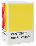
- PERFECT FOR PANTONE COLOR BOOK FANS: This charming postcard collection features a palette drawn from the Pantone Color Matching Systems.
- GRAPHIC DESIGN INSPIRATION: Each postcard in this set of 100 offers a different bold hue to brighten up the mail.
- COLOR MATTERS: Color as a form of communication is incredibly powerful. The art of Pantone makes this set of cards a brilliant way to connect.
- BLANK POSTCARDS: These high-quality cards are great for any occasion: birthdays, thank yous, sympathy, or just saying hello.
- DOUBLES AS DECOR: Postcards work wonderfully as miniature art pieces to display on the desk or bulletin board.
Product prices and availability are accurate as of the date/time indicated and are subject to change. Any price and availability information displayed on Amazon at the time of purchase will apply.

