Quick wins for a faster PC:
Fix the driver behind crashes, sound loss and screen glitchesFind Drivers →Clear out junk files and repair common Windows errorsFree Scan →Scan for outdated or missing drivers - takes under a minuteDriver Scan →A strong interior color scheme is not just a wall color. It is a finish plan: walls, trim, ceilings, doors, cabinets, flooring, tile, counters, hardware, lighting, and furniture all working in the same direction. That is the difference between a room that looks freshly painted and a room that feels professionally finished.
For 2026, the best interior palettes are warmer, deeper, and more natural than the cool gray-and-white interiors that dominated the last decade. Sherwin-Williams named Universal Khaki SW 6150 its 2026 Color of the Year, while Benjamin Moore selected Silhouette AF-655, a burnt umber and charcoal-influenced shade. Across major color forecasts, we are seeing khaki, umber, sage, clay, burgundy, cashmere taupe, forest green, navy, soft yellow, and restorative darks showing up more often.

As an Amazon Associate I earn from qualifying purchases.
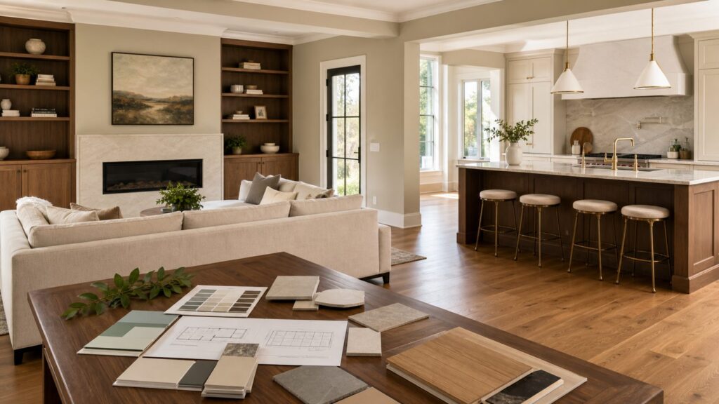
On our job sites, we choose color after looking at the permanent materials first. Floors, stone, brick, countertops, shower tile, cabinets, and stair parts usually cost far more to change than paint. The smartest color schemes respect those fixed elements and use paint, wallpaper, lighting, and trim to pull the home together.
What’s actually slowing this PC down?
Pick the symptom - the matching free tool is one click away.
How to Build a Color Scheme That Works in a Real House
Start with the 60-30-10 rule. About 60 percent of the visible room should be the dominant color, usually walls or large surfaces. About 30 percent should be the secondary color, often trim, cabinetry, flooring, upholstery, or tile. The final 10 percent is the accent: a door color, island color, wallpaper, hardware finish, pillows, art, or a built-in.
#1 Best Overall
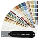
- Brand: Benjamin moore
- Container type: Box
- Finish type: Opa
Before choosing a palette, tape large samples vertically on at least two walls. A 12-by-12-inch sample is better than a small chip, and a 2-by-2-foot painted sample is better still. Check it in morning, afternoon, and evening light. North-facing rooms often make colors cooler and grayer. South-facing rooms intensify warmth. LED bulbs also matter: 2700K feels warm, 3000K is a good residential middle ground, and 4000K can make many warm neutrals look flat or commercial.
Sheen is part of the scheme. Matte hides drywall flaws but scuffs more easily. Eggshell is common for living spaces and bedrooms. Satin is useful in baths, kitchens, mudrooms, and kids’ spaces. Semi-gloss still makes sense for trim, doors, and some built-ins, but it will reveal every sanding mark and caulk line if prep is rushed.
20 Interior Design Color Schemes Worth Considering
1. Warm Khaki, Ivory, and Walnut
This is one of the most practical whole-house palettes for 2026. Use a warm khaki on walls, ivory on trim and ceilings, and walnut in floors, furniture, vanities, or built-ins. It works especially well in open floor plans because the wall color has more body than white but still behaves like a neutral.
Best rooms: living rooms, hallways, kitchens, primary bedrooms, and open-concept main floors. Watch out for: gray flooring. Khaki can look muddy beside cool vinyl plank or blue-gray tile.
2. Burnt Umber, Cream, and Aged Brass
Burnt umber brings depth without going pure black. Use it on a dining room, office, powder room, or built-in wall, then balance it with cream trim and aged brass hardware. This palette pairs well with medium oak, walnut, leather, plaster finishes, and warm stone.
Best rooms: dining rooms, libraries, offices, and powder rooms. Watch out for: low lighting. Dark umber needs layered light, including sconces or picture lights, not just one ceiling fixture.
3. Sage Green, Warm White, and Natural Oak
Sage is popular because it reads calm without feeling cold. Pair sage walls or cabinets with warm white trim and natural oak floors. In kitchens, sage lower cabinets with white uppers can keep the room bright while adding color where it counts.
Best rooms: kitchens, mudrooms, bedrooms, laundry rooms, and baths. Watch out for: yellow-beige tile. Some sages turn dull beside older beige ceramic unless the white trim is warmed up.
4. Deep Navy, White Oak, and Linen
Deep navy gives a home a tailored look when it is used with restraint. Try navy on built-ins, an island, interior doors, or a bedroom accent wall. White oak flooring and linen upholstery keep the color from feeling heavy.
Best rooms: offices, bedrooms, media rooms, and kitchens with islands. Watch out for: glossy navy. Dark satin or semi-gloss surfaces show fingerprints and roller marks, so the substrate and application need to be clean.
5. Terracotta, Clay, and Soft Green
This palette works well in homes with brick, Saltillo-style tile, clay roof tones, or warm stone. Use terracotta sparingly as an accent, clay or soft beige as the wall color, and muted green in textiles, cabinetry, or a secondary room.
Do these 3 things before closing this tab:
1Repair Windows errors before they cause bigger problems2Fix the driver behind crashes, sound loss and screen glitches3Clear out junk files and repair common Windows errorsBest rooms: sunrooms, kitchens, entries, dining spaces, and patios that connect to interiors. Watch out for: too much orange. Keep fixed finishes and upholstery quieter so the room does not feel themed.
6. Charcoal, Mushroom, and Black Metal
Charcoal and mushroom make a strong modern palette without relying on stark white. Mushroom walls soften the room, charcoal anchors built-ins or doors, and black metal works for lighting, stair railings, cabinet pulls, and shower frames.
Best rooms: basements, lofts, offices, and modern kitchens. Watch out for: cool concrete-gray floors. Add warm wood or textured rugs so the space does not feel flat.
7. Dusty Blue, Greige, and Aged Brass
Dusty blue is easier to live with than bright blue. Use it in a bedroom, bath vanity, laundry cabinet, or quiet sitting room. Greige walls and aged brass fixtures make the palette warm enough for a family home.
PC Slower Than It Used to Be?
A free scan shows the junk files, broken settings and background clutter dragging Windows down - then fixes them in one click.Free scan · Windows 10 & 11Outdated Drivers Are Slowing You Down
One free scan finds every outdated or missing driver and matches the right update for your exact hardware.Free scan · exact hardware matchBest rooms: bedrooms, baths, laundry rooms, and guest rooms. Watch out for: blue-white trim. It can make dusty blue feel colder than intended.
8. Burgundy, Taupe, and Cream
Burgundy is showing up again, but the successful version is controlled. Use it on a powder room, dining room, pantry door, built-in, or velvet upholstery. Taupe walls and cream trim keep the scheme grounded.
Best rooms: powder rooms, dining rooms, bars, and reading nooks. Watch out for: cheap-looking red. Choose browned burgundy or wine tones, not primary red.
9. Olive Green, Plaster White, and Leather
Olive works beautifully with plaster white walls, tan leather, bronze hardware, and natural fiber rugs. It feels less delicate than sage and more architectural.
The Tool Desk
Outbyte Driver Updater FREEScan for outdated or missing drivers - takes under a minuteDriver Scan →Outbyte PC Repair FREERepair Windows errors before they cause bigger problemsFix Now →Best rooms: dens, offices, mudrooms, kitchens, and bedrooms. Watch out for: fluorescent lighting. Olive can turn harsh under cool bulbs.
10. Soft Blush, Cocoa, and Travertine
This is not a pink nursery palette. Soft blush can act as a warm neutral when paired with cocoa brown, travertine, cream, and unlacquered brass. It works especially well in bathrooms and bedrooms where softer light is welcome.
Best rooms: primary suites, dressing areas, baths, and powder rooms. Watch out for: overly sweet accents. Keep metals, stone, and wood mature.
11. Coastal Blue-Gray, Warm White, and Rattan
Blue-gray can still work when it is softened with warm white and natural texture. Rattan, oak, jute, linen, and woven shades keep the palette from drifting into cold coastal cliché.
Best rooms: bedrooms, family rooms, guest rooms, and vacation homes. Watch out for: pairing it with icy white. Warm trim is the difference between fresh and chilly.
12. Black, Warm White, and Natural Stone
Black is best used as punctuation: stair rails, window sashes, doors, vanities, fireplace surrounds, or a paneled accent wall. Warm white walls and natural stone counters or surrounds prevent the contrast from becoming harsh.
Best rooms: entries, baths, kitchens, fireplaces, and stair halls. Watch out for: poor prep. Black paint exposes drywall waves, brush marks, dust, and caulk ridges.
13. Lavender-Gray, Ivory, and Pewter
Muted lavender-gray is a good option when a homeowner wants color but not a loud room. Ivory trim warms it up, and pewter hardware keeps it refined.
Recommended Free Tools
Best rooms: bedrooms, baths, nurseries, and quiet offices. Watch out for: yellow lighting. Some lavender-grays can turn beige or bruised under the wrong bulb.
14. Butter Yellow, Cream, and Pale Oak
Soft yellow is returning in a much quieter form. Butter yellow works well in kitchens, breakfast rooms, laundry rooms, and older homes with traditional trim. Cream and pale oak make it feel sunny instead of loud.
Best rooms: kitchens, breakfast rooms, laundry rooms, and small bedrooms. Watch out for: high-gloss yellow walls. Use a restrained sheen and test carefully.
15. Forest Green, Camel, and Marble
Forest green is excellent for cabinetry, bars, libraries, and powder rooms. Camel leather or upholstery warms it, while marble or quartz with soft veining adds contrast.
Best rooms: kitchens, bars, offices, powder rooms, and libraries. Watch out for: weak lighting. Dark green cabinetry needs good under-cabinet and task lighting.
Rank #3
!['BENJAMIN MOORE' CLASSIC COLORS FAN DECK [CASE OF 1]](https://m.media-amazon.com/images/I/41Xq67AO80L._SL160_.jpg)
- Very good condition
- Benjamin Moore Classic Colors Fan Deck
- Classic Colors
- Includes the American Classic Colors (AC)
16. Slate Blue, Putty, and Bronze
Slate blue has enough gray to feel architectural. Putty walls or trim and bronze hardware give it a practical, lived-in quality. This palette is strong for homes with stone fireplaces or medium wood floors.
Best rooms: offices, bedrooms, mudrooms, and family rooms. Watch out for: mixing too many metals. Pick bronze as the lead finish and keep chrome limited.
17. Cashmere Taupe, Off-White, and Champagne Metal
Cashmere taupe is a strong kitchen and whole-house neutral because it sits between beige, gray, and mushroom. Off-white trim and champagne metal hardware give it a softer, updated look.
Best rooms: kitchens, closets, bedrooms, and open main floors. Watch out for: old gray countertops. Taupe needs to be tested beside quartz, granite, and tile before committing.
18. Teal, Walnut, and Warm Gray
Teal has more personality than navy but still feels substantial when paired with walnut and warm gray. Use it for built-ins, a powder bath vanity, an office wall, or a dining room.
Best rooms: offices, powder rooms, dining rooms, and media rooms. Watch out for: too many saturated accents. Let teal be the main color moment.
19. Red-Brown, Linen, and Dark Bronze
Red-brown is one of the richest 2026 color directions. It works well with linen walls, dark bronze fixtures, honed stone, and warm wood. Used on doors or millwork, it can make a new home feel more established.
Free tools Windows power users keep installed
One-click scans. No signup required.
Best rooms: entries, dining rooms, offices, and built-in cabinetry. Watch out for: orange undertones in floors. Sample before using it near red oak.
20. Pale Celadon, Chalk White, and Light Maple
Pale celadon is a soft green-blue that works beautifully in light-filled rooms. Chalk white trim and light maple flooring or cabinetry keep the palette clean without looking sterile.
Best rooms: baths, bedrooms, kitchens, and smaller rooms needing lightness. Watch out for: cool LEDs. Use warmer bulbs to keep celadon from going minty.
What Interior Painting and Finish Work Costs in 2026
Color schemes affect cost because every added color, sheen, surface, and transition adds labor. A one-color wall refresh is much simpler than a full finish schedule with ceilings, trim, doors, cabinets, accent walls, and wallpaper.
Free tools Windows power users keep installed
One-click scans. No signup required.
| Project scope | Typical 2026 cost range | Best use |
|---|---|---|
| Single 10-by-10-foot room, walls only | About $200 to $600 | Low-cost bedroom or office refresh |
| Single 16-by-16-foot room | About $515 to $1,540 | Living room, primary bedroom, or dining room |
| Professional interior wall painting | About $2 to $6 per square foot | Most standard wall repaint projects |
| Walls, trim, and ceilings | Often $4.70 to $6.75 per square foot | Full room transformation with cleaner detailing |
| Full 2,000-square-foot interior | Commonly $4,200 to $9,500 | Whole-house repaint before move-in or sale |
| Large or custom home interior | Often $12,000 and up | High ceilings, detailed trim, cabinets, repairs, multiple colors |
| Wallpaper installation labor | Commonly $2 to $7 per square foot | Powder rooms, accent walls, dining rooms, and ceilings |
| Interior designer hourly help | Often $100 to $500 per hour | Palette, furniture, finish, and material coordination |
The biggest price drivers are wall condition, drywall repair, caulking, nail pops, water stains, texture matching, ceiling height, trim complexity, number of colors, dark-to-light transitions, occupied-home protection, cabinet painting, premium coatings, and low-VOC specifications. On a real project, the paint itself is rarely the main cost. Labor and prep are.
For budgeting, think in three tiers. A basic refresh uses one wall color and keeps existing trim. A midrange refresh includes walls, ceilings, trim, and doors. A premium palette remodel may include painted cabinets, new lighting, wallpaper, flooring changes, tile, hardware, and coordinated fixtures.
When to DIY and When to Hire a Pro
DIY can make sense for a simple bedroom, office, or accent wall if the walls are in good condition and the ceiling is standard height. Plan on one day for prep and masking, one day for primer or first coat, and one day for the final coat and touch-ups. A 10-by-10 room is a reasonable weekend project for a careful homeowner.
Hire a pro when the project includes high ceilings, stairwells, heavy drywall repair, stained trim, cabinet painting, wallpaper, multiple sheens, water damage, dark colors, lacquered or sprayed finishes, or an occupied home that needs serious dust and floor protection. Cabinet painting in particular is a finishing trade, not just regular wall painting. Doors and cabinet fronts usually need cleaning, sanding, bonding primer, controlled drying, and a durable enamel or cabinet-grade coating.
If you are hiring design help, a color consultation may be enough for a paint-only project. Full-service interior design costs more because it can include furniture plans, lighting, tile, flooring, window treatments, drawings, procurement, and project coordination. Hourly design rates often fall between $100 and $500 per hour, with many US averages around $150 per hour.
Rank #4

- Features 216 timeless hues from the RAL CLASSIC collection with five colors per page - fan size 15.0 x 5.0 x 2.0, color display 2.0 x 5.0 cm
- Crafted with low-solvent, low-odour water-based paints for eco-friendly use
- Enhanced UV resistance provides long-lasting color protection
- Cover made from 100% recyclable post-industrial polypropylene waste
- Compact and portable design, ideal for precise color matching on the go
Safety, VOC, and Permit Notes
Most interior repainting does not require a building permit, but there are exceptions. If the work changes rated assemblies, commercial interior finishes, corridors, exits, stair enclosures, fire-resistance requirements, or wall and ceiling finish classifications, code review may apply. Commercial projects must pay close attention to interior finish requirements under building codes, including flame spread and smoke-developed classifications for certain locations.
Homes built before 1978 need extra caution because lead-based paint may be present. If painted surfaces will be disturbed by sanding, scraping, demolition, window replacement, or renovation work, lead-safe practices matter. Contractors working on covered pre-1978 homes and child-occupied facilities must follow EPA Renovation, Repair and Painting requirements.
VOC content is another practical consideration. Many homeowners ask for low-VOC or zero-VOC paint, especially in bedrooms, nurseries, and occupied homes. That is a reasonable request, but product selection still needs to match the room. A low-VOC wall paint in a low-traffic bedroom is different from a scrubbable coating in a mudroom or a cabinet enamel in a kitchen. Ask for the specific product, sheen, and application location before work starts.
Recommended Free Tools
Common Color Scheme Mistakes We See on Job Sites
The first mistake is choosing paint before looking at fixed finishes. A wall color that looks beautiful online can fail immediately beside existing flooring, tile, brick, granite, or stained wood. We always sample beside the materials that are staying.
The second mistake is ignoring trim and ceilings. White is not one color. Some whites are blue, some are yellow, some are gray, and some look dingy beside warm walls. For many homes, a warmer off-white trim is more forgiving than a stark gallery white.
The third mistake is underestimating prep. Paint will not hide nail pops, open trim joints, drywall waves, water stains, or bad texture patches. Dark colors and higher sheens make those defects more visible. A good finish schedule should include wall repair, caulking, sanding, priming, and stain blocking where needed.
The fourth mistake is using dramatic colors without improving lighting. A dark office, forest green built-in, or burgundy powder room can look excellent, but it needs the right bulbs, sconces, under-cabinet lighting, or ceiling fixtures. Color and lighting should be selected together, not weeks apart.
How to Choose a Whole-House Palette
For a whole house, start with one connective neutral that can run through hallways, main living areas, and open spaces. Warm khaki, cashmere taupe, mushroom, soft greige, plaster white, or a quiet warm white can all work. Then choose two or three stronger colors for contained rooms: a navy office, sage mudroom, umber powder room, forest green built-in, or dusty blue guest room.
Keep expensive permanent finishes timeless. Flooring, counters, tile, and major cabinetry should survive more than one paint trend. Use bolder 2026 colors on surfaces that are easier to update: walls, vanities, islands, interior doors, wallpaper, textiles, and decor.
Before construction starts, write a finish schedule. It should list each room, wall color, trim color, ceiling color, door color, cabinet color, sheen, product line, primer requirements, wallpaper locations, and any special notes. On a larger remodel, that one document prevents costly confusion between the homeowner, designer, painter, cabinet shop, electrician, and builder.
The best interior color scheme is the one that fits the house, not just the trend. When the palette respects the light, materials, budget, and way the family uses the space, the result feels intentional for years instead of fashionable for one season.
Do these 3 things before closing this tab:
1Clear out junk files and repair common Windows errors2Scan for outdated or missing drivers - takes under a minute3Repair Windows errors before they cause bigger problemsFrequently Asked Questions
What interior color schemes are trending in 2026?
Warm and grounded palettes are leading: khaki, taupe, umber, sage, olive, clay, terracotta, burgundy, forest green, navy, soft yellow, and layered off-whites. The strongest rooms pair these colors with natural materials such as oak, walnut, linen, travertine, marble, plaster, bronze, and brass.
How much does it cost to paint a home interior in 2026?
Professional interior painting commonly runs about $2 to $6 per square foot for walls. Walls plus trim and ceilings often land closer to $4.70 to $6.75 per square foot. A full 2,000-square-foot interior commonly ranges from about $4,200 to $9,500, while large or custom homes can exceed $12,000.
How do I choose a whole-house color palette?
Start with fixed finishes such as flooring, counters, tile, stone, brick, and cabinetry. Choose one main neutral for connected areas, then use stronger colors in contained rooms like offices, bedrooms, mudrooms, powder rooms, and built-ins. Limit the palette to one dominant color, one or two secondary colors, and controlled accents.
Should trim and ceilings be white or colored?
White is common, but it should not be automatic. Warm off-white trim works well with khaki, taupe, sage, clay, and umber palettes. Colored trim can look excellent in offices, powder rooms, and historic homes, but it needs a clear plan for doors, baseboards, crown, casing, and adjacent rooms.
Outdated Drivers Are Slowing You Down
One free scan finds every outdated or missing driver and matches the right update for your exact hardware.Free scan · exact hardware matchPC Slower Than It Used to Be?
A free scan shows the junk files, broken settings and background clutter dragging Windows down - then fixes them in one click.Free scan · Windows 10 & 11What should I know before painting a home built before 1978?
Homes built before 1978 may contain lead-based paint. If sanding, scraping, demolition, or renovation will disturb painted surfaces, lead-safe practices are required. Contractors working on covered pre-1978 homes and child-occupied facilities must follow EPA Renovation, Repair and Painting rules.
What paint colors make a room look bigger?
Warm whites, pale greige, soft celadon, dusty blue, light taupe, and gentle cream can make a room feel larger when paired with good lighting and low-contrast trim. The bigger factor is usually contrast: rooms feel more open when walls, trim, ceilings, and large furniture do not chop the space into harsh blocks.
Quick Recap
Product prices and availability are accurate as of the date/time indicated and are subject to change. Any price and availability information displayed on Amazon at the time of purchase will apply.

