Some links on this page are affiliate links: if you buy through them we may earn a commission, at no extra cost to you.
Wood finishes do not need to match exactly. The most reliable way to combine them is to choose one dominant wood, add one supporting tone, and use a smaller accent only when it serves a clear purpose. Coordinate undertones, create either intentional contrast or genuine harmony, repeat important tones, and test physical samples in the actual room before committing to flooring, cabinetry, furniture, or stain.
Start with the dominant wood
Begin with the largest or most permanent wood element in the room. This is usually the floor, but it may be kitchen cabinetry, a built-in, exposed beams, wall paneling, or a large dining table.
As an Amazon Associate I earn from qualifying purchases.
Once identified, treat that element as the room’s base color. Other wood pieces are supporting elements rather than separate colors that must compete for attention. For example:
- With medium-oak flooring, a walnut table can provide deliberate contrast while smaller oak or walnut accents repeat the palette.
- With dark kitchen cabinetry, lighter flooring may be the better supporting wood than another dark brown surface.
- With a prominent built-in, choose furniture that relates to the built-in’s undertone, grain activity, or level of contrast instead of trying to duplicate it exactly.
This hierarchy prevents a common problem: several similar medium-brown woods appearing to be almost—but not quite—the same color. Near matches can look accidental. A clear base-and-supporting relationship is easier for the eye to understand.
#1 Best Overall

- AUTHENTIC WOOD FINISH -Go Beyond Faux with our patented liquid wood technology. It looks and feels like wood because it contains over 60% recycled wood fibers. Transform any hard surface into stunning wood with Retique It! Get the warm, natural look of wood on any surface without the cost and hassle of traditional woodwork.
- STAINABLE & SUSTAINABLE - Retique It is hassle-free way to get that perfect wood finish without any fuss! With its eco-friendly, water-based formula, there are zero VOCs and no offensive odors, making it easy to use even in confined spaces. When you're finished, clean-up is a breeze with just soap and water!
- NO STRIPPING REQUIRED - No need to sand or strip off old finishes or surfaces - just apply it right over any painted or finished surface. Our wood-based primers and stains let you add a layer of actual wood to virtually any hard surface.
- EXTREME DURABILITY - INTERIOR / EXTERIOR – Durable enough for decking, flooring, and countertops yet perfect for furniture and cabinets as well.
- ANY SURFACE IMAGINABLE - Painted, Stained, Wood, Metal, MDF, Concrete, Plastic, Drywall, virtually any hard surface…
Compare undertones, not just lightness and darkness
Two woods can be equally dark and still clash because their undertones differ. Look at the color beneath the apparent brown, tan, or gray:
| Visual family | Common appearance | Examples that often coordinate |
|---|---|---|
| Warm | Red, orange, honey, or yellow | Walnut, cherry, cognac, and golden oak finishes |
| Cool | Gray, blue, ashy, or weathered | Ash, pale maple, gray-washed, and whitewashed finishes |
| Neutral or bridging | Beige, tan, or relatively balanced | Finishes that can connect warm and cool materials |
These are visual categories, not permanent rules about the tree species. Stain, bleaching, aging, sheen, and the color of the surrounding room can significantly change how a wood reads. A species that looks neutral in one finish may look distinctly warm in another.
Recommended Free Tools
When in doubt, keep the main wood tones within the same temperature family. A warm oak floor generally works more naturally with warm walnut, cherry, or cognac accents than with a strongly gray-stained piece. Conversely, pale ash or weathered gray flooring may need cooler or more neutral furniture to avoid a yellow-orange contrast.
Choose harmony or make the contrast obvious
There are two dependable ways to combine woods:
Close harmony
Use woods that share a similar undertone and value, while allowing their species, grain, shape, or finish to distinguish them. For example, light oak furniture and natural maple may form a quiet, pale palette if their finish levels and surrounding materials are compatible.
When woods are close in color, do not rely on color alone. Make the difference intentional through a visibly different grain, furniture style, edge detail, plank direction, or sheen.
Clear contrast
Pair a light wood with a substantially darker one, such as a pale floor with walnut furniture or light flooring with dark cabinetry. Contrast gives each surface a defined role and can keep the room from appearing flat.
Crashes, No Sound, or Screen Glitches?
Random freezes, missing sound and display glitches usually trace back to one bad driver. Find and replace yours safely.Free scan · under a minuteWindows Errors? Fix Them Before They Spread
Repair common Windows errors and clear accumulated junk for a smoother, more stable PC - no reinstall needed.Free scan · no reinstallRank #2
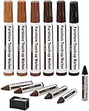
- PRODUCT DETAILS - This 13 piece kit includes 6 Repair Markers, 6 paper wrapped wax sticks and 1 wax stick sharpener packaged in a blister card.
- 6 UNIQUE COLORS - Maple, Oak, Cherry, Walnut, Mahogany and Black to match the color of your furniture. Now there's no need for you to call a professional to retouch your scuffed furniture. Become the pro yourself!
- PREMIUM QUALITY - Top quality markers and wax sticks that cover scratches, nicks, scuffs, and discoloration on furniture, cabinets, tables, beds and more. 100% effective and permanent.
- EASY TO USE - Simply draw over the scratch, allow it to quickly dry, and watch the scratches disappear right before your eyes! These are safe to use on all types of wooden furniture. Use the included sharpener to sharpen the wax sticks.
The difficult middle ground is a pair of woods that is only slightly different: a medium brown floor beside a medium brown table with a subtly redder or yellower stain. If the difference is not strong enough to look deliberate, the pieces may appear like failed attempts at a match.
Repeat supporting tones
A secondary wood usually looks more intentional when it appears at least twice. If you introduce walnut in a coffee table, echo it in a picture frame, shelf, console, lamp base, or another smaller element. If a light oak chair is the supporting tone, repeat a similar light wood in shelving or a smaller table.
The repeat does not need to be an exact species-and-stain match. Similar undertone, visual value, grain character, or sheen can be enough. Repetition creates a connection between pieces and makes an individual wood color feel like part of the design rather than an isolated purchase.
Do not interpret this as a requirement to distribute every wood equally. The dominant wood should remain dominant. Repetition is most useful for the supporting tone, while accents should occupy a smaller visual area.
Control grain, knots, and visual activity
Wood contributes more than color. Grain scale, figure, knots, pores, plank width, direction, and surface variation all affect how busy a room feels.
A strongly figured or heavily knotty surface is usually easier to combine with quieter-grained pieces. Several dramatic grains placed beside one another can create visual noise even when their colors coordinate. Likewise, a wide-plank floor with prominent knots already provides substantial pattern; furniture with a calmer grain may be a better partner than another highly figured statement piece.
Rank #3

- REAL WOOD DOOR - Upgrade your curb appeal with a beautiful wood finished front door. Works great over painted and stained doors as well as metal, veneer, cement. Any type of smooth surfaced table.
- AUTHENTIC WOOD FINISH -Go Beyond Faux with our patented liquid wood technology. It looks and feels like wood because it contains over 60% recycled wood fibers. Transform any hard surface into stunning wood with Retique It! Get the warm, natural look of wood on any surface without the cost and hassle of traditional woodwork.
- STAINABLE & SUSTAINABLE - Retique It is hassle-free way to get that perfect wood finish without any fuss! With its eco-friendly, water-based formula, there are zero VOCs and no offensive odors, making it easy to use even in confined spaces. When you're finished, clean-up is a breeze with just soap and water!
- NO STRIPPING REQUIRED - No need to sand or strip off old finishes or surfaces - just apply it right over any painted or finished surface. Our wood-based primers and stains let you add a layer of actual wood to virtually any hard surface.
- EXTREME DURABILITY - INTERIOR / EXTERIOR – Durable enough for decking, flooring, and countertops yet perfect for front doors. Your doors will have a beautiful wood finish for many years to come.
Consider these characteristics together:
- Grain direction: Long, directional flooring can be balanced by furniture with less pronounced linear movement.
- Figure and knots: Burled, highly figured, or knotty surfaces should generally have room to act as the focal point.
- Porosity: Open-pored and smooth, closed-grain surfaces may reflect stain and light differently.
- Sheen: A glossy surface attracts more attention than a matte or softly oiled one.
- Scale: A small side table can carry a more active grain without overwhelming the room; a highly patterned floor has a much larger visual impact.
Use non-wood materials as bridges
Strong light-dark contrast or a mixture of several wood families can benefit from a visual bridge. A rug, upholstered chair, stone countertop, painted wall, woven material, glass surface, or metal detail can interrupt the transition between woods.
For example, a high-contrast kitchen with light flooring and dark walnut cabinetry can be moderated by a stone counter, upholstered seating, and hardware that repeats elsewhere in the room. In a living room, a rug containing both the floor’s light tone and the furniture’s darker tone can connect them without adding another wood color.
These materials also provide breathing room. A room does not need to be a continuous field of brown, tan, and gray wood surfaces to feel warm or cohesive.
Coordinate sheen and design style
Finish sheen can be as noticeable as color. High-gloss lacquer, matte oil, open-pore finishes, and heavily distressed surfaces communicate different design intentions, even when their underlying colors are similar.
Mixed woods tend to work best when their styles and finish levels are compatible—or when the difference is unmistakably intentional. A smooth contemporary cabinet may not relate naturally to a heavily distressed farmhouse table simply because both are medium brown. On the other hand, an antique piece can work in a contemporary room when its placement, proportions, and contrast are clearly deliberate.
Also examine the fixed elements before choosing movable furniture. Floors, doors, trim, cabinets, beams, stair parts, and built-ins will remain in place, so they should be assessed first. Changing a table is easier than changing a floor or a full run of cabinetry.
Quick wins for a faster PC:
Clear out junk files and repair common Windows errorsFree Scan →Fix the driver behind crashes, sound loss and screen glitchesFind Drivers →Repair Windows errors before they cause bigger problemsFix Now →Rank #4

- AUTHENTIC WOOD FINISH - Go Beyond Faux with our patented liquid wood technology. It looks and feels like wood because it contains over 60% recycled wood fibers. Transform any hard surface into stunning wood with Retique It! Get the warm, natural look of wood on any surface without the cost and hassle of traditional woodwork.
- STAINABLE & SUSTAINABLE - Retique It is hassle-free way to get that perfect wood finish without any fuss! With its eco-friendly, water-based formula, there are zero VOCs and no offensive odors, making it easy to use even in confined spaces. When you're finished, clean-up is a breeze with just soap and water!
- NO STRIPPING REQUIRED - No need to sand or strip off old finishes or surfaces - just apply it right over any painted or finished surface. Our wood-based primers and stains let you add a layer of actual wood to virtually any hard surface.
- EXTREME DURABILITY - INTERIOR / EXTERIOR – Durable enough for decking, flooring, and countertops yet perfect for furniture and cabinets as well.
- ANY SURFACE IMAGINABLE - Painted, Stained, Wood, Metal, MDF, Concrete, Plastic, Drywall, virtually any hard surface…
Reliable wood combinations
Warm and collected
Use a medium-oak floor as the base, walnut for a table or casework, and smaller cherry or cognac-colored accents. Cream upholstery, warm neutral walls, and aged-brass details can support the warm palette without introducing another competing wood tone.
Light and contemporary
Pair pale oak or ash flooring with natural maple or light-oak furniture. Black or charcoal details can supply definition, while cooler stone and gray-green textiles help keep the pale woods from becoming overly yellow.
High-contrast kitchen
Use lighter flooring with darker walnut cabinetry, then moderate the contrast with a counter surface, upholstered stools, a rug, or hardware that creates a transition between the two values.
Collected or eclectic room
Inherited pieces do not all need to match. Keep varied furniture, then unify it through repeated undertones, a consistent textile palette, or one medium-toned bridge piece. A room with several woods can feel intentional if the surrounding colors and materials provide a common thread.
Do these 3 things before closing this tab:
1Fix the driver behind crashes, sound loss and screen glitches2Repair Windows errors before they cause bigger problems3Scan for outdated or missing drivers - takes under a minuteHow to test wood combinations before buying
- Photograph or list every existing wood element. Include floors, doors, trim, cabinets, beams, furniture, and decorative pieces.
- Identify the dominant surface. Usually this is the largest or most permanent element.
- Classify each wood visually. Note whether it appears warm, cool, or neutral, and record whether the grain is quiet or active.
- Select one supporting tone. It should either share the dominant wood’s undertone or create a strong, deliberate contrast.
- Plan at least one repeat. Ideally, repeat the supporting tone in two locations rather than introducing it once.
- Compare grain and sheen. Do not approve a combination based on color alone.
- Add a bridge if necessary. Try a rug, upholstery, paint, stone, glass, or metal before adding a third prominent wood.
- Test physical samples in the room. View them beside the existing wood in morning, afternoon, and evening light.
A wood stain sample kit can be a practical product-search starting point when you are comparing undertones or planning to refinish a piece. Treat it as a way to obtain physical samples, not as a guarantee that a color will look identical on your furniture. Manufacturer guidance commonly emphasizes that the final result changes with species, substrate, preparation, application, lighting, and finish. Test on the same species and preparation level whenever possible, or on an inconspicuous area.
For cabinetry, flooring, or a large furniture purchase, a small sample board is more dependable than a product photograph, phone screen, or online color chip. Keep the sample beside the existing wood and view it at different times of day.
If you are refinishing existing wood
Refinishing can coordinate an awkward collection of pieces, but stain is not a universal color overlay. Different species absorb and display stain differently, and the result also depends on sanding, wood condition, application method, opacity, and protective topcoat.
- Prepare a sample using the same sanding and cleaning process planned for the real piece.
- Apply the stain to matching scrap wood whenever possible.
- Test more than one coat or application method if the product instructions allow it.
- Let the sample dry fully before judging its color and sheen.
- Compare it with the fixed wood elements under the room’s actual lighting.
- Apply the protective finish to the sample too, because it can alter the final appearance.
For a small scratch or edge mark, wood touch-up markers or blend pencils may help disguise the damage. They are a repair tool, not a substitute for matching a major floor, cabinet run, or tabletop. A poor color match over a large surface is usually more visible than the original defect.
What’s actually slowing this PC down?
Pick the symptom - the matching free tool is one click away.
The mistakes that make mixed woods look accidental
- Trying to match every wood exactly: Near matches often look less convincing than a clearly lighter or darker companion.
- Ignoring undertones: A gray-stained floor beside strongly orange furniture can create tension even when both are medium-dark.
- Using too many equal-strength woods: Four or five prominent tones with unrelated grain patterns can make the room feel restless.
- Choosing from a screen: Digital color is only an approximation and varies with the display and surrounding light.
- Overlooking fixed elements: Floors, trim, doors, cabinets, beams, and stairs establish the palette before movable furniture is added.
- Refinishing without a test: A stain that looks right on one species may appear much warmer, darker, or more uneven on another.
- Adding a third wood too soon: First try a rug, upholstery, paint, stone, glass, or metal bridge. More wood is not always the solution.
A quick decision framework
When choosing between two pieces, ask:
- Which wood is dominant in the room?
- Does the new piece share its warm, cool, or neutral undertone—or provide obvious contrast?
- Is the difference clear enough to look intentional?
- Is the grain quieter or more active than the existing wood?
- Does the sheen suit the room’s style and other finishes?
- Can the new tone be repeated somewhere else?
- Would a rug, textile, stone, paint, or metal element make the transition easier?
- Have I compared a real sample in the room rather than relying on a screen?
If the answers are mostly yes, the woods are likely to feel coordinated without being identical. If they are not, adjust the undertone, increase the contrast, reduce the number of competing grains, or introduce a bridge material.
Best Value
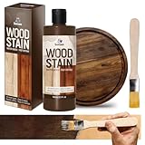
- Professional Results: Achieve rich, even color and enhanced wood grain with just a single application. SENVEN wood stain fast-drying, high-concentration formula provides excellent coverage and deep penetration, instantly revitalizing old wood with a natural matte finish
- Enhances Natural Wood Grain: SENVEN wood stain has a semi-transparent finish that highlights the wood’s inherent natural grain, adding color to furniture and effortlessly enhancing overall aesthetics. (To ensure a more even coloring effect, it is recommended to shake it well before application)
- Water Based & Safe To Use: Breathe easy with SENVEN wood stain non-toxic, water-based formula. Ultra-low in VOCs and free from harsh fumes, it’s safe for families, pets, and the environment. SENVEN wood stain Perfect for kitchen cabinets, furniture, decks, and more—use anywhere with confidence.
- Wide Application & Uniform Coloring: SENVEN wood stain provides excellent staining effects with even color distribution, and is widely applicable to various indoor and outdoor wooden surfaces. It easily handles furniture, cabinets, doors, windows, floors, and more.
- Complete Kit with Guaranteed Satisfaction: Everything you need in one box: high-concentration wood stain, brush. Friendly Reminder: Due to differences in absorption across various wood types, slight variations in staining color results may occur. It is recommended to test on a hidden part of the wood before staining. Proceed with large-area staining only after confirming satisfaction with the test results. If you have any questions regarding our wood stain, please feel free to contact us.
Frequently Asked Questions
Do all the wood finishes in a room need to match?
No. A room usually looks more intentional when it has one dominant wood, one supporting tone, and possibly a smaller accent. Exact matching is less important than coordinating undertones, contrast, grain activity, and sheen.
Can warm and cool wood tones be used together?
Yes, but the contrast should be deliberate. A neutral wood, rug, upholstery, stone surface, paint color, or metal detail can help bridge a warm wood and a cool wood that otherwise feel disconnected.
Should wood flooring match the furniture?
Not necessarily. Flooring often becomes the dominant wood, while furniture can be lighter, darker, or similar in undertone. A clear contrast is generally easier to coordinate than a nearly identical but imperfect match.
The Tool Desk
Outbyte Driver Updater FREEScan for outdated or missing drivers - takes under a minuteDriver Scan →Outbyte PC Repair FREEClear out junk files and repair common Windows errorsFree Scan →How many different wood tones can one room have?
There is no universal number, but several prominent woods with unrelated undertones and active grains can feel busy. Establish a dominant tone, repeat the supporting tone, and use non-wood materials to create breathing room.
Can I judge a stain color from an online photo?
Only as a preliminary reference. Species, preparation, application, lighting, finish, and the display itself can change the result. Test a physical sample on the same species and preparation level whenever possible.
The Bottom Line
The goal is coordination, not identical wood. Start with the largest existing surface, identify its undertone, then choose a supporting wood that either harmonizes or contrasts clearly. Repeat that supporting tone, manage grain and sheen, use rugs or other materials as bridges, and approve the combination only after viewing real samples in the room.
Quick Recap
Product prices and availability are accurate as of the date/time indicated and are subject to change. Any price and availability information displayed on Amazon at the time of purchase will apply.

