Free tools Windows power users keep installed
One-click scans. No signup required.
There is no single universal 2026 Color of the Year. Different organizations have selected different colors for paint, exterior stain, wood stain, spray coatings, fashion, product design, retail, and marketplace trends.
As of August 10, 2026, the clearest overall pattern is warm, earthy, and material-led: khaki, brown, ivory, ochre, green, and blue-green shades dominate many paint announcements. Pantone’s airy Cloud Dancer provides a lighter cross-industry counterpoint, while WGSN/Coloro’s Transformative Teal is a forward-looking trend forecast. This guide separates those categories so you can choose a usable color for the actual surface, lighting, finish, and region of your project.
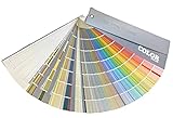
As an Amazon Associate I earn from qualifying purchases.
There is no single official 2026 color
“Color of the Year” is a brand- or authority-specific designation. Paint manufacturers choose colors for their own product ranges; Pantone publishes a cross-industry color standard; WGSN and Coloro issue a commercial trend forecast; stain and spray-paint companies select product colors; and retailers such as IKEA and Etsy identify directions within their own design ecosystems.
That means 2026 has many legitimate Colors of the Year, not one universal winner. This roundup covers the publicly announced selections within those categories as of August 10, 2026, while identifying what each color is actually for, where it is sold, and how useful it is for a real construction, renovation, or decorating project.
#1 Best Overall
For homeowners and contractors, the most important distinction is practical: a wall paint, exterior wood stain, spray coating, and global color-standard reference cannot be compared as though they were the same product.
2026 Colors of the Year at a glance
| Brand or authority | 2026 selection | Code or designation | Product type | Availability note |
|---|---|---|---|---|
| Sherwin-Williams | Universal Khaki | SW 6150; 207-C3 in design material | Interior, exterior, commercial, and industrial coatings | Sherwin-Williams stores and channels |
| HGTV Home by Sherwin-Williams | Universal Khaki | HGSW6150 | Consumer wall paint and color collection | Lowe’s in the United States |
| Benjamin Moore | Silhouette | AF-655 | Interior and exterior paint | Dealer network in the U.S., Canada, and other markets |
| Behr | Hidden Gem | N430-6A | Interior paint | Availability varies across the U.S., Canada, and Mexico |
| Valspar | Warm Eucalyptus | 8004-28F | Tintable interior, exterior, and specialty coatings | Retailer and market availability varies |
| Glidden / PPG Paints | Warm Mahogany | PPG1060-7 | Interior and exterior paint | Branding and availability vary by market |
| Dutch Boy | Melodious Ivory | 313-2DB | Interior paint | Particularly relevant to Menards in the U.S. |
| Dunn-Edwards | Midnight Garden | DE5657 | Interior and exterior paint | Especially relevant to the western U.S. footprint |
| C2 Paint | Epernay | C2 #639 | Premium paint | U.S. brand; retailer availability varies |
| Graham & Brown | Divine Damson | No prominent public code | Paint and related home products | Regional product and finish availability varies |
| Farrow & Ball | Naperon | No. 315 | Interior and exterior paint | International availability varies by region |
| Mylands | Burlington Arcade | No. 216 | Architectural paint | U.K.-based; check local international supply |
| Earthborn | Freckle | No public code located | Clay paint | Primarily U.K.-focused |
| Dulux / AkzoNobel | Rhythm of Blues: Mellow Flow, Slow Swing, and Free Groove | Three-shade family | Decorative paint and design direction | Market-specific Dulux ranges |
| Minwax | Special Walnut | MW 224 | Wood stain | For wood projects, cabinetry, furniture, and millwork |
| Cabot | Acorn | No public code located | Exterior wood stain | Cabot says it is available through retailers nationwide |
| Behr exterior stain | Taupe | SC-153 solid; ST-153 semi-transparent in Canada | Exterior wood stain | U.S. and Canadian product lines differ |
| Krylon | Matte Coffee Bean, also called Coffee Bean | No public code located | Spray paint | Use the launch naming when comparing references |
| Rust-Oleum | Satin Lagoon | No public code located | Spray and specialty coating | Part of Rust-Oleum’s Color Watch program |
| Pantone | Cloud Dancer | PANTONE 11-4201 | Global color standard and design reference | Not a specific wall-paint product |
| WGSN / Coloro | Transformative Teal | Coloro 092-37-14 | Cross-industry trend forecast | Used across fashion, beauty, interiors, packaging, and products |
| IKEA | Rebel Pink | No universal paint code | Retail and product-design direction | Specific products and colors depend on market |
| Etsy | Patina Blue | No universal paint code | Marketplace trend direction | Paired with Etsy’s Texture of the Year, Washed Linen |
The table includes shared selections separately where the brand relationship matters, but they should not be counted as unrelated colors. Sherwin-Williams and HGTV Home chose the same Universal Khaki. Glidden and PPG identify the same Warm Mahogany using the PPG code. Minwax’s Special Walnut is a coordinating Sherwin-Williams palette color, not a second Sherwin-Williams wall-paint winner.
The major paint-company picks
Universal Khaki — Sherwin-Williams and HGTV Home by Sherwin-Williams
Universal Khaki is the clearest example of why annual roundups need careful counting. Sherwin-Williams lists it as SW 6150, with 207-C3 appearing in the company’s design material. HGTV Home by Sherwin-Williams lists the shared shade as HGSW6150.
Do these 3 things before closing this tab:
1Clear out junk files and repair common Windows errors2Scan for outdated or missing drivers - takes under a minute3Repair Windows errors before they cause bigger problemsIt is a warm, grounded neutral intended for interior, exterior, commercial, and industrial coating applications through Sherwin-Williams, while HGTV Home packages it for the consumer market and places it at the center of its separate Honest Essentials Color Collection.
For a renovation, Universal Khaki is the kind of color to consider when you want a flexible backdrop that is warmer than a conventional cool gray. Sample it beside flooring, trim, stone, and cabinetry: khaki can look more beige, green, or gray depending on the surrounding materials and light.
HGTV Home’s consumer range is sold through Lowe’s in the United States. Sherwin-Williams products are sold through Sherwin-Williams stores and channels. The two codes should be preserved as each brand publishes them rather than treated as a guarantee that every product line is identical.
Silhouette AF-655 — Benjamin Moore
Silhouette AF-655 is Benjamin Moore’s rich espresso-brown with charcoal and burnt-umber character. It is a deeper, more dramatic choice than a conventional mid-tone neutral and can support a library, dining room, built-in cabinetry, study, powder room, or carefully sampled exterior element.
Quick wins for a faster PC:
Scan for outdated or missing drivers - takes under a minuteDriver Scan →Repair Windows errors before they cause bigger problemsFix Now →On a large wall, its depth can absorb light and make a room feel more intimate. On cabinetry or millwork, it can read as a sophisticated wood-adjacent color without being actual wood. The final effect will change with sheen: matte and eggshell soften reflection, while satin and semigloss make the color appear more defined and can emphasize surface imperfections.
Benjamin Moore distributes through its dealer network in the United States, Canada, and other markets. Check the local dealer and product line before specifying the color for a project.
Hidden Gem N430-6A — Behr
Hidden Gem N430-6A is Behr’s smoky jade, placing it in the blue-green family. It is one of the most directly useful picks for a homeowner who wants color without moving to a highly saturated jewel tone.
Hidden Gem can be considered for a feature wall, bathroom, kitchen island, built-in storage, bedroom, or exterior accent. Blue-green colors are especially sensitive to the light around them: daylight, warm LED bulbs, white trim, wood flooring, and adjacent tile can all shift how much blue or green is visible.
Behr’s primary 2026 Color of the Year is Hidden Gem for its paint program. The company separately selected Taupe as its 2026 Exterior Stain Color of the Year; Taupe is not a replacement name for Hidden Gem.
Warm Eucalyptus 8004-28F — Valspar
Warm Eucalyptus 8004-28F is a muted gray-green with a warmer character than many blue-based eucalyptus colors. Valspar offers tintable interior, exterior, and specialty products, but the exact product and retailer availability can vary by market.
It is a plausible choice for kitchens, bedrooms, bathrooms, covered outdoor areas, and cabinetry where a softened botanical color is wanted. Before ordering, verify that the required finish and substrate-specific product are available. A color available in an interior eggshell may not be offered in the same formulation for exterior trim or masonry.
Warm Mahogany PPG1060-7 — Glidden and PPG Paints
Warm Mahogany, identified by the PPG code PPG1060-7, is a rich red-brown. Glidden lists the selection in its 2026 color trends material, and PPG’s own trend page also identifies Warm Mahogany as its Color of the Year.
The Tool Desk
Outbyte PC Repair FREEClear out junk files and repair common Windows errorsFree Scan →Outbyte Driver Updater FREEScan for outdated or missing drivers - takes under a minuteDriver Scan →Rank #2
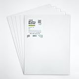
- PERFECT SAMPLES: These 12" x 9" white, styrene panels provide a smooth, warp-free surface for testing up to 5 color samples with paint, stain or other coatings.
- DURABLE MATERIAL: Made of sturdy styrene, these panels can withstand multiple coats and are non-absorbent so colors will stay true.
- CONVENIENT SIZING: At 12" x 9", the panels are just the right size for testing many common paint colors side by side before committing to a full project.
- PACKAGE INCLUDES: This value pack contains 5 white panels, enough for testing several color options on one purchase.
- VERY FLEXIBLE: Mighty Boards do not warp like foam core and you can bend them without breaking.
This is a warmer and more expressive direction than a beige neutral. It can work as a dining-room or entryway wall color, a built-in accent, a door color, or a smaller-scale feature where its red and brown undertones can be controlled. In warm artificial light, red, orange, and yellow undertones may become stronger, so a sample should be evaluated at different times of day.
Treat Warm Mahogany as one shared PPG/Glidden selection unless the purpose of the article is specifically to compare the two brands’ distribution and product ranges.
Melodious Ivory 313-2DB — Dutch Boy
Melodious Ivory 313-2DB is Dutch Boy’s soft, creamy beige neutral. It is a light option for walls, ceilings, trim coordination, and spaces where a warmer alternative to stark white is preferred.
Like most pale neutrals, it can look noticeably different beside bright white trim, natural wood, cool stone, or warm flooring. It may also appear flatter in low-light rooms unless the finish and surrounding materials provide contrast.
Outdated Drivers Are Slowing You Down
One free scan finds every outdated or missing driver and matches the right update for your exact hardware.Free scan · exact hardware matchPC Slower Than It Used to Be?
A free scan shows the junk files, broken settings and background clutter dragging Windows down - then fixes them in one click.Free scan · Windows 10 & 11Dutch Boy directs consumers toward Menards, making this selection particularly relevant to the U.S. retail market served by that chain. Confirm current local stock and the available finish before specifying it.
Midnight Garden DE5657 — Dunn-Edwards
Midnight Garden DE5657 is a deep, muted green with earthy undertones. It belongs to the darker, nature-inspired end of the 2026 palette and is well suited to a dramatic room, cabinetry, a study, a front door, or a controlled exterior accent.
Deep greens can be highly effective in rooms with adequate daylight or strong layered lighting, but they may make a small or poorly lit room feel heavier. Dunn-Edwards has a particularly strong retail and dealer presence in the western United States, so availability should be checked by region.
Epernay C2 #639 — C2 Paint
Epernay C2 #639 is a soft, earthy ochre with mineral undertones. It sits between a neutral and a statement color, offering warmth without the depth of a brown or plum.
Epernay may be useful in living areas, dining spaces, hallways, kitchens, and rooms with natural wood or stone. Whether it reads yellow, tan, or muted clay will depend heavily on the lighting and adjacent finishes. C2 is a U.S.-based premium paint brand; retailer availability varies.
Divine Damson — Graham & Brown
Divine Damson is a deep damson and plum-red inspired by damson fruit and fig. Graham & Brown presents it alongside its broader design and home-product direction, and its official product page provides paint information.
It is a strong candidate for a dining room, bedroom, powder room, media room, or accent wall when the goal is depth and warmth. It is less forgiving of untested lighting than a neutral, and the amount of natural light should influence whether it is used across all walls or in a smaller application.
The announcement does not prominently provide a universal color code. Graham & Brown’s U.S. product page should be used to confirm the available finish and regional product details.
Naperon No. 315 — Farrow & Ball
Naperon No. 315 is a warm terracotta or clay shade. It can add a distinctly earthy note to walls, alcoves, cabinetry, doors, and architectural details.
Terracotta shades often become more vivid beside cool whites and more subdued beside warm woods. They can also intensify under warm bulbs. Farrow & Ball is an international brand, and the official source for this selection is regional, so local availability and finish options should be confirmed in the market where the project is located.
Burlington Arcade No. 216 — Mylands
Burlington Arcade No. 216 is a rich, layered teal. It sits near the intersection of the blue-green and jewel-tone directions that appear repeatedly across the 2026 announcements.
Rank #3

- Core Color Matching: Paint color sample cards include 83 standard colors to support paint color sample cards, color matching cards for painting, and paint chips standard samples, helping users compare shades before selecting a final finish for floor paint, hardware, and other project needs
- Reliable Reference: Paint samples are made with color matching materials designed to support accurate color comparison, giving painters and DIY users a practical paint and paint color samples reference for selecting tones that fit the project surface and intended look
- Portable Format: Measuring 3.74 x 1.57 x 1.18 in and weighing 3.88 oz, this paint samples set is compact for a toolbox, work bag, or travel use, making it easier to carry color test card paint and check shades on site when planning paint work
- Wide Project Use: Paint sample cards are suitable for floor paint, paint hardware, and related color selection tasks, offering a useful paint chips samples reference for contractors, decorators, and home improvement users working on color coordination across different surfaces
- Simple Set Package: Each package includes 1 set of paint sample cards, giving users a straightforward paint sample standard cards option for daily work, project planning, and quick shade comparison when choosing among paint color cards and paint chips sample cards
It can be effective on cabinetry, a built-in, a study wall, a bathroom vanity, or a smaller room where a more enveloping color is intentional. Because teal can shift toward blue or green, test it against the actual tile, worktop, timber, and lighting planned for the room.
What’s actually slowing this PC down?
Pick the symptom - the matching free tool is one click away.
Mylands is a U.K.-based paint brand. International supply, sample availability, and product ranges vary.
Freckle — Earthborn
Freckle is Earthborn’s peachy orange or clay shade, associated with the company’s clay paint range. It is a warmer and more playful earthy direction than the brown and khaki neutrals.
Freckle may suit a bedroom, nursery, hallway, dining space, or small accent area, particularly where natural materials are part of the design. Earthborn is primarily U.K.-focused, and no public code was located in the cited campaign material.
Rhythm of Blues — Dulux and AkzoNobel
Dulux and AkzoNobel deliberately selected a three-color family rather than one isolated shade. Rhythm of Blues consists of:
Recommended Free Tools
- Mellow Flow: a light blue.
- Slow Swing: a dark blue.
- Free Groove: a vibrant blue.
The official framing is a group of colors for different moods and applications. It should be counted as one 2026 family with three shades, not as three unrelated annual winners. Dulux’s U.K. page uses the label “Colours of the Year,” while AkzoNobel describes the trio across decorative paint and broader product markets.
For a building project, Mellow Flow is the easiest of the three to use over a large area; Slow Swing is more suitable for a dramatic or controlled application; and Free Groove is the expressive accent. Those are practical interpretations, not a manufacturer ranking.
Stains, spray paints, and specialty coatings
These selections deserve their own category because their appearance depends on the material being coated. A stain interacts with wood grain and existing finish; spray paint depends on substrate preparation and the coating system; neither should be specified as a direct substitute for wall paint.
Taupe — Behr Exterior Stain Color of the Year
Behr selected Taupe as its 2026 Exterior Stain Color of the Year. The company describes it as a soft brown with gentle gray undertones. Behr’s Canadian product page identifies SC-153 for solid stain and ST-153 for semi-transparent stain.
Use Taupe when the project involves exterior wood rather than interior walls. The result will depend on wood species, grain, preparation, previous coatings, opacity, weathering, and the selected finish. A stain sample on the actual or equivalent wood is substantially more informative than a digital swatch.
Special Walnut MW 224 — Minwax
Special Walnut MW 224 is a wood stain for furniture, cabinetry, millwork, and other wood projects. Sherwin-Williams includes it as a coordinating stain in its 2026 palette, but that does not make it a second Sherwin-Williams wall-paint selection.
Special Walnut can look very different on oak, pine, maple, or previously finished timber. Always prepare and test a sample using the same sanding, conditioner, number of coats, and topcoat planned for the finished work.
Acorn — Cabot
Acorn is Cabot’s golden-brown exterior wood stain. Cabot says it is available in solid, semi-solid, and semi-transparent exterior stain finishes through retailers nationwide.
What’s actually slowing this PC down?
Pick the symptom - the matching free tool is one click away.
The finish choice changes how much grain remains visible and how much the existing wood influences the final color. For siding, decking, fencing, or exterior furniture, compare a sample on the actual exposure and surface condition rather than relying on the name alone.
Matte Coffee Bean — Krylon
Matte Coffee Bean, also referred to as Coffee Bean on some current product material, is Krylon’s spray-paint selection. The launch announcement uses the fuller name Matte Coffee Bean, which is the clearest wording when identifying the 2026 selection.
Rank #4
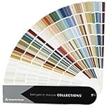
- Brand: Benjamin moore
- Container type: Box
- Finish type: Opa
It is intended for smaller projects, furniture details, hardware, décor, and other spray-paint applications—not as a can of architectural wall paint. Surface cleaning, sanding or scuffing, primer compatibility, spray distance, ventilation, and recoat timing will influence the result.
Satin Lagoon — Rust-Oleum
Satin Lagoon is Rust-Oleum’s jewel-toned teal selection for its Color Watch program. It is relevant to spray and specialty coating products and can provide a vivid accent on furniture, accessories, hardware, or smaller DIY projects.
Satin sheen reflects more light than a matte coating, so surface preparation matters. Test the product on the actual substrate and confirm that the chosen Rust-Oleum formulation is appropriate for interior, exterior, metal, wood, plastic, or another intended surface.
Global color authorities
Cloud Dancer — Pantone
PANTONE 11-4201 Cloud Dancer is Pantone’s 2026 Color of the Year, announced on December 4, 2025. Pantone describes it as an airy white associated with quiet reflection, clarity, and a fresh start.
Cloud Dancer matters in fashion, product design, packaging, branding, and visual communication, but it is not a specific wall-paint product. Pantone’s designation should not be described as the official color of all 2026 interiors, nor should readers assume that a paint retailer’s white labeled with a similar name is an exact match.
Transformative Teal — WGSN and Coloro
Transformative Teal is WGSN and Coloro’s 2026 Colour of the Year. Coloro identifies it as 092-37-14 and describes the shade as a fusion of dark blue and aquatic green.
WGSN and Coloro position it for fashion, beauty, interiors, packaging, and product design. Because WGSN publishes forecasts ahead of the calendar year, Transformative Teal should be presented as a forward-looking commercial forecast rather than as a competing paint-company announcement.
Retail and marketplace directions
Rebel Pink — IKEA
IKEA’s U.S. 2026 Style Guide identifies Rebel Pink as its color of the year. The retailer presents it as a vivid, playful direction associated with joy, energy, creativity, and self-expression.
Rebel Pink is a merchandising and interior-design direction, not a standardized paint formula with a universal code. Readers may find furniture, textiles, accessories, or other products in the color family, but the availability and exact shade depend on the local IKEA range.
Patina Blue — Etsy
Etsy’s 2026 Color of the Year is Patina Blue, inspired by the blue-green surface created as copper ages. Etsy paired it with its first Texture of the Year, Washed Linen.
Etsy said its selection was informed by marketplace behavior, including a more-than-threefold rise in searches for “blue copper” during the comparison period cited in its announcement. That search figure was reported as of November 3, 2025; it should not be presented as a current August 2026 measurement.
Patina Blue is useful as a product, styling, and material reference. It is not automatically a paint code, and an Etsy product described as patina blue may vary considerably from another seller’s version.
Independent reader supportYour contribution helps us test, update, and keep practical guides available for everyone.What the 2026 selections reveal
1. Warmth and materiality are everywhere
A clear pattern across many announcements is a movement toward warm, grounded, tactile colors: Universal Khaki, Silhouette, Melodious Ivory, Warm Mahogany, Epernay, Special Walnut, Acorn, and Taupe.
This is a synthesis of the published selections, not proof that the industry has abandoned gray. The more accurate conclusion is that many brands are offering warmer alternatives to cool, blue-based neutrals and are linking their choices to wood, soil, mineral, clay, and other natural-material references.
Free tools Windows power users keep installed
One-click scans. No signup required.
2. Blue-green and teal remain the strongest chromatic family
Blue-green shades appear in selections from Behr, Valspar, Dunn-Edwards, Mylands, Rust-Oleum, WGSN/Coloro, and Etsy:
Best Value

- Practical to use: paint color sample standard colors cards are designed for your different paint needs,color test card paint bulk,paint color samples
- Paint cards: made of plastic and paper that provides accurate colors and reliable results,paint standard samples,water color cards
- Professional: paint color standard sample cards are great for professionals and DIY enthusiasts alike,paint color cards,paint chips samples
- Paint color sample cards: suitable for various such as floor paint, paint hardware, and more,paint color sample cards,paint color cards bulk
- Comprehensive color chart: featuring multi standard colors, great for various ,paint cards,water color paint cards
- Behr: Hidden Gem.
- Valspar: Warm Eucalyptus.
- Dunn-Edwards: Midnight Garden.
- Mylands: Burlington Arcade.
- Rust-Oleum: Satin Lagoon.
- WGSN/Coloro: Transformative Teal.
- Etsy: Patina Blue.
These are not interchangeable colors. Their lightness, saturation, undertones, pigment formulas, finish, and intended surface differ. A teal forecast cannot be substituted for a paint swatch without testing the actual product.
3. Earthy reds, plums, terracottas, and ochres add personality
Warm Mahogany, Divine Damson, Naperon, Epernay, and IKEA’s Rebel Pink keep 2026 from being reduced to another neutral-only year. The overall pattern is better understood as warm foundations plus expressive accents: brown, khaki, ivory, and taupe provide the base, while plum, red-brown, terracotta, pink, and saturated blue provide contrast.
4. Pantone’s white is a counterpoint, not a paint-market consensus
Cloud Dancer is visually much lighter and less chromatic than most of the major paint-company picks. It supplies a calm, cross-industry mood and a reference point for product and visual design, but it does not mean that most paint brands selected white.
Quick wins for a faster PC:
Scan for outdated or missing drivers - takes under a minuteDriver Scan →Repair Windows errors before they cause bigger problemsFix Now →How to choose a 2026 color for a real project
Start with the surface
- Walls: Begin with paint selections such as Universal Khaki, Silhouette, Hidden Gem, Warm Eucalyptus, Melodious Ivory, Epernay, Divine Damson, or Naperon.
- Cabinetry and millwork: Consider Silhouette, Universal Khaki, Hidden Gem, Warm Eucalyptus, Midnight Garden, Burlington Arcade, or Divine Damson, then verify the available cabinet-grade finish.
- Exterior wood: Use the stain category—Behr Taupe, Cabot Acorn, or Minwax Special Walnut—not an interior wall-paint list.
- Furniture and small DIY projects: Krylon Matte Coffee Bean and Rust-Oleum Satin Lagoon are spray or specialty coating choices. IKEA Rebel Pink is a product and styling direction.
- Fashion, packaging, or product design: Pantone Cloud Dancer, WGSN/Coloro Transformative Teal, Dulux/AkzoNobel Rhythm of Blues, and Etsy Patina Blue are more relevant as cross-industry references.
Then evaluate light and scale
In many northern-hemisphere homes, north-facing rooms receive cooler, more indirect daylight, while south-facing rooms receive stronger and warmer light. East- and west-facing rooms change more dramatically during the day. The same color can therefore look calmer, grayer, greener, yellower, or more saturated depending on orientation and time.
Large surfaces exaggerate undertones. A color that looks attractive on a small card may feel much stronger across four walls. Dark shades such as Silhouette, Midnight Garden, Divine Damson, and Slow Swing need especially careful sampling in rooms with limited daylight. Vivid choices such as Rebel Pink, Free Groove, and Satin Lagoon may be easier to control on a door, vanity, furniture piece, or accent wall than across an entire exterior.
Use a physical sample
Digital swatches are useful for comparing names and broad families, but they are not reliable substitutes for physical samples. Screen settings, photography, sheen, substrate, surrounding colors, and lighting can all alter the apparent result.
For paint, test the actual product or a manufacturer sample on a large board and move it around the room. View it in daylight and under the artificial lighting used in the finished space. For stain, test on the same wood species and with the same preparation, number of coats, opacity, and topcoat planned for the project. For spray coatings, test the actual substrate and confirm primer and clear-coat compatibility.
Recommended Free Tools
Check the product line before specifying
A published Color of the Year does not guarantee availability in every sheen, base, exterior formulation, or regional catalog. Confirm:
- Whether the color is offered in the required interior or exterior product.
- Whether the desired sheen is available.
- Whether the product is suitable for the substrate.
- Whether the retailer or dealer serves the project location.
- Whether the brand uses a different code in the local market.
- Whether samples are currently available.
Practical choices by project goal
| Project goal | Strong candidates | Trade-off to consider |
|---|---|---|
| Safe warm neutral | Universal Khaki, Melodious Ivory, Taupe | May read flat or beige in low light |
| Dark, elegant room | Silhouette, Divine Damson, Midnight Garden | Can absorb light and requires careful sampling |
| Nature-inspired color | Hidden Gem, Warm Eucalyptus, Midnight Garden | Green and blue undertones shift substantially by lighting |
| Wood restoration or millwork | Special Walnut, Acorn | The wood species and finish may matter more than the name |
| Bold accent | Rebel Pink, Free Groove, Satin Lagoon | Less universally adaptable across large surfaces |
| Warm earthy statement | Warm Mahogany, Naperon, Epernay | Red, orange, and yellow undertones can strengthen under warm bulbs |
| Cross-industry design reference | Cloud Dancer, Transformative Teal | Neither is necessarily purchasable as a directly matched consumer paint |
Common mistakes when comparing Color of the Year lists
- Assuming there is one official winner: Every selection belongs to a particular brand, authority, product category, or marketplace.
- Counting Universal Khaki twice: Sherwin-Williams and HGTV Home by Sherwin-Williams selected the same color.
- Counting Warm Mahogany as unrelated colors: Glidden and PPG use the same named selection and PPG code.
- Calling Special Walnut a wall paint: Minwax selected a wood stain, and Sherwin-Williams lists it as a coordinating stain.
- Treating Rhythm of Blues as one shade: Dulux/AkzoNobel selected Mellow Flow, Slow Swing, and Free Groove as a family.
- Assuming a retailer color has a paint formula: IKEA Rebel Pink and Etsy Patina Blue are ecosystem-specific design directions.
- Publishing exact digital matches without documentation: Names such as khaki, eucalyptus, mahogany, teal, and ivory are not universal specifications.
- Overlooking regional availability: Dutch Boy, HGTV Home, Dunn-Edwards, Farrow & Ball, Mylands, Earthborn, and Dulux do not have identical distribution footprints.
- Assuming a trend forecast is a product: WGSN/Coloro’s Transformative Teal is a forecast and color standard, not a guaranteed can of paint.
Does a Color of the Year affect construction or resale value?
A Color of the Year can help homeowners identify current design directions and make a renovation feel intentional, but it is not a guarantee of improved resale value. Market value depends on the property, location, workmanship, maintenance, layout, materials, and buyer preferences. For a project intended for broad appeal, a warm neutral may be easier to live with than a highly saturated statement color; for a long-term home, personal preference and the quality of the finished work matter more than an annual label.
Keeping this list current
This list was checked against public announcements available as of August 10, 2026. New regional, specialty-brand, retailer, or product-line selections may be announced later. Availability, retailer exclusivity, finish options, and codes can also change, so confirm details with the manufacturer or local dealer before ordering materials.
Frequently Asked Questions
What is the official 2026 Color of the Year?
No. Pantone selected Cloud Dancer, PANTONE 11-4201, as its 2026 Color of the Year, but paint manufacturers, retailers, stain brands, and trend authorities make separate selections for different purposes.
Are Sherwin-Williams and HGTV Home using the same 2026 color?
No. Universal Khaki is one shared selection. Sherwin-Williams lists it as SW 6150, while HGTV Home by Sherwin-Williams lists HGSW6150 for its Lowe’s consumer range.
Is Behr Taupe the same as Behr Hidden Gem?
No. Hidden Gem N430-6A is Behr’s 2026 interior-paint selection. Taupe is Behr’s separate 2026 Exterior Stain Color of the Year, with Canadian designations SC-153 for solid stain and ST-153 for semi-transparent stain.
Can one brand’s 2026 color be color-matched to another brand?
Not reliably. A color name is not a universal specification, and paint formulas, sheen, substrate, lighting, and regional product lines differ. Use the manufacturer’s physical sample or an approved color-matching service and test it on the actual surface.
Which 2026 colors are easiest to use in a home?
For warm, adaptable neutrals, start with Universal Khaki or Melodious Ivory. However, even neutrals can appear beige, gray, or dull depending on daylight, bulbs, trim, flooring, and surrounding materials. Always sample first.
Are all of these colors available internationally?
Not necessarily. Pantone Cloud Dancer and WGSN/Coloro Transformative Teal are color-standard or forecast references, while several paint brands have region-specific distribution. Verify availability with the local manufacturer, dealer, or retailer.
How accurate are online color swatches?
Digital swatches are useful for comparing broad color families, but they are not exact representations of painted surfaces. Screen settings, photography, sheen, substrate, and lighting can all change the appearance.
The Bottom Line
Bottom line: 2026 does not have one universal Color of the Year. The strongest paint-market pattern is warm, earthy, and material-led, with khaki, brown, ivory, ochre, green, and blue-green shades dominating. Cloud Dancer adds a light Pantone counterpoint, Transformative Teal represents a forward-looking commercial forecast, and Rebel Pink and Patina Blue show that expressive consumer color remains important. Choose by surface, lighting, finish, and local product availability—not by the annual label alone.
Quick Recap
Product prices and availability are accurate as of the date/time indicated and are subject to change. Any price and availability information displayed on Amazon at the time of purchase will apply.
The Tool Desk
Outbyte Driver Updater FREEFix the driver behind crashes, sound loss and screen glitchesFind Drivers →Outbyte PC Repair FREERepair Windows errors before they cause bigger problemsFix Now →
