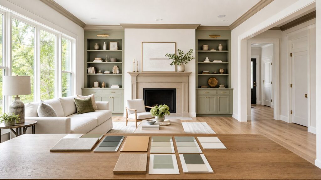
Quick wins for a faster PC:
Clear out junk files and repair common Windows errorsFree Scan →Scan for outdated or missing drivers - takes under a minuteDriver Scan →Repair Windows errors before they cause bigger problemsFix Now →The best interior paint colors right now are warmer, quieter, and more grounded than the cool gray palette that dominated homes for years. For 2026, the strongest colors are warm off-whites, khaki, taupe, sage, smoky blue-green, clay, terracotta, ochre, deep green, cordovan, and brown-black. Used well, they make a home feel finished without making it feel trendy for the sake of being trendy.
On our job sites, the paint color is only one part of the finished result. The same color can look clean and expensive in one house and dull in another because of light direction, trim color, flooring, wall texture, primer, sheen, and prep. A 2-inch paper chip is not enough information for a whole room.
As an Amazon Associate I earn from qualifying purchases.
If you want the short answer: use warm off-white, cream, khaki, greige, or soft beige for main living areas; use sage, smoky jade, clay, deep green, or warm brown-red in contained rooms; and save very dark colors for offices, dining rooms, powder rooms, built-ins, islands, and bedrooms with good lighting. Test every finalist on at least two walls for 24 to 48 hours before you buy gallons.
Before You Choose an Interior Paint Color
A good paint decision starts with the room, not the swatch. We look at seven things before recommending a color: natural light, trim color, flooring undertone, ceiling height, room size, existing cabinets or stone, and the condition of the walls. Paint does not hide bad drywall work. In many rooms, paint actually highlights it.
#1 Best Overall

- COLORS CRAFTED BY ANNIE SLOAN: A timeless off-white, that works with everything. Old White is a sophisticated and understated neutral that will give your walls a soft, chalky, traditional look and feel.
- COVERAGE: One-step high performance Annie Sloan Wall Paint provides great coverage. Each gallon covers up to 387 sq. ft. Coverage will vary depending on surface and application.
- HOW TO USE: Make sure the surface is clean and dry. Stir paint well before use. Apply by brush or roller. Ready for a second coat 1.5 hours after application, depending on conditions. Recommended application of two coats for best finish.
- AFTERCARE: Thoroughly wash brushes or rollers in warm soapy water.
- WASHABLE FINISH: Each deeply nuanced shade offers durable and wipeable coverage. It is easy to clean walls without damaging the paint surface.
Light direction matters. North-facing rooms tend to make colors look cooler, grayer, and flatter. South-facing rooms add warmth and intensity. East-facing rooms look brighter in the morning and can feel dull later in the day. West-facing rooms can make creams, yellows, and warm beiges much stronger in late afternoon light. That is why a cream that looks soft in the store can turn yellow in a west-facing kitchen.
Use LRV, or light reflectance value, as a practical screening tool. Higher LRV colors reflect more light and usually feel safer in small or dark rooms. Lower LRV colors absorb light and create mood, but they need contrast, lamps, windows, or lighter trim to avoid feeling heavy. Most whole-house wall colors work best in the middle-to-high LRV range. Deep greens, browns, reds, and blue-greens are better when you intentionally want drama.
We also check the fixed finishes. Oak floors, black windows, white quartz, travertine, brick fireplaces, walnut cabinets, brass hardware, and stainless appliances all push color differently. A beautiful paint color that fights your flooring or countertops will never look quite right.
The 20 Best Interior Paint Colors
This list is built around color families, not just isolated swatches. Some are specific named colors from major paint brands. Others are practical color directions because homeowners often need the idea first, then the exact match based on their lighting and finishes.
1. Sherwin-Williams Universal Khaki SW 6150
Universal Khaki is one of the most useful 2026 neutrals because it sits between beige, khaki, and soft taupe. It is warmer than gray without going yellow, which makes it a strong whole-house candidate in homes with oak, walnut, brick, black windows, or warm stone.
Best uses: living rooms, hallways, open-concept areas, bedrooms, and resale-oriented repaints. Pair it with warm white trim instead of stark blue-white trim. In a 12-by-12 bedroom, expect about 2 gallons for two coats on the walls, assuming average 8-foot ceilings and normal coverage.
2. Benjamin Moore Silhouette AF-655
Silhouette is a deep brown-black with warmth. It is not a casual whole-house wall color, but it is excellent where you want weight and definition. We would use it on an office, dining room, media room, interior doors, built-ins, or a fireplace wall.
Deep colors like this need better prep. Plan on a gray-tinted primer when changing from a light wall, then two full finish coats. Touch-ups on dark, low-LRV colors are harder to hide, especially in rooms with raking light.
3. Behr Hidden Gem
Hidden Gem points toward the smoky jade and blue-green trend that works well in modern interiors. It can make a powder room, laundry room, office, or guest bedroom feel designed without requiring expensive millwork or wallpaper.
Use it with warm white trim, brass hardware, natural wood, black fixtures, and creamy tile. In a bathroom, choose a moisture-tolerant satin finish rather than flat paint. Bathrooms often cost more per square foot to paint because of masking, fixtures, ventilation, and detailed brushwork around mirrors, tile, and trim.
4. PPG Warm Mahogany
Warm Mahogany is a rich brown-red that feels current because it has earthiness rather than a loud cherry-red cast. It works best in dining rooms, libraries, powder rooms, bedrooms, and accent millwork. This is also a strong color for built-ins or a kitchen island if the surrounding walls are quiet.
Outdated Drivers Are Slowing You Down
One free scan finds every outdated or missing driver and matches the right update for your exact hardware.Free scan · exact hardware matchWindows Errors? Fix Them Before They Spread
Repair common Windows errors and clear accumulated junk for a smoother, more stable PC - no reinstall needed.Free scan · no reinstallDo not cheap out on the paint line with this kind of color. Deep reds and browns often need a tinted primer and two careful coats for depth and uniformity. Budget more time for cutting in because wavy lines at the ceiling or trim will show.
5. PPG Secret Safari
Secret Safari fits the move toward yellow-green, olive, and botanical neutrals. It is bolder than beige but still connected to natural materials. In the right room, it can make white trim, stone, and wood look more intentional.
Best uses: mudrooms, offices, playrooms, laundry rooms, powder rooms, and bedrooms with natural light. It can also work on cabinetry when paired with simple counters and restrained hardware.
6. Benjamin Moore Swiss Coffee OC-45
Swiss Coffee remains one of the best warm off-whites because it is soft without feeling dingy. It is a good choice when the homeowner wants a light interior but does not want a cold gallery white.
Recommended Free Tools
Rank #2

- Ready to use, pre-mixed door and trim paint offers a fresh new look on interior or exterior metal, wood and fiberglass
- Water-based paint formula emits less odor and withstands fading for a long lasting finish
- Dries to the touch in 45 minutes, up to 3X faster than traditional oil-based paints
- Durable, chip resistant coating provides ultimate protection with modern curb appeal
- Beautiful satin door paint is available in 6 pre-mix color options for the perfect look
Best uses: whole-house walls, bedrooms, ceilings in warm schemes, and trim in rooms with earthier wall colors. Be careful pairing it with bright white cabinets or very cool quartz; sample it directly against those surfaces first.
7. Sherwin-Williams Creamy
Creamy is a warm white that can help older homes, traditional trim, and warm floors feel cohesive. It is especially useful where stark white would make wood floors or beige stone look dated.
In west-facing rooms, test carefully because afternoon sun can make creamy whites read more yellow. If that happens, move one step cooler or cleaner while staying in the warm white family.
8. Sherwin-Williams Neutral Ground
Neutral Ground is a restrained neutral that works in homes where the owner wants warmth but still needs the room to feel bright. It is a good bridge between white trim, warm floors, and mixed furnishings.
Free tools Windows power users keep installed
One-click scans. No signup required.
Best uses: living rooms, bedrooms, hallways, and open plans. This is the kind of color we consider when a homeowner wants to repaint before selling but does not want the house to look sterile.
9. Sherwin-Williams Still Water
Still Water gives you blue-green depth without going neon or beachy. It is a strong choice for bedrooms, bathrooms, office walls, vanities, and built-ins.
Use this type of color in eggshell on walls and satin or semi-gloss on trim or cabinetry depending on the surface and product system. For cabinets, wall paint is not enough. Cabinets need proper cleaning, sanding, bonding primer, and a harder enamel or cabinet coating.
10. Benjamin Moore Narragansett Green HC-157
Narragansett Green is a deep heritage green that works beautifully in homes with traditional millwork, brass, walnut, brick, or stone. It can read nearly black in low light, which is part of the appeal when used intentionally.
Do these 3 things before closing this tab:
1Repair Windows errors before they cause bigger problems2Fix the driver behind crashes, sound loss and screen glitches3Clear out junk files and repair common Windows errorsBest uses: dining rooms, offices, powder rooms, libraries, built-ins, and wainscoting. Pair with a warm white ceiling and trim to keep the room from collapsing visually.
11. Benjamin Moore Raindance 1572
Raindance represents the softer, desaturated blue direction. It is useful for bedrooms, bathrooms, nurseries, and quiet offices where you want color without high contrast.
Blue can turn cold in north-facing rooms, so compare it against your flooring and trim. If it looks icy after sunset under LED lighting, warm up the bulb temperature or choose a blue with more green or gray in it.
12. Benjamin Moore Southwest Pottery 048
Southwest Pottery is a clay and terracotta direction that works especially well with plaster-like finishes, natural wood, cream upholstery, travertine, brick, and matte black hardware. It has enough character for a powder room or dining room but can also work in a bedroom when softened with warm whites.
The Tool Desk
Outbyte Driver Updater FREEFix the driver behind crashes, sound loss and screen glitchesFind Drivers →Outbyte PC Repair FREEClear out junk files and repair common Windows errorsFree Scan →Clay colors look best when the walls are smooth and the edges are crisp. They can expose sloppy patching, so skim, sand, prime, and inspect under work lights before the finish coats.
13. Benjamin Moore Sherwood Tan 1054
Sherwood Tan is a practical warm tan that can rescue interiors that feel too gray or too stark. It pairs well with oak, leather, stone, and traditional furniture.
Best uses: family rooms, halls, bedrooms, and basements that need warmth. In basements, test with the actual lighting because artificial light controls most of the color read.
Rank #3

- Includes Three Shades to Match 90% of Surfaces: We offer two color shades of Matte Beige and one Matte White to instantly achieve the perfect color match. Eliminating the need for color charts, returns, and waiting for the right color to arrive. Instead, match to one of the two beige colors or mix colors and match to your desired shade.
- Repair and Restore in Minutes: Maintain and restore your home and home furnishings interior and exterior with our Matte finish, ultra-low VOC, water-based, and odor-free Matte Beige and White three-pack color matching kit.
- Instant Renovation: Whether it's from your children, movers, rental, pets, or anything else that comes your way. Spot.'s design and a quick-drying, self-priming formulation, your home furnishing or appliance will appear like new again.
- Easy and Simple: Everything you need is provided in an all-in-one paint and brush applicator. No other materials, tools or pre-process is required.
- Eco Friendly: Water-based paint with ultra-low emissions and odor means better indoor air quality. Non-toxic, eco-friendly, and safe for adults, children and pets.
14. HGTV Home by Sherwin-Williams Cordovan
Cordovan is a brown-red with a classic, tailored feel. It is stronger than a neutral but more livable than a bright red. We like this color family in dining rooms, studies, powder rooms, or on paneled walls.
Use it where the room has a clear boundary. In open-concept homes, keep the main field color quieter and use cordovan on contained surfaces so the plan still feels connected.
15. HGTV Home by Sherwin-Williams Reddened Earth
Reddened Earth is part of the broader shift toward warm mineral colors. It gives a room more body than beige while still feeling connected to clay, brick, and natural materials.
Best uses: bedrooms, sitting rooms, powder rooms, entry niches, and accent ceilings. A red-brown ceiling in a small powder room can be more effective than one accent wall because it feels deliberate.
16. Soft Sage or Olive Green
Soft sage and olive greens are among the safest ways to bring color into a home in 2026. They work with oak, white oak, walnut, black hardware, brass, cream tile, and many stone counters.
What’s actually slowing this PC down?
Pick the symptom - the matching free tool is one click away.
Best uses: kitchens, bedrooms, laundry rooms, mudrooms, bathrooms, and cabinets. In kitchens, compare the green directly against the cabinet finish and countertop. A sage that looks refined beside white oak may look muddy beside cool gray tile.
17. Smoky Jade
Smoky jade is deeper and more saturated than sage. It works best when you want a room to feel polished and slightly moody without going navy or charcoal.
Best uses: offices, vanities, built-ins, kitchen islands, guest rooms, and powder rooms. Use warm metal finishes and wood tones to keep it from feeling cold.
18. Desaturated Sky Blue
A desaturated sky blue is a good alternative to gray in bedrooms and bathrooms. The key is choosing a blue that has enough gray or green to stay calm under artificial light.
Best uses: bedrooms, bathrooms, laundry rooms, ceilings, and smaller rooms that need a fresher feel. Avoid very bright blue in rooms with limited daylight unless that is the exact look you want.
19. Ochre or Lemon-Vanilla
Ochre and lemon-vanilla colors bring warmth without looking like the heavy golds of older interiors. Used carefully, they make kitchens, breakfast rooms, entries, and north-facing rooms feel more welcoming.
These colors are sensitive to sunlight. In west-facing rooms, they can become much stronger late in the day. Paint a large sample before committing, especially if the room has warm bulbs or golden wood floors.
20. Warm Clay or Terracotta
Warm clay and terracotta are useful when a home needs color that still feels architectural. They pair well with creamy whites, walnut, oak, iron, brick, plaster, handmade tile, and natural fiber rugs.
Best uses: dining rooms, powder rooms, bedrooms, niches, mudrooms, and fireplace walls. For a softer approach, use clay on one contained room and keep adjoining spaces in warm white, khaki, or soft beige.
Best Paint Colors by Room
Living rooms and open-concept spaces usually need the most restrained colors because they connect to flooring, furniture, kitchens, stairs, hallways, and natural light from multiple directions. Warm off-white, cream, khaki, greige, soft beige, and light tan are the safest choices. Universal Khaki, Swiss Coffee, Creamy, Neutral Ground, and Sherwood Tan all fit this role depending on the home.
Rank #4
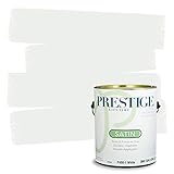
- Ultra premium paint and primer in one
- Ideal for living rooms, family rooms, media rooms, bedrooms, dining rooms and hallways
- Smooth application
- Acrylic latex for easy soap and water clean-up, durable and washable
- Low VOC: less than 5 g/l prior to tinting
Kitchens need coordination more than trend. Look at the cabinets, counters, backsplash, floors, appliances, and hardware before choosing a wall color. If you have white quartz and cool tile, a very yellow cream may clash. If you have white oak, walnut, brick, or travertine, warm neutrals and sage greens usually work better than cool gray.
Bathrooms need paint that handles moisture and cleaning. A satin finish is often a better wall choice than flat or matte. Powder rooms are different because they are smaller, more contained, and used briefly. That makes them ideal for Hidden Gem, Warm Mahogany, Narragansett Green, Cordovan, Reddened Earth, smoky jade, or clay.
Do these 3 things before closing this tab:
1Scan for outdated or missing drivers - takes under a minute2Repair Windows errors before they cause bigger problems3Fix the driver behind crashes, sound loss and screen glitchesBedrooms can handle softer color than public spaces. Raindance, Still Water, sage, olive, clay, warm tan, and deep green can all work. For smaller bedrooms, keep ceilings and trim lighter so the room still has relief. In a 10-by-12 bedroom, many homeowners are in the rough $240 to $720 professional painting range depending on repairs, ceiling height, number of colors, and trim scope.
Home offices are good candidates for deeper focusing colors. Silhouette, Narragansett Green, Still Water, smoky jade, and Warm Mahogany can all work in offices because the room has a clear purpose and usually has doors or cased openings that separate it from the rest of the house.
Paint Sheen: What to Use Where
Color gets most of the attention, but sheen changes how the color looks and performs. Higher sheen reflects more light, shows more wall defects, and usually cleans better. Lower sheen hides defects better but is less washable unless you are using a premium scrubbable matte product.
| Surface or Room | Typical Sheen | Why We Use It |
|---|---|---|
| Ceilings | Flat | Hides framing waves, drywall joints, and roller marks |
| Adult bedrooms and low-traffic living areas | Matte or eggshell | Soft look with reasonable touch-up performance |
| Hallways, kitchens, baths, laundry rooms, kids’ rooms | Eggshell or satin | Better cleaning and moisture resistance |
| Trim, casing, baseboards, doors | Satin or semi-gloss | More durable against scuffs, hands, and cleaning |
| Cabinets and built-ins | Satin, semi-gloss, or cabinet enamel system | Harder finish, better blocking resistance, better durability |
Do not automatically use the same sheen everywhere. A flat wall paint in a bathroom may mark up quickly. A semi-gloss wall in a living room may show every drywall patch. For deep colors, sheen also affects perceived depth. A satin dark green can look richer but will show more roller lap marks if the painter does not keep a wet edge.
Recommended Free Tools
Interior Painting Costs in 2026
For professional interior painting in the United States, many projects fall around $2 to $6 per square foot, depending on the room, prep, ceiling height, number of colors, paint grade, and local labor rates. Room-level pricing commonly ranges from about $400 to $1,600. Broader homeowner project averages often land around $605 to $2,464, with many typical interior painter projects near $1,200.
DIY material costs vary widely. Interior paint commonly runs about $20 to $100 per gallon depending on brand, product line, finish, tint base, and performance claims. Most interior paints cover roughly 350 to 400 square feet per gallon per coat under normal conditions, but real coverage drops on porous drywall, heavy texture, patched walls, dramatic color changes, cheap paint, and deep-base colors.
| Room Size | Typical Professional Range | Notes |
|---|---|---|
| 10 by 10 feet | $200 to $600 | Simple bedroom or office, limited repairs |
| 10 by 12 feet | $240 to $720 | Common bedroom size |
| 12 by 12 feet | $290 to $870 | More wall area, often 2 gallons for two coats |
| 14 by 16 feet | $450 to $1,350 | Living room or primary bedroom scale |
| 16 by 16 feet | $515 to $1,540 | Large room, more cutting and rolling time |
The cheapest quote is often cheap because it excludes prep. Drywall repair, nail pops, caulking, stain blocking, wallpaper removal, texture matching, furniture moving, floor protection, high ceilings, stairwells, trim, doors, and multiple colors all change the real cost. Kitchens, bathrooms, stairwells, built-ins, and high-ceiling rooms usually cost more per square foot than a simple bedroom.
Deep colors can also cost more in practice. A warm mahogany, cordovan, deep green, or brown-black may require tinted primer, premium paint, two finish coats, careful cutting, and more time between coats. That extra work is worth it if you want the color to look solid instead of streaky.
Quick wins for a faster PC:
Scan for outdated or missing drivers - takes under a minuteDriver Scan →Clear out junk files and repair common Windows errorsFree Scan →Our Job-Site Testing Process
We do not choose whole-house colors from a fan deck alone. For homeowners, the best testing process is simple and inexpensive compared with repainting a room twice.
Buy peel-and-stick samples or sample quarts of the top 3 to 5 colors. Put each color on at least two different walls because one wall may get direct light while another stays shaded. If you use sample paint, make a large patch at least 18 by 24 inches. Better yet, paint a movable board so you can hold it against trim, flooring, cabinets, counters, and tile.
View the samples in morning light, afternoon light, and at night with your actual lamps on. Keep them up for 24 to 48 hours. Compare them against the trim and flooring, not just against each other. A color can win against the other samples and still lose against the house.
Decide sheen after color. The same color in matte and satin can look different because satin reflects more light. If the room gets strong side light across textured walls, a lower sheen may produce a cleaner result.
When to DIY and When to Hire a Pro
DIY interior painting makes sense for a simple bedroom, office, or low-risk accent wall when the walls are in good shape, ceilings are 8 to 9 feet high, there is minimal trim, and you have time for careful prep. A homeowner can usually paint a 10-by-12 room over a weekend if the scope is walls only: one day for protection, patching, sanding, cleaning, and cutting in; another day for two coats and cleanup.
Best Value

- Use for a variety of indoor and outdoor project surfaces including wood, metal, plaster, masonry or unglazed ceramic
- Water-based acrylic formula is low odor, resist chips and provides long-lasting protection
- Covers up to 120 sq ft and dries to touch in 30 minutes for quick project completion
- Semi-gloss finish minimizes surface imperfections, goes on smoothly and provides excellent hide
- Prior to application sand surfaces with 180/200 grit sandpaper, then wash with a degreaser, allow the surface to dry and apply paint
Hire a pro when the room has high ceilings, stairwells, heavy drywall repair, water stains, smoke staining, wallpaper removal, old texture, cabinets, built-ins, many doors, dark-to-light color changes, or saturated colors that need a flawless finish. Also hire a pro when the home is occupied and the job requires dust control, floor protection, furniture moving, and daily cleanup.
Cabinet painting is its own category. A good cabinet finish usually requires degreasing, sanding, masking, bonding primer, and a cabinet-grade coating. Brushing wall paint over cabinets may look acceptable for a few weeks, then fail around handles, edges, and high-touch areas.
Safety, Lead Paint, and VOC Notes
If your home was built before 1978, assume lead-based paint may be present until testing proves otherwise. Federal lead-safe renovation rules apply to contractors disturbing painted surfaces in pre-1978 homes and child-occupied facilities. Sanding, scraping, or demolition can create hazardous lead dust. This is not a cosmetic issue; it affects containment, cleanup, worker practices, and family safety.
For older homes, ask whether the painter is following lead-safe practices before any sanding or surface disturbance starts. Do not dry-sand unknown old paint with a power sander in a lived-in home. Proper containment, HEPA cleanup, and approved methods matter.
VOC rules also matter, especially in occupied homes, nurseries, bedrooms, and poorly ventilated spaces. Architectural coatings are regulated for volatile organic compounds, and some states and air districts have stricter limits. Many modern interior paints are low-VOC, but tint, product line, specialty coating, and local regulations can affect what is available. Ventilate during and after painting, follow the label, and allow proper cure time before heavy cleaning.
Best Color Strategy for Resale
For resale, stay with warm off-white, cream, khaki, greige, taupe, or light warm beige for the main field color. These colors photograph well, work with common flooring and cabinetry, and let buyers imagine their own furniture in the room. Swiss Coffee, Creamy, Neutral Ground, Universal Khaki, and Sherwood Tan all belong in this conversation.
Use trend colors in places that feel intentional but reversible: powder rooms, offices, dining rooms, laundry rooms, mudrooms, bedroom walls, islands, built-ins, vanities, and interior doors. A deep green office or clay powder room can make the home memorable without forcing every buyer to accept a bold living room.
If the trim is tired, repainting only the walls may not be enough. Fresh walls beside yellowed, chipped, or glossy old trim can make the trim look worse. In many homes, the better project is walls plus trim and doors, even if that raises the quote.
Final Recommendation
The best interior paint color is the one that works with the house you already have. For most homes, start with a restrained warm neutral for the connected spaces, then use richer 2026 colors in rooms with boundaries. Universal Khaki, Swiss Coffee, Creamy, Neutral Ground, and Sherwood Tan are strong main-area choices. Hidden Gem, Still Water, Narragansett Green, Warm Mahogany, Cordovan, Reddened Earth, clay, terracotta, smoky jade, and ochre are better as purposeful room colors or architectural accents.
Before buying gallons, test large samples for 24 to 48 hours, check the color against trim and fixed finishes, choose the right sheen for the surface, and budget honestly for prep. A professional-looking paint job is not just color. It is surface repair, primer, clean edges, even coverage, proper sheen, and enough patience to let the room tell you what the swatch cannot.
Frequently Asked Questions
What interior paint colors are most popular for 2026?
Warm neutrals, khaki, taupe, creamy whites, sage, smoky jade, soft blue, clay, terracotta, ochre, deep green, mahogany, and brown-black are the strongest 2026 directions.
Outdated Drivers Are Slowing You Down
One free scan finds every outdated or missing driver and matches the right update for your exact hardware.Free scan · exact hardware matchPC Slower Than It Used to Be?
A free scan shows the junk files, broken settings and background clutter dragging Windows down - then fixes them in one click.Free scan · Windows 10 & 11What is the safest interior paint color for resale?
Warm off-white, soft cream, khaki, greige, taupe, and light warm beige are usually safest because they pair well with common floors, cabinets, stone, and trim.
How much does it cost to paint a room in 2026?
Many professional interior painting jobs run about $2 to $6 per square foot. A typical room can range from about $400 to $1,600 depending on size, prep, trim, ceilings, and paint quality.
What sheen should I use for interior walls?
Eggshell is a common wall default. Matte or flat hides flaws in low-traffic rooms, while satin is better for kitchens, baths, laundry rooms, kids’ rooms, and high-traffic areas.
Should I test paint samples before painting a whole room?
Yes. Test large samples on at least two walls and view them for 24 to 48 hours in morning, afternoon, and nighttime lighting before choosing.
The Tool Desk
Outbyte PC Repair FREEClear out junk files and repair common Windows errorsFree Scan →Outbyte Driver Updater FREEScan for outdated or missing drivers - takes under a minuteDriver Scan →Do pre-1978 homes need special painting precautions?
Yes. Homes built before 1978 may contain lead-based paint. Any sanding, scraping, or surface disturbance should follow lead-safe practices, especially when hiring a contractor.
Quick Recap
Product prices and availability are accurate as of the date/time indicated and are subject to change. Any price and availability information displayed on Amazon at the time of purchase will apply.

