Recommended Free Tools
The most important paint direction for 2026 is not one universally correct color—it is a move toward warmth, depth, natural references, and rooms with more personality. Designer forecasts and major paint-brand selections repeatedly point to earthy greens, chocolate and khaki neutrals, saturated blues, ochre, terracotta, burgundy, and other dramatic shades. That gives homeowners more useful choices than a single “Color of the Year.”
Below are seven trend families, with representative paint colors, the rooms where they work best, pairing ideas, and a practical way to test them before committing.
| # | Preview | Product | Price | |
|---|---|---|---|---|
| 1 |

|
Sherwin Williams Colors collection Deck Complete Paint Colors | $35.00 | Buy on Amazon |
| 2 |
|
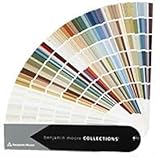
Benjamin Moore Collections Fan Deck | $33.99 | Buy on Amazon |
| 3 |
!['BENJAMIN MOORE' CLASSIC COLORS FAN DECK [CASE OF 1]](https://m.media-amazon.com/images/I/41Xq67AO80L._SL160_.jpg)
|
"BENJAMIN MOORE" CLASSIC COLORS FAN DECK [CASE OF 1] | $48.57 | Buy on Amazon |
| 4 |

|
280 Color Paint Sample Cards for Renovation Planning and Walls | $24.29 | Buy on Amazon |
As an Amazon Associate I earn from qualifying purchases.
What is the paint color trend for 2026?
The broad 2026 palette is warmer and moodier than the cool gray-and-white schemes that dominated many recent interiors. A 1stDibs designer survey identified chocolate brown as the leading anticipated color for 2026, while burgundy, dark green, and sage also gained interest. The same survey recorded renewed attention to butter yellow, cornflower blue, powder pink, and pistachio.
Windows Errors? Fix Them Before They Spread
Repair common Windows errors and clear accumulated junk for a smoother, more stable PC - no reinstall needed.Free scan · no reinstallCrashes, No Sound, or Screen Glitches?
Random freezes, missing sound and display glitches usually trace back to one bad driver. Find and replace yours safely.Free scan · under a minutePaint companies are forecasting a similar shift from several different angles. Sherwin-Williams selected Universal Khaki SW 6150, Benjamin Moore selected Silhouette AF-655, PPG selected Warm Mahogany PPG1060-7, and Valspar selected Warm Eucalyptus 8004-28F. Those choices are not proof that every home should be painted brown, red, or green, but their convergence is significant: warm neutrals, grounded earth tones, and richer colors are replacing stark, impersonal backgrounds.
#1 Best Overall
The seven colors below should therefore be read as trend families, not seven mandatory paint cans. A deep purple room, a khaki hallway, and an olive kitchen can all feel current without looking alike.
1. Deep purple
Deep, eggplant-inspired purple is one of the most effective 2026 choices for creating a room with mood and visual richness without resorting to a bright jewel tone. Designer Mugdha Girish Uma specifically highlighted warm, deep brinjal purple for walls and cabinetry, particularly where a moody, enveloping effect is wanted.
Use it in a dining room, library, study, bedroom, powder room, or built-in cabinetry. A small room can often handle a full treatment because the color’s intensity becomes part of the atmosphere. In a larger room, purple cabinetry, a fireplace wall, or millwork can deliver the same character with less visual weight.
Quick wins for a faster PC:
Scan for outdated or missing drivers - takes under a minuteDriver Scan →Clear out junk files and repair common Windows errorsFree Scan →Fix the driver behind crashes, sound loss and screen glitchesFind Drivers →A current representative example is PPG Purple Basil PPG1046-7, included in PPG’s 2026 Ode palette. That palette is described as jewel-toned and romantic, making Purple Basil a useful reference for the broader eggplant family—not an exact cross-brand match for every dark purple.
- Pair it with: warm white, aged brass, natural wood, linen, cream upholstery, and pale stone.
- Best use: a color-drenched study, a dramatic dining room, or lower-risk cabinetry and millwork.
- Watch for: red undertones can become more pronounced beside warm bulbs or reddish wood. Test it beside the room’s actual flooring and furniture.
2. Inky blue
Deep indigo, navy, and dark muted teal are taking the place of some of the softer blue-gray interiors associated with earlier years. Jessica Shaw of Turett Collaborative described dramatic blues being used on walls, cabinetry, and furniture, rather than being reserved for small decorative accents.
Inky blue is particularly useful when you want a room to feel cocooning, settled, and substantial. It can anchor a living room, bedroom, office, library, bathroom, kitchen island, or built-in shelving. Current bedroom guidance also favors saturated but calming colors, including deep navy and dusty plum; Newburyport Blue HC-155 is one representative bedroom recommendation in contemporary 2026 coverage.
- Pair it with: warm white trim or bedding, walnut or oak, brass, woven textures, and muted terracotta.
- Best use: a bedroom with matte walls, a library with painted shelving, or a kitchen island that needs architectural weight.
- Watch for: north-facing and low-light rooms can make dark blue appear more intense and sometimes cooler. Sample it on more than one wall before buying paint.
Do not assume every navy will look black at night or blue in daylight. Undertones, lighting, sheen, and surrounding finishes can change the result substantially.
What’s actually slowing this PC down?
Pick the symptom - the matching free tool is one click away.
3. Khaki and warm taupe
Khaki is the most adaptable whole-home direction in this list. It offers more character than a generic off-white or pale beige while remaining quiet enough for walls, trim, doors, cabinetry, molding, and connected open-plan spaces.
Rank #2
- Brand: Benjamin moore
- Container type: Box
- Finish type: Opa
Sherwin-Williams Universal Khaki SW 6150 is the clearest 2026 reference point. Sherwin-Williams describes it as an essential mid-tone neutral with a slight yellow undertone. Its warm, earthy quality is intended to work with natural finishes, crisp whites, and stronger accents. It can suit living rooms, bedrooms, kitchens, dining areas, and whole-home applications.
At the darker end of the same family is Benjamin Moore Silhouette AF-655. Benjamin Moore describes Silhouette as a blend of rich espresso, burnt umber, and charcoal. It is not simply a darker version of Universal Khaki: it creates considerably more drama. Benjamin Moore’s 2026 palette also includes Sherwood Tan 1054 and Southwest Pottery 048 for lighter or warmer companion directions.
Universal Khaki or Silhouette?
| Choose Universal Khaki when… | Choose Silhouette when… |
|---|---|
| You want a flexible neutral for several connected rooms. | You want a dark, enveloping statement. |
| The room has natural wood, cream textiles, or crisp white details. | The room can support espresso, charcoal, or burnt-umber depth. |
| You need a foundation that will not compete with artwork or bold accents. | You want a library, dining room, office, or built-in to feel highly intentional. |
- Pair khaki with: creamy white, oak, walnut, woven textures, black accents, and aged brass.
- Best rooms: living areas, hallways, entries, bedrooms, dining rooms, kitchens, mudrooms, and rental interiors.
- Watch for: yellow undertones can look warmer beside incandescent light and cooler whites. Compare the sample with the trim you actually have.
4. Yellow ochre
Yellow is not disappearing in 2026; it is becoming deeper and earthier. Yellow ochre is a more grounded alternative to the lighter butter-yellow trend associated with 2025. It brings cheerfulness without the sharpness of a bright primary yellow.
Do these 3 things before closing this tab:
1Fix the driver behind crashes, sound loss and screen glitches2Repair Windows errors before they cause bigger problems3Scan for outdated or missing drivers - takes under a minuteThe color is especially effective in libraries, guest bedrooms, kitchens, breakfast nooks, playrooms, entries, and mudrooms. Designer commentary places ochre with dark wood in libraries and guest rooms, while C2 Epernay is a current 2026 reference described as a soft, sun-washed ochre.
- Pair it with: chalky white, dark wood, navy, wicker, cane, olive green, and pewter.
- Best use: a breakfast nook, a bright entry, a guest room, or a single wall behind open shelving.
- Watch for: direct sunlight can make ochre appear much more saturated. Test it during the brightest part of the day as well as in the evening.
For a lower-commitment application, use ochre on a door, ceiling, niche, or cabinetry rather than assuming the color must cover every wall.
5. Terracotta
Terracotta remains a durable earth-tone direction because it is warm, recognizable, and easy to connect with wood, stone, and natural textiles. In 2026 coverage, it is described as upbeat, nature-inspired, nostalgic, and flexible with both light and dark furniture.
It is also moving beyond the expected Mediterranean accent wall. Richer earth tones such as terracotta and sandstone are appearing in bathrooms and powder rooms, where they offer an alternative to bright white. A terracotta bathroom can feel spa-like without becoming sterile, particularly when paired with limestone, handmade tile, or warm wood.
Within the broader red-earth family, PPG’s 2026 selections include Red Clay PPG16-32 and Warm Mahogany PPG1060-7. PPG describes Warm Mahogany as a rich, grounded red capable of making a bold but timeless statement. These are useful examples of the range from clay to deeper red-brown, not interchangeable colors.
Rank #3
- Very good condition
- Benjamin Moore Classic Colors Fan Deck
- Classic Colors
- Includes the American Classic Colors (AC)
- Pair it with: cream, natural stone, dark wood, olive green, soft blue, and aged metal.
- Best rooms: bathrooms, dining rooms, kitchens, breakfast areas, entries, and sunrooms.
- Lower-risk applications: a powder room, backsplash wall, niche, fireplace wall, or island cabinetry.
- Watch for: large areas of terracotta can become visually dominant. A subdued, dusty version is usually easier to live with than a highly saturated orange-red.
6. Earthy greens
Green continues its move into neutral territory, but 2026 is broadening the conversation beyond pale sage. Designers are watching deep olive, forest green, smoky jade, and muted blue-green—colors that bring natural references while still supplying enough depth to define a room.
Dunn-Edwards’ 2026 Color of the Year, Midnight Garden DE5657, is a calm, sophisticated, dramatic example. Other brand forecasts reinforce the family: Behr’s Hidden Gem is described as a smoky jade, while Valspar’s Warm Eucalyptus 8004-28F is a softer earthy sage suited to bedrooms, living rooms, entries, and laundry rooms.
Sherwin-Williams Oyster Bay is another relevant blue-green reference, with current designer commentary recommending it for living rooms, bedrooms, and kitchen or bathroom millwork. Its usefulness illustrates why “green” is too broad a label: olive, sage, smoky jade, forest, and blue-green produce very different rooms.
- Pair earthy green with: warm wood, terracotta, linen, cream, natural stone, and matte black.
- Best rooms: kitchens, cabinetry, bedrooms, living rooms, home offices, laundry rooms, entries, and bathrooms.
- Use it as a neutral when: you want a natural, restorative atmosphere but find beige too predictable.
- Watch for: blue-green shades can look cooler beside bright white, while olive shades can look yellower beside warm bulbs. Compare the sample with both daylight and artificial light.
7. Dramatic jewel tones
Jewel tones are the broadest category here: emerald, sapphire, deep teal, burgundy, ruby, and related high-chroma colors used to give a room more depth and identity. They are not necessarily intended to cover every wall. Their value is the ability to make one architectural element or small room memorable.
The 1stDibs designer survey found burgundy’s share of responses rising from 7% for 2025 to 21% for 2026, alongside growing interest in dark green and sage. PPG’s 2026 Collective palette includes Deep Emerald PPG1148-7, Mallard Green PPG1132-6, Ruby Lips PPG1052-7, and Briar Rose PPG1050-5. HGTV Home by Sherwin-Williams’ 2026 Honest Essentials collection pairs Universal Khaki with Cordovan, a burgundy red.
Use jewel tones in dining rooms, powder rooms, libraries, home bars, offices, bedrooms, cabinetry, doors, ceilings, or accent walls. A small room can accommodate a full-color treatment when the goal is a boutique-hotel or cocooning effect. In a large or open-plan area, one wall, island, built-in, or ceiling usually gives better control.
- Pair them with: warm neutrals, natural wood, aged brass, stone, and restrained textiles.
- Try color drenching when: you deliberately want an immersive, architectural look and the room has enough visual interest to support it.
- Use selectively when: you want drama without making the color the room’s permanent focal point.
- Watch for: high-chroma colors can dominate artwork, furniture, and adjoining rooms. Plan the transition at doors, corners, and sightlines.
Which 2026 color works best in each room?
| Room | Strong 2026 directions | Why they work |
|---|---|---|
| Living room | Universal Khaki, warm taupe, soft off-white, smoky green, inky blue | They create warmth and continuity without the starkness of gallery white. |
| Kitchen | Warm eucalyptus, sage, olive, smoky jade, khaki, ochre | These shades work especially well on cabinetry and connect naturally with wood and stone. |
| Bedroom | Deep blue, dusty plum, earthy green, warm taupe, muted khaki | Saturated but controlled colors create a more layered, boutique-hotel atmosphere. |
| Bathroom or powder room | Terracotta, sandstone, slate blue, charcoal, deep green, plum | Richer colors give small spaces character and can replace an overly bright-white treatment. |
| Dining room | Ochre, terracotta, burgundy, Warm Mahogany, deep purple, Silhouette | Dining rooms can support stronger saturation because drama is often part of the intended mood. |
| Office or library | Inky blue, deep purple, Silhouette, forest green, ochre | Dark colors help define a focused, enveloping space and suit built-ins and woodwork. |
| Hallway or entry | Universal Khaki, warm taupe, ochre, soft creamy neutral | These shades connect adjoining rooms without competing with more dramatic spaces. |
How to choose among the 2026 paint colors
- Start with permanent finishes. Identify the undertones in flooring, countertops, tile, cabinetry, stone, and existing trim. A color that looks balanced on a screen may clash with a pinkish tile or strongly yellow wood.
- Choose the room’s intended feeling. Select inky blue, purple, or jewel tones for depth and drama; khaki and taupe for flexibility; ochre and terracotta for warmth and energy; earthy green for a natural, grounded atmosphere.
- Decide whether the color is a foundation or an accent. Universal Khaki, warm taupe, and softer eucalyptus can connect several rooms. Burgundy, deep purple, and saturated emerald may be more effective on cabinetry, a small room, a door, or one architectural feature.
- Check the sightlines. In an open plan, a dramatic color visible from the living room may need to relate to the kitchen and hallway. Use shared undertones rather than forcing every room to be the same color.
- Choose the finish after considering use. Matte or eggshell generally supports the soft, layered look associated with these palettes. Satin or semi-gloss may be more practical for cabinetry, trim, and areas that need frequent wiping. The paint manufacturer’s label and the room’s conditions should determine the final sheen.
Sample before you buy: a reliable paint-testing process
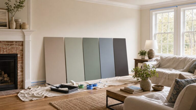
Color names, online photographs, and small chips are not enough for a dependable purchase decision. Sherwin-Williams offers color chips, peel-and-stick samples, and wet Color To Go samples. Benjamin Moore recommends viewing samples at home, comparing them side by side, and using a movable white board or foam-core board so the color can be observed in changing light. Major home-improvement retailers likewise recommend testing in natural and artificial light at different times of day.
If you are comparing several families, a paint color fan deck can make it easier to place warm neutrals, purples, blues, greens, ochres, terracottas, and jewel tones side by side. Treat it as a comparison tool, not a substitute for a manufacturer-specific sample: verify the brand, color range, and accuracy before relying on it.
Paint sample checklist
- Obtain a manufacturer-specific wet sample, peel-and-stick sample, or small pot for each serious contender.
- Apply a large sample to more than one wall, including a wall that receives different light.
- Use a movable white or foam-core sample board if you need to compare the color against flooring, counters, furniture, or trim without painting the wall.
- View the sample in the morning, afternoon, and evening, with both daylight and the room’s usual artificial lighting.
- Leave the sample in place long enough to see it beside permanent finishes and furnishings.
- Judge the final color at the sheen you intend to use; a sample’s appearance can change when the finish changes.
Removable paint sample sheets can be useful when you want to test multiple walls without wet paint or drying time. They are convenient, but verify the manufacturer, size, and color fidelity before treating one as an exact substitute for a real paint sample.
For the complete project, plan for the practical supplies as well: sample pots, painter’s tape, sample boards, brushes, rollers, and drop cloths. These tools help you evaluate the color accurately and protect the surrounding construction and finishes.
Are these colors guaranteed to stay fashionable?
No. “Trendy” is a forecast, not a guarantee of resale value, longevity, or universal appeal. Brand Color of the Year selections are design-forecast and marketing tools, while designer surveys and editorial interviews are directional evidence rather than a complete statistical census of the profession.
Free tools Windows power users keep installed
One-click scans. No signup required.
Rank #4
- Broad appeal: from professional designers to homeowners, the wall shade comparison card serves as a full spectrum palette and matching tool for diverse home decor palette sheet projects,wall coating reference sheet,residential paint Color chart
- Diverse color options: the 280 wall decoration color card is ideal for matching house coating palette, ensuring the wall tone comparison chart meets every architectural and residential requirement,exterior paint color chart,true color sample sheet
- Compact for portability: the bendable shade color card offers easy transportation and storage, making it the perfect DIY color matching card for decorators and professionals,vivid color display card,wall decoration color card
- Accurate color reproduction: crafted from paper and plastic materials, the indoor wall coating card vividly portrays each tone, providing a true color sample sheet for reliable building renovation chart use,wall coating shade chart,building wall tone Color chart
- Portable convenient: designed as a portable paint palette, this lightweight paint color chart is ideal for decorators and contractors who need paint comparison or DIY color matching card solutions,house paint selection card,house building color card
The more defensible conclusion is the overlap among several independent signals: warm neutrals, brown, burgundy, earthy green, saturated blue, ochre, terracotta, and more individual rooms are all prominent in 2026 coverage. Choose the version that works with your home’s light, architecture, and permanent finishes—not simply the shade with the most attention.
Also treat named colors as representative examples. Universal Khaki, Silhouette, Warm Mahogany, Warm Eucalyptus, Hidden Gem, Midnight Garden, Purple Basil, and the other colors above are not exact cross-brand matches. Always test the actual product and finish you intend to purchase.
Frequently Asked Questions
What is the most versatile 2026 paint color?
Universal Khaki is the most flexible choice in this group. Its warm mid-tone neutrality can work in living rooms, hallways, bedrooms, kitchens, dining rooms, and whole-home schemes. Test it against your trim and flooring because its slight yellow undertone will change with the light.
Are dark paint colors suitable for small rooms?
Yes, when the goal is an intimate or dramatic room. Deep purple, inky blue, green, and jewel tones can work especially well in powder rooms, libraries, bedrooms, and dining rooms. Sample first, and consider the room’s lighting and adjoining spaces.
The Tool Desk
Outbyte PC Repair FREEClear out junk files and repair common Windows errorsFree Scan →Outbyte Driver Updater FREEScan for outdated or missing drivers - takes under a minuteDriver Scan →Should I use matte or satin paint for these colors?
Matte or eggshell generally supports the soft, layered appearance associated with the 2026 palette. Satin or semi-gloss may be more practical for cabinetry, trim, and frequently cleaned areas. Follow the paint manufacturer’s guidance and the room’s maintenance needs.
How large should a paint sample be?
Use a large enough sample to judge the color away from the edge of the wall, and test it on more than one wall when possible. A movable white or foam-core board is useful because you can compare the sample with flooring, countertops, cabinetry, and trim in different lighting.
The Bottom Line
The best 2026 paint color is the one that matches your room’s light, materials, and intended mood. Start with warm khaki or taupe for an adaptable foundation, earthy green for a natural neutral, inky blue or deep purple for cocooning depth, and ochre, terracotta, or jewel tones when you want more energy and personality. Sample the actual paint at home before committing—especially with dark or highly saturated colors.
Quick Recap
Product prices and availability are accurate as of the date/time indicated and are subject to change. Any price and availability information displayed on Amazon at the time of purchase will apply.