The Tool Desk
Outbyte Driver Updater FREEScan for outdated or missing drivers - takes under a minuteDriver Scan →Outbyte PC Repair FREEClear out junk files and repair common Windows errorsFree Scan →Earth tones cover far more than beige and brown. These 22 choices include sandy neutrals, khaki, taupe, greige, clay, terracotta, muted green, and deep brown—organized by color family so you can find a shade that fits your room and existing finishes.
Earth tones are not limited to beige or brown. The category includes sandy neutrals, taupes, greiges, clay and terracotta shades, muted greens, and deep browns—colors associated with materials and landscapes such as sand, stone, soil, wood, leaves, and fired clay.
As an Amazon Associate I earn from qualifying purchases.
That range makes earth tones useful for nearly any room, but it also makes choosing one more complicated. A beige with a yellow undertone can look very different from a pink-leaning taupe; a muted green may read gray beside cool tile and olive beside warm wood. The 22 colors below are an editorial shortlist drawn from official Sherwin-Williams and Benjamin Moore color collections. They are not a universal industry-standard list, and colors from different brands should not be assumed to match.
What’s actually slowing this PC down?
Pick the symptom - the matching free tool is one click away.
22 earth tone paint colors at a glance
| Color | Brand and code | Good starting point |
|---|---|---|
| Natural Linen | Sherwin-Williams SW 9109 | Light walls, bedrooms, living areas, and exteriors |
| Practical Beige | Sherwin-Williams SW 6100 | Soft, traditional whole-room neutral |
| Universal Khaki | Sherwin-Williams SW 6150 | Warmer foundational neutral and deeper beige |
| Basket Beige | Sherwin-Williams SW 6143 | Walls with wood, wicker, and woven textures |
| Wool Skein | Sherwin-Williams SW 6148 | Traditional and Craftsman-inspired palettes |
| Serengeti Sand | Benjamin Moore 2164-40 | Dusty, sand-inspired walls or accents |
| Shiitake | Sherwin-Williams SW 9173 | Mushroom-taupe walls and quiet neutral schemes |
| Double Latte | Sherwin-Williams SW 9108 | Cozy rooms and deeper monochromatic palettes |
| Colonnade Gray | Sherwin-Williams SW 7641 | A bridge between gray, beige, stone, and wood |
| Wenge | Benjamin Moore AF-180 | Cabinetry, built-ins, doors, and dramatic accents |
| Fresh Clay | Benjamin Moore 2093-20 | Dining rooms, offices, entryways, and accents |
| Toasted Chestnut | Benjamin Moore 2174-10 | Deep brown focal walls and visual weight |
| Cavern Clay | Sherwin-Williams SW 7701 | Accent walls, dining areas, rustic, or Southwestern schemes |
| Grounded | Sherwin-Williams SW 6089 | Refined earthen brown in a concentrated color scheme |
| Roycroft Adobe | Sherwin-Williams SW 0040 | Warm adobe-inspired reddish brown |
| Fired Brick | Sherwin-Williams SW 6335 | Brick-red accent with beige, cream, brown, or green |
| Acacia Haze | Sherwin-Williams SW 9132 | Soft green-gray botanical accent |
| Green Earth | Sherwin-Williams SW 7748 | Muted green for traditional interior or exterior combinations |
| Dried Thyme | Sherwin-Williams SW 6186 | Cabinetry, studies, bedrooms, and accent walls |
| Tree Branch | Sherwin-Williams SW 7525 | Brown-neutral with creamy white and rustic red |
| Maryville Brown | Benjamin Moore HC-75 | Den, library, study, or focal wall |
| Rural Earth | Benjamin Moore 1239 | Deep, dramatic, enveloping accent |
Best sandy beige and khaki earth tones
Light beige and khaki shades are usually the easiest earth tones to use across several rooms. They can provide a warm base without the visual intensity of terracotta or dark brown. Their main risk is undertone: some beiges turn yellow, pink, or green depending on the room’s flooring, trim, light, and furnishings.
#1 Best Overall

- 20 Pure Earth & Mineral Pigments – Create your own artist-quality watercolor, oil paint, gouache, egg tempera, drawing ink, and more with 20 natural earth and mineral pigment powders. Archival, non-toxic, sustainably sourced, and free from fillers, heavy metals, additives, and petrochemicals.
- Create Custom Paints – Mix each pigment with your favorite binder to create watercolor, oil paint, gouache, egg tempera, drawing ink, and other handmade paints. Every pigment has unique tinting strength and absorption, giving you complete control over color, consistency, and finish.
- Rich, Archival Color – Earth and mineral pigments are among the most permanent artist pigments available, producing vibrant, lightfast colors that are made to last. Perfect for fine artists, art students, restoration projects, and traditional painting techniques.
- Pure, Non-Toxic Ingredients – Made in the USA using carefully selected natural pigments. Contains no fillers, petroleum, preservatives, stabilizers, gluten, dairy, nuts, or GMOs. When handling dry pigments, wear a dust mask. Once mixed with a liquid binder, they are safe to use as intended.
- Sustainably Sourced – Responsibly sourced from small quarries around the world, including the USA, France, and Italy. Packaged in a 100% post-consumer recycled box with compostable pouches for a more environmentally friendly choice.
1. Sherwin-Williams Natural Linen SW 9109
Natural Linen is a light warm neutral suited to walls, bedrooms, living areas, and many exteriors. It is a practical option when you want more warmth than a stark white but do not want a strongly colored wall. Pair it with natural wood, creamy trim, linen upholstery, or a darker brown accent.
2. Sherwin-Williams Practical Beige SW 6100
Practical Beige offers a flexible, traditional foundation. It can work throughout a home where the goal is a soft neutral backdrop rather than a high-contrast statement. Check it carefully beside cool gray flooring or bright white trim, since surrounding finishes can change how warm it appears.
3. Sherwin-Williams Universal Khaki SW 6150
Universal Khaki is a deeper khaki-neutral with a more grounded presence than a pale beige. Sherwin-Williams selected it as its 2026 Color of the Year and describes it as a warmer neutral suited to foundational spaces. Its depth can be useful in living rooms, offices, dining rooms, and other areas where a very pale wall color would feel insubstantial.
Quick wins for a faster PC:
Scan for outdated or missing drivers - takes under a minuteDriver Scan →Clear out junk files and repair common Windows errorsFree Scan →Fix the driver behind crashes, sound loss and screen glitchesFind Drivers →4. Sherwin-Williams Basket Beige SW 6143
Basket Beige is an earthy beige that naturally supports wood furniture, wicker, rattan, jute, and other woven textures. It is a strong candidate for a relaxed living room, hallway, bedroom, or sunroom. Use a sample beside the room’s actual wood species rather than judging it in isolation.
5. Sherwin-Williams Wool Skein SW 6148
Wool Skein is a muted neutral suited especially well to traditional or Craftsman-inspired combinations. It can sit comfortably with stained wood, built-ins, brick, and warm metal finishes. If your room already contains several warm materials, compare it with a less yellow-leaning option before committing to a whole-room application.
6. Benjamin Moore Serengeti Sand 2164-40
Serengeti Sand is a dusty, sand-inspired choice from Benjamin Moore’s Earth palette. Its character is stronger than a generic off-white but quieter than a saturated clay color. Consider it for a bedroom, den, entryway, or accent area where a dry, natural-looking neutral is desirable.
Taupe, greige, and mushroom earth tones
Taupe and greige can be useful when beige feels too yellow and gray feels too cool. These colors often bridge stone, wood, upholstery, and metal finishes. However, “greige” is not a guarantee of neutrality: a formula can still lean pink, violet, green, or yellow in a particular room.
7. Sherwin-Williams Shiitake SW 9173
Shiitake is a mushroom-taupe neutral with a soft, grounded appearance. It is a good middle value for bedrooms, living rooms, hallways, and layered neutral schemes. Use it with Natural Linen for a lighter contrast or with a deep brown such as Wenge for a more architectural palette.
Rank #2

- The Earth Tones model paint set is specially designed to bring natural environments to life in your terrains, figure bases, small scenes and dioramas. Whether you’re painting trees, rocks or vegetation, our paints give you the versatility and quality you need to bring your projects to life with an amazing level of detail
- The set consists of 16 bottles of 18 ml (0.60 fl.oz.) and contains the following colors: 70.820 Off-White - 70.918 Ivory - 70.911 Light Orange - 70.886 Green Grey - 70.986 Deck Tan - 70.884 Stone Grey - 70.987 Medium Grey - 70.941 Burnt Umber - 70.887 US Olive Drab - 70.882 Middle Stone - 70.879 Green Brown - 70.819 Iraqi Sand - 70.916 Sand Yellow - 70.875 Beige Brown - 70.856 Ochre Brown - 70.994 Dark Grey
- The water-based formula of the Model Color range has been specifically developed for adhesion on difficult surfaces such as metal and plastic. In addition, the consistency of the paints allows for an extremely smooth and uniform paint film, which leaves no traces of brush strokes
- The Model Color range is one of the most popular among modelers. This line is characterized by its wide variety of colors, with more than 200 different shades. The paints in the Model Color range are known for their excellent coverage and easy application, allowing for authentic and detailed results
- Note: The brand Vallejo is currently in the process of rebranding, therefore, for a period of time, it is possible that you may receive the product with either the new packaging or the old packaging
8. Sherwin-Williams Double Latte SW 9108
Double Latte is a richer coffee-colored neutral. It can make a large room feel more concentrated and can support a cozy dining room, den, reading area, or bedroom. Because it has more visual weight than a pale taupe, test it on the wall that receives the least daylight as well as the brightest wall.
9. Sherwin-Williams Colonnade Gray SW 7641
Colonnade Gray is a warm-leaning gray that can bridge gray, beige, stone, and wood finishes. It may be a useful compromise when a home has both gray flooring and warm cabinetry. It should still be sampled beside those fixed materials: a warm gray can reveal an unexpected color cast next to certain tiles or counters.
10. Benjamin Moore Wenge AF-180
Wenge is a deep brown neutral that can give cabinetry, built-ins, doors, or an accent wall a substantial, tailored appearance. It is better approached as a deliberate focal color than as an automatic whole-room neutral. Balance it with lighter walls, warm off-whites, natural textures, or carefully placed lighting.
Clay, terracotta, and warm brown choices
Clay and terracotta shades bring more color into an earth-tone palette. They can echo brick, tile, pottery, leather, and desert landscapes. Their red, orange, or pink undertones are especially sensitive to nearby colors, so physical sampling matters more than a small digital swatch.
11. Benjamin Moore Fresh Clay 2093-20
Fresh Clay is a terracotta-like earth color with strong presence. It can suit a dining room, office, entryway, or carefully chosen accent wall. If the room already contains red brick, orange wood, or warm leather, compare the sample with those materials to prevent the combination from becoming visually overpowering.
12. Benjamin Moore Toasted Chestnut 2174-10
Toasted Chestnut is a deep chestnut brown that adds visual weight and warmth. It can create a dramatic study, library, dining room, or focal wall. Light-colored upholstery, cream textiles, and directional lighting can help preserve detail against this darker shade.
13. Sherwin-Williams Cavern Clay SW 7701
Cavern Clay is an earthy clay tone suited to accent walls, dining spaces, and rustic or Southwestern-inspired schemes. It can be paired with sand, beige, muted green, leather, and aged metal. On a large wall, expect it to read more prominently than it does on a small card.
Do these 3 things before closing this tab:
1Scan for outdated or missing drivers - takes under a minute2Repair Windows errors before they cause bigger problems3Fix the driver behind crashes, sound loss and screen glitches14. Sherwin-Williams Grounded SW 6089
Grounded is a refined earthen brown from Sherwin-Williams’ 2025 Color Capsule. Its concentrated brown character makes it appropriate for a study, intimate dining area, built-in, or accent application. Use a lighter surrounding color if the room is small or receives limited daylight.
Rank #3

- 6 DISTINCT SKIN SHADES - This collection embraces a spectrum of 6 skin tones, ranging from the fairest to the deepest hues. It is tailor-made for body and facial art, comics, portrait creation, illustrations, and a myriad of other artistic endeavors. The vibrant hues retain their integrity once dry, ensuring long-lasting vibrancy without fading. These 6 skin tone options empower you to craft decorative paintings and crafts for Birthdays, Halloween, Christmas, and other special celebrations.
- VERSATILE USE - These smooth, consistent liquid paints boast robust coverage, lively colors, and elevated pigmentation. They can be employed straight from the bottle or blended with other mediums to suit diverse painting styles, including pour painting, outdoor murals, and wooden crafts. They are ideal for artists at every level, from beginners to seasoned professionals and serious learners alike.
- VERSATILE APPLICATION - Perfectly compatible with a wide array of surfaces including canvas, paper pads, wood, fabrics, bricks, nails, and more, these paints offer unparalleled versatility for painting, crafting, and a multitude of other artistic expressions. They cater to various techniques such as dry brushing, stippling, splattering, dabbing, palette knife work, and intricate detailing.
- SAFETY CERTIFIED - Meeting the rigorous standards of EN 71 and ASTM-4236, this model paint set guarantees non-toxic use, making it safe for both children and adults. Cleanup is a breeze, with soap and water sufficient to remove the paints.
- SPECIFICATIONS & DESIGN HIGHLIGHTS - The PHOENIX skin tone acrylic paint set includes 6 flesh tones, spanning from light to dark (each 59ml/2 Fl Oz): Buff Titanium (duplicated entry intended as a note to check, possibly a typo), Wheat, Light Red Ochre, Marron, and Burnt Umber. Each bottle is labeled clearly with both the color name and number. The miniature paints are neatly organized within the box and the 2 oz. bottles are designed for smart, convenient access, transport, and storage.
15. Sherwin-Williams Roycroft Adobe SW 0040
Roycroft Adobe is an adobe-inspired reddish brown. Sherwin-Williams describes it as warm, inviting, and exceptionally earthy. It can work with Craftsman details, natural wood, cream, stone, and muted greens. Test it near existing brick and flooring because the red component may become more noticeable in warm artificial light.
16. Sherwin-Williams Fired Brick SW 6335
Fired Brick is a brick-red accent that pairs naturally with beige, cream, brown, and muted green. It can be effective on a fireplace wall, interior door, dining-room wall, or other contained surface. For a less intense result, use it in furnishings or millwork instead of covering every wall.
Muted green earth tones
Muted greens connect an earth-tone palette to foliage, herbs, and weathered natural surfaces. Compared with bright greens, these softened colors are generally easier to combine with wood and neutral finishes, but they can still shift toward olive, gray, or blue in different light.
Windows Errors? Fix Them Before They Spread
Repair common Windows errors and clear accumulated junk for a smoother, more stable PC - no reinstall needed.Free scan · no reinstallCrashes, No Sound, or Screen Glitches?
Random freezes, missing sound and display glitches usually trace back to one bad driver. Find and replace yours safely.Free scan · under a minute17. Sherwin-Williams Acacia Haze SW 9132
Acacia Haze is a softened green-gray that can provide a botanical, low-saturation accent. Consider it for a bedroom, bathroom, office, cabinetry, or a single living-room wall. It pairs well conceptually with sand, mushroom taupe, brown, and warm white, but sample it beside the room’s tile and metal finishes first.
18. Sherwin-Williams Green Earth SW 7748
Green Earth is a muted green used by Sherwin-Williams in a traditional exterior combination with Nacre and Fiery Brown. Indoors, it can support a nature-connected palette in a study, mudroom, bedroom, or cabinetry. Outdoors, evaluate it with the roof, masonry, landscaping, and the amount of direct sun on the facade.
19. Sherwin-Williams Dried Thyme SW 6186
Dried Thyme is a subdued herbal green suited to cabinetry, studies, bedrooms, and accent walls. It can provide color without the brightness of a saturated green. Warm wood and creamy neutrals will generally emphasize its earthy side, while cool white and blue-gray finishes may make it appear more gray.
20. Sherwin-Williams Tree Branch SW 7525
Tree Branch is a brown-neutral that coordinates with creamy whites and rustic red accents. It is useful when you want a natural brown presence without moving all the way to a nearly black shade. Try it on a feature wall, built-in, door, or smaller room where a richer neutral can create definition.
Deep grounding earth tones
Deep browns can make a room feel visually enclosed and intentional, but they require more attention to daylight, artificial lighting, and contrast. They are often most successful on focal walls, cabinetry, millwork, studies, libraries, and rooms with enough illumination to preserve texture.
Rank #4

- Comprehensive Skin Tone Palette - Elevate your portraiture game with the PHOENIX Skin Tone Watercolor Paints. Perfectly suited for capturing the nuances of human and animal skin tones, this set is an invaluable addition to your art arsenal.
- Intensely Pigmented Hues - Crafted from premium fine art pigments, not mere dyes, and harnessing advanced grinding techniques, the PHOENIX artist-grade watercolors deliver breathtaking brightness and unparalleled saturation in each exquisite half-pan. These colors are a testament to the art of watercolor painting.
- Effortless Mixing & Blending - Effortlessly dissolve in water, ensuring a quick and even distribution. Their rich, velvety consistency facilitates seamless blending with other watercolors, catering to a diverse range of artistic visions. Versatile on both light and dark papers, these paints empower you to create stunning artworks without limits.
- Portable Design - Housed in a sturdy metal tin box, the refillable half-pans offer ultimate portability for your creative endeavors. Each 4-gram pan can be reorganized as per your personal preferences, enhancing workflow efficiency. Plus, the lid doubles as a convenient travel palette, making it an ideal choice for on-the-go inspiration.
- Premium Quality, Safe for Use - Adhering to AP standards, these non-toxic and acid-free watercolor paints guarantee superior quality without compromising on safety. Suitable for adults, the palette boasts a range of colors including Honey Beige, Light Apricot, Peach, Pale Terracotta, Quinacridone Gold, Lamp Black, Raw Sienna, Light Umber, Indian Red, Sepia, Mid-Brown, and Vandyke Brown, offering endless possibilities for your artistic expressions.
21. Benjamin Moore Maryville Brown HC-75
Maryville Brown is a rich brown from Benjamin Moore’s Earth palette. It is appropriate to consider for a den, library, study, or focal wall. Pair it with lighter ceilings, trim, upholstery, or artwork so the room retains depth rather than becoming flat.
22. Benjamin Moore Rural Earth 1239
Rural Earth is a deep earth-inspired neutral that can create a dramatic, enveloping accent. It may be especially effective in a study, reading nook, powder room, or feature wall. In an open-plan room, test how it relates to adjoining spaces before using it across a large area.
Independent reader supportYour contribution helps us test, update, and keep practical guides available for everyone.Three simple ways to pair earth tones
A reliable starting framework is one light neutral, one midtone earth color, and one darker accent. This creates hierarchy without requiring every surface to be the same temperature or value.
Recommended Free Tools
Natural and quiet
Natural Linen + Shiitake + Wenge creates a light-to-dark neutral progression. Use Natural Linen on the main walls, Shiitake where you want a slightly deeper related tone, and Wenge for cabinetry, doors, built-ins, or a restrained accent.
Woven and botanical
Basket Beige + Acacia Haze + Tree Branch combines a sandy wall color with a softened green and a brown-neutral. It suits rooms containing wood, wicker, plants, linen, and other low-gloss natural textures.
Desert and dramatic
Serengeti Sand + Fresh Clay + Rural Earth moves from a dusty light neutral to terracotta and then to a deep accent. Keep the strongest colors on limited surfaces if the room is small, dim, or already contains highly patterned materials.
Other combinations can use Wool Skein with Dried Thyme and Toasted Chestnut, or Practical Beige with Fired Brick and Maryville Brown. These are starting points, not guaranteed matches: the actual result depends on the paint formula, finish, surface, light, and surrounding materials.
Free tools Windows power users keep installed
One-click scans. No signup required.
How to choose the right earth tone
- Identify the room’s fixed elements. Look at flooring, countertops, backsplash tile, brick, cabinetry, upholstery, stone, trim, and adjacent wall colors. Paint should be evaluated in relation to these materials, not against a white screen.
- Determine the undertone. Compare several samples together. Ask whether each beige, taupe, gray, brown, green, or clay color leans yellow, red, pink, olive, blue, or violet. A color that looks neutral in a store can reveal an undertone at home.
- Match depth to the room’s purpose and light. Pale sand shades usually give more visual openness; midtones provide definition; deep browns and clay colors make a stronger statement. None is universally better, and a dark color is not automatically unsuitable for a small room.
- Consider adjoining rooms. In an open floor plan, compare the proposed color with every visible wall and major finish. A warm earth tone may clash with a cool neighboring gray even if each color looks attractive alone.
- Choose sheen separately from color. For common interior walls, compare matte, eggshell, or another low-sheen option appropriate to the product line and surface. Trim and doors commonly use a more durable higher sheen. The correct finish depends on cleaning needs, surface condition, light reflection, and the manufacturer’s specifications.
- Confirm the product and availability. The same named color can look different across paint lines, bases, finishes, and application conditions. Check the specific product label and local retailer, especially for exterior use.
Sampling and lighting checklist
Do not select a full gallon from a phone image or a small online color chip. Benjamin Moore advises observing samples in both artificial and natural light and notes that screen representations are not reliable substitutes for physical samples.
Best Value
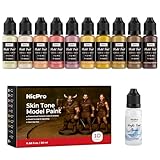
- 【Skin Tone Model Paint Set】Nicpro acrylic model paint set designed for painting faces and skin on miniatures, busts and character models. The 10 coordinated colors cover highlights, midtones and deep shadows for natural-looking flesh tones.
- 【10 × 20 ml Bottles + Thinner】Each 20 ml dropper bottle provides smooth, consistent flow and enough paint for multiple projects—more volume than typical 17 ml skin paints. The included acrylic thinner lets you fine-tune consistency for layering, glazes and airbrush work.
- 【Soft Matte Finish for Realistic Skin】Dries to a smooth, matte surface with strong coverage and minimal brush marks, ideal for faces, hands and other exposed skin. Blends easily so you can build subtle transitions, warm and cool shifts and lifelike tones.
- 【Made for Miniatures, Figures & Dioramas】Perfect for tabletop miniatures, busts, display figures and diorama characters. Works on plastic, resin, metal, PVC figures and 3D prints on a clean, dry surface (primer recommended on very smooth materials).
- 【Water-Based, Non-Toxic & Hobby-Friendly】Water-based, low-odor and non-toxic acrylic formula that conforms to ASTM D-4236. Suitable for home studios, hobby benches and classrooms with appropriate supervision for younger painters.
- Order or purchase earth-tone paint samples that clearly identify the manufacturer, color name, and code. A third-party marketplace sample should not be treated as a named manufacturer color unless the listing explicitly identifies those details.
- Test more than one location in the room, including a bright wall, a shaded wall, and a corner near the floor or ceiling.
- Observe the sample in morning, afternoon, evening, and artificial light.
- Place samples beside flooring, countertops, tile, brick, cabinetry, upholstery, and trim.
- Use a large enough sample to judge the color’s value and undertone. Small cards can hide how a shade behaves across a wall.
- Keep samples separate from one another when possible. Strong neighboring colors can visually influence the comparison.
- For exterior paint, check the roof, masonry, landscaping, sun exposure, and any HOA or architectural rules. Also verify that the selected paint line and finish are approved for exterior use.
If you decide to repaint, gather the application and protection supplies before opening the can: a paint roller and brush kit, painter’s tape, a drop cloth, a tray, and suitable surface-preparation materials. Paint color selection and paint preparation are separate decisions; a carefully chosen color will still produce a poor result on a dirty, glossy, damp, or inadequately repaired surface.
What can change the final appearance?
Two rooms painted with the same named color can look different because of natural light direction, bulbs, wall texture, primer, substrate, neighboring colors, paint line, sheen, and the number of coats. A display screen adds another layer of uncertainty. Treat the names and codes above as precise starting references, then approve the color from a physical sample in the actual space.
Earth tones work best when they are chosen as part of the room’s complete material palette. Start with the fixed finishes, select a light, midtone, and accent relationship, and test the actual product before committing to the entire room or exterior.
Frequently Asked Questions
What colors are considered earth tones?
Earth tones are nature-associated colors such as beige, sand, taupe, greige, brown, clay, terracotta, and muted green. They are broader than brown alone and can range from very pale neutrals to deep accent shades.
Can earth tones work throughout a whole house?
Yes. Earth tones can be used in living rooms, bedrooms, kitchens, bathrooms, offices, entryways, cabinetry, trim, accent walls, and exteriors. The appropriate color depth and product finish depend on the room, light, fixed materials, and surface.
How do I test an earth tone before painting?
Start by sampling the exact color beside flooring, countertops, tile, brick, cabinetry, upholstery, and trim. View it in several parts of the room at different times of day and under artificial light. Screen images are not reliable substitutes for physical samples.
Are dark earth tones a bad choice for small rooms?
Not necessarily. A room’s apparent size depends on color depth, contrast, lighting, furnishings, and layout. Deep browns and clay colors make a stronger visual statement, but they can work well on a focal wall or in a well-lit small room when balanced with lighter elements.
The Bottom Line
The best earth tone is not simply the most popular beige or the trendiest green. It is the color whose undertone, depth, finish, and light response work with your home’s existing flooring, trim, cabinetry, tile, and furnishings. Sample the exact manufacturer color and code in several places before painting.
Quick Recap
Product prices and availability are accurate as of the date/time indicated and are subject to change. Any price and availability information displayed on Amazon at the time of purchase will apply.