The best colors to pair with red depend on the red’s undertone, depth, and saturation. Blue-leaning reds such as burgundy and cranberry usually work with navy, plum, blush, and cool gray. Orange-leaning reds such as tomato, brick, rust, and terracotta tend to pair naturally with cream, camel, beige, olive, and warm gray.
Below are 21 designer-informed options—not universal rules. Before committing to paint, upholstery, clothing, branding, or a digital palette, test the exact shades together in the setting where they will be used.
As an Amazon Associate I earn from qualifying purchases.
How to tell which colors work with your red
“Red” can describe a broad range of colors, from a cool crimson or wine shade to a warm tomato, coral, brick, or rust. Two reds that look similar in a store or on a screen may behave very differently beside the same companion color.
#1 Best Overall
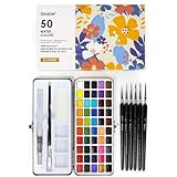
- 50 Essential Colors for Every Artist: A carefully curated palette of vibrant, rich pigments that cater to all artistic styles—just add a little water to activate these semi-transparent watercolors.
- 6 Premium Brushes Included: Enjoy precision painting with high-quality brushes (sizes 3/0 to 3) featuring fine-pointed tips—no cheap water brush pens or wooden substitutes here!
- Built-In Mixing Tray for Easy Blending: The integrated mixing space lets you create custom colors effortlessly—no extra tools needed for seamless color exploration.
- Beginner-Friendly All-in-One Kit: Perfect for new artists! This set simplifies watercolor painting with ready-to-use colors and tools, so you can start creating confidently right away.
- Portable Metal Case for Artists On-the-Go: Everything stores neatly in a sturdy metal "tool box"—ideal for travel, or plein air painting adventures.
1. Identify the undertone
Hold the red beside a true neutral white or gray. If it appears slightly blue, purple, or pink, it is a blue-leaning red. If it appears orange, brown, or golden, it is an orange-leaning red.
Blue-reds—including cranberry, burgundy, wine, and many raspberry shades—often harmonize with navy, lavender, plum, blush, and cooler grays. Orange-reds—including tomato, brick, rust, and terracotta—usually sit comfortably beside cream, camel, beige, olive, sage, and warm gray. These are practical applications of color-wheel relationships, not fixed rules: muted or unusually deep shades can change the result.
A physical color wheel or paint color fan deck can make undertones easier to compare than a phone or monitor. It is especially useful when coordinating an existing red sofa, tile, garment, artwork, or accent wall.
2. Control saturation and depth
Bright red beside another vivid color creates strong visual energy. That can be effective in a logo, child’s room, fashion look, or dramatic dining room, but it may feel noisy across a large surface. Muting one color—using sage instead of emerald, mustard instead of primary yellow, or dusty rose instead of hot pink—usually makes the combination easier to live with.
3. Decide which color should dominate
A useful starting proportion is approximately 60% dominant background or neutral, 30% secondary color, and 10% red accent. If red is the intended hero color, reverse the emphasis: let red occupy the largest visual role and use the companion color in smaller, deliberate areas. This is a design heuristic rather than a measurable standard.
Neutrals that go with red
1. Soft white
Soft white gives red breathing room without the sometimes-harsh contrast of pure white. It works especially well as trim, cabinetry, bedding, lettering, or a background around saturated red. Warm whites are natural partners for tomato, brick, coral, and red-orange shades, while a softly pink or blush-based white can balance cooler reds.
Use soft white when you want the red to remain the focal point while the surrounding space feels light and calm. In a room, it also gives you flexibility to add wood, brass, black, or gray without introducing another dominant color.
Free tools Windows power users keep installed
One-click scans. No signup required.
2. Cream
Cream softens red and creates a warmer, more traditional combination than bright white. It is particularly effective with burgundy, brick, rust, and cherry red in dining rooms, kitchens, living rooms, textiles, and upholstery.
Wood, aged brass, leather, and woven materials reinforce the palette’s warmth. If the red already looks orange, choose a cream that is not excessively yellow; otherwise the entire combination may become too golden.
3. Beige
Beige is a dependable grounding color for red. Warm beige works well with tomato, terracotta, and brick, while a grayer beige can better support cranberry, wine, and cooler red-violets.
Beige is useful when red appears in a sofa, rug, headboard, curtains, or kitchen accessories and you want the surrounding finish to recede. Compare the beige directly with the red: some beiges lean pink, yellow, or gray, and those subtle differences matter.
Quick wins for a faster PC:
Clear out junk files and repair common Windows errorsFree Scan →Fix the driver behind crashes, sound loss and screen glitchesFind Drivers →4. Taupe
Taupe tempers red without making the palette as stark as red and white or as dramatic as red and black. Its gray-brown character is well suited to an accent wall, red sofa, rug, or upholstered headboard that needs a quieter supporting color.
Choose taupe by undertone rather than by name alone. A pinkish taupe may complement burgundy but look discordant with an orange-red; a warmer taupe may do the reverse.
5. Warm gray
Warm gray gives red a restrained, contemporary backdrop. It is generally easier to live with than a second saturated hue and can prevent red from overwhelming a room. It also works in branding, clothing, product photography, and presentations where red needs to attract attention without making the whole composition feel aggressive.
For a cool cranberry or wine red, compare warm gray with a neutral or slightly cooler gray before choosing. Gray’s apparent temperature can shift significantly beside red.
PC Slower Than It Used to Be?
A free scan shows the junk files, broken settings and background clutter dragging Windows down - then fixes them in one click.Free scan · Windows 10 & 11Crashes, No Sound, or Screen Glitches?
Random freezes, missing sound and display glitches usually trace back to one bad driver. Find and replace yours safely.Free scan · under a minute6. Charcoal gray
Charcoal creates a tailored, dramatic pairing. Use it for cabinetry, furniture, doors, graphic panels, borders, or smaller areas rather than automatically covering an entire room.
With burgundy or oxblood, charcoal produces a moody, layered palette. With bright red, it creates sharper contrast. Add soft white, cream, natural wood, or a warm metal if the result feels too severe.
Rank #2

- 100 UNIQUE SHADES YOU COULD DREAM OF, EXTREMELY WIDE SELECTION OF COLORS: Grabie watercolor paint set of 100 colors including 50 regular watercolors, and the amazing metallic, macaron, and fluorescent watercolors, features high-quality artist-grade watercolors that blend easily and offer many color options to save you time from having to blend custom colors. With 100 different watercolor paints to choose from, let your imagination run wild.
- PRECISELY FORMULATED WATERCOLOR PAINTS, LET YOUR INSPIRATIONG FLOW: Grabie watercolor set possess good transparency, excellent tinting strength and good working properties. These paints are made from a selection of modern high-quality pigments milled to perfection, bright, rich, soluble, easy to blend, fade-resistant, durable and will not crack. A must have watercolor paints to add to your art supplies, make your watercolor art come to life.
- HIGH QUALITY PAINT SET, 100% NON-TOXIC TESTED AND CERTIFIED FOR SAFE USE: Grabie watercolor paint set conforms to ASTM D-4236 and EN71 safety standards, utilizing high grade pigments developed to showcase the vibrancy of rich, vivid color, 100% safe and non-toxic. Artist quality paints are manufactured by high-quality control standards, aimed at providing quality painting, drawing and art supplies for all ages and levels.
- PREMIUM WATERCOLOR SET WITH PENCIL AND BRUSHES, EVERYTHING INCLUDED: This travel watercolor set gives you the ability to paint with watercolor paint at home or while traveling, 1 drawing pencil, 1 natural sponge, 1 swatch sheet and 3 water brush pens, this watercolor set is complete with the most comprehensive selection of watercolor accessories, ideal for artists, amateur hobbyists and painting lovers.
- PERFECT PORTABLE WATERCOLOR PAINT SET, CREAT ON THE GO: Ultimate travel watercolor set with a compact carrying box, size-8.19*4.93*1.38 in, item weight-14.9 oz, the sturdy metal case won't take up much space in your bag, lightweight and portable. Grabie watercolor paint set has been selected by lots of artists, travel, indoors, countryside, park, beach, garden and city, wherever they go, they can always enjoy the freedom of painting.
7. Black
Black and red form a high-contrast, graphic combination. The pairing is strongest when one color clearly dominates and the other appears in controlled accents—for example, a red door with black hardware, a black outfit with a red accessory, or red typography on a predominantly black layout.
If red and black feel harsh together, introduce a light neutral such as cream or soft white, or use wood and natural textures to break up the contrast. In an interface or logo, check the actual contrast ratio rather than relying on visual impression alone.
Do these 3 things before closing this tab:
1Fix the driver behind crashes, sound loss and screen glitches2Repair Windows errors before they cause bigger problems3Scan for outdated or missing drivers - takes under a minuteGreens and blues that go with red
8. Olive green
Olive is a muted, earthy member of red’s complementary family. It is less visually aggressive than bright red with emerald green and works especially well with brick, rust, terracotta, and burgundy.
Try olive cabinetry with a red tile or textile, an olive jacket with a red accessory, or olive walls with carefully limited red furnishings. Because both colors can become heavy, cream, beige, or natural wood is often a useful third element.
9. Sage green
Sage provides a softer, more relaxed complementary contrast. Sage walls with red furnishings, sage upholstery with a red patterned textile, or small red accents in a sage room can all work well.
The most cohesive results usually come from matching intensity: pair a muted sage with a softened brick, cranberry, or dusty red rather than an extremely bright scarlet. If you want a more energetic look, use vivid red in a small, intentional accent.
10. Forest green
Forest green creates a rich, traditional, high-impact red-and-green scheme. It suits libraries, dining rooms, classic interiors, holiday-inspired décor, clothing, and heritage-style branding.
When both red and green are highly saturated, include a neutral to prevent the palette from becoming visually crowded. Ivory, warm gray, dark wood, or aged metal can provide that visual pause.
11. Teal
Teal combines blue’s coolness with green’s relationship to red on the color wheel. It makes red feel more contemporary and energetic than a traditional red-and-green pairing.
Teal with coral, tomato, or scarlet creates a lively scheme. Teal with burgundy produces a deeper jewel-toned palette. In either case, compare the relative depth: a very dark teal and a very dark red may need a lighter neutral to keep the composition from becoming muddy.
What’s actually slowing this PC down?
Pick the symptom - the matching free tool is one click away.
12. Navy blue
Navy anchors red with a classic, tailored contrast. It works in interiors, clothing, branding, stationery, and nautical or collegiate-inspired designs.
Because navy has a lower value than bright blue, it is often more forgiving and less visually noisy beside red. Navy with cherry red feels crisp; navy with burgundy feels restrained and sophisticated. Add cream or soft white when the combination needs more light.
13. Powder blue
Powder blue lightens red and creates a softer, more approachable contrast. It is useful with cherry red, coral, and raspberry when the goal is cheerful rather than dramatic.
Keep red in an accent role if the powder blue is very pale and the space receives strong daylight. A large amount of saturated red can overpower the delicacy of the blue.
Recommended Free Tools
Pinks and purples that go with red
14. Blush pink
Blush pink creates a tonal relationship with pink-reds while softening stronger reds. It works with burgundy, cherry, raspberry, and crimson in bedrooms, fashion, weddings, textiles, and feminine-leaning interiors.
For a layered palette, use red as the deeper accent and blush as the larger, quieter field. Soft white, pale wood, or warm metallic details can keep the combination from becoming too sweet.
15. Dusty rose
Dusty rose is more muted and gray-based than blush, making it a sophisticated companion for burgundy, wine, brick, and other softened reds.
Rank #3

- Core Color Matching: Paint color sample cards include 83 standard colors to support paint color sample cards, color matching cards for painting, and paint chips standard samples, helping users compare shades before selecting a final finish for floor paint, hardware, and other project needs
- Reliable Reference: Paint samples are made with color matching materials designed to support accurate color comparison, giving painters and DIY users a practical paint and paint color samples reference for selecting tones that fit the project surface and intended look
- Portable Format: Measuring 3.74 x 1.57 x 1.18 in and weighing 3.88 oz, this paint samples set is compact for a toolbox, work bag, or travel use, making it easier to carry color test card paint and check shades on site when planning paint work
- Wide Project Use: Paint sample cards are suitable for floor paint, paint hardware, and related color selection tasks, offering a useful paint chips samples reference for contractors, decorators, and home improvement users working on color coordination across different surfaces
- Simple Set Package: Each package includes 1 set of paint sample cards, giving users a straightforward paint sample standard cards option for daily work, project planning, and quick shade comparison when choosing among paint color cards and paint chips sample cards
It creates a monochromatic-adjacent palette without requiring exact shade matching. This is a good option when you want red-family variation but do not want a room, outfit, or brand palette to look excessively bright.
16. Plum
Plum adds a blue-violet counterpoint to burgundy, cranberry, and wine reds. The result can feel rich and atmospheric in upholstery, dining rooms, evening clothing, packaging, and editorial design.
Because both shades can be dark, include at least one lighter element—ivory, pale gray, soft white, or natural wood—to preserve definition and visual balance.
17. Lavender
Lavender offers a gentler red-violet contrast than saturated purple. Pair it with raspberry, cherry, or crimson for a modern, playful palette, or use dusty lavender with burgundy for a quieter effect.
Lavender usually works best when red is used selectively. A red cushion, graphic, shoe, vase, or small furniture piece can energize a lavender background without overwhelming it.
Warm colors and earth tones that go with red
18. Terracotta
Terracotta intensifies red’s earthy side. It is a natural match for brick red, rust, coral, and muted tomato, particularly alongside cream, tan, natural wood, linen, stone, or aged metal.
Rather than matching two nearly identical shades, look for a clear difference in depth or temperature. A muted tomato can stand out against dusty terracotta, while a deeper brick red can anchor a lighter terracotta.
19. Rust
Rust and red create a warm, autumnal palette. The combination is most successful when the shades differ in depth or undertone—for example, a clearer red with brownish rust, or a deep red with lighter orange-rust.
Use cream, camel, beige, olive, or dark wood to keep the arrangement grounded. In clothing and interiors, wool, leather, clay, and other tactile materials complement the palette naturally.
Free tools Windows power users keep installed
One-click scans. No signup required.
20. Mustard yellow
Mustard brings warmth and controlled contrast to red. It is more nuanced than pairing red with bright primary yellow and works well in textiles, accessories, kitchens, posters, and vintage-inspired rooms.
Let one color dominate and use the other as an accent. Mustard with burgundy feels autumnal and traditional; mustard with tomato or brick feels warmer and more energetic. Add a neutral if both colors appear heavily in the same area.
21. Camel
Camel is a warm tan that grounds red while preserving its energy. It is especially effective with burgundy, oxblood, brick, and rust in leather, wool, upholstery, clothing, bags, boots, and accessories.
Camel is one of the safest choices when you want red to feel polished rather than loud. Add cream or soft white when the palette needs more brightness, or use dark brown and brass for a richer traditional look.
Do these 3 things before closing this tab:
1Clear out junk files and repair common Windows errors2Scan for outdated or missing drivers - takes under a minute3Repair Windows errors before they cause bigger problemsChoosing a red pairing by use
For walls and paint
Large painted surfaces magnify color intensity. If the red is saturated, use a neutral or muted companion on most walls and reserve red for one wall, cabinetry, an island, a door, or furnishings. Soft white, cream, beige, warm gray, olive, sage, navy, and camel are practical starting points.
Finish also changes the impression. A higher-gloss finish can heighten red’s drama and reflect more light, while a lower-sheen finish generally makes it feel quieter. Coordinate the finish as well as the hue: a glossy red beside a flat charcoal will read differently from two matte colors.
For furniture and décor
When red is already present in a sofa, rug, artwork, or headboard, repeat a small amount of that red elsewhere rather than introducing several competing accent colors. Use beige, taupe, warm gray, olive, navy, camel, or cream for larger supporting pieces.
For a more traditional room, try red with cream, forest green, camel, or wood. For a contemporary room, try red with charcoal, warm gray, teal, or soft white.
Rank #4

- Note:Our product only includes color swatch chart, not a palette. Thank you.
- 1.Portable Watercolor Chart:This white paint swatch paper includes 20 sheets with a practical dimension of 7.87x3.93 inches, crafted with pre-printed lined for neat color recording. Designed to pair seamlessly with 50 colors watercolor paint sets, it also fits perfectly for color card documentation of 100 color pigments. The grid layout keeps your color swatches organized and easy to reference, fully satisfying all your demands for professional color matching, pigment swatch making and daily color record-keeping.
- 2.Rounded Corner:All four corners of the color swatch paper are rounded with no sharp edges. The swatch paper is also designed for easy grabbing, which effectively prevents any accidental scratches on your hands during use. This rounded-edge design can well prevent the paper corners from curling up and wearing out, greatly enhancing the color chart template’s sturdiness and making it much more durable for your daily color recording.
- 3.Clear Lined Grids:Each grid on the watercolor swatch cards features a vertical center line, specially designed for testing watercolor transparency. You can paint on both sides of the line, darker on one side and lighter on the other to visually compare the transparency and blending effects of the colors, mastering the shade gradations of watercolor mixing with precision, and it’s ideal for color matching in watercolor painting.
- 4.Good Material:Our color chart cards are crafted from 300gsm heavy-duty watercolor paper, boasting exceptional thickness and sturdiness. This material effectively prevents ink bleeding and paper warping during use, ensuring clean color swatches every time. Color chart cards is the perfect choice for watercolor swatching and pigment testing, delivering smudge-free, professional-looking results for all your color recording needs.
For clothing
Red is easiest to wear with neutrals such as soft white, cream, beige, camel, charcoal, navy, and black. Olive and blush create more distinctive combinations without requiring another bright primary color. Burgundy and wine reds often look especially natural with camel, navy, dusty rose, and plum.
For branding and graphics
Use red strategically to attract attention, then let a quieter background carry most of the composition. Navy, charcoal, cream, soft white, beige, and warm gray can make red feel established or professional; teal, powder blue, mustard, or lavender create a more expressive identity.
Do not select a palette solely by appearance. If text is involved, test the foreground and background colors for readability at the intended size and weight.
Test before committing
Screen previews are not a substitute for physical paint samples. Manufacturers caution that lighting and surrounding colors affect how a shade appears, and the same named or displayed color may look different on different walls, materials, monitors, and times of day.
What’s actually slowing this PC down?
Pick the symptom - the matching free tool is one click away.
- Sample the exact red. Do not coordinate from a generic “red” chip if the permanent material is already selected.
- Place candidate colors beside it. Compare at least two or three options, including one neutral.
- Use large samples. Small chips can hide undertones and make a color seem less intense than it will look across a wall or large furnishing.
- View them throughout the day. Check morning, afternoon, evening, artificial light, and the effect of nearby flooring or furniture.
- Move the samples. A color that works on one wall may look different beside a window, cabinet, countertop, or existing upholstery.
- Test the finish and material. Paint sheen, fabric texture, leather, paper, and digital color all reflect or absorb light differently.
For a DIY paint project, paint sample boards, swatch cards, or removable paint samples make it easier to compare combinations without judging a tiny screen image or committing immediately to a full gallon. When available, use samples from the actual paint brand and finish you plan to buy.
Digital accessibility: a separate check
A red pairing that looks attractive in a room or mood board may still be difficult to read in a website, app, presentation, or sign. Under WCAG 2.2 Level AA guidance, normal text generally needs a contrast ratio of at least 4.5:1, while large text generally needs at least 3:1, subject to the applicable exceptions.
Check the actual text color against the actual background color, including hover, disabled, visited, and focus states where relevant. Avoid using red and green as the only way to communicate status, because color-vision differences can make the distinction unclear. A color contrast checker or accessible palette tool can supplement—not replace—human review and testing on real screens.
For digital work, a palette generator can help explore analogous, complementary, split-complementary, triadic, and monochromatic schemes, while a contrast checker verifies whether the resulting text combinations remain readable. These tools are for digital colors and should not be treated as accurate predictions of how physical paint will appear.
Reliable starting combinations
| Red type or goal | Good first colors to test | Overall effect |
|---|---|---|
| Burgundy, wine, or oxblood | Camel, cream, dusty rose, navy, plum, charcoal | Rich, tailored, layered |
| Cranberry or cool crimson | Soft white, cool gray, blush, lavender, navy | Clean, balanced, or softly contrasting |
| Tomato or scarlet | Soft white, warm gray, teal, powder blue, charcoal | Energetic and contemporary |
| Brick or rust red | Cream, beige, olive, sage, camel, terracotta | Earthy and approachable |
| Red accent in a cautious scheme | Soft white, beige, taupe, warm gray, camel | Low-risk and flexible |
These combinations synthesize standard color-wheel relationships with paint-brand guidance and designer examples. They are starting points, not approvals or guarantees that every shade will coordinate.
Frequently Asked Questions
What is the safest color to pair with red?
Soft white, beige, warm gray, camel, and navy are generally forgiving starting points because they provide structure without competing with red. Choose the exact temperature to match the red: warm neutrals suit tomato and brick, while gray-beige or cooler neutrals may suit cranberry and wine.
Does red go with green?
Yes. Red and green are classic complementary colors, but two highly saturated versions can feel intense or seasonal. Olive and sage create softer, more livable pairings; forest green creates a richer, more traditional result. Add a neutral when both colors are strong.
What colors go with burgundy red?
Try camel, cream, dusty rose, navy, plum, charcoal, olive, or soft white. Because burgundy is deep, include at least one lighter element if the overall palette begins to look too dark.
What colors go with brick red or terracotta red?
Cream, beige, camel, olive, sage, rust, terracotta, warm gray, and natural wood are strong options. These colors reinforce brick red’s warm, earthy character without competing with it.
How many colors should I use with red in a room?
Start with one dominant background or neutral, one secondary color, and red as an accent—roughly a 60/30/10 proportion. If red is the main color, reduce the secondary color and use neutrals to control the intensity.
Can I use red and black together?
Yes, but it is a high-contrast combination. Let one color dominate, use the other selectively, and add cream, soft white, wood, or warm metal if the result feels too severe.
The Bottom Line
There is no single color that works with every red. Start by identifying whether your red leans blue or orange, then choose a partner with a compatible temperature and a manageable level of saturation. For a dependable first test, compare the red with soft white, beige, olive, navy, or camel—using large physical samples for paint and a contrast check for digital text.
Windows Errors? Fix Them Before They Spread
Repair common Windows errors and clear accumulated junk for a smoother, more stable PC - no reinstall needed.Free scan · no reinstallCrashes, No Sound, or Screen Glitches?
Random freezes, missing sound and display glitches usually trace back to one bad driver. Find and replace yours safely.Free scan · under a minuteQuick Recap
Product prices and availability are accurate as of the date/time indicated and are subject to change. Any price and availability information displayed on Amazon at the time of purchase will apply.