A permanent restroom sign that meets the federal accessibility rules has five parts that must all be right: raised uppercase letters, Grade 2 Braille beneath them, a non-glare finish with strong contrast, a mounting position that works for a person approaching by touch, and, where a pictogram is used, a text descriptor under it. The rules that govern these signs come from the U.S. Department of Justice’s 2010 ADA Standards for Accessible Design. This guide walks through what those standards require, where local code can add to them, and what to check before you buy or install a sign.
What the federal standards cover
The 2010 ADA Standards treat a restroom label as a room-identification sign. They distinguish signs that permanently identify a room or space from directional and informational signs that point somewhere or give general information. The two categories have different requirements, so a sign on a restroom door and a sign pointing down a corridor to a restroom should not be assumed to follow the same rules.
The provisions for permanent room identification appear in the Standards’ signage section (§216) and the technical requirements for tactile and visual characters (§703). The Department of Justice’s lodging guide, which covers guest rooms and facilities, names restroom signs among permanent-room signs and repeats the same feature list: raised characters, Braille, installation, contrast, finish, and pictograms where used. The full text is available from the official standard at ada.gov’s 2010 ADA Standards page.
These are federal requirements for facilities covered by the ADA, which means new construction and alterations to existing facilities. They do not settle everything. The building code edition adopted by your state or city, and any local amendments, can add requirements or set different conditions for certain building types. Confirm those with the local building department before treating a design as compliant.
Crashes, No Sound, or Screen Glitches?
Random freezes, missing sound and display glitches usually trace back to one bad driver. Find and replace yours safely.Free scan · under a minuteWindows Errors? Fix Them Before They Spread
Repair common Windows errors and clear accumulated junk for a smoother, more stable PC - no reinstall needed.Free scan · no reinstall#1 Best Overall

- RESTROOM SIGN FOR BUSINESS: These bathroom signs help your employees and visitors easily locate your facilities with bold white letters on a black background for maximum visibility.
- ADA COMPLIANT: These signs are compliant with the Americans with Disabilities Act. They feature raised icons, raised lettering, and raised braille.
- MANY STYLES TO CHOOSE FROM: From basic men’s and women’s bathroom signs to handicap signs to all gender bathroom signs, our selection will fit your business, office, or restaurant perfectly.
- EASY INSTALLATION: These signs come with self-adhesive strips on the back of each sign. Simply peel the thin cover from these adhesive strips and place your sign on any smooth, flat surface.
- DIMENSIONS: Each sign is 9” tall by 6” wide by 1/16” thick.
Tactile characters and Braille
Where tactile signs are required, the 2010 Standards call for raised characters with these features:
- Uppercase letters in a sans serif style. Mixed-case or serif lettering does not meet the tactile requirement for these signs.
- Character height in the tactile range. Raised characters must fall within the minimum and maximum heights set in §703.2. Check the letter height on the product drawing against that range rather than relying on a product description.
- Grade 2 (contracted) Braille. The Braille must duplicate the raised text in contracted Grade 2 form, not uncontracted Grade 1.
- Braille placed below the text. The Braille cells sit beneath the corresponding raised characters, aligned with the text.
A sign that shows raised letters with Braille added in a different position, in a different grade, or with uncontracted text does not meet the rule, even if it can be read by touch.
Mounting height and location
This is the part most often done wrong. Mounting a restroom sign “at eye level” is not the standard. The Standards set a height range measured from the baseline of the lowest and the highest tactile characters, not from the top or center of the sign. Installers should take those measurements from the characters themselves and check the exact figures in §703.4 for the specific sign layout.
Rank #2
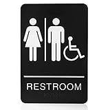
- Easy recognizable:Mark clearly where the bathroom location,Help your guests and employees find the restroom in your space, no more confusion office space or toilet space again.usion office space or toilet space again.
- Easy to installation:Unisex restroom sign with Double Sided 3M Tape for Secure Mounting , no screw and no need to drill holes.
- Professional Sign Manufacturer: 10 year rich experience in Bathroom signs industry. The sign is made from first-class materials and compliant with ADA standards,durable, Waterproof and resists heat or cold
- Sign Dimension: Our unisex bathroom wall mount is 6 inches wide and 9 inches long,with the elegant traditional design,looks great and wonderful.
Location is governed by the door, not just the wall. For a sign on a door, the Standards place it on the wall beside the latch side of the door. Where there is no wall space on the latch side, including at double-leaf doors, the sign goes on the nearest adjacent wall. The person reading the sign must be able to approach it without encountering protruding objects or standing within the arc of the door swing. The Standards include a stated exception for certain push-side installations, so confirm that case against the text before using it.
The Tool Desk
Outbyte Driver Updater FREEFix the driver behind crashes, sound loss and screen glitchesFind Drivers →Outbyte PC Repair FREERepair Windows errors before they cause bigger problemsFix Now →Plan the mounting around the sign’s actual dimensions and the door hardware. A sign that fits the height range on paper can still fail if a closer, handle, or the door’s swing blocks the approach.
Visual characters, contrast, and finish
The Standards require visual characters and their background to have a non-glare finish. The characters must contrast with the background, either light characters on a dark background or dark characters on a light background. The accompanying advisory notes that stronger contrast improves legibility for people with low vision.
Rank #3
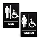
- RESTROOM SIGN FOR BUSINESS: These bathroom signs help your employees and visitors easily locate your facilities with bold white letters on a black background for maximum visibility.
- ADA COMPLIANT: These signs are compliant with the Americans with Disabilities Act. They feature raised icons, raised lettering, and raised braille.
- MANY STYLES TO CHOOSE FROM: From basic men’s and women’s bathroom signs to handicap signs to all gender bathroom signs, our selection will fit your business, office, or restaurant perfectly.
- EASY INSTALLATION: These signs come with self-adhesive strips on the back of each sign. Simply peel the thin cover from these adhesive strips and place your sign on any smooth, flat surface.
- DIMENSIONS: Each sign is 9” tall by 6” wide by 1/16” thick.
Color choice is secondary. The questions that matter are whether the contrast is clear, whether the finish reflects overhead light into the lettering, whether the text is readable from the distance a person will stand, and whether tactile details are present when the sign requires them. A glossy laminate or a dark-on-dark design with weak contrast can fail even when the lettering is correctly sized.
Pictograms and the accessibility symbol
Many restroom signs include a pictogram, such as a figure or a wheelchair symbol. When a pictogram identifies a permanent room, the Standards treat the pictogram field and its text descriptor as separate parts of the sign:
- The pictogram field must meet the minimum height set in §216.6.
- The text descriptor sits below the field and carries the raised characters and Braille that the room identification requires.
- Symbols that only provide information are not automatically subject to the same text-descriptor rule, so do not assume every symbol on a sign needs the same treatment.
The International Symbol of Accessibility, the wheelchair figure, marks a space as accessible. On a restroom sign, it tells a reader that the room, or the route to it, is intended for people with disabilities. It is not a substitute for the tactile room identification described above. Where a restroom is accessible, the symbol and the tactile identification both belong on the sign.
Rank #4

- 【Contemporary Design】: Enhance your space with a modern restroom sign that follows national ADA guidelines. Featuring raised icons, lettering, and Grade 2 braille, this brushed aluminum sign looks great on door for all business types.
- 【ADA Compliant & Braille】: Ensure inclusivity and accessibility with our ADA-compliant braille restroom sign. Install it adjacent to the door handle, positioned 48-60 inches from the floor.
- 【Easy-to-Read & Sleek】: Designed with a clean font, large text/icons, and contrasting colors, our ADA restroom tin sign guarantees easy visibility. Its minimalist layout blends seamlessly with any workspace, restaurant, or business environment.
- 【Installation Without Damage】: Our sign features adhesive strips that securely hold it in place without damaging the door surface upon removal. Enjoy easy installation and peace of mind. Available in Women, Men, and Unisex handicap options.
- 【Restroom Sign Options for Every Space】This collection offers a variety of restroom signs, including Men, Women, Restroom, and All-Gender options, each with unique icon designs and text to fit different restroom scenarios.
Directional signs and clustered toilet rooms
Not every restroom needs its own tactile sign at the door. The Standards address two situations where other signs take over:
- Directional signs to the nearest accessible toilet room. Where existing toilet rooms do not comply with the referenced accessibility provisions, a directional sign identifies the nearest compliant toilet room. These are informational signs, so their lettering and symbol rules differ from the room-identification rules.
- Clustered single-user toilet rooms. When single-user rooms are grouped and not every room in the cluster is accessible, the Department of Justice’s guidance on the 2010 Standards explains how accessible rooms are identified. The answer depends on the exception and scope that apply, so read that guidance alongside the building plan.
In a facility with several restrooms, map each room’s status before ordering signs. Ordering identical signs for every door can leave a non-accessible room labeled as accessible or a compliant room without the required identification.
Independent reader supportYour contribution helps us test, update, and keep practical guides available for everyone.What to check before you buy
A product search for “ADA tactile restroom sign with Braille” will return many listings. The phrase describes the type of sign you need. It does not confirm that any listing meets the standard. A title, a Braille icon, or a wheelchair picture on the product photo are not evidence of compliance. Ask the seller or read the product documentation for the following:
Best Value

- 【Bathroom Sign】: Enhance your space with a modern restroom sign that follows national ADA guidelines. Featuring raised icons, lettering, and Grade 2 braille, this brushed aluminum sign looks great on door for all business types.
- 【ADA Compliant & Braille】: Ensure inclusivity and accessibility with our ADA-compliant braille restroom sign. Install it adjacent to the door handle, positioned 48-60 inches from the floor.
- 【Easy-to-Read & Sleek】: Designed with a clean font, large text/icons, and contrasting colors, our ADA restroom tin sign guarantees easy visibility. Its minimalist layout blends seamlessly with any workspace, restaurant, or business environment.
- 【Installation Without Damage】: Our sign features adhesive strips that securely hold it in place without damaging the door surface upon removal. Enjoy easy installation and peace of mind.
- 【Restroom Sign Options for Every Space】This collection offers a variety of restroom signs, including Men, Women, Restroom, and All-Gender options, each with unique icon designs and text to fit different restroom scenarios.
- Raised, uppercase sans serif characters with stated height and a drawing showing the letter dimensions.
- Contracted Grade 2 Braille, placed beneath the raised text.
- Mounting instructions that give the height and latch-side placement, not just a generic “eye level” note.
- A non-glare finish and a stated light/dark contrast combination.
- A pictogram field and text descriptor arranged as the Standards require, if the sign includes a pictogram.
- Any directional sign or accessibility symbol needed for the room’s arrangement, as a separate item.
- Durability suited to the location, such as humidity or frequent cleaning.
If you are comparing two or more signs, a side-by-side table of these features will show gaps faster than reading each listing:
| Feature | What the 2010 Standards require | What to confirm on the listing |
|---|---|---|
| Character style and case | Uppercase sans serif raised characters | Font name and case shown in the product drawing |
| Braille | Contracted Grade 2, below the text | Braille grade and placement stated, not just “Braille included” |
| Mounting height | Height range measured from the lowest and highest tactile character baselines (§703.4) | Installation drawing with dimensions, not only the sign’s overall size |
| Mounting location | Latch side of the door, or nearest adjacent wall where no latch-side wall exists | Instructions that address door swing and approach |
| Finish and contrast | Non-glare finish; light on dark or dark on light | Stated finish type and color pairing |
| Pictogram | Minimum field height (§216.6) and text descriptor below the field | Field dimensions and descriptor layout shown |
Where local rules need a separate check
The federal standard sets the baseline. Your state or municipal building code, the edition it adopts, and the type of building can impose additional requirements or change how the federal rules apply. Projects with historic buildings, leased spaces, or unusual room layouts often need a written review by the building official or an accessibility consultant before the signs are ordered. The installer should have the exact text of the applicable standard and the approved drawings in hand.
When a supplier or installer says a sign is “ADA compliant,” ask which edition of the standard it was checked against and whether the sign drawings were reviewed for your jurisdiction. That question separates a documented product from a marketing claim.
The Bottom Line
A restroom sign is compliant only when its tactile letters, Braille, finish, contrast, mounting height, and location all match the 2010 ADA Standards for the room it marks. Check the actual sign specifications and installation drawing against the standard, then confirm with the local building department before installing.
Quick wins for a faster PC:
Scan for outdated or missing drivers - takes under a minuteDriver Scan →Repair Windows errors before they cause bigger problemsFix Now →Quick Recap
Product prices and availability are accurate as of the date/time indicated and are subject to change. Any price and availability information displayed on Amazon at the time of purchase will apply.