The Tool Desk
Outbyte PC Repair FREERepair Windows errors before they cause bigger problemsFix Now →Outbyte Driver Updater FREEScan for outdated or missing drivers - takes under a minuteDriver Scan →Some links on this page are affiliate links: if you buy through them we may earn a commission, at no extra cost to you.
What are neutral colors? Neutral colors are subdued, adaptable hues such as white, cream, beige, gray, greige, taupe, brown, black, and muted earth tones. Neutral does not mean colorless: undertones and lighting can make the same white, gray, or beige look warm, cool, pink, yellow, green, blue, or purple.
Neutral colors are popular in interiors because they provide a flexible foundation for architecture, furniture, artwork, and changing décor. A successful neutral room is not necessarily an all-white or all-beige room; it usually combines related values, materials, textures, and one or two controlled accents.
As an Amazon Associate I earn from qualifying purchases.
Key takeaways
- Neutral colors are subdued, adaptable hues such as white, cream, beige, gray, greige, taupe, brown, black, and muted earth tones.
- Neutral does not mean colorless: white, gray, beige, and taupe can carry yellow, red, orange, blue, green, violet, or brown undertones.
- Warm neutrals generally feel grounded and inviting, while cool neutrals tend to feel crisp, calm, and airy.
- Natural and artificial light can make the same neutral appear warmer, cooler, pinker, yellower, greener, or bluer at different times of day.
- Physical paint chips and large sample areas are more reliable than a color name or screen image when choosing a neutral paint.
- Texture, value contrast, wood, stone, metal, artwork, plants, and one controlled accent keep a neutral room from looking flat.
What are neutral colors?
Neutral colors are relatively subdued hues that coordinate easily with other colors and work well as backgrounds or supporting layers in a room. Common interior neutrals include white, off-white, cream, beige, gray, greige, taupe, brown, black, and muted earth tones, although there is no universal list.
Paint manufacturers organize neutral colors differently. Benjamin Moore’s neutral color guidance includes nuanced families beyond basic gray and beige, while Sherwin-Williams and PPG organize neutral selections into overlapping groups such as warm, cool, white, beige, gray, greige, and earthy colors.
Popular on Amazon
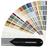
- Brand: Benjamin moore
- Container type: Box
- Finish type: Opa
The practical definition is more useful than a rigid technical boundary: a neutral is a comparatively quiet color that can support a room without competing with its architecture, furniture, artwork, or other finishes. Some desaturated blues, greens, blushes, ochres, clays, and olive-gray shades can function as near-neutrals when their saturation is low enough to behave like background colors.
What colors are considered neutral?
Interior neutral colors usually fall into several overlapping families. The categories below are design-organizing labels rather than a universal color standard.
| Neutral family | Common examples | Typical visual effect |
|---|---|---|
| True or near-true neutrals | White, black, gray, and some minimally biased beige or taupe | Flexible foundation with relatively little obvious color influence |
| Warm neutrals | Cream, ivory, sand, camel, tan, beige, warm gray, warm taupe, and brown-based greige | Comfortable, relaxed, grounded, and connected to natural wood |
| Cool neutrals | Icy white, silver, blue-gray, green-gray, violet-gray, and cool gray | Crisp, calm, airy, and contemporary |
| Earthy neutrals | Mushroom, putty, stone, muted clay, soft terracotta, olive-gray, and nature-derived browns | Organic, layered, and more expressive than plain white or beige |
Is beige a neutral color? Yes. Beige is a commonly used warm neutral, but the exact beige may lean yellow, pink, gray, green, or brown. Is gray a neutral color? Yes, but gray can also be warm or cool depending on its undertone. Benjamin Moore explains that white and gray can lean warm or cool, so the color name alone is not enough to predict how paint will look in a particular room.
What is the difference between warm and cool neutrals?
Warm neutrals contain visual influence from yellow, orange, red, or brown, while cool neutrals tend toward blue, green, violet, or silver. The distinction affects the atmosphere of a room and the way a paint color interacts with fixed finishes.
| Comparison | Warm neutrals | Cool neutrals |
|---|---|---|
| Common undertones | Yellow, red, orange, beige, or brown | Blue, green, violet, or silver |
| Typical mood | Cozy, familiar, relaxed, and grounded | Calm, crisp, open, and modern |
| Often coordinates with | Warm wood, brass, bronze, leather, cream, and natural fibers | Cool stone, chrome, silver, blue textiles, bright daylight, and minimalist furnishings |
| Potential problem | Can look yellow, pink, or muddy beside cool flooring or blue-gray stone | Can look stark beside strongly warm wood or in a dim room |
Sherwin-Williams describes warm neutrals as comfortable and familiar and identifies cool neutrals through blue, violet, or silver undertones. Neither temperature is universally better. The existing floor, countertop, cabinetry, trim, furniture, and light should determine the direction.
Greige sits between gray and beige. Taupe generally occupies a gray-brown or beige-brown range. Both can bridge a room containing warm and cool materials, but neither is automatically neutral in every setting. A greige can look distinctly green beside pink-beige furnishings, and a taupe can look purple or brown beside certain grays.
Free tools Windows power users keep installed
One-click scans. No signup required.
Also popular on Amazon
Sherwin-Williams color marketing director Sue Wadden described Poised Taupe in 2017 as “a weathered, woodsy neutral that brings the sense of coziness and harmony people are seeking.” The same source describes the color as combining the appeal of cool gray with the warmth of brown. Those descriptions illustrate why taupe can feel balanced without being visually colorless; they do not mean every taupe will behave the same way in every room. Read Sherwin-Williams’ discussion of warm and cool neutrals.
Why do neutral paint colors change in different rooms?
Neutral paint colors change because undertones interact with the room’s light, surrounding colors, and permanent materials. A white may look creamy in warm lamp light, a gray may look blue or purple beside cool finishes, and a beige may appear pink or green beside particular flooring or upholstery.
Room orientation also matters. North-facing light often makes colors appear cooler, while strong southern light can intensify warmth; east- and west-facing rooms change substantially between morning and afternoon. Artificial bulbs add another variable. These are useful starting observations, not guarantees, because windows, trees, neighboring buildings, wall exposure, and bulb temperature also affect the result.
Compare a candidate with a clean white sheet, a neutral gray, and the room’s actual flooring, countertop, trim, cabinetry, and large furniture. View the color in morning, midday, evening, and the room’s usual artificial light. Benjamin Moore’s neutral guidance emphasizes evaluating neutrals in context, while PPG’s cool-white guidance shows why apparently similar whites need to be compared rather than chosen from a name alone.
What are the best neutral color palettes for a room?
The best neutral palette depends on the room’s fixed finishes and the mood you want, but the following combinations provide reliable starting points. Treat each palette as a relationship between temperatures, values, textures, and accents rather than as a requirement to match every item.
| Palette | Core colors and materials | Best use and caution |
|---|---|---|
| Soft warm white and natural wood | Ivory or creamy white, oak, rattan, linen, oatmeal, and sand | Relaxed living rooms and bedrooms; keep the wall white compatible with the wood and fabrics. |
| Cool white and pale gray | Clean white, cool gray, black accents, bouclé, wool, ribbed glass, or matte ceramics | Crisp modern spaces; add texture so the palette does not look flat or sterile. |
| Beige, cream, and medium wood | Warm beige, cream upholstery, medium wood, and darker accents | Traditional, transitional, farmhouse, and relaxed contemporary rooms; vary value to avoid a beige field. |
| Greige and muted green | Bridge-color greige, white trim, gray-green textiles, and warm wood | Rooms containing both warm wood and cooler accents; choose a low-saturation green. |
| Taupe and stone gray | Taupe, stone gray, aged brass, bronze, or black metal | Sophisticated architectural schemes; use one dominant metal and one supporting metal. |
| Mushroom, muted clay, and ivory | Mushroom, restrained clay or soft terracotta, and ivory | Earthy rooms with more personality than plain beige; keep clay muted and controlled. |
| Gray, navy, and warm wood | Gray walls or upholstery, navy accents, and warm wood | A neutral foundation for readers who want color without an all-beige room. |
What neutral paint colors go with wood floors?
Neutral paint colors that go with wood floors should repeat or deliberately balance the wood’s undertone. Warm oak, honey, red, or orange-toned floors often pair comfortably with cream, warm white, beige, warm gray, taupe, or brown-influenced greige. Very cool gray or blue-white paint can make warm flooring look more orange by comparison.
Also popular on Amazon

- Very good condition
- Benjamin Moore Classic Colors Fan Deck
- Classic Colors
- Includes the American Classic Colors (AC)
Gray-washed, pale, or cooler wood floors can work with clean white, cool gray, blue-gray, green-gray, greige, or soft black accents. A warm neutral can also work when the room needs softness, but test it beside the actual floor because the floor’s finish and reflected light may change the balance.
Do not choose wall paint from a flooring label such as “oak” or “walnut” alone. Put large samples next to the floor, trim, cabinets, and upholstery, then check whether the combination feels intentionally warm, intentionally cool, or balanced.
Do these 3 things before closing this tab:
1Clear out junk files and repair common Windows errors2Fix the driver behind crashes, sound loss and screen glitches3Repair Windows errors before they cause bigger problemsHow do you choose the right neutral paint color?
- Inventory fixed elements first. Record the undertones and values of flooring, countertops, stone, cabinets, tile, trim, large furniture, and permanent fixtures. Fixed elements are harder and more expensive to change than paint.
- Study the room’s light. Note the window orientation, amount of daylight, shadows, nearby greenery or buildings, and the artificial light used after dark.
- Identify the undertone. Compare candidate colors against clean white, neutral gray, and the room’s fixed finishes. Look specifically for yellow, pink, green, blue, violet, or brown influence.
- Compare value as well as hue. Two beiges may share an undertone but create different visual weight. Consider ceiling height, window area, furniture size, and how much contrast the room needs.
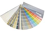
- Screen several candidates. An interior paint color fan deck or paint color swatch book can narrow a group of whites, grays, greiges, and beiges before you buy paint. Printed colors and screens are approximate, so a fan deck is a screening tool, not a substitute for testing the actual paint.
- Test large samples. Use sample quantities on large boards or inconspicuous wall areas rather than relying on a tiny chip. Move boards around the room to compare the color beside different finishes and windows.
- Review samples at multiple times. Check morning, midday, evening, and the room’s usual lamp light. A neutral that looks balanced at noon may look yellow, pink, green, blue, or purple at night.
- Coordinate the trim intentionally. Trim does not have to be the brightest white available. Match the wall’s undertone for a quiet effect or choose a deliberate, tested contrast.
- Repeat the temperature through materials. Echo the wall’s warmth or coolness in rugs, curtains, wood, metals, upholstery, artwork, and accessories without making every surface identical.
Sherwin-Williams’ neutral-color guidance also supports using chips and samples as part of the selection process. Testing matters because a paint color can look different from a printed card, a digital image, and the painted wall.
Independent reader supportYour contribution helps us test, update, and keep practical guides available for everyone.How do you make a neutral room look less boring?
Make a neutral room more interesting by adding texture and contrast before adding lots of color. Linen curtains, woven baskets, wool throws, bouclé upholstery, visible wood grain, stone, ceramics, matte metals, ribbed glass, and natural fibers create variation while preserving a restrained palette.
- Use value contrast: pair pale walls with medium wood and dark accents, or pair a dark neutral wall with light upholstery and reflective surfaces.
- Repeat undertones: support a pink-beige wall with compatible beige, wood, or textile notes rather than pieces that turn green beside it.
- Add one controlled accent: olive, navy, rust, terracotta, muted blue, charcoal, or black can give the room a focal point without replacing the neutral foundation.
- Use artwork and plants: greenery, books, and framed artwork supply organic variation and prevent a restrained room from feeling sterile.
- Vary sheen: a matte wall, satin trim, glossy ceramic, and reflective metal can contrast even when their colors are close.
- Use the 60-30-10 idea flexibly: let the largest area carry the main neutral, use a secondary neutral or material for structure, and reserve a smaller share for contrast or accent.
Avoid accidental monochrome. When the walls, sofa, rug, curtains, and accessories all have nearly the same value and texture, the room can look unfinished rather than calm. A darker frame, medium-tone wood, textured rug, sculptural light, or small black detail may provide enough definition.
Sherwin-Williams’ neutral color collection demonstrates the breadth of neutral families, while neutral décor guidance commonly relies on layering materials rather than matching every surface. The goal is a coordinated range, not a room filled with one beige.
Crashes, No Sound, or Screen Glitches?
Random freezes, missing sound and display glitches usually trace back to one bad driver. Find and replace yours safely.Free scan · under a minutePC Slower Than It Used to Be?
A free scan shows the junk files, broken settings and background clutter dragging Windows down - then fixes them in one click.Free scan · Windows 10 & 11Also popular on Amazon

- Features 216 timeless hues from the RAL CLASSIC collection with five colors per page - fan size 15.0 x 5.0 x 2.0, color display 2.0 x 5.0 cm
- Crafted with low-solvent, low-odour water-based paints for eco-friendly use
- Enhanced UV resistance provides long-lasting color protection
- Cover made from 100% recyclable post-industrial polypropylene waste
- Compact and portable design, ideal for precise color matching on the go
Which neutral should be used on walls, trim, ceilings, or accents?
Use the lightest or most reflective neutral only when it supports the room’s desired contrast; a wall, ceiling, trim, cabinet, and accent do not need to use the same neutral or the same brightness.
| Surface | Useful decision | What to check |
|---|---|---|
| Walls | Choose the neutral that best connects fixed finishes and establishes the room’s mood. | Undertone, value, daylight, furniture contrast, and sample size |
| Ceiling | Use a compatible lighter neutral for continuity or a tested contrast for architectural emphasis. | Whether the ceiling looks clean rather than gray, yellow, or disconnected |
| Trim | Match the wall undertone or contrast intentionally instead of defaulting to the brightest white. | How the trim changes the apparent temperature of the wall |
| Cabinetry | Coordinate with counters, backsplash, flooring, and appliances before choosing a white, gray, beige, or greige. | Permanent materials and artificial light |
| Accent | Use charcoal, black, navy, muted green, clay, or another controlled near-neutral for definition. | Whether the accent repeats elsewhere without overpowering the room |
A practical neutral-color checklist
- Have you identified the undertones in the floor, counters, cabinets, trim, and large furniture?
- Have you decided whether the room should feel cozy and grounded or crisp and airy?
- Have you compared the paint with a clean white sheet and a neutral gray?
- Have you tested the color in daylight and artificial light?
- Have you viewed the sample in the morning, afternoon, and evening?
- Have you tested a large painted board or wall area instead of relying only on a small chip?
- Does the wall color have enough value contrast with the furniture, rug, and trim?
- Will texture, wood, artwork, plants, or one accent color keep the room from becoming flat?
- Are the trim and ceiling choices intentional rather than automatic?
Frequently Asked Questions
Is beige a neutral color?
Yes. Beige is a common warm neutral, but individual beige colors may lean yellow, pink, gray, green, or brown. Compare beige paint with the room’s flooring, trim, furniture, and lighting before choosing it.
Is gray a neutral color?
Yes. Gray is a neutral color, but gray paint can be warm or cool. Blue, green, violet, or silver undertones make a gray feel cooler, while beige, yellow, red, or brown influence can make a gray feel warmer.
Why does my gray paint look blue or purple?
Gray paint can look blue or purple when its undertone is exposed by cool daylight, nearby blue or violet furnishings, or a contrasting warm finish. Test the gray beside the room’s fixed materials in both daylight and artificial light.
Quick wins for a faster PC:
Repair Windows errors before they cause bigger problemsFix Now →Scan for outdated or missing drivers - takes under a minuteDriver Scan →Clear out junk files and repair common Windows errorsFree Scan →Why does my white paint look yellow?
White paint can look yellow when it has a warm yellow or cream undertone, when warm artificial lighting reflects onto it, or when it is placed beside a much cooler white. Compare the white at different times of day before painting the whole room.
How do I choose a neutral paint color?
The safest way to choose a neutral paint color is to identify the room’s fixed undertones, study its natural and artificial light, compare several physical chips, and test large samples in the actual space. A color name or digital image cannot replace an in-room sample.
The Bottom Line
Neutral colors are not limited to plain white, beige, or gray. The most successful neutral interiors account for undertone, value, lighting, fixed finishes, texture, and contrast. Choose a warm or cool direction based on the room, screen candidates with physical references, and test the actual paint before committing.
Quick Recap
Product prices and availability are accurate as of the date/time indicated and are subject to change. Any price and availability information displayed on Amazon at the time of purchase will apply.
Recommended Free Tools

