What’s actually slowing this PC down?
Pick the symptom - the matching free tool is one click away.
Some links on this page are affiliate links: if you buy through them we may earn a commission, at no extra cost to you.
Color and contrast in the built environment should be specified for two different jobs: supporting a room’s mood and making doors, stairs, signs, glazing and controls easy to find. The evidence does not justify painting an entire office red for productivity or an entire school blue for creativity. Hue effects are small, task-specific findings; luminance contrast is the dependable accessibility tool. A sound specification therefore keeps large fields visually calm, gives critical elements a measurable lightness difference, adds non-color cues, and verifies the result under the lighting the building will actually have.
What does the evidence actually say about color and performance?
There is no conclusive evidence that one color universally improves the human mind or body. Building Design + Construction’s Emily Koch describes color as subjective, personal and situational: cultural associations, personal memories and changing visual ability all affect the result. Her practical warning is important for designers: a hue that feels calm to one group can feel oppressive or distracting to another, and overusing a single color produces monotony.
As an Amazon Associate I earn from qualifying purchases.
Free tools Windows power users keep installed
One-click scans. No signup required.
The best-known red-versus-blue result is a University of British Columbia study reported by ScienceDaily. More than 600 participants completed six cognitive tasks between 2007 and 2008. In that protocol, red improved detail-oriented work such as memory retrieval and proofreading by as much as 31 percent compared with blue, while blue produced twice as many creative outputs on brainstorming tasks. Juliet Zhu explained the proposed association: red is linked with danger, mistakes and caution, which can promote vigilance; blue is linked with sky, water and openness, which can make exploratory thinking feel safer.
Those numbers describe computer-screen, advertising and package experiments, not a measured change in a finished room. They do not mean that painting an office red will raise proofreading accuracy by 31 percent, or that blue walls will double creativity. Koch’s example of Kareo’s 45,450-square-foot Irvine headquarters used blue and orange to support creativity, brainstorming and alertness, but the article reports design intent rather than a before-and-after performance measurement.
Popular on Amazon

- Ergonomically Designed: Work in tight areas with a compact design that gets into tough spots
- Both tools are designed to fit into difficult to reach spaces
- Complete a wide range of applications with a high-performance motor that delivers up to 300 UWO, and an impact driver delivering up to 1,400 in-lbs of torque
- Both the DEWALT impact driver and drill driver feature integrated LED work lights with a convenient 20-second delay, ensuring enhanced visibility in dimly lit or challenging work areas
- One-Handed Loading - Keep one hand free with a 1/4 in. hex chuck that accepts 1 in. bit tips
Other popular claims need the same caution. Koch summarizes reports that some autistic students experience large fields of primary red as super-intense, fluorescent or pulsating, while smaller red objects can be useful in occupational-therapy activities. That is a summary of A.J. Paron-Wildes’s 2008 discussion, not a universal prohibition. Similarly, blue outdoor lighting has been associated with security or suicide-prevention projects, but a color of light is not evidence that blue paint deters crime, and evening blue light from screens is a spectrum and melatonin issue rather than evidence about blue walls.
Color-science professor Stephen Westland, quoted by Bluebeam, makes a narrower claim: studies of dynamic office lighting suggest that changing the light spectrum through the day may reduce tiredness, and wall color could probably bring some performance or well-being benefits. The distinction matters. Dynamic light, reflected paint, and task-specific color associations are different interventions.
Quick wins for a faster PC:
Scan for outdated or missing drivers - takes under a minuteDriver Scan →Repair Windows errors before they cause bigger problemsFix Now →Why is luminance contrast more important than hue for accessibility?
Luminance contrast is the difference in reflected light between two surfaces. It is what helps a person with low vision distinguish a door from a wall, a stair nosing from a tread, or a control from its panel. CNIB’s Colour and Brightness guidance separates this from color contrast, which is distance on the color wheel. Two hues can look dramatically different to a person with typical vision yet be nearly identical in lightness; red/green and blue/green combinations are particularly problematic for many people with color-vision deficiency.
Do not rely on color as the only identifier. The 2025 systematic review in Buildings recommends redundant encoding—color plus shape, text, position or icons—with high luminance contrast as the baseline. CNIB also warns that contrast at every turn can become confusing. Use strong contrast at decision points and hazards, then give the surrounding space a quieter visual field.
Also popular on Amazon

- Valued Carpenter Pencil Set: You will get 2 pcs solid carpenter pencils with 26 piece 2.8 mm refills, 1 replaceable sharpener, 1 plastic storage box.The complete carpenter pencils combination allows you to finish your work faster and more easily
- Deep Hole Marker Pencil: The deep-hole construction pencils adopts 45mm elongated tip design, which is more convenient to mark in the small hole or in other tight areas that other carpenter markers cannot reach
- Carpenter Pencils with Sharpener: The sharpener is screwed into the top of the work pencil, which won't get lost either. Built-in pencil sharpener that keep the lead with pointed and smooth to Improves line of sight in fine work
- Stronger Solid Lead: This work pencil is matched with a 2.8 mm thick lead , which is much thicker and stronger during the drawing process of construction work, it will not break or damage easily
- Marks on Various Surfaces: 3 colors solid construction pencil can marks on various surfaces,such as metal, plastic, wood, paper etc. Ideals for woodworkers, contractors, craftsmen, builders, merchants and masons
Contrast supports people beyond those who identify as blind. The Australian Institute of Architects’ Design for vision impairment guide states that 18 percent of Australians aged 65 and older have low vision, compared with 6 percent of people under 65, and notes that most people with a discernible sight disability can still distinguish light and shade. Its design strategy is therefore to make the lightness relationship between adjacent elements deliberate. Treat the quoted prevalence as the guide’s figure, not as a substitute for a project-specific demographic study.
What do the different contrast numbers mean?
“Thirty percent contrast” is not a complete specification. LRV points, Weber-style percentage, Michelson contrast and WCAG contrast ratio use different equations and can produce very different numbers for the same pair of finishes.
Do these 3 things before closing this tab:
1Fix the driver behind crashes, sound loss and screen glitches2Clear out junk files and repair common Windows errors3Scan for outdated or missing drivers - takes under a minute| Metric | What it calculates | Where it belongs | Illustration or threshold |
|---|---|---|---|
| LRV point difference | Subtract one light reflectance value (0–100) from the other. | Commonly cited for architectural finishes in UK guidance summaries. | Dulux Trade’s CPD summary reports 30 LRV as a critical-surface target for new build or major refurbishment, with 20 as a lower best-practice floor and 30 preferred: Dulux Trade CPD. |
| Weber-style percentage | [(B1 − B2) / B1] × 100, where B1 is the lighter LRV. | California detectable-warning provisions and CNIB’s field method. | LRV 80 and 50 are 30 points but 37.5% Weber contrast; LRV 40 and 10 are also 30 points but 75%. |
| Michelson contrast | (Lighter − darker) / (lighter + darker). | The 2022 vision-impairment preference study and some research syntheses. | Do not convert its percentages into LRV points without the study’s definitions. |
| WCAG contrast ratio | A ratio used for foreground and background luminance in digital content. | ICT, websites and hardware controls, not wall-and-floor finish schedules. | Section508.gov cites 4.5:1 for ordinary text and 3:1 for large text. |
The 2025 California Building Code, section 11B-705.1.1.3, prints the Weber-style equation as [(B1−B2)/B1] × 100 in the UpCodes text. CNIB’s page uses the same family of calculation and recommends at least 50 percent contrast on key elements and 70 percent on signs. A Hong Kong Architectural Services Department note describes a difference greater than 30 LRV points under its reading of British regulations. These are not interchangeable requirements; name the metric and the governing jurisdiction in every specification.
Does a 30 percent minimum make an element easy to see?
Not necessarily. In a 2022 Work study, participants with and without vision impairment rated simulated door frames, handles, switches and stair nosings on an iPad. The authors report that 30 percent Michelson contrast rendered elements only poorly visible for people with severe impairment, while about 65 percent luminance contrast was needed for an “easily visible” rating. They also caution that simulated objects may not predict real-life performance. Read the full abstract and caveat at SAGE Journals.
Also popular on Amazon

- 【Great Compatibility】This Katerk 1/4 inch hex shank bit holder is specifically designed for 1/4 inch hex shank drill bits. It's compatible with most 1/4 fast hex handles, hex sockets, various electric screwdrivers, and handheld screwdrivers. The bit holder makes it a valuable addition for any handyman.
- 【Secure and Safe】Built with a secure backup nut design, each drill bit holder securely locks onto your bits, ensuring they stay firmly in place. Additionally, our bit holder incorporates a high-quality steel ball rolling design that holds up to several kilograms of weight, ensuring your various drill bits don't fall off.
- 【Easy One-Handed Operation】The bit holder for impact driver allows you to change bits single-handedly, simplifying your workflow. Its multi-color design further allows for quick identification of the drill bit you need.
- 【Compact and Convenient】Thanks to its compact size, this 1/4 inch bit holder is easy to carry around. The bit holder allows for easy attachment to various tools, making this a convenient addition to your construction accessories. The Katerk bit holder is cast from high-quality alloy material, promising a long product lifespan. Despite its rugged strength, the bit holder remains lightweight, making it portable.
- 【Cool Christmas Gift For Men Stocking Stuffers】 This screwdriver bit holder, driver bit holder, impact bit holder, can be given as a gift to your loved one, especially for anyone involved in construction or electrical work. It's a must-have for stocking stuffers for men and women, tools gifts for dad, tech gadgets for men, gifts for dad, gifts for him, gifts for husband, gifts for boyfriend, cool gadgets for men, and cool gifts for dad.
This creates three honest targets. First, meet the local code minimum in the metric that code actually uses. Second, aim higher—often 50 to 70 percent on small, critical elements—where a stronger relationship can be achieved without creating visual clutter. Third, inspect the built condition under actual lighting, because glare, shadow, dirt, daylight behind glazing and surface gloss can erase a contrast that looked adequate on a drawing.
How should a project team specify color and contrast?
- Identify the task before choosing a hue. Decide whether the surface is supporting orientation, hazard detection, reading, calm, social identity or a short-duration accent. Treat red-for-detail and blue-for-creativity as screen-study hypotheses, not room-performance guarantees.
- Map the critical elements. Mark entrances, door leaves and frames, stair nosings, handrails, glazing bands, controls, signs, sanitary fittings, tactile indicators and detectable warnings. These are the places where a measurable lightness difference earns its cost.
- Set the jurisdictional metric. Write “30 LRV points,” “70 percent Weber contrast,” “30 percent luminance contrast under the applicable Australian method,” or another precise requirement. Never write only “30 percent contrast.”
- Choose exact finish data. Obtain manufacturer-published LRV values and product identifiers; “light gray” or “dark blue” is not a verifiable specification. The Colour, Light and Contrast Manual lists LRV measurement, color notation systems including CIE, NCS, Munsell and RAL, and element-by-element guidance.
- Add redundant cues. Pair a contrasting color with raised text, Braille, an icon, a tactile shape, a change in texture or a consistent location. This is essential where red/green or blue/green pairs might be confused.
- Review sensory load with users. Use smaller saturated accents rather than large fields of intense primary color where autistic users or people with sensory sensitivities may be affected. Invite staff, students, patients and maintenance personnel to review mock-ups.
- Verify the installed result. Record the lighting condition, surface state, instrument and formula. A field reading is evidence for that installation, not automatically a laboratory LRV for every product batch.
What contrast should be specified for stairs, glazing, signs and controls?
| Element | Practical specification guidance | Source and qualification |
|---|---|---|
| Stair nosings | Use opaque risers and a full-width nosing strip 50–75 mm wide, not projecting beyond the riser face, with at least 30 percent luminance contrast in the Australian guide. | AIA guide, describing AS 1428.1:2021 provisions. |
| Tactile ground indicators | At hazards such as stairs, escalators and low overhead obstructions, the guide lists 30 percent integrated, 45 percent discrete and 60 percent composite contrast, with placement discussed as 300 mm from the hazard. | AIA technical summary; confirm the adopted edition and certification path. |
| Glazing mistaken for an opening | Provide a solid, non-transparent band at least 75 mm wide across the glazing, its underside 900–1000 mm above the floor, with 30 percent contrast against the floor from both sides. A best-practice detail cited by the guide is 20 mm black / 75 mm white / 20 mm black where the background is predominantly light. | AIA guide; daylight and exterior backgrounds can reduce the apparent contrast. |
| Signs and pictograms | Give the sign background or border at least 30 percent contrast with the wall, then contrast characters against that background. CNIB recommends at least 70 percent for signs and pictograms. | AIA guide and CNIB. |
| Handrails | Use contrast against the wall as well as continuous geometry. CNIB’s key-element target is at least 50 percent; the AIA guide describes both sides in the usual case, 865–1000 mm height, 50 mm wall offset and a 30–50 mm round or elliptical profile. | CNIB and AIA guidance; verify local dimensional rules. |
| Detectable warnings in California | The primary option is an integral yellow surface approximating SAE AMS-STD-595A color 33538. An alternative allows at least 70 percent visual contrast with the adjacent walking surface; if that is not achieved, a contrasting strip at least 25 mm wide must contrast with both surfaces. | California Building Code 2025 §11B-705.1.1.3. ICC’s model text is less specific: it requires visual contrast but gives no percentage in the excerpt at ICC A117.1-2017 §705.3. |
| Toilets, switches and lift controls | Avoid white fixtures disappearing against white walls. The AIA guide calls for about 30 percent minimum contrast between fit-out items and their immediate background where applicable, and cites 100 lux in lift cars and 50 lux at controls under AS 1735.12:1999. | AIA guide; confirm current project standards. |
How do you measure contrast on site?
Start with the finish schedule and the governing standard, not with a phone color-picker. Ask manufacturers for published LRV values and retain the product, sheen and batch information. The manual cited by CIBSE names BS 8493:2008 as an LRV measurement standard; its clauses were not reproduced in the available material, so do not imply that an informal reading is equivalent to a laboratory result.
The Tool Desk
Outbyte PC Repair FREERepair Windows errors before they cause bigger problemsFix Now →Outbyte Driver Updater FREEFix the driver behind crashes, sound loss and screen glitchesFind Drivers →For the practical field method described by CNIB, hold a light meter 200–250 mm above the lighter surface and record B1, then repeat over the darker surface for B2. Calculate [(B1−B2)/B1] × 100, with B1 as the higher reading, unless the project standard states another order or equation. Record incident lighting, time, weather for exterior readings, gloss, dirt and whether the surfaces were wet. Repeat at the viewing directions that matter: glazing, signs and floor transitions can change markedly with daylight and observer position.
Use the result only against the metric named in the specification. A 30-point LRV difference cannot be reported as “30 percent,” and a WCAG 4.5:1 text ratio cannot be used to approve a wall-and-floor pair. If values are borderline, increase the separation or change the finish rather than arguing over instrument precision.
Also popular on Amazon
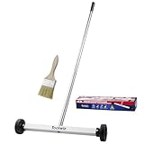
- Toolwiz 17-inch magnetic sweeper maintaining a load capacity of up to 8.8 pounds provides a perfect solution to the problem of clearing small ferrous metal objects, such as nails, tacks, bolts, and metal shavings from workshops or garage floors.
- Convenient and portable:17” is good for home, small workshop, or small yard as it is space-saving and more reachable for narrow areas. Perfect for collecting nails or small parts in the car, under the table, and in other nooks or crannies.
- Upgraded Handle Design: The handle features a sturdy, non-telescopic design to completely prevent slipping during use. By simply adding or removing the extension poles, the height can be adjusted to 3 different lengths: 18.9" (48 cm), 32.5" (82.5 cm), and 42.5" (108 cm) from ground to top. This customizable height helps prevent back bending and muscle strain, making your cleaning tasks effortless
- Flexible wheels: Upgrade wheel screws to avoid being too tight to spin or too loose. More comfortable 3-inch rubber wheels roll smoothly on carpet, grass, concrete, and hardwood floors. Just push and pull this rolling magnet-sweeper to pick up metal nails easily.
- Lightweight materials: The magnetic nail sweeper's compact and lightweight design makes the sweeping can be done anywhere you want, Push or pull it under the furniture, passing through the workshop floor, driveway, mud, grass, and gravel.
How can designers balance wayfinding with visual comfort?
Use a hierarchy. Keep ceilings, broad walls and long corridors in a restrained lightness range; reserve high contrast for the entrance, the next decision point, the stair edge, the handrail, the door, the sign and the control. Koch’s warning about “circus stripes” and CNIB’s warning against contrast at every turn describe the same failure mode: a space that demands attention everywhere gives users nowhere to rest.
In schools, a contrasting accent around a bright white writing or projection surface can create visual variety without turning the whole room into a saturated field. In healthcare and civic buildings, involve end users so cultural associations and sensory needs are represented. Avoid relying on red/green or blue/green coding; add labels, icons and position. A white toilet against a white room, a black sign on a dark wall, or a glossy lift interior can fail even when the nominal colors sound different.
What changes outdoors?
For streets and public spaces, color also affects heat and night lighting. The 2025 Buildings review synthesizes roof and pavement albedo increases of about 0.10–0.20 as a possible heat-rejection band, while warning that brighter pavement can raise pedestrian radiant temperature in some conditions. It describes warm night lighting at or below 3000 K with color-quality, glare and spill limits. These are evidence-based review bands, not replacements for an energy code, lighting ordinance or glare analysis.
The same review recommends conservative identification and wayfinding bands around ΔE00 18–25 and Weber or Michelson contrast of roughly 0.4–0.6, while emphasizing that they are aggregated research guidance rather than a single adopted code. Use them to frame options, then apply the local accessibility rule and validate the actual installation.
Also popular on Amazon

- APPLY TO MOST DRILLS : 6 pieces screw extractors work with any drill and all the screw size or bolt (3-12mm), These extractor tools are used to reverse the damaged screw counterclockwise until it is released
- The DIY Tools for Men-Men won't know they need screw extractor set until they have one! This screw extractor set is GIFTS WRAP AVAILABLE, can be gifted to your loved ones as it reflects a fresh trend with fun and practical. Amazing and Unique tool gifts for men women. The must have stocking stuffers for men, gifts for dad, husband, father, him, guy teens, adult, Boyfriend, son on Birthdays, Christmas, Fathers Day or anniversary. Perfect Holiday Gifts Guide
- HIGH QUALITY - This damaged screw remover tool kit is made from High-Speed Steel H.S.S 4341# , which have high hardness of 63hrc, it's durable and easily to remove any damaged screws.
- EASY TO USE: Just two simple steps to get the job done - drill a hole with a cutting size using the right size screw extractor and easily remove the screw or bolt using the removal tool Hardness 63-65HRC: Titanium hardened steel material, more durable than most screw extractors on the market, better hardness and durability than others, buy with confidence and complete peace of mind
- Cool Gadgets for Men Dad Christmas Birthday Gifts for Men and Women - Men won't know they need screw extractor sets until they have one! Every screw has the potential to rust and break, which can create a situation where it cannot be removed. Owning it, there will be no anxiety about rusty screws. This screw extractor set is GIFTS WRAP AVAILABLE, can be gifted to your loved ones as it reflects a fresh trend with fun and practical. Amazing and unique tool gifts for men women. A must have stocking stuffer for men on birthdays, Christmas, Father's Day or anniversaries, a gifts for dads, husbands, fathers, him, adults, boyfriends, sons. The best and most practical and surprising Christmas gifts
What should be in the final specification?
- A finish schedule with exact product identifiers, sheen and manufacturer LRV values.
- A plan marking every hazard, route decision point and user control that needs contrast.
- The named contrast metric, equation, lighter/darker convention and pass value for each jurisdiction.
- Redundant wayfinding cues: text, icons, tactile information, shape or position in addition to color.
- Mock-ups reviewed by representative users, including people with low vision, color-vision deficiency and sensory sensitivities.
- Field verification under occupied lighting, including daylight, glare and surface condition.
- A maintenance note covering repainting, dirt, replacement nosings, faded warning surfaces and mismatched batches.
The most useful reference book for this work is The Colour, Light and Contrast Manual: Designing and Managing Inclusive Built Environments (Wiley-Blackwell, 2010, ISBN 9781405195041), documented by CIBSE. Its contents cover color blindness, LRV, measuring, BS 8493:2008 and element guidance from walls and floors to signs, controls and hazards. It is a design reference, not a substitute for the adopted code.
Bottom line: specify contrast deliberately, not color mythology
Use hue to support a clearly defined experience, and treat red-versus-blue performance findings as limited task studies. Use measurable luminance contrast to make the building legible. Name the metric, exceed the minimum on critical elements where possible, add non-color cues, and verify the finished surfaces in real light. That approach is more defensible for code compliance and more useful to people who must navigate the building.
Recommended Free Tools
Frequently Asked Questions
What LRV difference should a door and wall have?
Some UK guidance summaries cite 30 LRV points for critical surfaces, with 20 as a lower best-practice floor; other jurisdictions specify a percentage using a different equation. Check the adopted local rule and write the metric explicitly rather than assuming every “30” means the same thing.
Are blue walls better for creativity than red walls?
The University of British Columbia study found blue cues produced twice as many brainstorming outputs as red cues in its screen-based protocol, while red improved detail tasks by up to 31 percent. It did not test painted offices, so the result should guide a small, task-specific accent rather than determine an entire building palette.
How should color-blind users be considered in wayfinding?
Avoid relying on red/green or blue/green pairs, which CNIB identifies as difficult combinations. Pair color with text, icons, shape, position or tactile information, and ensure a measurable lightness difference remains when the hues are viewed in grayscale.
What is the difference between a detectable warning and a stair nosing?
A detectable warning is a tactile surface identifying a hazard such as a curb or platform edge; California allows a specified yellow or a 70 percent visual-contrast alternative. A stair nosing marks each tread edge and is governed by separate dimensional and contrast provisions, such as the 50–75 mm strip described in the Australian guidance.

