A phone-friendly small-business website helps a visitor complete the next important task—understand your service, confirm that you serve their area, call, request a quote, book, or buy—without zooming, hunting, or correcting avoidable errors. The reliable way to achieve that is to inspect those tasks on a real phone, simplify the content and path to action, improve the existing responsive site where practical, then retest after every significant change.
What “easy to use on a phone” really means
Mobile usability is not just a page that shrinks until it fits the screen. A useful site lets someone act while holding a phone, often with one hand, in changing light and with limited time. The visitor should be able to answer a question and take the next step without horizontal scrolling, tiny controls, hidden contact details, or a form that rejects information without explaining why.
As an Amazon Associate I earn from qualifying purchases.
For a local contractor, that might mean seeing the services offered, checking the areas covered, viewing examples of completed work, calling from a job site, or requesting an estimate. For another small business it could be an appointment, a purchase, or a message. Judge every design decision by whether it makes the priority task clearer and more reliable.
Recommended Free Tools
Step 1: Identify the phone visitor’s main task
Write down the small number of actions that produce a useful customer outcome. Do this before changing colors, photographs, or a theme. Google’s starter guidance begins with testing a site and considering mobile customers; it also frames the build decision as either getting professional help or working independently.
#1 Best Overall

- Valued Carpenter Pencil Set: You will get 2 pcs solid carpenter pencils with 26 piece 2.8 mm refills, 1 replaceable sharpener, 1 plastic storage box.The complete carpenter pencils combination allows you to finish your work faster and more easily
- Deep Hole Marker Pencil: The deep-hole construction pencils adopts 45mm elongated tip design, which is more convenient to mark in the small hole or in other tight areas that other carpenter markers cannot reach
- Carpenter Pencils with Sharpener: The sharpener is screwed into the top of the work pencil, which won't get lost either. Built-in pencil sharpener that keep the lead with pointed and smooth to Improves line of sight in fine work
- Stronger Solid Lead: This work pencil is matched with a 2.8 mm thick lead , which is much thicker and stronger during the drawing process of construction work, it will not break or damage easily
- Marks on Various Surfaces: 3 colors solid construction pencil can marks on various surfaces,such as metal, plastic, wood, paper etc. Ideals for woodworkers, contractors, craftsmen, builders, merchants and masons
List the highest-value actions
- Understand the offer: Can a first-time visitor tell what you do in the opening screen?
- Check fit: Can the visitor confirm service areas, opening hours, project types, minimums, or other eligibility information?
- Make contact: Is there a visible phone number, message route, or email option that works from a phone?
- Request a quote or appointment: Can a person submit the minimum information needed to start a conversation?
- Buy or pay: If you sell online, can the customer complete the transaction and see confirmation?
Turn each action into a short test
Phrase each task as a sentence a customer could follow: “I need a roof repair in this service area; I want to call now,” or “I need an appointment next week; I want to request one.” A task is complete only when the expected result appears—for example, a call screen opens, a booking is confirmed, or a quote request produces a clear acknowledgement.
Step 2: Audit the current site on a phone
Use an ordinary phone, not only a desktop browser narrowed to a small window. Start from the home page and behave like a new customer. Record where you hesitate, mis-tap, lose context, or wonder what happens next.
Run this first-pass audit
- Load the home page on a cellular connection and wait for the first useful content.
- Identify the business and its primary service without pinching or scrolling through a large promotional panel.
- Open the menu, then close it. Check whether the menu is easy to find, readable, and usable with a thumb.
- Find the phone number, service area, hours, and primary call to action. Note how many screens of scrolling each requires.
- Open a representative service or project page. Check headings, photographs, captions, and any comparison or pricing information.
- Start the most important form, booking flow, or checkout. Enter realistic information, including a long name, a postal code, and a phone number.
- Submit it with one field intentionally incomplete to see whether the error identifies the field and explains the correction.
- Complete the task if possible and verify that a confirmation appears, an email arrives, or the requested call or booking state is obvious.
Keep a short issue log with the page, symptom, likely cause, and customer impact. “Phone number is below three promotional sections” is more actionable than “home page feels bad.” Fix high-impact task blockers before cosmetic details.
Quick wins for a faster PC:
Scan for outdated or missing drivers - takes under a minuteDriver Scan →Clear out junk files and repair common Windows errorsFree Scan →Fix the driver behind crashes, sound loss and screen glitchesFind Drivers →Step 3: Choose whether to fix, rebuild, use a builder, or hire help
Do not replace a working site merely because it is not fashionable. First determine whether its structure, content management system, and templates allow the changes your customer tasks require. A rebuild becomes sensible when routine edits are risky, the theme cannot reflow correctly, or essential forms and navigation cannot be made understandable.
| Route | Best fit | Advantages | Risks or limits |
|---|---|---|---|
| Improve the existing site | The current platform can change layout, content, forms, and images without custom work. | Least disruption; existing URLs, content, and analytics can remain in place. | Old templates, plug-ins, or page builders may constrain mobile behavior and slow future edits. |
| Rebuild with responsive design | The information architecture or template is the problem, not just a few pages. | One codebase can adapt presentation to screen size; Google describes responsive design as the easiest pattern to implement and maintain. | Requires planning redirects, forms, tracking, accessibility, and content parity before launch. |
| Hosted site builder | An owner needs to edit pages without managing servers or code. | Visual controls and hosting can make routine changes approachable. Some platforms provide a dedicated mobile editor; others document content that stacks vertically on many mobile views. | Check whether the editor exposes the exact navigation, form, speed, and accessibility controls your business needs. A general “mobile” claim is not proof that your pages work well. |
| Developer or designer | Tasks involve custom booking, quoting, payments, integrations, migration, or accessibility remediation. | Professional implementation can address structural and technical constraints while preserving business requirements. | You still need to supply priorities, approve content, and test the finished customer journeys; outsourcing does not remove that responsibility. |
Google also documents dynamic serving and separate mobile URLs, but those approaches add consistency and maintenance work. Unless a specific technical constraint requires them, a single responsive implementation is usually the simpler route. Ask any provider to demonstrate your real tasks on a phone, not just to show a responsive preview.
Rank #2

- Ergonomically Designed: Work in tight areas with a compact design that gets into tough spots
- Both tools are designed to fit into difficult to reach spaces
- Complete a wide range of applications with a high-performance motor that delivers up to 300 UWO, and an impact driver delivering up to 1,400 in-lbs of torque
- Both the DEWALT impact driver and drill driver feature integrated LED work lights with a convenient 20-second delay, ensuring enhanced visibility in dimly lit or challenging work areas
- One-Handed Loading - Keep one hand free with a 1/4 in. hex chuck that accepts 1 in. bit tips
Step 4: Make the layout reflow without losing essential information
Use narrow-screen reflow as a baseline
At narrow widths, ordinary text should remain readable without side-to-side scrolling. WCAG 2.2’s Reflow guidance explains a 320 CSS-pixel viewport for content in horizontal languages. That width is a criterion-specific test condition, not a particular phone model or a universal breakpoint. A single vertical column is common for reading-focused pages, but other arrangements are acceptable when users can read and operate the content without two-dimensional scrolling.
- Let text blocks, cards, tables, and images adapt to the available width.
- Stack columns when side-by-side content becomes cramped.
- Keep headings, buttons, and related explanations visually connected.
- Prevent images, maps, embedded documents, and code samples from forcing the whole page wider than the viewport.
- Remove decorative elements that push the phone number or primary action below unnecessary content.
Keep mobile content equivalent to desktop content
A mobile layout can look different while retaining the same essential information. Google allows space-saving patterns such as accordions and tabs, but says primary content should remain equivalent because indexing uses the mobile version. Do not hide service descriptions, location information, testimonials, prices, titles, metadata, structured data, or important images solely on phones. If a long section is collapsed, make its label clear and ensure it opens reliably.
Outdated Drivers Are Slowing You Down
One free scan finds every outdated or missing driver and matches the right update for your exact hardware.Free scan · exact hardware matchWindows Errors? Fix Them Before They Spread
Repair common Windows errors and clear accumulated junk for a smoother, more stable PC - no reinstall needed.Free scan · no reinstallDesign touch targets and focus states
Links and controls need enough separation that a thumb can activate one without hitting its neighbor. Use clear pressed, focused, and disabled states, and make the entire meaningful label clickable where appropriate. Avoid placing a small close icon at the edge of a banner where it is easy to miss. Test with increased text size and with a screen reader or keyboard navigation when possible; a visual fit alone does not establish accessibility.
Step 5: Simplify navigation and page content
Put the decision-making information first
The opening screen should establish what the business does, where it operates, and what the visitor can do next. Follow with proof and detail that help the decision: examples of work, process, credentials, service limitations, response expectations, and a direct contact option. Move background history and decorative galleries lower unless customers specifically need them first.
Make the menu predictable
Use familiar labels such as Services, Areas Served, Work, About, and Contact when they match your business. Keep the most important action visible in the header or immediately below it. Avoid a menu that opens only after a tiny icon is tapped, and do not make visitors guess whether “Solutions,” “Explore,” or a logo leads to the information they need.
Write for scanning
- Use one clear heading for each topic and short paragraphs beneath it.
- Put one idea or decision in each list item.
- State service areas and constraints plainly instead of burying them in prose.
- Caption project photographs so visitors understand the work shown.
- Use descriptive link text, such as “Request a roofing estimate,” rather than repeated “Learn more” links.
Do not remove useful information just to make a page shorter. Reorganize it, prioritize it, and use expandable sections when necessary while keeping the essential content available.
Rank #3

- 【Great Compatibility】This Katerk 1/4 inch hex shank bit holder is specifically designed for 1/4 inch hex shank drill bits. It's compatible with most 1/4 fast hex handles, hex sockets, various electric screwdrivers, and handheld screwdrivers. The bit holder makes it a valuable addition for any handyman.
- 【Secure and Safe】Built with a secure backup nut design, each drill bit holder securely locks onto your bits, ensuring they stay firmly in place. Additionally, our bit holder incorporates a high-quality steel ball rolling design that holds up to several kilograms of weight, ensuring your various drill bits don't fall off.
- 【Easy One-Handed Operation】The bit holder for impact driver allows you to change bits single-handedly, simplifying your workflow. Its multi-color design further allows for quick identification of the drill bit you need.
- 【Compact and Convenient】Thanks to its compact size, this 1/4 inch bit holder is easy to carry around. The bit holder allows for easy attachment to various tools, making this a convenient addition to your construction accessories. The Katerk bit holder is cast from high-quality alloy material, promising a long product lifespan. Despite its rugged strength, the bit holder remains lightweight, making it portable.
- 【Cool Christmas Gift For Men Stocking Stuffers】 This screwdriver bit holder, driver bit holder, impact bit holder, can be given as a gift to your loved one, especially for anyone involved in construction or electrical work. It's a must-have for stocking stuffers for men and women, tools gifts for dad, tech gadgets for men, gifts for dad, gifts for him, gifts for husband, gifts for boyfriend, cool gadgets for men, and cool gifts for dad.
Step 6: Remove friction from calls, forms, bookings, and checkout
Make contact immediate
On a phone, a telephone link should open the dialer and a message link should open the intended messaging or email action. Show the number as text as well, with hours or response expectations nearby. If calls are not appropriate for every visitor, provide a second route such as a short quote form; do not force a long form on someone who only needs to ask one question.
Design forms around the minimum useful information
Keep labels visible next to their fields rather than relying on placeholder text that disappears while typing. Mark required fields, but do not make optional information appear mandatory. Use meaningful field names and browser autocomplete for predictable details such as name, email, address, and telephone number. Set suitable input types so a phone or postal-code field can offer an appropriate numeric keypad.
Explain errors beside the field that needs correction. Preserve information that was entered correctly, describe the problem in plain language, and move focus to the first error when the technology supports it. “Enter a 10-digit phone number” is more useful than “Invalid input.”
Keep booking and quote requests focused
Ask only what staff need to respond or schedule the next step. If photos, measurements, or documents are useful but not essential, make them optional and explain accepted formats and limits. Show what happens after submission: a confirmation page, reference number, expected response time, or calendar result.
Make checkout recoverable
For online sales, keep the product, price, delivery or collection choice, and total visible as the customer progresses. Allow correction before payment, avoid surprising overlays, and provide a clear completion confirmation after the order. These practical controls come from Google’s older mobile shopping checklist; apply them as usability ideas, not as current numeric standards or a substitute for accessibility conformance.
Rank #4

- Long Nib and Deep Hole Marker: Our mechanical carpenter pencil with 45mm nib is designed for easy marking of deep holes or narrow areas. These construction pencils are the great choice for woodworking tools, construction tools, carpenter tools, contractor tools, wood carpentry tools and architect tools
- Extra Refills in 2 Colors for Versatile Marking: The construction mechanical pencil comes with 12 extra 2.8mm refills, including 6 red and 6 black refills. The black refill is suitable for light surfaces, while the red wax is perfect for dark surfaces. Our carpenter mechanical pencil makes sure that you'll have an ample supply for extended use
- Built-in Sharpener: Our construction pencil comes with a built-in sharpener to ensure the mechanical pencil tip is always sharp and ready for use. Never buy an extra pencil sharpener again. A great tool for any woodworker pencil, contractor pencils. The refill can easily be extended or retracted with a simple click of the pencils mechanical, allowing you to work more efficiently and accurately
- Portable Clip Design: Our deep hole construction pencil features a portable clip design, easy to carry and attach to your pocket or tool box, so that you can keep the carpenter pencils mechanical close at hand, making it a convenient tool to have on the go. Great gifts choice for carpenters
- Stronger Pencil Lead: The black refills are made of lead, sturdy and smooth. The red refills are made of wax, clear and light. These marking pencils are much thicker and stronger than normal pencils during the marking process of construction work, suitable for various surfaces, such as glasses, metal, boards, floors, walls, furniture, etc. The written marks can be easily wiped with a wet paper towel when needed
Step 7: Check speed and visual stability without treating scores as a promise
Performance affects whether people can begin and complete a task, especially on a congested cellular connection. Use current diagnostics to find problems, then fix the underlying cause: oversized hero images, render-blocking scripts, excessive third-party widgets, inefficient fonts, or a slow server.
| Core Web Vital | Google’s “good” target | What it helps you notice |
|---|---|---|
| Largest Contentful Paint (LCP) | Within 2.5 seconds after page load starts | How quickly the main visible content appears. |
| Interaction to Next Paint (INP) | Below 200 milliseconds | How promptly the page responds after a visitor taps, clicks, or types. |
| Cumulative Layout Shift (CLS) | Below 0.1 | Whether content jumps while a visitor is trying to read or tap. |
These targets are Google Search Central guidance updated in 2025. Core Web Vitals are used by ranking systems, but good scores alone do not guarantee a top search position. Google’s page-experience guidance says, “There is no single signal.” Consider secure delivery, mobile display, intrusive interstitials, distracting advertising, and whether the main content is easy to distinguish alongside the metrics.
Practical fixes to investigate
- Resize and compress photographs before uploading; serve an appropriately sized image for the phone layout.
- Reserve space for images, embeds, and banners so they do not push text and buttons around as they load.
- Remove scripts and widgets that do not support a customer task.
- Load below-the-fold media only when it is needed, while keeping the main content available quickly.
- Use HTTPS and review forms, payment pages, and third-party integrations for secure delivery.
Step 8: Use the right evaluation tools
Do not send anyone to Google’s retired Mobile-Friendly Test. Google retired that test, its API, and the Search Console Mobile Usability report beginning December 1, 2023. For current evaluation, use Chrome Lighthouse, available Search Console Core Web Vitals and HTTPS reports, an accessibility review, and hands-on customer-task testing.
Automated reports can identify likely issues, but they cannot tell you whether a homeowner understands your service area or whether a quote request asks for unnecessary detail. Treat a report as a diagnostic list to investigate, not as a certificate that the site is easy to use.
Step 9: Test the complete journey on real devices
Use a repeatable test script
- Choose at least one current phone and a cellular connection; test another phone or browser when your customers use a broad mix of devices.
- Start with no prior knowledge of the site. Find the service, area, hours, and primary action.
- Open and close navigation, rotate the device if relevant, and try the page with larger text settings.
- Tap every primary control once. Check that links, phone numbers, accordions, maps, and form controls respond as expected.
- Complete the main form, booking, or checkout with realistic data and verify the confirmation.
- Repeat after changing a theme, navigation label, form, image, payment integration, or major block of content.
Record failures by customer impact
- Blocker: The visitor cannot call, submit, book, pay, or reach the needed page.
- High friction: The task is possible but requires repeated zooming, backtracking, or guessing.
- Clarity issue: The visitor can act but cannot tell what a service, field, error, or confirmation means.
- Polish issue: Spacing, imagery, or animation could improve after task blockers are resolved.
Fix in that order. A visually impressive page that loses quote requests is less useful than a plain page with a dependable contact path.
Best Value
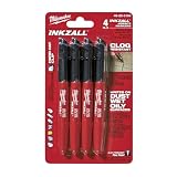
- Milwaukee Ink all Fine Point Marker, Black, 4 Per Pack
- 4 per pack Features Clog Resistant Marker Tip Writes through Dusty, Wet and Oily Surfaces Durable Marker Tip for Writing on Concrete, OSB and Rough Surfaces
- Clog resistant tip writes on dusty, wet and oily surfaces and is optimized for rough surfaces such as OSB, cinderblock and concrete
- Hard hat clip- attaches for easy access
- Quick dry time with reduced smearing and marking
Common mobile problems and specific remedies
The page is technically responsive but still feels hard to use
Responsive CSS can prevent overflow while leaving a confusing hierarchy. Put the value proposition and next action earlier, reduce competing calls to action, and test whether a new visitor can state what to do without an explanation from the owner.
The menu works, but visitors cannot find contact details
Expose the primary phone or message action in the header or first task-relevant section. Repeat it where a visitor naturally decides to act, such as after service details or a project example, without filling every screen with identical banners.
What’s actually slowing this PC down?
Pick the symptom - the matching free tool is one click away.
A form looks short but produces poor leads
Explain the information needed to provide a useful response, add a service-area or project-type choice when it prevents unsuitable submissions, and show the expected response time. Do not add fields simply because the system makes them available.
Images make the page slow or unstable
Resize them to their displayed dimensions, compress them, reserve layout space, and remove galleries that do not help a customer choose or trust the service. Keep essential images and descriptive context available on mobile.
Mobile and desktop versions disagree
Compare headings, service descriptions, locations, prices, structured data, and important images. If a mobile accordion or tab is used, verify that its contents are present and operable. Because Google indexes the mobile version, omissions can affect what search systems and visitors receive.
A maintenance routine that keeps the phone experience usable
Assign ownership for mobile checks rather than treating them as a one-time launch task. After publishing a change, run the main customer script and inspect the affected page on a phone. On a regular schedule, review analytics or support messages for abandoned forms, repeated questions, broken links, and calls that arrive without enough context. Those signals identify where the next usability improvement is likely to matter.
Free tools Windows power users keep installed
One-click scans. No signup required.
Keep a small release checklist covering navigation, phone and message links, forms, confirmation messages, service areas, image loading, HTTPS, and the primary conversion path. When a platform update or plug-in changes behavior, rerun the checklist before assuming the mobile experience is unchanged.
When a rebuild or professional help is justified
Seek a developer or designer when the existing platform cannot produce equivalent mobile content, when forms or payments require custom integration, when template changes repeatedly break desktop pages, or when your team cannot safely maintain the site. Bring a written task list, example customer questions, service areas, required integrations, and acceptance tests. Ask the professional to demonstrate the finished flows on a real phone and explain how you will edit routine content afterward.
A builder can be appropriate when the business needs dependable hosting and simple self-service editing. Compare platforms on the controls you will actually use: mobile editing, responsive stacking, form behavior, redirects, image handling, accessibility options, analytics, and export or migration paths. A platform’s documented capability is not independent evidence that your particular pages are usable, so test the completed site before committing.
Quick Recap
Final launch checklist
- The home page identifies the business, offer, service area, and next action quickly.
- Text and controls reflow at narrow widths without ordinary horizontal scrolling.
- Mobile content retains the essential information available on desktop.
- Navigation labels are familiar, visible, and usable with a thumb.
- Phone, message, quote, booking, and purchase paths match the business’s real priorities.
- Labels, required fields, autocomplete, input types, errors, and confirmations work as intended.
- Images and scripts do not create avoidable loading delays or layout jumps.
- HTTPS, Core Web Vitals diagnostics, accessibility review, and current Search Console reports have been checked.
- A person has completed the main customer task on an actual phone after the latest significant edit.
Product prices and availability are accurate as of the date/time indicated and are subject to change. Any price and availability information displayed on Amazon at the time of purchase will apply.
Do these 3 things before closing this tab:
1Scan for outdated or missing drivers - takes under a minute2Repair Windows errors before they cause bigger problems3Fix the driver behind crashes, sound loss and screen glitches
