Recommended Free Tools
Simplicity in the built world is not a blank façade or a shortage of detail. It is a place that people can understand, navigate, use, access and care for without unnecessary effort. The most reliable way to create it is to make routes, scale, visual cues, building relationships and long-term stewardship coherent—while still responding to local character and changing needs.
What simplicity means in a built place
A simple place gives people a clear mental model. They can tell where the main route goes, which streets are quieter, where a destination lies and how different spaces connect. They do not have to decode a maze of signs, leftover spaces or competing visual signals.
As an Amazon Associate I earn from qualifying purchases.
The UK National Design Guide defines legibility as “how easy it is for people to find their way around,” while also including how memorable a place is. That definition is useful because it treats simplicity as a practical outcome rather than a visual style. A highly decorated building can still be easy to understand; a minimalist one can be confusing if its entrance, circulation and surroundings are unclear.
What’s actually slowing this PC down?
Pick the symptom - the matching free tool is one click away.
Legibility operates at several scales:
- Building: entrances, stairs, lifts and shared facilities are visible or intuitively located.
- Block and street: routes connect logically, with a recognizable hierarchy between primary and secondary streets.
- Neighborhood: destinations, public spaces and transit stops relate to one another instead of functioning as isolated objects.
- Daily operation: cleaning, repairs, servicing and future alterations can be carried out without undermining the original logic.
The result should feel straightforward, not generic. The same guide asks designers to understand local context and character. Compact form and density must relate to accessibility, building type, landscape and the existing pattern of streets and spaces.
#1 Best Overall

- Valued Carpenter Pencil Set: You will get 2 pcs solid carpenter pencils with 26 piece 2.8 mm refills, 1 replaceable sharpener, 1 plastic storage box.The complete carpenter pencils combination allows you to finish your work faster and more easily
- Deep Hole Marker Pencil: The deep-hole construction pencils adopts 45mm elongated tip design, which is more convenient to mark in the small hole or in other tight areas that other carpenter markers cannot reach
- Carpenter Pencils with Sharpener: The sharpener is screwed into the top of the work pencil, which won't get lost either. Built-in pencil sharpener that keep the lead with pointed and smooth to Improves line of sight in fine work
- Stronger Solid Lead: This work pencil is matched with a 2.8 mm thick lead , which is much thicker and stronger during the drawing process of construction work, it will not break or damage easily
- Marks on Various Surfaces: 3 colors solid construction pencil can marks on various surfaces,such as metal, plastic, wood, paper etc. Ideals for woodworkers, contractors, craftsmen, builders, merchants and masons
Why legibility matters to construction and development
Clear organization reduces friction for residents, visitors, staff, delivery workers and emergency services. It can shorten the time needed to find an entrance, reduce missed turns and make public spaces feel safer because people understand where they are and where they can go next.
Legibility also supports inclusive use. Someone with low vision may depend on contrast, tactile information and consistent routes. A wheelchair user needs a continuous, reasonably direct path rather than a nominally accessible entrance hidden behind a service yard. A person with cognitive limitations benefits from fewer decisions, repeated cues and destinations that are easy to recognize.
Simplicity is a stewardship issue as well as a first-impression issue. The National Design Guide calls for places that are robust, easy to use and look after, and adaptable to changing needs and technology. A sign system that only works when every panel is pristine is not simple in operation. Nor is a building whose plant, access or drainage cannot be maintained without disruptive reconstruction.
PC Slower Than It Used to Be?
A free scan shows the junk files, broken settings and background clutter dragging Windows down - then fixes them in one click.Free scan · Windows 10 & 11Outdated Drivers Are Slowing You Down
One free scan finds every outdated or missing driver and matches the right update for your exact hardware.Free scan · exact hardware matchThe American Institute of Architects has introduced a framework that attributes nearly 40% of greenhouse-gas emissions to architecture. The estimate should be treated as an attributed figure rather than a universal, date-specific measurement because the underlying reference and year are not identified here. Its practical implication is still clear: extending service life, enabling reuse and avoiding needless complexity can reduce the environmental burden of repeated work.
Build a route structure people can read
Start with a clear hierarchy
Building for a Healthy Life, 2026 edition, recommends direct streets and a simple hierarchy. A primary route should be distinguishable from a quieter residential or service street through alignment, width, activity, landscape or frontage—not through an ever-growing taxonomy of street types.
Before fixing building footprints, draw the routes that people will actually use. Test the shortest reasonable path between homes, entrances, transit, shops, schools, parks and community facilities. If a route is technically present but forces a long detour, crosses a service area or disappears at a block edge, the plan is not simple from the pedestrian’s perspective.
Rank #2

- Ergonomically Designed: Work in tight areas with a compact design that gets into tough spots
- Both tools are designed to fit into difficult to reach spaces
- Complete a wide range of applications with a high-performance motor that delivers up to 300 UWO, and an impact driver delivering up to 1,400 in-lbs of torque
- Both the DEWALT impact driver and drill driver feature integrated LED work lights with a convenient 20-second delay, ensuring enhanced visibility in dimly lit or challenging work areas
- One-Handed Loading - Keep one hand free with a 1/4 in. hex chuck that accepts 1 in. bit tips
Connect rather than isolate
Buildings should be designed as parts of blocks, streets and open spaces. A freestanding building with a handsome entrance can still produce a confusing place if adjacent paths terminate at blank walls or parking edges. Align entrances and crossings with the wider network, and make the transition from public to shared to private space apparent.
Do these 3 things before closing this tab:
1Clear out junk files and repair common Windows errors2Fix the driver behind crashes, sound loss and screen glitches3Repair Windows errors before they cause bigger problemsSupport walking and cycling where practical. A connected network gives people alternatives when a route is busy, closed or unsuitable for a particular mobility aid. It also makes a neighborhood easier to learn because each path relates to another instead of ending unexpectedly.
Use views, landscape and landmarks
Building for a Healthy Life identifies landmarks, landscape and framed views as orientation aids. A distinctive civic building, a line of trees, a visible tower, a change in topography or a framed view toward a park can tell people where they are without adding more signs.
Use these cues deliberately. A landmark should be visible from the routes that need orientation, not hidden behind unrelated massing. Landscape features should survive ordinary maintenance. A tree that is central to the wayfinding concept but has no viable soil volume or irrigation plan is a short-lived cue.
Design wayfinding from the pedestrian’s perspective
The Global Designing Cities Initiative states that wayfinding systems should encourage walking and transit use by providing multimodal information and adopting the pedestrian perspective. That means deciding where information is needed while walking, not merely placing a map at the property entrance.
Free tools Windows power users keep installed
One-click scans. No signup required.
Place information at decision points
Install directional information before a turn, at a fork, near a destination and where a route changes character. A sign that appears only after a junction cannot help someone choose the correct path. Show walking times or distances when they are reliable, and include transit, cycling and accessible-route information where relevant.
Rank #3

- 【Great Compatibility】This Katerk 1/4 inch hex shank bit holder is specifically designed for 1/4 inch hex shank drill bits. It's compatible with most 1/4 fast hex handles, hex sockets, various electric screwdrivers, and handheld screwdrivers. The bit holder makes it a valuable addition for any handyman.
- 【Secure and Safe】Built with a secure backup nut design, each drill bit holder securely locks onto your bits, ensuring they stay firmly in place. Additionally, our bit holder incorporates a high-quality steel ball rolling design that holds up to several kilograms of weight, ensuring your various drill bits don't fall off.
- 【Easy One-Handed Operation】The bit holder for impact driver allows you to change bits single-handedly, simplifying your workflow. Its multi-color design further allows for quick identification of the drill bit you need.
- 【Compact and Convenient】Thanks to its compact size, this 1/4 inch bit holder is easy to carry around. The bit holder allows for easy attachment to various tools, making this a convenient addition to your construction accessories. The Katerk bit holder is cast from high-quality alloy material, promising a long product lifespan. Despite its rugged strength, the bit holder remains lightweight, making it portable.
- 【Cool Christmas Gift For Men Stocking Stuffers】 This screwdriver bit holder, driver bit holder, impact bit holder, can be given as a gift to your loved one, especially for anyone involved in construction or electrical work. It's a must-have for stocking stuffers for men and women, tools gifts for dad, tech gadgets for men, gifts for dad, gifts for him, gifts for husband, gifts for boyfriend, cool gadgets for men, and cool gifts for dad.
Make signs readable at human scale
- Use type large enough to read at the expected approach distance.
- Provide strong contrast between lettering, background and surrounding surfaces.
- Keep wording short and use the same destination names throughout the site.
- Position signs so parked vehicles, planting, doors or crowds do not obscure them.
- Scale mounting heights and panel depths to people walking or using wheelchairs, rather than to drivers alone.
The Global Designing Cities Initiative also recommends braille in relevant locations. Tactile information is most useful when it is consistently positioned and paired with a route that is actually accessible. A braille panel beside a flight of steps, with no nearby lift or ramp, does not create inclusive wayfinding.
Coordinate signs with the architecture
Wayfinding should reinforce the spatial logic rather than compensate for its absence. Repeated sign colors, symbols and destination names can help, but a proliferation of arrows usually signals that the underlying routes need review. Coordinate signs, lighting, paving, entrances and sightlines so that each confirms the others.
Make simplicity inclusive by design
Building for a Healthy Life calls for navigation features that account for visual, mobility and cognitive limitations. Apply that requirement at the beginning of site planning, not as a late compliance exercise.
For visual access
Provide consistent contrast at doors, steps, kerbs and changes in level. Avoid glare that makes signs unreadable. Use tactile or textured cues where they clarify a boundary, and keep obstacles out of the predictable walking line. Lighting should reveal edges and destinations without creating sharp reflections or deep shadow.
For mobility access
Keep accessible routes continuous, direct and free from movable furniture, delivery activity and drainage failures. Check gradients, turning areas, door widths, lift locations and crossing surfaces as one system. A ramp that reaches a locked side entrance is not a usable route.
For cognitive access
Reduce the number of choices at each decision point. Repeat the same names, symbols and color associations. Make transitions visible: a change from public street to shared courtyard should be understandable through gates, paving, lighting or frontage rather than an unexplained break.
Rank #4

- Long Nib and Deep Hole Marker: Our mechanical carpenter pencil with 45mm nib is designed for easy marking of deep holes or narrow areas. These construction pencils are the great choice for woodworking tools, construction tools, carpenter tools, contractor tools, wood carpentry tools and architect tools
- Extra Refills in 2 Colors for Versatile Marking: The construction mechanical pencil comes with 12 extra 2.8mm refills, including 6 red and 6 black refills. The black refill is suitable for light surfaces, while the red wax is perfect for dark surfaces. Our carpenter mechanical pencil makes sure that you'll have an ample supply for extended use
- Built-in Sharpener: Our construction pencil comes with a built-in sharpener to ensure the mechanical pencil tip is always sharp and ready for use. Never buy an extra pencil sharpener again. A great tool for any woodworker pencil, contractor pencils. The refill can easily be extended or retracted with a simple click of the pencils mechanical, allowing you to work more efficiently and accurately
- Portable Clip Design: Our deep hole construction pencil features a portable clip design, easy to carry and attach to your pocket or tool box, so that you can keep the carpenter pencils mechanical close at hand, making it a convenient tool to have on the go. Great gifts choice for carpenters
- Stronger Pencil Lead: The black refills are made of lead, sturdy and smooth. The red refills are made of wax, clear and light. These marking pencils are much thicker and stronger than normal pencils during the marking process of construction work, suitable for various surfaces, such as glasses, metal, boards, floors, walls, furniture, etc. The written marks can be easily wiped with a wet paper towel when needed
Respond to local character without becoming complicated
Simple design is not a universal visual formula. The National Design Guide places local context and character at the center of good design. Materials, roof forms, setbacks, landscape patterns and building heights should be derived from the site’s conditions and the way its surroundings work—not copied as decorative references.
Context-sensitive simplicity can mean fewer materials in one project and a carefully layered palette in another. In a historic town, preserving a familiar street line may make a new building easier to understand. In a suburban setting, a clear public path and a strong civic landmark may matter more than matching every façade detail.
Density should be judged in relation to accessibility, building type and character. Compact form can shorten journeys and support services, but excessive height, overshadowing or blank podiums can make routes harder to read. Test the experience from eye level as well as from a plan or aerial view.
Independent reader supportYour contribution helps us test, update, and keep practical guides available for everyone.Design for upkeep, adaptation and a long service life
Stewardship is part of simplicity. Select assemblies that can be inspected, repaired and replaced without dismantling unrelated work. Keep plant rooms, drainage runs, access panels and waste routes understandable to the people who operate the building.
Plan for change. Ground-floor rooms may need to accommodate different uses; digital signs may fail or become obsolete; household and mobility patterns may shift. Provide a durable physical hierarchy that still works when technology is unavailable. A mobile app can supplement a legible route, but it should not be the only way to find an entrance.
Write maintenance responsibilities into the project brief. Identify who trims landmark planting, cleans tactile surfaces, updates destination names and checks lighting. If no party owns those tasks, the original simplicity will erode.
Best Value
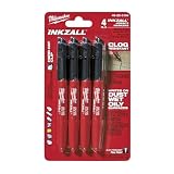
- Milwaukee Ink all Fine Point Marker, Black, 4 Per Pack
- 4 per pack Features Clog Resistant Marker Tip Writes through Dusty, Wet and Oily Surfaces Durable Marker Tip for Writing on Concrete, OSB and Rough Surfaces
- Clog resistant tip writes on dusty, wet and oily surfaces and is optimized for rough surfaces such as OSB, cinderblock and concrete
- Hard hat clip- attaches for easy access
- Quick dry time with reduced smearing and marking
A practical design process
- Map users and destinations. List residents, visitors, staff, deliveries, emergency access and people with visual, mobility or cognitive limitations. Mark every destination they need to reach.
- Draw the primary routes first. Test direct connections between destinations. Separate main movement corridors from quieter streets without creating unnecessary categories.
- Locate orientation cues. Identify useful views, landscape features, public spaces and potential landmarks. Confirm that each is visible from the decisions points where it is needed.
- Set the pedestrian information plan. Place signs, maps and tactile information before turns and at destination thresholds. Check reading distance, mounting height, contrast and obstruction.
- Test inclusive journeys. Walk or wheel the routes at different times and in different weather. Check gradients, crossings, glare, noise, crowding, doors, lifts and temporary obstructions.
- Coordinate buildings and open space. Align entrances, frontage, lighting, paving, planting and drainage so the public-to-private sequence is clear.
- Audit maintenance and adaptation. Review access to equipment, replacement of signs, planting care, cleaning, future technologies and likely changes of use.
- Compare alternatives with the people who will use them. Record where each option improves or weakens orientation, access, local fit, connectivity and long-term care.
How to compare competing design approaches
No official source establishes a universal score or a single winning style. A useful comparison asks the same questions of every option and records trade-offs openly.
| Decision factor | Questions to ask | Evidence to check |
|---|---|---|
| Route legibility | Can a first-time visitor identify the main route, destination and next decision point? | Plans, eye-level views, walk-throughs and timed route tests |
| Accessibility | Can people with visual, mobility or cognitive limitations complete the journey independently? | Gradients, surfaces, contrast, tactile information, lift and door layouts |
| Local fit | Does the proposal strengthen the site’s character without relying on imitation? | Street pattern, scale, materials, landscape and community feedback |
| Connectivity | Does it support walking, cycling and transit, with useful alternatives when a route is closed? | Network diagrams, crossing locations, cycle links and transit connections |
| Durability and maintenance | Will the logic survive wear, staff changes, new technology and altered uses? | Maintenance access, replacement schedules, adaptable rooms and operating responsibilities |
Use the table as a decision record, not a pseudo-precise numerical ranking. An option with the clearest route may require more landscape maintenance; a compact plan may improve walking distances but need careful treatment of height and shade. The right choice is the one whose compromises are understood and manageable for this site.
Common failure modes and corrections
Too many street categories
Symptom: residents and visitors cannot tell which route is primary. Correction: simplify the hierarchy and reinforce it through alignment, activity, landscape and frontage.
Signs added after construction
Symptom: arrow boards multiply because entrances and paths are hard to see. Correction: revisit sightlines, destination placement and public-to-private transitions before adding more information.
A landmark that cannot be maintained
Symptom: planting dies, lighting fails or a feature becomes obscured. Correction: assign an owner, provide access and select robust materials and species during design.
Accessibility at a secondary entrance
Symptom: the accessible route is longer, less visible or passes through service space. Correction: integrate the accessible path with the principal arrival sequence and repeat its cues.
Minimal appearance, complex operation
Symptom: concealed equipment, custom finishes or proprietary controls make repairs difficult. Correction: judge simplicity by operation and adaptability, not by the number of visible details.
The Tool Desk
Outbyte Driver Updater FREEScan for outdated or missing drivers - takes under a minuteDriver Scan →Outbyte PC Repair FREEClear out junk files and repair common Windows errorsFree Scan →What success looks like
A successful simple place lets a newcomer form a reliable mental map after a short walk. Main routes are obvious, quieter routes feel intentional, destinations are named consistently and useful views or landscape features confirm progress. People using different mobility and sensory strategies can share the same coherent network rather than being diverted into a hidden parallel system.
The 2026 Building for a Healthy Life guidance, the UK National Design Guide and the Global Designing Cities Initiative converge on that practical standard: make movement understandable, information human-scaled, access inclusive and the whole arrangement durable. Simplicity is achieved when those decisions reinforce one another and remain workable years after handover.
Quick Recap
Product prices and availability are accurate as of the date/time indicated and are subject to change. Any price and availability information displayed on Amazon at the time of purchase will apply.

