Do these 3 things before closing this tab:
1Repair Windows errors before they cause bigger problems2Fix the driver behind crashes, sound loss and screen glitches3Clear out junk files and repair common Windows errorsChoose exterior colors for the house you have, in the coastal region where it stands—not from a one-size-fits-all blue-and-white formula. Start with the roof, masonry, landscape and neighboring homes; then select a body color, trim and a few accents that work with those fixed elements. Treat paint collections as idea starters, and check real samples on the house before committing.
What makes an exterior palette feel coastal?
Coastal style is less about one signature color than a relationship between colors and setting. The region, the house’s architecture and materials, and the surrounding landscape all affect whether a palette feels at home. A coastal house does not need blue siding, white trim or nautical accents to read as coastal.
| # | Preview | Product | Price | |
|---|---|---|---|---|
| 1 |

|
Sherwin Williams Colors collection Deck Complete Paint Colors | $35.00 | Buy on Amazon |
| 2 |
|
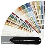
Benjamin Moore Collections Fan Deck | $33.99 | Buy on Amazon |
| 3 |
!['BENJAMIN MOORE' CLASSIC COLORS FAN DECK [CASE OF 1]](https://m.media-amazon.com/images/I/41Xq67AO80L._SL160_.jpg)
|
"BENJAMIN MOORE" CLASSIC COLORS FAN DECK [CASE OF 1] | $48.57 | Buy on Amazon |
| 4 |

|
280 Color Paint Sample Cards for Renovation Planning and Walls | $24.29 | Buy on Amazon |
As an Amazon Associate I earn from qualifying purchases.
Regional examples show why a single formula falls short. Sherwin-Williams describes Northern Shores and Seaports with softened traditional colors, including slate blue, dusty red and subdued gray-green. Its Southern Shores and Beaches palette leans toward sun-washed tones. These are different directions for inspiration, not rules that every northern or southern home must follow. See Sherwin-Williams’ residential exterior palettes.
Before choosing individual paint colors, decide which broad character suits the property: muted maritime, warmer and sun-washed, or mostly neutral with a restrained coastal accent. Then test that direction against the house and its surroundings.
#1 Best Overall
Think of “coastal” as a starting point for narrowing options, not a checklist of colors every beach-area home must use. A regional palette can suggest the mood, while the home’s existing finishes determine which particular shades make sense. Two houses near the same shoreline may call for different schemes because their roofs, masonry, landscape and neighboring context differ. The useful question is not simply “Is this color coastal?” but “Does this combination suit this house and its setting?”
Compare three useful palette directions
Use these directions to narrow your search, not as ready-made prescriptions. The right choice depends on what the home’s fixed finishes and setting can support.
| Palette direction | Starting point | What to check on the house |
|---|---|---|
| Muted maritime | Softened traditional hues such as slate blue, dusty red and subdued gray-green, described in Sherwin-Williams’ Northern Shores and Seaports palettes | Whether the muted colors sit comfortably beside the roof, masonry, landscape and nearby homes |
| Sun-washed | The warmer, sun-washed character in Sherwin-Williams’ Southern Shores and Beaches description | Whether the light and warmth work with the fixed finishes and the home’s setting |
| Neutral with a coastal accent | A restrained accent against a neutral body-and-trim scheme; one manufacturer example pairs Perfect Greige SW 6073 body, Pure White SW 7005 trim and Naval SW 6244 accent | Whether the accent belongs on a door, shutters or another limited area, and whether all three colors complement the permanent materials |
The third row is an example of assigning colors to roles, not a recommendation for every house. Sherwin-Williams’ displayed combination can be a useful prompt, but its fit must be judged against the actual site and finishes. View the coastal exterior combination.
Recommended Free Tools
When comparing directions, use the same questions for each one. Does it have the regional character you want? Does it harmonize with fixed roof and masonry colors? Is the difference between body, trim and accent comfortable for the home? Does it sit appropriately beside nearby homes and landscape? Finally, does the actual sample look right at the house? Comparing candidates on these same axes helps prevent a compelling color name or attractive online image from carrying too much weight.
Start with what will not be painted
Before looking at paint chips, make an inventory of the visible materials and colors that are likely to stay. Benjamin Moore advises factoring existing brick, stone and roofing into exterior color selection. Extend that check to other prominent fixed features so a new palette does not treat the walls as if they were the entire exterior. Benjamin Moore’s exterior color guidance also points homeowners to landscape and neighboring schemes as considerations.
Record the fixed elements
- Roofing, including its dominant color and whether it reads warm, cool or neutral in daylight.
- Brick, stone, masonry and the foundation that will remain exposed.
- Prominent walkways and other permanent hardscape near the house.
- Large or visually dominant landscape colors, including mature planting that frames the exterior.
- Windows, garage doors and other large components that may remain their current color.
Take photographs in daylight and note what is actually staying. A small sample viewed alone can look compatible while clashing with a large roof or expanse of masonry. Think about the visual area each fixed material occupies, not just whether its color seems attractive on its own.
It can help to separate the inventory into two lists: items that are definitely staying and items that may be changed as part of the project. Keep the first list in view while evaluating every paint candidate. If a garage door, window or foundation will remain its current color, it is part of the palette whether or not you initially thought of it as a color choice. Likewise, a walkway or large area of stone can have enough visual presence to affect how the body color reads.
Free tools Windows power users keep installed
One-click scans. No signup required.
Do not try to make every fixed element disappear by matching it exactly. Instead, ask whether the proposed body, trim and accents feel coordinated with those materials as a group. A scheme that works with the roof and masonry may be a stronger choice than one that looks ideal on a single paint chip but leaves a permanent feature feeling unrelated.
Read the neighborhood and the landscape
Walk around the property and look at the house from the places where it will usually be seen: the street, the approach and the main outdoor living areas. Note the dominant colors in the landscape and the neighboring homes. The goal is not necessarily to match the neighbors. It is to understand the visual context so the proposed palette feels considered rather than disconnected.
Rank #2
- Brand: Benjamin moore
- Container type: Box
- Finish type: Opa
Look for repeated cues rather than copying one nearby house: subdued or bright colors, warm or cool neutrals, and the amount of contrast between walls and trim. The setting can help you choose between a quiet, blended palette and one with a more noticeable accent. Local design rules, historic-district requirements and HOA restrictions may also affect what you can select; confirm the rules that apply to your property before finalizing colors.
Consider the view at more than one scale. From farther away, the body color and the overall contrast between walls and trim may dominate. Closer to the entry, a door or shutter accent may be more noticeable. This is another reason to evaluate a palette as a whole: the different color roles appear together, but they do not all occupy the same amount of visual space.
Choose colors by role: body, trim and accents
Build the scheme as a small system, not a collection of favorite paint names. The body covers the largest area, so it establishes the overall character. Trim defines edges and openings. Accents draw attention to selected details such as a front door or shutters. Benjamin Moore recommends considering the main surface, trim and accents together, and notes that many homeowners use three to four exterior colors. Its exterior guidance is a useful reference for thinking about the roles as a group.
Body color
Choose the body color after considering the roof, masonry and overall regional direction. Because it covers the most surface, a color that looks subtle on a small chip can have a much stronger effect across a wall. Decide whether the body should blend with the fixed materials or provide a clear contrast; then test it outside rather than relying on its name or a screen image.
Ask whether the body color is doing the job you want across the whole home. It may provide a quiet background for existing stone or brick, or establish a more visible color direction. Neither approach is automatically more coastal. What matters is how that broad field works with the unpainted elements and whether the rest of the scheme supports it.
Trim color
Trim can soften or sharpen the outline of the house. A lighter trim may create a familiar coastal contrast, but bright white is not automatically the best partner for every roof, stone or body color. Compare trim candidates alongside the body color and the finishes next to the trim, including windows and doors that will not be repainted.
Also decide how much contrast you want between the trim and body. If the distinction is strong, the trim can become a prominent part of the overall look; a quieter relationship can make the scheme feel more blended. Judge that contrast in the context of the home’s existing openings and materials, rather than selecting trim in isolation.
Accent color
Use accents selectively. A door or shutters can supply color without requiring the body to carry the entire scheme. If more than one accent is planned, check that those details work with each other and with the trim. A strong accent can be effective on a limited area but overpowering when repeated across many features.
Give every accent a clear purpose. If an accent is meant to draw attention to an entry, consider whether repeating it on shutters or another feature would reinforce that idea or spread the color too widely. The aim is not to maximize the number of colors. It is to make the body, trim and accents read as a coordinated set. Three or four colors may be common, but a homeowner should use only the roles that make sense for the particular exterior.
Rank #3
- Very good condition
- Benjamin Moore Classic Colors Fan Deck
- Classic Colors
- Includes the American Classic Colors (AC)
Use named coastal colors as starting points
Manufacturer collections are useful for discovering candidates, but their names do not tell you exactly how a shade will look on your home. Benjamin Moore’s coastal collection includes Ocean Air 2123-50, Chantilly Lace OC-65, Linen White OC-146, Windham Cream HC-6, Natural Linen 966 and Quiet Moments 1563. Consider these options as prompts to explore a direction; none is a universal answer for coastal architecture. Browse Benjamin Moore’s coastal paint colors.
PC Slower Than It Used to Be?
A free scan shows the junk files, broken settings and background clutter dragging Windows down - then fixes them in one click.Free scan · Windows 10 & 11Outdated Drivers Are Slowing You Down
One free scan finds every outdated or missing driver and matches the right update for your exact hardware.Free scan · exact hardware matchAs you compare candidates, ask whether the color supports the regional character you chose, coordinates with permanent materials, and makes sense in its intended role. A color name can help you find a sample; it cannot account for your roof, the light at your site, nearby homes or the amount of paintable wall.
Use a collection to discover possibilities, then filter them through the same practical checks you use for any other candidate. A shade included in a coastal collection is not automatically right for a northern or southern setting, or for a particular house. The regional descriptions offer different moods, while the home’s fixed finishes and surroundings help determine which individual color is a good fit.
Test the actual colors before ordering paint
Color shown on a screen or printed page can differ from actual paint. Benjamin Moore explicitly cautions that screen and printed representations may vary, so use online palettes to discover ideas rather than to make the final call. Review that guidance.
- Shortlist a few candidates. Narrow the field to colors that fit your chosen regional direction and do not conflict with the fixed finishes.
- Get physical color references. A fan deck is one optional way to compare shades in person; Sherwin-Williams lists fan decks among its color tools. Check the current listing and confirm that any deck you choose is relevant to the paint products you are considering. See the color tools listed with its exterior palettes.
- View candidates at the house. Compare samples in their intended locations and against nearby fixed materials. Check them in the conditions in which the surfaces will be seen, rather than making a decision from a sample indoors or on a screen.
- Judge the complete combination. Look at the body, trim and accent choices together. A color that works alone may not work beside the proposed trim or an existing window, roof or masonry color.
- Commit only after the on-site comparison. If the sample does not fit the house or setting, revise the candidate before moving to the full project.
This process is about visual fit, not coating performance. A color palette page cannot establish whether a particular paint system is suitable for a specific substrate or exposure. Confirm product compatibility and application requirements with the relevant manufacturer and project professional before choosing materials.
The Tool Desk
Outbyte PC Repair FREERepair Windows errors before they cause bigger problemsFix Now →Outbyte Driver Updater FREEFix the driver behind crashes, sound loss and screen glitchesFind Drivers →Keep the shortlist manageable and compare like with like: each possible body color should be viewed with the trim and accents being considered for it. If you change the body candidate, reassess the other roles instead of assuming that the former trim and accent will still work. This simple discipline makes it easier to identify whether a concern comes from one color or from the combination.
When a candidate looks different on the house than it did in a catalog or on a screen, trust the on-site comparison over the representation. The point of a fan deck or online collection is to help you find a direction and compare options, not to substitute for seeing actual samples against the home. If the result feels wrong in the setting, return to the shortlist and test another candidate rather than trying to justify a mismatch by its name.
Independent reader supportYour contribution helps us test, update, and keep practical guides available for everyone.Check project rules and material suitability
Color selection can be affected by conditions specific to the property. Check local design requirements, historic-district controls and HOA rules with the authority or organization responsible for them. Do not assume that a palette shown in a manufacturer collection is permitted for your home.
Likewise, do not infer salt-air, ultraviolet, wind or moisture durability from a color-inspiration page. The appropriate coating system depends on the substrate and the conditions at the site. Consult the product’s technical documentation and the manufacturer about suitability for the particular surface and project; the color guidance cited here does not establish a universal coastal performance rule.
What’s actually slowing this PC down?
Pick the symptom - the matching free tool is one click away.
Rank #4
- Broad appeal: from professional designers to homeowners, the wall shade comparison card serves as a full spectrum palette and matching tool for diverse home decor palette sheet projects,wall coating reference sheet,residential paint Color chart
- Diverse color options: the 280 wall decoration color card is ideal for matching house coating palette, ensuring the wall tone comparison chart meets every architectural and residential requirement,exterior paint color chart,true color sample sheet
- Compact for portability: the bendable shade color card offers easy transportation and storage, making it the perfect DIY color matching card for decorators and professionals,vivid color display card,wall decoration color card
- Accurate color reproduction: crafted from paper and plastic materials, the indoor wall coating card vividly portrays each tone, providing a true color sample sheet for reliable building renovation chart use,wall coating shade chart,building wall tone Color chart
- Portable convenient: designed as a portable paint palette, this lightweight paint color chart is ideal for decorators and contractors who need paint comparison or DIY color matching card solutions,house paint selection card,house building color card
Separate approval questions from color-preference questions. First identify whether a local authority, historic district or HOA has requirements that apply; then choose among colors that can be used for the property. Separately, confirm with the product manufacturer that the paint system and application instructions suit the actual substrate and project conditions. Color selection guidance alone does not answer either home-specific question.
Common mistakes to avoid
- Choosing from a formula. Blue siding and white trim may be familiar, but they are not the only coastal direction. Regional inspiration includes muted traditional hues and sun-washed tones, as well as neutral schemes with limited accents.
- Ignoring fixed finishes. A paint choice has to live beside roofing, brick, stone, foundation materials, windows and other features that may stay. Assess those elements before settling on a body color.
- Picking each color separately. A body, trim and accent can look appealing individually and still clash as a combination. Assign roles and compare them together.
- Trusting a screen or printed image as the final sample. Representations can vary from actual paint. Use them to shortlist, then check physical references and samples at the home.
- Assuming an inspiration page settles performance or permission. Manufacturer palettes do not establish coating suitability for every substrate or exposure, or whether a color is allowed by local or HOA rules. Verify those specifics separately.
A final selection checklist
- Does the palette suit the coastal region and the character you want, rather than relying on a generic blue-and-white formula?
- Have you considered the roof, brick, stone, foundation, walkways, windows and other elements that will stay?
- Does the scheme make sense alongside the landscape and neighboring homes?
- Are body, trim and accents assigned clear roles and considered together?
- Have you checked applicable local or HOA requirements?
- Have you compared physical samples at the house before committing?
- Have you confirmed that the selected paint system is appropriate for the substrate and project conditions?
Frequently Asked Questions
What are the best coastal house exterior colors?
There is no single best palette for every coastal home. Sherwin-Williams’ Northern Shores and Seaports inspiration includes softened slate blue, dusty red and gray-green, while its Southern Shores and Beaches description emphasizes sun-washed tones. Start with the regional character you prefer, then check candidates against the house’s fixed finishes and setting.
What colors go with a coastal home?
Colors that coordinate with the roof, brick or stone, foundation, landscape and nearby homes are the best starting point. Build a scheme around body, trim and selected accents rather than choosing colors independently. A manufacturer’s coastal collection can help you find candidates, but it cannot account for the particular property.
Does a coastal home have to be blue and white?
No. Coastal palettes can be muted maritime, warmer and sun-washed, or mostly neutral with a restrained accent. Blue and white are options, not a requirement.
How many exterior colors should I use?
Benjamin Moore notes that many homeowners use three to four exterior colors and recommends considering the main surface, trim and accents together. Treat that as a useful guide, not a required count; use the roles that suit the home and its existing materials.
Can I choose exterior paint from a screen or printed color card?
Use online and printed colors to discover and shortlist candidates, not as the final decision. Benjamin Moore cautions that screen and printed representations may vary from actual paint. Compare physical color references and actual samples at the home before committing.
Will a coastal color collection tell me whether paint is suitable for salt air or my exterior surface?
No. Color-inspiration pages do not establish durability under salt air, UV, wind or moisture exposure, or compatibility with a specific substrate. Check the product’s technical documentation and ask the manufacturer about the conditions and surface at your home.
Do I need approval before changing exterior colors?
Requirements depend on the property. Check with the relevant local authority, historic-district organization or HOA to learn whether rules apply before finalizing the palette.
The Bottom Line
The strongest coastal exterior palette is the one that suits the region and works with the house’s permanent materials, landscape and neighborhood. Choose a direction, assign body, trim and accent roles, check local requirements and material suitability, and compare actual samples at the home before committing.
Quick Recap
Product prices and availability are accurate as of the date/time indicated and are subject to change. Any price and availability information displayed on Amazon at the time of purchase will apply.