Outdated Drivers Are Slowing You Down
One free scan finds every outdated or missing driver and matches the right update for your exact hardware.Free scan · exact hardware matchPC Slower Than It Used to Be?
A free scan shows the junk files, broken settings and background clutter dragging Windows down - then fixes them in one click.Free scan · Windows 10 & 11Some links on this page are affiliate links: if you buy through them we may earn a commission, at no extra cost to you.
Architectural color guides attention, explains how to use a building and helps it belong to its setting. The strongest schemes do not add a fashionable hue at random: they place color where people need a cue, then relate the palette to local materials, landscape and neighboring buildings. A colored tower, a red entry or a yellow doorway can make an important feature legible while quieter surrounding tones let the building sit comfortably on its site.
That principle comes through in practitioner interviews published by Building Design + Construction. The article is from 2017, so its named color-of-the-year examples are historical evidence of that moment, not current recommendations. Its more durable lesson is to give every color decision a job: direct, distinguish, reinforce identity or connect the building to its context.
As an Amazon Associate I earn from qualifying purchases.
Recommended Free Tools
Why does color matter in the built environment?
Color is one of the quickest visual signals a building can send. Before a visitor reads a sign or understands the plan, a contrasting element can indicate where to enter, which volume is public, or what part of a complex deserves attention. In a large building, color can establish hierarchy: a tower, canopy or entrance becomes a landmark while secondary walls recede.
Jonathan Brown, senior associate at JHP Architecture, described the risk and the opportunity plainly: “Color is a visual language when it comes to design, but it can often be misused by emphasizing the wrong things.” His related observation was, “Color for architects is about giving emphasis.” Together, those comments suggest a useful test: identify the feature that matters most to the user’s next decision, and make sure the strongest contrast supports that feature rather than competing with it.
Popular on Amazon

- Ergonomically Designed: Work in tight areas with a compact design that gets into tough spots
- Both tools are designed to fit into difficult to reach spaces
- Complete a wide range of applications with a high-performance motor that delivers up to 300 UWO, and an impact driver delivering up to 1,400 in-lbs of torque
- Both the DEWALT impact driver and drill driver feature integrated LED work lights with a convenient 20-second delay, ensuring enhanced visibility in dimly lit or challenging work areas
- One-Handed Loading - Keep one hand free with a 1/4 in. hex chuck that accepts 1 in. bit tips
Color also affects how a building is read over distance. A single saturated plane may be visible from a road or plaza, while a restrained range of related tones can help a long facade break into understandable parts. The same hue can feel calm on a shaded wall and intense on a sunlit panel, so placement matters as much as the swatch.
How can color emphasize an entrance?
Use contrast, continuity and repetition to make the entry unmistakable. A red or yellow doorway against quieter walls can act as a visual cue; a colored vertical tower can perform the same role at a larger scale. The color should lead people toward the correct threshold, not merely decorate the elevation.
What’s actually slowing this PC down?
Pick the symptom - the matching free tool is one click away.
- Define the decision point. Mark the door, lobby, reception volume, stair, drop-off or other feature where a visitor must choose a direction.
- Choose the scale of emphasis. A door leaf may need only a small accent. A recessed portal, canopy or tower can carry more area when the building is viewed from a distance.
- Control competing contrasts. Keep adjacent fields, trim and signage from creating several equally strong focal points. Secondary elements can use lighter, darker or less saturated relatives of the accent.
- Repeat the cue where orientation changes. If an approach path turns, carry the entry color into a canopy edge, interior vestibule or wayfinding element so the signal does not disappear at the threshold.
- Check the view from the user’s approach. A color that looks prominent in an elevation drawing may be hidden by landscaping, parked vehicles, neighboring wings or the angle of arrival.
The goal is not maximum brightness. It is reliable recognition. A restrained accent in exactly the right location can communicate more effectively than a highly saturated color spread across the whole facade.
How do architects choose exterior color that fits its surroundings?
Start with the place rather than a trend card. Karen Quinn, project architect at The Boudreaux Group, said, “We try to work from the indigenous location of the project.” John Erickson, principal at DSGW Architects, similarly said, “We work toward trying to fit within the context of the area, rather than closely following or adhering to a trend.” Their comments point to a context-first process, not a requirement that every building blend into sameness.
Also popular on Amazon

- Valued Carpenter Pencil Set: You will get 2 pcs solid carpenter pencils with 26 piece 2.8 mm refills, 1 replaceable sharpener, 1 plastic storage box.The complete carpenter pencils combination allows you to finish your work faster and more easily
- Deep Hole Marker Pencil: The deep-hole construction pencils adopts 45mm elongated tip design, which is more convenient to mark in the small hole or in other tight areas that other carpenter markers cannot reach
- Carpenter Pencils with Sharpener: The sharpener is screwed into the top of the work pencil, which won't get lost either. Built-in pencil sharpener that keep the lead with pointed and smooth to Improves line of sight in fine work
- Stronger Solid Lead: This work pencil is matched with a 2.8 mm thick lead , which is much thicker and stronger during the drawing process of construction work, it will not break or damage easily
- Marks on Various Surfaces: 3 colors solid construction pencil can marks on various surfaces,such as metal, plastic, wood, paper etc. Ideals for woodworkers, contractors, craftsmen, builders, merchants and masons
Document the visual conditions that will remain around the project:
- Ground and landscape: soil, rock, vegetation, seasonal changes and the colors visible at the pedestrian eye level.
- Neighboring construction: masonry, timber, metal, concrete, roof colors and the degree of weathering already present.
- Urban or rural distance: what is seen from the sidewalk, a road, a courtyard and longer approach routes.
- Light and weather: the direction of sun, persistent shade, reflected light and the way wet or dusty surfaces alter perceived color.
- Local identity: established civic, institutional or commercial cues that users already associate with the area.
Context does not mean copying the nearest building. A project may use a distinct accent while borrowing a value, undertone or material relationship from its surroundings. For example, a strong entry color can stand out against local stone while a larger wall relates to the stone’s overall warmth. The design remains legible as a new building without appearing detached from its setting.
How should a design team balance bold accents with a contextual palette?
Separate the role of the accent from the role of the field colors. The broad palette should establish fit and calm; the accent should identify the feature that deserves attention. Michael Smith, senior designer at Humphreys & Partners Architects, captured the desire for emphasis: “We want it to have that pop, we want to have that color splash.” The practical question is where that splash earns its place.
| Design objective | Color move | Review question |
|---|---|---|
| Make an entry easy to find | Use a contrasting door, portal or canopy | Can a first-time visitor identify the threshold from the normal approach? |
| Fit a sensitive setting | Use tones or materials related to local landscape and buildings | Does the scheme respond to its surroundings without disappearing? |
| Clarify a complex mass | Assign related colors to primary and secondary volumes | Does the hierarchy match the building’s organization? |
| Create a landmark | Concentrate a stronger color on a visible tower or vertical element | Is the landmark intentional from both near and far views? |
| Support interior wayfinding | Continue an exterior cue into the lobby or circulation route | Does the signal remain understandable after entry? |
Present bold options as controlled alternatives rather than as an all-or-nothing choice. Showing a quiet contextual scheme, a moderate accent scheme and a stronger focal scheme helps owners discuss the likely reaction of users. The source article notes that designers may propose bold colors while owners worry about how end users will respond; that conversation is a normal part of responsible design, not evidence that one side is correct in every project.
Also popular on Amazon

- 【Great Compatibility】This Katerk 1/4 inch hex shank bit holder is specifically designed for 1/4 inch hex shank drill bits. It's compatible with most 1/4 fast hex handles, hex sockets, various electric screwdrivers, and handheld screwdrivers. The bit holder makes it a valuable addition for any handyman.
- 【Secure and Safe】Built with a secure backup nut design, each drill bit holder securely locks onto your bits, ensuring they stay firmly in place. Additionally, our bit holder incorporates a high-quality steel ball rolling design that holds up to several kilograms of weight, ensuring your various drill bits don't fall off.
- 【Easy One-Handed Operation】The bit holder for impact driver allows you to change bits single-handedly, simplifying your workflow. Its multi-color design further allows for quick identification of the drill bit you need.
- 【Compact and Convenient】Thanks to its compact size, this 1/4 inch bit holder is easy to carry around. The bit holder allows for easy attachment to various tools, making this a convenient addition to your construction accessories. The Katerk bit holder is cast from high-quality alloy material, promising a long product lifespan. Despite its rugged strength, the bit holder remains lightweight, making it portable.
- 【Cool Christmas Gift For Men Stocking Stuffers】 This screwdriver bit holder, driver bit holder, impact bit holder, can be given as a gift to your loved one, especially for anyone involved in construction or electrical work. It's a must-have for stocking stuffers for men and women, tools gifts for dad, tech gadgets for men, gifts for dad, gifts for him, gifts for husband, gifts for boyfriend, cool gadgets for men, and cool gifts for dad.
What can the 2017 color examples teach—and what can they not prove?
The source article named Farrow & Ball Studio Green, Pantone Greenery and Dulux Denim Drift, described as a smoky, calming gray-blue, among its 2017 trend or color-of-the-year examples. It also listed a deep charcoal-violet and a muted taupe from other major paint companies. These references document what was being promoted in 2017; they do not establish what is fashionable or suitable in 2026.
The useful lesson is methodological. A trend name can start a conversation about mood, saturation or contrast, but it cannot replace a site review. A green selected for a forested site may read differently beside red brick; a gray-blue that feels calm on a sample can become stark on a highly reflective facade. Treat historical trend palettes as references, then test the design intent against the actual context.
What is a practical color-selection workflow?
Color work becomes more defensible when the team records the reason for each choice. The following sequence turns a subjective discussion into a series of visible decisions.
- Write the communication goal. In one sentence, state what users should notice or understand: “Find the public entrance,” “read the upper volume as a civic hall,” or “recognize the building as part of this streetscape.”
- Map viewpoints. Collect photographs or renderings from the principal pedestrian approach, vehicle approach, adjacent properties, public space and interior threshold. Note where the proposed accent is visible and where it is blocked.
- Build a context palette. Sample the dominant colors and materials of the site and surroundings. Include landscape and hardscape, not only neighboring facades.
- Assign hierarchy. Choose the field color, secondary color and focal accent. Record which building element receives each one and why.
- Review material behavior. Compare the intended color on the actual cladding, render, masonry, metal or painted substrate. Texture, sheen and joint patterns can change how much area a color appears to occupy.
- Prepare large samples. Small chips are useful for narrowing choices, but oversized boards, metal coils, cladding pieces or mock-up panels reveal relationships and reflections that a tiny card cannot.
- Inspect in changing light. Review morning, midday and late-day conditions, plus the lighting expected after dark. Record whether the entry remains legible when the facade is shaded.
- Invite owner and user review. Explain the purpose of the accent and show alternatives at the same viewpoints. Ask whether the scheme supports recognition and identity, not simply whether someone likes a color.
- Document the specification. Identify the approved color, substrate, finish, location and acceptable variation. Keep the rationale with the drawings so substitutions can be judged against the original intent.
What physical tools help translate a color idea into a building?
Color chips, peel-and-stick samples, larger “to-go” samples, fan decks, catalogs and oversized material samples are practical aids for narrowing and communicating choices. Architectural color libraries also use metal coil or extrusion samples when the project includes coated metal. These tools are most useful when they are viewed beside the proposed material and in the actual lighting conditions, rather than in isolation.
Also popular on Amazon
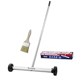
- Toolwiz 17-inch magnetic sweeper maintaining a load capacity of up to 8.8 pounds provides a perfect solution to the problem of clearing small ferrous metal objects, such as nails, tacks, bolts, and metal shavings from workshops or garage floors.
- Convenient and portable:17” is good for home, small workshop, or small yard as it is space-saving and more reachable for narrow areas. Perfect for collecting nails or small parts in the car, under the table, and in other nooks or crannies.
- Upgraded Handle Design: The handle features a sturdy, non-telescopic design to completely prevent slipping during use. By simply adding or removing the extension poles, the height can be adjusted to 3 different lengths: 18.9" (48 cm), 32.5" (82.5 cm), and 42.5" (108 cm) from ground to top. This customizable height helps prevent back bending and muscle strain, making your cleaning tasks effortless
- Flexible wheels: Upgrade wheel screws to avoid being too tight to spin or too loose. More comfortable 3-inch rubber wheels roll smoothly on carpet, grass, concrete, and hardwood floors. Just push and pull this rolling magnet-sweeper to pick up metal nails easily.
- Lightweight materials: The magnetic nail sweeper's compact and lightweight design makes the sweeping can be done anywhere you want, Push or pull it under the furniture, passing through the workshop floor, driveway, mud, grass, and gravel.
Use samples to compare relationships, not to promise an exact appearance in every installation. A printed card cannot reproduce the texture, gloss, joint shadow or surrounding reflection of a finished wall. Keep a labeled record of each sample’s location and viewing conditions so the owner, architect, contractor and fabricator are discussing the same option.
Independent reader supportYour contribution helps us test, update, and keep practical guides available for everyone.How do user response, maintenance and accessibility affect a bold color?
End-user reaction deserves a structured discussion, especially for civic, education, health-care and workplace projects where many people encounter the building. Explain what the color is doing, show it from realistic viewpoints and distinguish a reversible accent from a commitment across the entire envelope. A focused doorway or canopy can deliver visual energy with less exposure than a full elevation.
Free tools Windows power users keep installed
One-click scans. No signup required.
Maintenance is part of the visual strategy. Dirt, fading, patching and replacement panels are more conspicuous on some strong colors than on a varied or quieter field. The specification should identify how future repairs will preserve the intended contrast between the focal element and its background.
Color should support, not replace, readable signage, lighting and accessible routes. A person who cannot distinguish the chosen contrast must still be able to find and use the entrance through clear text, geometry, illumination and tactile or spatial cues. The design objective is understandable navigation for everyone, not reliance on hue alone.
Also popular on Amazon

- APPLY TO MOST DRILLS : 6 pieces screw extractors work with any drill and all the screw size or bolt (3-12mm), These extractor tools are used to reverse the damaged screw counterclockwise until it is released
- The DIY Tools for Men-Men won't know they need screw extractor set until they have one! This screw extractor set is GIFTS WRAP AVAILABLE, can be gifted to your loved ones as it reflects a fresh trend with fun and practical. Amazing and Unique tool gifts for men women. The must have stocking stuffers for men, gifts for dad, husband, father, him, guy teens, adult, Boyfriend, son on Birthdays, Christmas, Fathers Day or anniversary. Perfect Holiday Gifts Guide
- HIGH QUALITY - This damaged screw remover tool kit is made from High-Speed Steel H.S.S 4341# , which have high hardness of 63hrc, it's durable and easily to remove any damaged screws.
- EASY TO USE: Just two simple steps to get the job done - drill a hole with a cutting size using the right size screw extractor and easily remove the screw or bolt using the removal tool Hardness 63-65HRC: Titanium hardened steel material, more durable than most screw extractors on the market, better hardness and durability than others, buy with confidence and complete peace of mind
- Cool Gadgets for Men Dad Christmas Birthday Gifts for Men and Women - Men won't know they need screw extractor sets until they have one! Every screw has the potential to rust and break, which can create a situation where it cannot be removed. Owning it, there will be no anxiety about rusty screws. This screw extractor set is GIFTS WRAP AVAILABLE, can be gifted to your loved ones as it reflects a fresh trend with fun and practical. Amazing and unique tool gifts for men women. A must have stocking stuffer for men on birthdays, Christmas, Father's Day or anniversaries, a gifts for dads, husbands, fathers, him, adults, boyfriends, sons. The best and most practical and surprising Christmas gifts
What are the most common color mistakes?
- Choosing a trend before defining a purpose: a fashionable sample becomes the driver even when no building element needs emphasis.
- Applying the accent everywhere: when every wall is loud, no entrance or public volume is visually privileged.
- Ignoring approach views: the color is judged from a presentation elevation rather than from where people actually arrive.
- Sampling only on paper: the final substrate, texture and sheen are left out of the decision.
- Confusing context with camouflage: a palette is so similar to its surroundings that the building loses orientation cues.
- Skipping the owner conversation: a bold proposal reaches approval without explaining user response, maintenance or the reason for emphasis.
- Treating a 2017 trend as a current rule: historical color-of-the-year references are mistaken for evidence about today’s best choice.
How can a project team tell whether its color scheme is doing its job?
Ask three questions at each review: What should a person notice first? Does the palette relate to the site’s surroundings? Can the intended user understand where to go or what the building is communicating? If the answer to any question is unclear, revise the placement or hierarchy before debating minor hue differences.
A successful scheme may be colorful or nearly neutral. Its quality lies in the connection between purpose, context and perception. As Brown’s formulation suggests, color is a language; the project is stronger when its emphasis points to the right thing.
Frequently Asked Questions
Should an entrance always be a bright color?
No. Contrast can come from value, material, texture, lighting or a change in plane, so a subdued but distinct entry may work better in a sensitive setting. The deciding factor is whether the threshold is recognizable from the real approach.
How many facade colors should a building use?
There is no universal count. Assign colors by hierarchy—field, secondary volumes and focal elements—and remove any color that does not support a stated purpose. Fewer, clearly differentiated roles are usually easier to read than many unrelated accents.
Can a historical color-of-the-year still be specified?
It can be specified if it suits the project and the current manufacturer and material system, but its appearance in a 2017 article is not proof that it remains fashionable or appropriate. Recheck availability, finish and context during the current specification process.
How should a team present a controversial bold color to an owner?
Show the proposal in realistic approach views, alongside a quieter contextual option and an intermediate alternative. Explain what the accent helps users find or understand, then discuss maintenance and how the color is limited to the most important element.
Do these 3 things before closing this tab:
1Repair Windows errors before they cause bigger problems2Scan for outdated or missing drivers - takes under a minute3Clear out junk files and repair common Windows errors
