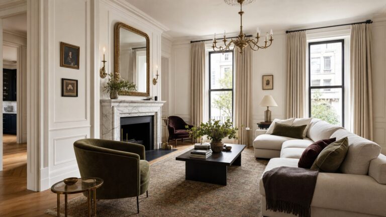
Farrow & Ball’s 12-color palette addition was announced in February 2025 and became available on February 27, 2025. The collection is still relevant: it remains represented in the brand’s current 132-color regional palette, but it should not be described as an upcoming or 2026 launch.
There are nine new shades and three archive revivals. The colors center on familiar, weathered references—garden tools, domestic objects, traditional tilework, tarnished metal, and natural materials—making them a plausible fit for renovation and construction projects where paint needs to work with timber, stone, tile, brick, and aged finishes.

As an Amazon Associate I earn from qualifying purchases.
Farrow & Ball’s 12-color palette addition is no longer an upcoming launch: the collection was announced in February 2025 and became available on February 27, 2025. It remains part of the brand’s current 132-color palette in the regional color information reviewed for this article.
Quick wins for a faster PC:
Fix the driver behind crashes, sound loss and screen glitchesFind Drivers →Repair Windows errors before they cause bigger problemsFix Now →The release contains nine new colors and three archive revivals. Together, they form a grounded palette of muted greens, terracottas, warm neutrals, an aged yellow, a pale blue, and a historic red—an especially useful range for builders, decorators, and homeowners planning rooms around natural materials and durable, lived-in finishes.
#1 Best Overall
What Farrow & Ball added
| Color | Number | Category | Broad character |
|---|---|---|---|
| Scallop | 311 | New | Soft, delicate pink-leaning neutral |
| Dibber | 312 | New | Understated earthy green |
| Reduced Green | 313 | New | Deep, muted green with brown influence |
| Sizing | 314 | New | Crisp, blue-based pale neutral |
| Naperon | 315 | New | Warm, faded terracotta or peachy clay |
| Marmelo | 316 | New | Warm, aged orange-ter even though? |
| Kakelugn | 317 | New | Pale blue inspired by Swedish tiled fireplaces |
| Douter | 318 | New | Muted green-gray between blue-green and green |
| Duster | 319 | New | Aged, earthy yellow |
| Etruscan Red | 56 | Archive revival | Rich, earth-derived historic red |
| Broccoli Brown | 198 | Archive revival | Muted dark brown |
| Sap Green | 199 | Archive revival | Olive-leaning natural green |
Note: “orange-ter even though?”
The idea behind the collection: “The extraordinary ordinary”
Farrow & Ball presented the collection under the theme “The extraordinary ordinary.” Rather than drawing only on dramatic landscapes or historic interiors, the brand looked to familiar domestic and garden details: planting tools, cleaning objects, traditional fireplaces, tarnished metal, everyday materials, and the emotional associations attached to them.
That concept explains why the palette feels familiar instead of aggressively novel. The colors are highly pigmented but generally restrained, with enough gray, brown, or weathered influence to sit comfortably alongside timber, stone, brick, tile, aged brass, and other construction materials. The result is a collection suited to rooms intended to feel settled rather than newly assembled.
This is a design direction, not a performance claim. A color that appears comforting in a brand image can look substantially lighter, darker, warmer, or cooler in a particular room. Existing flooring, cabinetry, artificial light, window orientation, and paint sheen all affect the result.
The nine new colors, grouped by how they may be used
Quiet light neutrals: Scallop and Sizing
Scallop No. 311 is the softer and warmer-feeling of the two light neutrals, with a delicate pink influence. It may suit bedrooms, halls, joinery, or rooms where a stark white would feel too hard. Its pink undertone also means it should not be treated as a universally neutral off-white.
Sizing No. 314 is a crisper, blue-based pale neutral. Its name refers to the starch traditionally used in decorating. In a north-facing room or beside cool stone and blue-gray finishes, that blue influence may become more apparent; in warmer light, it may read as a clean, calm pale backdrop.
For a construction or renovation project, these two shades are useful examples of why “neutral” is not a single category. Scallop and Sizing can both appear understated on a color card, yet their undertones may create very different relationships with white trim, natural oak, gray tile, or warm artificial lighting.
Earthy greens: Dibber, Reduced Green, and Douter
Dibber No. 312 is an understated earthy green named after the gardening tool used to make holes for planting. It is the softer, more grounded option in this new green group and could work well with unfinished or naturally textured materials.
Free tools Windows power users keep installed
One-click scans. No signup required.
Reduced Green No. 313 is darker and more muted, with a noticeable brown influence. It is better considered a deep, enveloping color than a bright botanical green. On cabinetry, a feature wall, or a small study, it may provide depth; on a large surface, the available daylight should be checked carefully before specifying it.
Rank #2
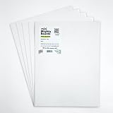
- PERFECT SAMPLES: These 12" x 9" white, styrene panels provide a smooth, warp-free surface for testing up to 5 color samples with paint, stain or other coatings.
- DURABLE MATERIAL: Made of sturdy styrene, these panels can withstand multiple coats and are non-absorbent so colors will stay true.
- CONVENIENT SIZING: At 12" x 9", the panels are just the right size for testing many common paint colors side by side before committing to a full project.
- PACKAGE INCLUDES: This value pack contains 5 white panels, enough for testing several color options on one purchase.
- VERY FLEXIBLE: Mighty Boards do not warp like foam core and you can bend them without breaking.
Douter No. 318 occupies a more complex green-gray position. Farrow & Ball places it between Inchyra Blue and Green Smoke, with inspiration drawn from tarnished brass and a candle snuffer. It can provide a bridge between cool blue-gray elements and warmer earthy finishes.
These three greens should not be assumed to behave identically. Dibber is the more quietly earthy choice, Reduced Green is deeper and browner, and Douter is the more blue-green or gray-influenced option.
Warm clay, orange, and red: Naperon, Marmelo, and Etruscan Red
Naperon No. 315 is a subdued terracotta or peachy clay shade. It offers warmth without necessarily becoming a vivid orange, making it a possible starting point for dining rooms, bedrooms, alcoves, or rooms with timber and woven textures.
Recommended Free Tools
Marmelo No. 316 is the more orange-leaning aged tone of the two new clay colors. Its domestic inspiration and weathered quality place it closer to softened earthenware than to a bright contemporary orange.
Etruscan Red No. 56 is not a new color at all: it is one of the three archived shades returned to the main palette. It is the deepest and most historically resonant option in this warm group, with an earth-derived red character that may suit a feature wall, dining room, library, entrance, or carefully balanced joinery scheme.
Warm colors can appear more intense over a large area than they do in a small swatch. If a clay or red shade is being considered for a whole room, test it on more than one wall and observe it during daylight and after the room’s artificial lighting is switched on.
The contrasting cool note: Kakelugn
Kakelugn No. 317 is a pale blue inspired by Swedish tiled fireplaces. It gives the collection a cooler counterpoint to the earthy greens, browns, terracottas, and reds.
Crashes, No Sound, or Screen Glitches?
Random freezes, missing sound and display glitches usually trace back to one bad driver. Find and replace yours safely.Free scan · under a minutePC Slower Than It Used to Be?
A free scan shows the junk files, broken settings and background clutter dragging Windows down - then fixes them in one click.Free scan · Windows 10 & 11The shade may be particularly relevant where a project already includes pale blue tile, white-painted woodwork, light stone, or other cool architectural details. However, pale blues can shift noticeably with orientation and surrounding colors, so the apparent neutrality of a digital image should not be relied on for ordering paint.
Rank #3

- Core Color Matching: Paint color sample cards include 83 standard colors to support paint color sample cards, color matching cards for painting, and paint chips standard samples, helping users compare shades before selecting a final finish for floor paint, hardware, and other project needs
- Reliable Reference: Paint samples are made with color matching materials designed to support accurate color comparison, giving painters and DIY users a practical paint and paint color samples reference for selecting tones that fit the project surface and intended look
- Portable Format: Measuring 3.74 x 1.57 x 1.18 in and weighing 3.88 oz, this paint samples set is compact for a toolbox, work bag, or travel use, making it easier to carry color test card paint and check shades on site when planning paint work
- Wide Project Use: Paint sample cards are suitable for floor paint, paint hardware, and related color selection tasks, offering a useful paint chips samples reference for contractors, decorators, and home improvement users working on color coordination across different surfaces
- Simple Set Package: Each package includes 1 set of paint sample cards, giving users a straightforward paint sample standard cards option for daily work, project planning, and quick shade comparison when choosing among paint color cards and paint chips sample cards
The distinctive yellow: Duster
Duster No. 319 is an aged, earthy yellow inspired by the familiar household cleaning tool. It is not positioned as a bright lemon yellow or a primary accent. Its softened, weathered quality makes it more compatible with the collection’s greens, browns, and clay shades than a clean, highly saturated yellow would be.
The three archive colors returning to the palette
The launch was significant because Farrow & Ball did more than add nine shades. It also brought three archived colors back into its signature palette—described in the launch material as the first time the brand had returned archived colors in this way.
Etruscan Red No. 56
This rich, earth-derived red brings historical depth and visual weight. It can be used as an accent or as a deliberately immersive room color, depending on the amount of natural light and the finish selected.
Broccoli Brown No. 198
Broccoli Brown is a muted dark brown that belongs naturally with weathered wood, stone, leather, and other organic materials. It may be a strong option for cabinetry, a study, a snug, or a room where a near-black color would feel too severe.
Sap Green No. 199
Sap Green is an olive-leaning green associated with natural vegetation. Its depth may make it especially effective in smaller spaces, although “effective” should not be confused with universally suitable: a compact room with limited daylight can make a dark olive feel substantially more enclosed.
How the 12 colors fit together
The palette is not a single matching scheme, and homeowners do not need to use several of the colors in one project. It is more useful to see it as a set of related families:
- Light foundations: Scallop and Sizing.
- Earthy greens: Dibber, Reduced Green, Douter, and Sap Green.
- Warm clay and red: Naperon, Marmelo, and Etruscan Red.
- Natural darks: Reduced Green, Broccoli Brown, and Sap Green.
- Cool contrast: Kakelugn.
- Weathered accent: Duster.
Possible starting combinations include Dibber with Scallop, Douter with Sizing, or Etruscan Red with a restrained light neutral. These are editorial suggestions, not laboratory-tested combinations or a substitute for a professional color consultation. Test each pairing against the actual flooring, trim, countertop, tile, and fixed furnishings in the room.
The Tool Desk
Outbyte Driver Updater FREEScan for outdated or missing drivers - takes under a minuteDriver Scan →Outbyte PC Repair FREEClear out junk files and repair common Windows errorsFree Scan →Why the colors remain relevant in 2026
Current interior-design commentary continues to discuss warm earth tones, muted greens, and richer colors as alternatives to uniformly cool gray schemes. The Farrow & Ball collection fits that conversation, but its appeal is broader than a short-lived trend. The colors are tied to materials and objects that already occur in many buildings: timber, clay, metal, garden foliage, stone, plaster, and painted joinery.
Rank #4

- Practical to use: paint color sample standard colors cards are designed for your different paint needs,color test card paint bulk,paint color samples
- Paint cards: made of plastic and paper that provides accurate colors and reliable results,paint standard samples,water color cards
- Professional: paint color standard sample cards are great for professionals and DIY enthusiasts alike,paint color cards,paint chips samples
- Paint color sample cards: suitable for various such as floor paint, paint hardware, and more,paint color sample cards,paint color cards bulk
- Comprehensive color chart: featuring multi standard colors, great for various ,paint cards,water color paint cards
That makes the collection potentially useful in renovation work where the paint needs to relate to existing fabric rather than compete with it. A muted green may sit more comfortably beside aged wood than a vivid green; an earthy red may reinforce brick or terracotta; a soft neutral may warm a room without requiring a stark white contrast.
Still, trend coverage is commentary, not a guarantee of future popularity or resale value. Choose the color for the building, its occupants, and its lighting—not because a particular shade is forecast to remain fashionable.
Sample before ordering a full tin
Farrow & Ball’s own sample guidance notes that color changes through morning, midday, evening, artificial, and natural light. The safest process is to paint a sample on paper or another suitable test surface and examine it in the intended room.
- Start with the physical color card. Use it to compare the full 12-color group and identify likely families. A Farrow & Ball color card is a comparison tool, not a replacement for a painted sample.
- Buy or obtain a sample pot where available. Paint a large enough area to judge the undertone and depth; a tiny patch can be misleading.
- Test more than one wall. Check the wall facing the main window as well as a shaded wall, particularly for pale blues, pale neutrals, and deep greens.
- View the sample at different times. Record how it looks in daylight, under the room’s normal evening lights, and beside fixed finishes.
- Check the sheen. The same color can appear different when its surface reflectance changes. Compare the finish intended for the actual application.
- Approve only after the surrounding materials are present. Tile, flooring, cabinetry, worktops, metal hardware, and white trim can all alter the perceived color.
Online photographs and on-screen swatches are useful for narrowing the choices, but they cannot reproduce the paint’s actual texture, sheen, coverage, or interaction with a particular wall. Regional product pages and stockists should be checked for current sample-pot formats, colors, sizes, and delivery options.
Independent reader supportYour contribution helps us test, update, and keep practical guides available for everyone.Choosing the right finish for the surface
Color selection is only part of the specification. Farrow & Ball offers different finishes for different surfaces and levels of use. Its regional product information describes Estate Emulsion as a low-sheen matte finish for walls and ceilings, while Modern Emulsion is positioned as a more washable option for higher-use areas.
For a construction or decorating project, confirm the following before application:
- Whether the chosen finish is intended for the surface—wall, ceiling, woodwork, cabinetry, or another substrate.
- Whether the room’s traffic and cleaning requirements call for a more washable finish.
- Whether the existing surface is sound, clean, dry, and suitably prepared.
- Which primer or undercoat is specified for the substrate and chosen color.
- Whether the regional product instructions require a particular preparation system or number of coats.
Primer and undercoat requirements can vary with the surface and color. Product-specific instructions should take precedence over generic painting advice. A contractor should also confirm compatibility when coating previously painted walls, glossy surfaces, repaired areas, bare timber, or unfamiliar substrates.
What’s actually slowing this PC down?
Pick the symptom - the matching free tool is one click away.
Availability and buying considerations
The original announcement described the colors as handcrafted in Dorset and available from February 27, 2025. The current regional information reviewed for this article continues to list the shades, including their numbers, but availability is not identical in every market.
Best Value
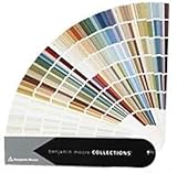
- Brand: Benjamin moore
- Container type: Box
- Finish type: Opa
US and UK buyers may encounter different showrooms, authorized stockists, delivery arrangements, finish names, tin sizes, and sample formats. The Japanese official color presentation also continues to show the 132-color palette and the 12-color “New Colours” group. Before placing an order, use the relevant regional Farrow & Ball site or a verified local stockist to confirm:
- that the selected shade is currently orderable in your country;
- the available finish and container sizes;
- whether sample pots are offered for the shade and finish you need;
- the current shipping area and lead time; and
- whether the product is suitable for the surface and project conditions.
Independent US routes may include Farrow & Ball showrooms and authorized stockists such as Ring’s End or Catalina Paint, but local inventory can change. Treat any marketplace listing as something to verify rather than proof of current official supply.
Useful resources before you commit
A physical Farrow & Ball color card can make the initial comparison easier, particularly when deciding whether the room needs a pink-leaning neutral, a blue-based pale, or a deeper earthy tone. It should be followed by a real painted sample.
For readers planning a complete room rather than selecting one paint color, Farrow & Ball: How to Decorate is a broader decorating resource associated with the brand and its color experts. It covers room planning, light, color, and finishes; it should not be treated as documentation of this particular 12-color launch, and current retailer availability should be checked before purchase.
For the paint itself, sample pots and full-size tins are best sourced through the official regional brand route or a verified paint stockist. Confirm current availability and application instructions locally rather than relying on an old listing or an unverified marketplace offer.
A practical specification checklist
- Record the exact color name and number—for example, Douter No. 318 rather than only “green-gray.”
- Identify whether the color is one of the nine new shades or one of the three archive revivals.
- Test a physical sample in the actual room and lighting conditions.
- Compare the sample with flooring, tile, cabinetry, trim, metal, and fixed furniture.
- Select the finish according to the surface and expected wear.
- Follow the regional technical instructions for preparation, primer, undercoat, and application.
- Confirm local stock, sample availability, sizes, and delivery before scheduling the work.
Frequently Asked Questions
When did Farrow & Ball add these 12 colors?
Farrow & Ball announced the collection in February 2025, and availability began on February 27, 2025. It is not a new 2026 launch.
Are all 12 Farrow & Ball colors newly created?
No. The release contains nine new colors—Scallop, Dibber, Reduced Green, Sizing, Naperon, Marmelo, Kakelugn, Douter, and Duster—and three colors returned from the archive: Etruscan Red, Broccoli Brown, and Sap Green.
Do these 3 things before closing this tab:
1Scan for outdated or missing drivers - takes under a minute2Clear out junk files and repair common Windows errors3Fix the driver behind crashes, sound loss and screen glitchesWhat is the difference between Scallop and Sizing?
Scallop is the pink-leaning soft neutral, while Sizing is the crisper blue-based pale neutral. Both should be tested because light and surrounding finishes can change how their undertones appear.
Where can I buy the new Farrow & Ball colors?
Use the relevant regional Farrow & Ball site, showroom, or verified local stockist. US and UK availability, finishes, sizes, sample formats, shipping, and stock can differ, so confirm those details before ordering.
Should I test a Farrow & Ball color before buying a full tin?
Yes. Farrow & Ball recommends testing color because it changes in morning, midday, evening, artificial, and natural light. A color card helps compare shades, but a painted sample is the more reliable final check.
The Bottom Line
Farrow & Ball’s February 2025 palette addition comprises nine new earthy shades and three revived archive colors—not 12 newly created colors and not a 2026 launch. The collection is strongest for projects built around natural, muted materials, but the correct choice depends on the room’s light, existing finishes, surface, and required durability. Compare the colors on a physical card, then test a painted sample before ordering the final finish and quantity.
Quick Recap
Product prices and availability are accurate as of the date/time indicated and are subject to change. Any price and availability information displayed on Amazon at the time of purchase will apply.