The Tool Desk
Outbyte PC Repair FREERepair Windows errors before they cause bigger problemsFix Now →Outbyte Driver Updater FREEFix the driver behind crashes, sound loss and screen glitchesFind Drivers →Some links on this page are affiliate links: if you buy through them we may earn a commission, at no extra cost to you.
Color harmony in building design is the deliberate organization of hues, values, chromas, materials, light and color-field proportions so a facade or room reads as a coherent whole. Color-wheel schemes are useful starting structures, but they cannot guarantee that people will like a palette or experience it in the same way. The most dependable approach is to use a scheme to generate options, then judge real samples in the actual architectural context.
In practice, that means asking more than whether two hues are “opposite” or “nearby.” You also need to examine how bright or muted each color is, how light changes it, how much area it occupies, what it reflects, which surfaces surround it, and who will use the space.
As an Amazon Associate I earn from qualifying purchases.
Quick wins for a faster PC:
Scan for outdated or missing drivers - takes under a minuteDriver Scan →Repair Windows errors before they cause bigger problemsFix Now →What is color harmony?
Color harmony is a perceived sense of fit or balance among colors. In architecture and interiors, the relationships may involve wall paint, flooring, ceilings, trim, roofs, cladding, furniture, signage, landscape and reflected daylight—not just isolated swatches.
Traditional design teaching often presents harmony as a predictable result of geometric relationships on a color wheel. The evidence is more cautious. Zena O’Connor’s peer-reviewed review in Color Research & Application concludes that “consensus regarding colour harmony is lacking in the literature,” leaving designers with information that can be contradictory and ambiguous. Her review describes harmony as dependent on perceptual, personal, cultural, contextual and temporal factors, rather than hue geometry alone. Read the review of competing color-harmony theories.
Popular on Amazon

- Ergonomically Designed: Work in tight areas with a compact design that gets into tough spots
- Both tools are designed to fit into difficult to reach spaces
- Complete a wide range of applications with a high-performance motor that delivers up to 300 UWO, and an impact driver delivering up to 1,400 in-lbs of torque
- Both the DEWALT impact driver and drill driver feature integrated LED work lights with a convenient 20-second delay, ensuring enhanced visibility in dimly lit or challenging work areas
- One-Handed Loading - Keep one hand free with a 1/4 in. hex chuck that accepts 1 in. bit tips
Therefore, call a palette “harmonious” as a design judgment for a particular setting, not as a universal scientific verdict. A combination that feels calm in a softly lit bedroom may feel dull in a bright lobby; a high-contrast entrance may aid wayfinding in one building and feel visually aggressive in another.
How do colors interact?
Colors interact through hue, value and chroma, and through the physical conditions in which they are viewed. Hue is the color family (such as blue or yellow); value is relative lightness or darkness; chroma is relative saturation or intensity. Changing any one of these can alter the relationship without changing the nominal hue.
The U.S. Army Corps of Engineers’ interior-design guidance explains that, in theory, any hue can be made to harmonize with another by manipulating value and chroma. That does not mean every pairing will be preferred. It means a difficult hue relationship may become more workable when one color is darkened, lightened, grayed or used in a smaller field. See the Engineer Design Guide’s discussion of interior color schemes.
Perception is also relative. A mid-value gray can appear warmer beside a cool blue and cooler beside a warm beige. A saturated accent can make neighboring neutrals look less colorful by comparison. Gloss, grain, weave, roughness and reflectance change the amount and character of light returning to the eye.
What are the main color-wheel harmony schemes?
Use a conventional color wheel as a planning vocabulary. The schemes below describe starting relationships; they do not predict universal preference or a guaranteed emotional effect.
Also popular on Amazon

- Valued Carpenter Pencil Set: You will get 2 pcs solid carpenter pencils with 26 piece 2.8 mm refills, 1 replaceable sharpener, 1 plastic storage box.The complete carpenter pencils combination allows you to finish your work faster and more easily
- Deep Hole Marker Pencil: The deep-hole construction pencils adopts 45mm elongated tip design, which is more convenient to mark in the small hole or in other tight areas that other carpenter markers cannot reach
- Carpenter Pencils with Sharpener: The sharpener is screwed into the top of the work pencil, which won't get lost either. Built-in pencil sharpener that keep the lead with pointed and smooth to Improves line of sight in fine work
- Stronger Solid Lead: This work pencil is matched with a 2.8 mm thick lead , which is much thicker and stronger during the drawing process of construction work, it will not break or damage easily
- Marks on Various Surfaces: 3 colors solid construction pencil can marks on various surfaces,such as metal, plastic, wood, paper etc. Ideals for woodworkers, contractors, craftsmen, builders, merchants and masons
| Scheme | Relationship | Typical design use | Main control point |
|---|---|---|---|
| Monochromatic | One hue varied in value and chroma | Unified rooms, restrained facades, continuous millwork | Create distinction with lightness, texture, pattern and material |
| Analogous | Neighboring hues on the wheel | Palettes with a shared hue neighborhood | Choose a dominant hue so adjacent colors do not compete |
| Complementary | Opposite hues | Strong focal contrast, entrances and feature elements | Reduce intensity or area when the contrast is visually loud |
| Split-complementary | One hue plus the two hues adjacent to its complement | Contrast with more flexibility than a direct complement | Keep one hue dominant and distribute the others deliberately |
| Triadic | Three hues spaced around the wheel | Varied schemes for civic, educational or hospitality settings | Control value, chroma and proportion to avoid visual competition |
| Tetradic | Two complementary pairs | Complex, multi-hue interiors or identity systems | Assign a clear hierarchy; equal emphasis often feels unsettled |
Neighboring-hue schemes generally offer an obvious shared family, while complementary and split-complementary schemes introduce more contrast. Triadic and tetradic arrangements can support variety, but they demand stronger decisions about dominance and area. A monochromatic scheme is not automatically flat: differences in value, surface texture, pattern, sheen and shadow can supply structure.
Why is a color wheel not enough?
A wheel maps hue relationships, but a building is experienced through light, surfaces, distance and use. The APPA overview of building interiors describes color as an interaction between the color of a light source and the colors of objects reflecting that light. Daylight direction, electric-light spectrum, time of day and nearby surfaces can all shift the appearance of a finish.
Interior-architecture research likewise identifies context, area, texture, number and relative position as relevant to color preference and interaction. A small painted sample does not show how a color will read across a large wall, beside a textured floor, or beneath a different light source. The research on accent and background colors discusses similarity and contrast as relationships among colors and attributes, not as a single recipe that works in every room. Review the study of accent and background color preference.
Culture and occupants matter as well. Meanings attached to colors, expectations for a building type, accessibility needs and the age or visual sensitivity of users can influence whether a palette feels appropriate. A scheme should be assessed with the people and setting in mind, not selected solely from a diagram.
How do I choose colors that work together in a room?
Begin with the intended relationship—quiet continuity, clear contrast, or controlled variety—then test the complete set of materials under the light the room will actually receive. The following process turns color theory into a construction decision.
Free tools Windows power users keep installed
One-click scans. No signup required.
Also popular on Amazon

- 【Great Compatibility】This Katerk 1/4 inch hex shank bit holder is specifically designed for 1/4 inch hex shank drill bits. It's compatible with most 1/4 fast hex handles, hex sockets, various electric screwdrivers, and handheld screwdrivers. The bit holder makes it a valuable addition for any handyman.
- 【Secure and Safe】Built with a secure backup nut design, each drill bit holder securely locks onto your bits, ensuring they stay firmly in place. Additionally, our bit holder incorporates a high-quality steel ball rolling design that holds up to several kilograms of weight, ensuring your various drill bits don't fall off.
- 【Easy One-Handed Operation】The bit holder for impact driver allows you to change bits single-handedly, simplifying your workflow. Its multi-color design further allows for quick identification of the drill bit you need.
- 【Compact and Convenient】Thanks to its compact size, this 1/4 inch bit holder is easy to carry around. The bit holder allows for easy attachment to various tools, making this a convenient addition to your construction accessories. The Katerk bit holder is cast from high-quality alloy material, promising a long product lifespan. Despite its rugged strength, the bit holder remains lightweight, making it portable.
- 【Cool Christmas Gift For Men Stocking Stuffers】 This screwdriver bit holder, driver bit holder, impact bit holder, can be given as a gift to your loved one, especially for anyone involved in construction or electrical work. It's a must-have for stocking stuffers for men and women, tools gifts for dad, tech gadgets for men, gifts for dad, gifts for him, gifts for husband, gifts for boyfriend, cool gadgets for men, and cool gifts for dad.
- Define the room’s job and visual priority. Decide whether the room needs rest, orientation, separation of zones, a focal wall, or continuity with adjacent spaces. Identify fixed elements that will remain, such as stone, brick, timber, tile, metal, glazing and existing furniture.
- Choose a provisional scheme. Start with monochromatic, analogous, complementary, split-complementary, triadic or tetradic relationships. Treat the choice as a hypothesis. It is acceptable to reject the first scheme after viewing samples.
- Set a dominant, supporting and accent role. A dominant color usually occupies the largest visual field; supporting colors connect secondary surfaces; an accent marks a smaller feature. Do not assume equal areas will feel balanced. Proportion is a design variable.
- Adjust value before chasing a new hue. If the palette lacks separation, lighten or darken one element. If adjacent surfaces blend too much, increase value difference or add texture. If contrast is harsh, move one color toward a middle value or use a less saturated version.
- Adjust chroma and saturation. Highly saturated colors attract attention. Consider reserving them for small areas—such as a door, niche, furniture element or sign—while using larger fields of lower-chroma colors. This follows a long-standing design principle documented in the NIST annotated bibliography on color harmony.
- Place real samples in the room. View paint cards, finish boards, tile, fabric, metal and wood together. Check them on more than one wall and at different times of day. A sample viewed flat under retail lighting is not a substitute for an installed-scale observation.
- Evaluate light and reflection. Record the orientation of windows, shading, glazing, lamp type, color temperature specified for the project and the reflectance of nearby surfaces. Inspect corners, transitions and areas where direct and indirect light meet.
- Check scale and distance. Stand at the distance from which the surface will normally be seen. A tiny accent can disappear on a large facade; a strong color that looks modest on a chip can dominate an entire wall.
- Review users, culture and accessibility. Confirm that important routes, doors, stairs and hazards remain legible. Check that color is not the only signal for critical information, and discuss culturally sensitive associations with the client and occupants.
- Document the decision. Record product or finish identifiers, sheen, substrate, lighting assumptions, adjacent materials, intended proportions and approval conditions. Note where a color must be rechecked after installation.
How should value, chroma and area be balanced?
Balance is often achieved by unequal areas rather than by making every color equally strong. A small highly saturated patch can supply emphasis against a larger low-saturation field. Similarly, a smaller light or dark element can balance a larger field of a contrasting value when its placement and visual weight are intentional. The NIST bibliography records these proportion-based approaches, but it does not establish one universal percentage rule.
Use area as a control when a hue relationship feels right in theory but overwhelming at full size. Reduce the accent’s footprint, lower its chroma, or separate it with a neutral transition. If a palette feels monotonous, increase contrast through a limited high-value or high-chroma element, a tactile material, or a patterned surface instead of adding several unrelated hues.
Sheen also changes perceived strength. A glossy surface can create brighter highlights and sharper transitions than a matte surface of a similar color. Texture breaks up a large field and can make a single hue read as more varied without introducing another hue.
How do light and materials change a harmonious palette?
Light is part of the color specification, not an afterthought. Daylight varies with orientation, weather, season and shading. Electric lighting adds its own spectral character. A warm source may make some finishes appear more yellow or muted; a cooler source can emphasize blue or green tendencies. The exact result depends on the source and the reflecting materials, so avoid universal claims about what one lamp will do to every color.
Recommended Free Tools
Materials can reflect, absorb or scatter light differently. Honed stone, polished metal, rough plaster, natural timber and woven fabric may each alter the apparent chroma and value of a nearby painted surface. Samples should therefore be assembled as a material board, not evaluated as isolated color chips. The Interior Design Reference provides broader reference material for coordinating color with interior finishes.
Also popular on Amazon
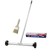
- Toolwiz 17-inch magnetic sweeper maintaining a load capacity of up to 8.8 pounds provides a perfect solution to the problem of clearing small ferrous metal objects, such as nails, tacks, bolts, and metal shavings from workshops or garage floors.
- Convenient and portable:17” is good for home, small workshop, or small yard as it is space-saving and more reachable for narrow areas. Perfect for collecting nails or small parts in the car, under the table, and in other nooks or crannies.
- Upgraded Handle Design: The handle features a sturdy, non-telescopic design to completely prevent slipping during use. By simply adding or removing the extension poles, the height can be adjusted to 3 different lengths: 18.9" (48 cm), 32.5" (82.5 cm), and 42.5" (108 cm) from ground to top. This customizable height helps prevent back bending and muscle strain, making your cleaning tasks effortless
- Flexible wheels: Upgrade wheel screws to avoid being too tight to spin or too loose. More comfortable 3-inch rubber wheels roll smoothly on carpet, grass, concrete, and hardwood floors. Just push and pull this rolling magnet-sweeper to pick up metal nails easily.
- Lightweight materials: The magnetic nail sweeper's compact and lightweight design makes the sweeping can be done anywhere you want, Push or pull it under the furniture, passing through the workshop floor, driveway, mud, grass, and gravel.
For exterior work, inspect the facade at the distances and angles from which it will be seen. Neighboring buildings, pavement, vegetation and sky become part of the visual field. A color that appears balanced on an elevation drawing may read differently when surrounded by reflective glazing or dark masonry.
How can I compare two or more real palette options?
Compare alternatives using the same questions and the same physical or digital conditions. This is a design framework, not a standardized score.
| Comparison axis | Questions to ask | Warning sign |
|---|---|---|
| Hue relationship | Are the hues neighboring, opposite, split-complementary or multi-hue? | The scheme is named, but no dominant relationship is clear. |
| Value range | Do surfaces separate enough for depth, edges and wayfinding? | Important elements disappear because values are too similar. |
| Chroma range | Where does the eye go first, and is that intentional? | Several saturated colors compete for equal attention. |
| Proportion and placement | Which color occupies the largest field, and where are accents located? | A small accent becomes visually heavier than the background. |
| Light and reflection | Does the option hold together in daylight, electric light and shadow? | The palette works only under one lighting condition. |
| Texture and material | Do grain, gloss, pattern and roughness reinforce or disrupt the relationship? | Material variation was ignored until late in specification. |
| People and setting | Does it fit the building’s use, culture, context and accessibility needs? | A purely visual preference conflicts with operational requirements. |
What common color-harmony mistakes should a project avoid?
- Treating the wheel as a guarantee: A geometrically correct complement can still be unsuitable for the occupants, light or building type.
- Choosing from a screen alone: Displays, room lighting and printing conditions can misrepresent value and chroma.
- Ignoring fixed materials: A new wall color must interact with floors, counters, roofs, frames and adjacent finishes that may not change.
- Using equal emphasis everywhere: Multi-hue palettes need hierarchy. If every color is an accent, none is an accent.
- Forgetting scale: Large areas amplify visual impact; small samples conceal repetition, glare and texture.
- Relying on color for safety information: Pair color with labels, contrast, form or lighting so essential cues remain usable.
- Failing to specify conditions: A color name without substrate, sheen, lighting and neighboring finishes is incomplete construction information.
How do color-harmony choices differ between interiors and facades?
The vocabulary is the same, but the viewing conditions differ. Interiors are encountered at close range, often under controlled electric light, with many tactile materials and repeated transitions. Facades are seen from changing distances, in weather and daylight, against a neighborhood context and landscape.
What’s actually slowing this PC down?
Pick the symptom - the matching free tool is one click away.
For an interior, give particular attention to glare, ceiling and floor reflectance, circulation, room-to-room transitions and the visual needs of occupants. For a facade, consider the proportion of wall, openings, roofs and trim; the effects of shadow lines; neighboring buildings; and how the palette reads from the public approach. In both cases, use physical samples and document the assumptions behind approval.
What does a reliable color-harmony workflow look like on a construction project?
A reliable workflow is iterative and documented: establish the purpose and constraints, generate one or more wheel-based options, adjust value and chroma, assemble materials, review under actual or representative lighting, assess proportions at scale, obtain stakeholder feedback, and record the approved specification. If the installed result differs from the sample, investigate substrate, sheen, lighting, batch variation and surrounding reflections before changing the entire palette.
Also popular on Amazon

- APPLY TO MOST DRILLS : 6 pieces screw extractors work with any drill and all the screw size or bolt (3-12mm), These extractor tools are used to reverse the damaged screw counterclockwise until it is released
- The DIY Tools for Men-Men won't know they need screw extractor set until they have one! This screw extractor set is GIFTS WRAP AVAILABLE, can be gifted to your loved ones as it reflects a fresh trend with fun and practical. Amazing and Unique tool gifts for men women. The must have stocking stuffers for men, gifts for dad, husband, father, him, guy teens, adult, Boyfriend, son on Birthdays, Christmas, Fathers Day or anniversary. Perfect Holiday Gifts Guide
- HIGH QUALITY - This damaged screw remover tool kit is made from High-Speed Steel H.S.S 4341# , which have high hardness of 63hrc, it's durable and easily to remove any damaged screws.
- EASY TO USE: Just two simple steps to get the job done - drill a hole with a cutting size using the right size screw extractor and easily remove the screw or bolt using the removal tool Hardness 63-65HRC: Titanium hardened steel material, more durable than most screw extractors on the market, better hardness and durability than others, buy with confidence and complete peace of mind
- Cool Gadgets for Men Dad Christmas Birthday Gifts for Men and Women - Men won't know they need screw extractor sets until they have one! Every screw has the potential to rust and break, which can create a situation where it cannot be removed. Owning it, there will be no anxiety about rusty screws. This screw extractor set is GIFTS WRAP AVAILABLE, can be gifted to your loved ones as it reflects a fresh trend with fun and practical. Amazing and unique tool gifts for men women. A must have stocking stuffer for men on birthdays, Christmas, Father's Day or anniversaries, a gifts for dads, husbands, fathers, him, adults, boyfriends, sons. The best and most practical and surprising Christmas gifts
The key decision is not “Which formula is correct?” It is “Which set of relationships remains coherent for these people, materials, light conditions and uses?” Color harmony is most useful when it structures that question without pretending to answer it automatically.
How we chose the guidance
This article prioritizes the research-supported factors that affect color relationships in buildings: hue schemes, value, chroma, area, proportion, texture, light, material reflection, context and occupants. It treats wheel arrangements as descriptive planning tools, incorporates the caution about conflicting harmony theories in the peer-reviewed literature, and avoids presenting a single palette or numerical ratio as universally correct.
Frequently Asked Questions
Can neutral colors be harmonious without using a color-wheel scheme?
Yes. Neutrals can be organized through value steps, undertones, texture, sheen and material contrast even when their hues are weak or difficult to place on a simple wheel. Check them together under the project lighting because small undertone differences can become apparent beside white surfaces, timber or stone.
Should ceilings and floors always be lighter or darker than walls?
There is no universal ordering that guarantees harmony. Their value and reflectance should support the room’s scale, orientation, circulation and lighting, while transitions remain legible for the people using the space.
How can a color palette support wayfinding?
Use deliberate value and chroma differences at doors, stairs, decision points or zones, and reinforce them with signs, symbols, lighting or changes in form. Color should be one layer of information rather than the sole indicator of a critical route.
Why does an approved paint color look different after installation?
The installed surface may have a different substrate, sheen, texture, batch, surrounding reflection or light source than the sample. Compare the sample and installed area under the same conditions, then determine whether the discrepancy is material, lighting-related or a proportion problem before revising the palette.

