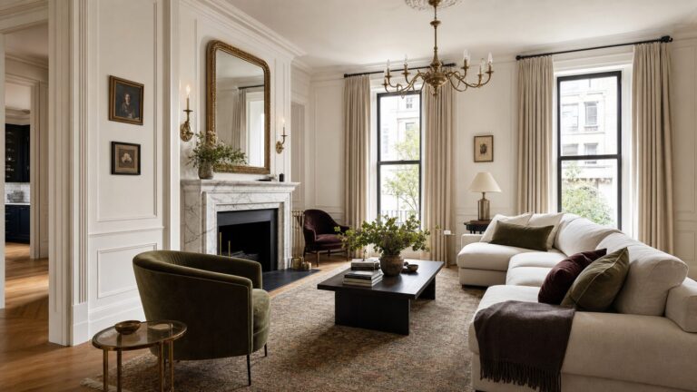
There is no single backsplash that is best for every maple kitchen. Start with the color and undertone of your installed cabinets, then compare tile with the countertop and the room’s lighting. A light backsplash can keep maple prominent and the kitchen feeling open; a dark or patterned one can add contrast or make the tile a focal point. These are design options, not guaranteed results.
Start with the maple you actually have
Maple does not look the same in every kitchen. A maple-specific guide describes many finishes as light to medium with subtle pink or peach warmth, while Caesarstone’s broader manufacturer guidance describes maple hues ranging from brown to light red. Stain, finish, surrounding colors, and light all affect how a particular installation reads. Look at the cabinets in your kitchen rather than choosing from the word “maple” alone. Tile Club’s maple-cabinet guide and Caesarstone’s wood-cabinet guide offer broad descriptions, not a diagnosis of your specific finish.
Compare the backsplash with the countertop
Assess the cabinet, counter, and backsplash as one palette. The maple-specific Tile Club guide suggests using the backsplash as a bridge between cabinets and countertop, including a neutral tile that picks up tones from both. BELK Tile’s general guide to wood cabinets advises a simpler backsplash when the granite is visually busy. That is useful guidance, not a fixed rule: the aim is to decide whether the counter or tile should carry more of the visual attention.
Choose the visual effect you want
| Direction | Example | Design effect and trade-off |
|---|---|---|
| Quiet and light | Matte white porcelain mosaic | Tile Club presents it as an understated option that lets maple remain prominent. Check that the white suits the cabinet and counter tones. |
| High contrast | Mirror black subway tile | Tile Club describes reflective contrast and depth. A dark backsplash may feel dominant in a small or dim kitchen; view a sample in place before committing. |
| Patterned, with color links | White terrazzo porcelain with rust, blue, and gray flecks | The flecks can add character and echo tones in the wood. Consider how much pattern is already in the countertop. |
| Graphic pattern | Black-and-white hexagon tile | A distinctive contrast that can compete with a busy counter or other patterned surfaces. |
| Decorative focal point | Calacatta stone mosaic | An intricate shape and near-monochromatic white-gray palette put more attention on the backsplash. Confirm care and product details with the manufacturer. |
The examples and visual descriptions are from Tile Club’s maple-specific guide. They are design suggestions, not comparative testing or guarantees of how a tile will look in your home.
What’s actually slowing this PC down?
Pick the symptom - the matching free tool is one click away.
#1 Best Overall

- Easy DIY, Just Peel & stick, cut with tin snip, utility knives or hand saws, saving large amount on labor
- 3"x6" individual subway tile, plans the layout freely to your imagination
- Waterproof, heat resistant, stain resistant, anti-scratch, high impact, color fadeless, easy to clean, durable
- Suitable surfaces: painted gypsum/dry wall, ceramic tile, linoleum, glass, marble/granite, metal/steel, sealed/polished/painted wood
- Unsuitable surfaces: brick wall, oily glossy painted wall, textured wall and any uneven rough surfaces
Use color beyond white and black carefully
Green or blue can be a more colorful direction, but the evidence here is anecdotal rather than a universal pairing rule. In a homeowner discussion, one person reports using fluted green tile with rye-finished maple; commenters also discuss blue for cabinets they perceive as yellowy. Treat those as individual examples, and judge the actual cabinet undertone before selecting a saturated tile. The discussion and its comments are user-generated, not professional consensus.
Make the choice in the room, not from a screen
- Identify the installed finish. Look at the cabinets beside the counter and note whether they read as pale, brown, reddish, pink-warm, peach-warm, or yellowy in the kitchen.
- Assess the counter. Note its undertone and how much movement or pattern it has. Decide whether the backsplash should quietly connect the surfaces or become another focal point.
- Pick a direction. Compare light and understated, dark and contrasting, or patterned and colorful options against the effect you want.
- View tile samples in place. Hold them near both cabinets and countertop in the kitchen’s actual light. The cited sources do not provide a controlled sample-testing method or measured outcomes; this is a practical way to judge the tones and finishes they discuss.
- Confirm the exact product details. Check the tile maker’s guidance for material, finish, grout compatibility, cleaning, and care. BELK Tile’s general wood-cabinet guide discusses matte, satin, and honed finishes and grout choices, but suitability and upkeep depend on the selected tile. See BELK Tile’s general guide.
What the recommendations can—and cannot—tell you
The tile examples are retailer design guidance from Tile Club’s article published January 12, 2025; BELK Tile’s advice addresses wood cabinets more broadly, and Caesarstone’s is manufacturer guidance published in 2021. These sources provide palette ideas, not a systematic comparison of durability, cost, installation difficulty, or visual outcomes across backsplash options. Use the recommendations to narrow the look, then rely on the selected product’s specifications for performance and care.
Quick Recap
Rank #4

- Enhanced Strength – At 0.08 inches thick, these tiles are 2–3 times sturdier than standard ones, offering enhanced durability and resistance to warping
- Seamless Application – Designed for convenience, these tiles feature an intuitive peel and stick backing that allows for a smooth and effortless installation process
- Premium Quality Adhesion – Made from premium adhesive material, these tiles offer a secure and long-lasting bond to surfaces, ensuring stability and endurance over time
- Contemporary Aesthetic – With their sleek and sophisticated appearance, these tiles instantly elevate the visual appeal of any room, bringing a modern flair to kitchens and beyond
- Ideal for any Space – Engineered to withstand moisture, they are perfectly suited for damp environments such as kitchen counters, bathroom walls and so on
Rank #3
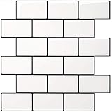
- Upgraded Thicker Build: 2–3 times thicker than regular peel and stick tiles, resistant to tearing and bending for easier installation.
- Stronger Adhesive Backing: Upgraded backing glue grips smooth, clean surfaces and lightly textured walls firmly for a more secure application.
- Classic Contrast Style: White subway tiles with contrasting black grout add crisp definition and a timeless look to your wall.
- Standard Size & Value Pack: Includes 10 ticker self-adhesive tile sheets measuring 12 x 12 inches for your wall makeover project.
- Versatile Wall Decor: Suitable for kitchen backsplashes, kitchen island walls, and other decorative wall applications.
Rank #2

- 2-3 Times Thickness: Much thicker than ordinary peel & stick tile, 2mm-2.5mm each, durable and solid tile, unlike soft sticker tiles
- Stronger Upgrade Adhesive: 3X Stronger backing glue than ordinary vinyl backsplash tile, not only stick firmly to the smooth surface, but also available on lightly textured wall
- 1.4 Times Coverage Area: 10 sheets thickened self-adhesive tiles, 12" X 12" each, which covers 40% more area than 10"x10" tile
- Widely Use: Perfectly decorated in kitchen island walls, bathroom backsplash, shower, fireplace, and installed behind the stove
- Easy Do It Yourself: Just peel, interlock and stick. No need to overlap, no grout and no mess, save your time and money on labor
Product prices and availability are accurate as of the date/time indicated and are subject to change. Any price and availability information displayed on Amazon at the time of purchase will apply.