The Tool Desk
Outbyte Driver Updater FREEScan for outdated or missing drivers - takes under a minuteDriver Scan →Outbyte PC Repair FREEClear out junk files and repair common Windows errorsFree Scan →A good living room color scheme is not just a wall color. It is the relationship between the walls, trim, ceiling, floor, sofa, fireplace, built-ins, lighting, metal finishes, and the rooms you can see from it. On our job sites, the living rooms that look finished are almost always planned as a full palette before the first gallon is opened.
For 2026, the strongest living room colors are warmer, richer, and more personal than the cool gray-and-white rooms that dominated for years. Warm whites, mushroom, taupe, clay, olive, forest green, deep teal, burgundy, oxblood, plum, charcoal, walnut, brass, and dark bronze are all showing up in practical, livable ways. Cool gray can still work, but it needs warmth from wood, fabric, stone, or black contrast so it does not feel flat.
| # | Preview | Product | Price | |
|---|---|---|---|---|
| 1 |
|
Benjamin Moore Collections Fan Deck | $33.99 | Buy on Amazon |
| 2 |

|
Sherwin Williams Colors collection Deck Complete Paint Colors | $30.00 | Buy on Amazon |
| 3 |
!['BENJAMIN MOORE' CLASSIC COLORS FAN DECK [CASE OF 1]](https://m.media-amazon.com/images/I/41Xq67AO80L._SL160_.jpg)
|
"BENJAMIN MOORE" CLASSIC COLORS FAN DECK [CASE OF 1] | $48.57 | Buy on Amazon |
| 4 |

|
RAL K7 Color Chart, 216 Colors, Gloss, 5 Languages | $26.13 | Buy on Amazon |
Below are 33 beautiful living room color schemes, written the way we would talk through them with a homeowner before painting, remodeling built-ins, or updating a fireplace wall.
How to Choose a Living Room Color Scheme That Actually Works
Start with the fixed surfaces. Flooring, fireplace brick or stone, stained wood trim, stair rails, kitchen cabinets in an open plan, and large upholstery pieces will control what the paint can successfully do. A color that looks elegant beside white oak may turn muddy next to red oak or orange brick.
Quick wins for a faster PC:
Clear out junk files and repair common Windows errorsFree Scan →Fix the driver behind crashes, sound loss and screen glitchesFind Drivers →Repair Windows errors before they cause bigger problemsFix Now →#1 Best Overall
- Brand: Benjamin moore
- Container type: Box
- Finish type: Opa
Use the 60-30-10 rule as a starting point: about 60% dominant color, 30% secondary color, and 10% accent color. In a living room, that usually means walls and large upholstery carry the 60%, floors, rugs, curtains, or casework carry the 30%, and pillows, art, lamps, or small furniture bring the 10%. Modern rooms often use tonal layering instead of sharp accent colors, but the ratio still keeps the room from feeling accidental.
Pay attention to LRV, or light reflectance value. High-LRV colors reflect more light and feel brighter. Low-LRV colors absorb light and feel richer, but they need better lamps, recessed lighting, or strong natural light. A deep green or charcoal room can be beautiful; it just cannot rely on one ceiling fixture and two weak table lamps.
Sample before committing. We use large swatches on at least two walls, then check them in morning light, afternoon light, evening lamps, and on cloudy days. North-facing rooms make colors cooler and dimmer. South and west exposures intensify warmth. East-facing rooms can look bright in the morning and noticeably flatter by dinner.
33 Living Room Color Schemes
1. Warm White, Natural Oak, and Soft Black
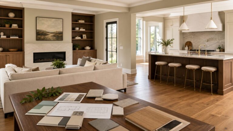
Use warm white on the walls, flat white on the ceiling, satin soft black on a fireplace surround or interior doors, and natural oak for flooring or furniture. This is one of the safest schemes for resale because it feels clean without becoming sterile. It works especially well in open floor plans where the living room connects to a kitchen.
Best when: you have light to medium wood floors, black window frames, or modern farmhouse details. Avoid stark blue-white trim, which can make the warm white walls look yellow.
2. Mushroom, Cream, and Walnut
Mushroom is a gray-brown neutral with more body than beige and more warmth than gray. Put it on the walls, use cream trim, and bring in walnut tables, picture frames, or built-ins. This palette is excellent for homeowners who want warmth without going tan.
Best when: the room has white oak, walnut, brown leather, or stone. Use aged brass or dark bronze hardware instead of chrome.
3. Taupe, Ivory, and Charcoal
Taupe walls with ivory trim and charcoal accents create a polished living room that still feels comfortable. Keep the ceiling flat white or a very pale ivory. Charcoal works well on a media cabinet, fireplace wall, or metal-framed coffee table.
Outdated Drivers Are Slowing You Down
One free scan finds every outdated or missing driver and matches the right update for your exact hardware.Free scan · exact hardware matchWindows Errors? Fix Them Before They Spread
Repair common Windows errors and clear accumulated junk for a smoother, more stable PC - no reinstall needed.Free scan · no reinstallBest when: you want a neutral scheme with more structure than greige. Watch undertones; pink taupe and yellow beige do not always play well together.
4. Cream, Putty, and Terracotta
Cream walls, putty upholstery, and terracotta pillows or pottery give a living room a warm, handmade feel. Terracotta is best used as an accent unless the room has excellent daylight and a confident design plan.
Best when: the room has plaster, clay tile, rustic beams, or dark bronze lighting. It also helps soften gray LVP floors.
5. Linen White, Olive, and Black
Linen white walls with olive built-ins or an olive sofa create a calm botanical palette. Black picture frames, lamps, or curtain rods keep it from looking too soft. This is one of the most versatile green schemes for 2026.
Best when: the room has plants, natural fiber rugs, linen curtains, and warm wood. Choose a smoky olive rather than a minty green.
6. Forest Green, Cream, and Cognac
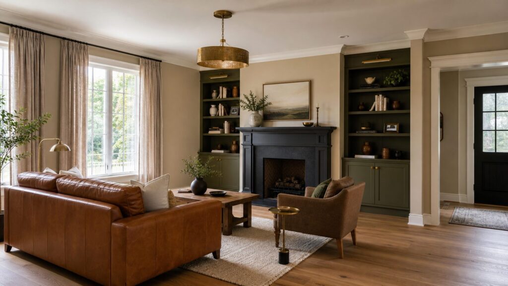
Forest green works well on built-ins, a fireplace wall, or all four walls in a room with enough light. Pair it with cream trim and cognac leather. The contrast feels traditional but still current.
Best when: you have a red brick fireplace, library-style shelves, or medium to dark wood floors. Add layered lighting because deep green absorbs light.
7. Green-Black, Warm White, and Brass
A green-black accent wall or built-in unit can make a living room feel tailored. Use warm white for the main walls and unlacquered brass or antique brass for lamps and hardware. Keep the ceiling light unless the room is intentionally moody.
Best when: the living room has high ceilings, substantial trim, or a strong focal wall. Use satin or enamel-grade finish on built-ins for durability.
8. Soft Sage, Bone, and White Oak
Sage is still usable when it is quiet and grayed down. Bone-colored trim and white oak flooring keep it warm. This scheme works for casual, airy living rooms and homes with indoor-outdoor flow.
Best when: the space gets steady natural light. Avoid pairing sage with icy white trim or blue-gray flooring.
9. Deep Teal, Cream, and Walnut
Deep teal is a strong choice for a living room with character. Use it on walls, built-ins, or a fireplace surround, then balance it with cream trim and walnut furniture. It feels richer than navy and less expected than green.
Best when: the room has good lamps, art, and warm wood. Use it carefully in small, dark rooms unless you are embracing a lounge-like feel.
10. Still Water Blue-Green, Sand, and Bronze
A muted blue-green with sand upholstery and bronze metal finishes gives a room a calm, coastal-adjacent look without becoming beach themed. It is a good option for homeowners who want color but not high saturation.
Best when: the floors are light, the trim is warm white, and the furniture is relaxed but tailored.
11. Navy, White, and Camel
Navy remains a reliable living room color when it is paired with warmth. Use navy on a feature wall, built-ins, or lower cabinetry, with warm white walls and camel leather or woven shades.
Recommended Free Tools
Best when: you want a classic palette for a colonial, craftsman, or transitional home. Avoid too much cool white and gray, which can make navy feel commercial.
12. Pale Blue, Cream, and Natural Fiber
Pale blue walls, cream trim, and jute or sisal textures create a bright living room that feels easy to live in. Choose a blue with enough gray or green in it so it does not read like a nursery.
Best when: the room has southern or western light. In north-facing rooms, test carefully because pale blue can go cold fast.
13. Warm Gray, White Oak, and Black
Warm gray is the version of gray that still earns its place. It should have a beige or green undertone, not a blue one. Pair it with white oak and black metal for contrast.
What’s actually slowing this PC down?
Pick the symptom - the matching free tool is one click away.
Best when: you already have gray flooring or a gray sectional and need the room to feel more current. Add texture through rugs, curtains, and wood.
14. Greige, Cream, and Deep Brown
Greige works best when it is balanced with cream trim and deep brown accents. This gives the room enough warmth for daily living and enough neutrality for resale.
Best when: the living room opens into other neutral spaces. Use a matte or eggshell wall finish so the color has depth without glare.
15. Charcoal, Ivory, and Caramel
Charcoal walls can be excellent in a den-like living room, especially with ivory trim and caramel leather. This palette needs good light placement: table lamps, floor lamps, sconces, or recessed lighting on dimmers.
Free tools Windows power users keep installed
One-click scans. No signup required.
Best when: the room is used mostly in the evening or has large windows. Flat charcoal can scuff, so consider washable matte or eggshell.
16. Burnt Umber, Cream, and Blackened Bronze
Burnt umber and charcoal-influenced dark neutrals are strong 2026 choices. They feel sophisticated on a fireplace wall, built-ins, or a color-drenched room. Use cream textiles and blackened bronze fixtures to keep the palette grounded.
Best when: you want a refined, moody room rather than a bright family room. Repair walls carefully because dark colors reveal poor patching.
17. Oxblood, Mushroom, and Warm White
Oxblood is powerful, so use it with discipline. A built-in bar, bookcase back, fireplace wall, or velvet chair can carry the color while mushroom walls and warm white trim keep the room livable.
Best when: the house has traditional architecture, dark wood, brass, or vintage rugs. Avoid glossy red walls unless the design is very intentional.
18. Burgundy, Taupe, and Walnut
Burgundy with taupe and walnut feels mature and comfortable. It works well in living rooms with art, books, and layered textiles. Keep the ceiling light to prevent the room from closing in.
Best when: the flooring is medium or dark wood. Use burgundy in controlled areas if resale is a near-term priority.
19. Plum, Cream, and Smoked Oak
Plum is a smart alternative to navy or charcoal. It brings depth without feeling harsh. Cream trim and smoked oak furniture make it elegant rather than theatrical.
Do these 3 things before closing this tab:
1Clear out junk files and repair common Windows errors2Fix the driver behind crashes, sound loss and screen glitches3Repair Windows errors before they cause bigger problemsBest when: the room has warm lamps and soft upholstery. Test plum beside flooring because some versions lean too red or too blue.
20. Clay, Warm White, and Dark Bronze
Clay walls can make a living room feel settled and architectural. Pair them with warm white trim, dark bronze lighting, and textured neutral upholstery.
Best when: the room has plaster texture, beams, brick, or handmade tile. Use large samples because clay colors shift dramatically under evening light.
21. Reddened Earth, Cream, and Olive
Earthy red-brown walls or accents work well with cream and olive. This is a rich, grounded palette that can make a plain drywall room feel more substantial.
Best when: you have warm wood floors and natural textiles. Keep the accent color muted so it does not become a primary-red room.
22. Universal Khaki, White, and Dark Green
Khaki walls are useful when beige feels too yellow and gray feels too cold. White trim keeps it crisp, while dark green adds depth through a sofa, built-ins, or art.
Best when: the house has traditional trim, tan stone, or brown furniture you plan to keep.
Rank #3
- Very good condition
- Benjamin Moore Classic Colors Fan Deck
- Classic Colors
- Includes the American Classic Colors (AC)
23. Lemon Chiffon, White, and Woven Brown
Muted yellow is coming back in careful doses. A soft lemon wall color with white trim and woven brown textures can brighten a living room without feeling loud.
The Tool Desk
Outbyte Driver Updater FREEFix the driver behind crashes, sound loss and screen glitchesFind Drivers →Outbyte PC Repair FREEClear out junk files and repair common Windows errorsFree Scan →Best when: the room is shaded or north-facing and needs warmth. Avoid strong yellow in rooms with intense west light.
24. Creamy White, Red Brick, and Black
If you have a red brick fireplace, do not fight it with cold gray. Creamy white walls, black accents, and warm wood make the brick look intentional. This is often less expensive and less risky than painting the brick.
Best when: the brick has orange, rust, or brown undertones. Use black sparingly for curtain rods, frames, and fireplace tools.
25. Putty, Blue-Gray, and White Oak
Putty walls with blue-gray upholstery and white oak furniture create a calm transitional palette. The putty keeps the room warm, while the blue-gray brings contrast.
Free tools Windows power users keep installed
One-click scans. No signup required.
Best when: you want a quiet room that still photographs well for listings. Make sure the blue-gray does not clash with green undertones in the wall paint.
26. Ivory, Chocolate Brown, and Brass
Chocolate brown is returning as a serious design color. Use ivory walls, brown upholstery or built-ins, and brass lamps or hardware. The result feels warmer than black-and-white but still crisp.
Best when: the room has substantial furniture and traditional details. Keep the wall color fresh so the brown does not look dated.
27. White, Slate Blue, and Cognac
Slate blue gives a living room a calm, tailored mood. Use white or warm white walls, slate blue casework or upholstery, and cognac leather for warmth.
Best when: you want color that still feels safe. This palette works well in craftsman, coastal, and transitional homes.
28. Pale Warm Gray, Cream, and Olive
This is a resale-friendly palette with enough character to avoid looking builder-basic. Pale warm gray walls, cream trim, and olive accents through pillows, art, or plants work in many homes.
Best when: the room already has gray flooring or stone. The olive keeps it from feeling cold.
29. Black, White, and Natural Wood
A black-and-white room needs natural wood to feel residential. Use white walls, black doors or fireplace accents, and wood tables, beams, shelving, or flooring.
Outdated Drivers Are Slowing You Down
One free scan finds every outdated or missing driver and matches the right update for your exact hardware.Free scan · exact hardware matchPC Slower Than It Used to Be?
A free scan shows the junk files, broken settings and background clutter dragging Windows down - then fixes them in one click.Free scan · Windows 10 & 11Best when: the architecture is clean and the room gets decent daylight. Avoid using high-gloss black on large surfaces because glare and fingerprints become obvious.
30. Color-Drenched Taupe
Color drenching means using one color family across walls, trim, doors, and sometimes ceiling, with finish changes by surface. Taupe is one of the safest colors for this because it creates depth without overwhelming the room.
Best when: the trim is plain or you want old trim to look more intentional. Use eggshell on walls and satin on trim, even when the color is the same.
31. Color-Drenched Green
A smoky green across walls, trim, and built-ins can make a living room feel custom. This is a higher-skill paint job because every caulk line, joint, and brush mark is more visible.
Best when: you have built-ins, paneled walls, or a library-style room. Plan for additional labor if trim and shelves need enamel-grade prep.
32. Warm White, Rust, and Deep Teal
Use warm white walls as the envelope, rust accents in textiles, and deep teal on a chair, cabinet, or art. This scheme gives you 2026 color without locking the entire room into a bold wall choice.
Best when: you like seasonal flexibility. It is also a smart approach for homeowners planning to sell within 2 to 4 years.
33. Soft Greige, Navy, and Brass
Soft greige walls, navy upholstery or built-ins, and brass lighting create a dependable living room palette. It is familiar, but when the undertones are right, it still looks current.
Best when: the home has open sightlines and you need a palette that transitions easily into kitchens, halls, and dining rooms.
Paint Costs for a Living Room in 2026
Most U.S. professional interior painting projects fall around $2 to $6 per square foot for walls, depending on prep, ceiling height, location, paint quality, and complexity. A construction-oriented living room estimate can run higher, roughly $4.22 to $8.19 per square foot, when labor, standard job inputs, setup, protection, and cleanup are included. Full interior painting averages around $2,022 nationally, with broad ranges from about $350 to $5,800 because scope varies so much.
Rank #4
- Features 216 timeless hues from the RAL CLASSIC collection with five colors per page - fan size 15.0 x 5.0 x 2.0, color display 2.0 x 5.0 cm
- Crafted with low-solvent, low-odour water-based paints for eco-friendly use
- Enhanced UV resistance provides long-lasting color protection
- Cover made from 100% recyclable post-industrial polypropylene waste
- Compact and portable design, ideal for precise color matching on the go
For a single living room, a basic wall repaint might be $600 to $1,500. Add ceilings, doors, windows, crown molding, built-ins, wall repair, or a dark-to-light color change, and a realistic project can move into the $1,500 to $3,500 range. High ceilings, stair connections, heavy drywall repair, smoke staining, or enamel-grade built-ins can push it further.
| Scope | Typical 2026 Cost Range | What Usually Drives the Price |
|---|---|---|
| DIY wall repaint | $150-$450 in paint and supplies | Paint quality, rollers, tape, drop cloths, patching materials |
| Professional walls only | $2-$6 per sq. ft. | Labor market, wall height, prep, paint grade, number of coats |
| Living room with typical job inputs | $4.22-$8.19 per sq. ft. | Protection, prep, labor, materials, cleanup, room complexity |
| Walls, ceiling, and trim | $1,500-$3,500+ | Trim detail, caulking, sanding, finish changes, access |
| Built-ins or fireplace wall | $750-$3,000+ | Primer, sanding, enamel finish, masking, spray or brush quality |
How Much Paint to Buy
A gallon of interior paint typically covers about 350 to 400 square feet per coat on smooth walls. Textured walls, porous drywall, dramatic color changes, and low-quality existing paint reduce coverage. Most professional living room jobs need two finish coats. Primer may also be needed for bare drywall, repaired areas, stains, glossy surfaces, or major color changes.
Do these 3 things before closing this tab:
1Fix the driver behind crashes, sound loss and screen glitches2Clear out junk files and repair common Windows errors3Scan for outdated or missing drivers - takes under a minuteUse this simple calculation: room perimeter x wall height minus openings = paintable wall area. Multiply by two coats, then divide by 350 to 400.
Example: a 16-by-20-foot living room has a 72-foot perimeter. With 9-foot walls, that is 648 square feet before subtracting windows and doors. Subtract about 80 square feet for openings and you have 568 square feet. Two coats equals 1,136 square feet of coverage. At 375 square feet per gallon, buy 4 gallons for the walls, with a little margin for touchups.
Do not forget separate products for ceiling and trim. Ceilings usually use flat paint. Living room walls are commonly matte or eggshell. Trim and doors are usually satin or semi-gloss. Built-ins often need a more durable satin or enamel-grade coating.
Trim, Ceilings, Lighting, and Undertones
Many living room color mistakes are actually trim and lighting mistakes. A warm taupe wall can look muddy against old cool-white trim. A deep green room can look flat with one overhead light. A creamy white can turn yellow beside blue-gray flooring.
Recommended Free Tools
When moving into warmer 2026 palettes, consider repainting trim and ceilings at the same time. It adds cost, but it can be the difference between a room that looks professionally planned and a room that looks like the walls changed but nothing else did.
For undertones, compare colors against fixed materials. Red oak often wants warmer neutrals, greens, creams, and earthy reds. Gray LVP often needs putty, warm white, olive, or black contrast. Red brick usually works better with cream, mushroom, olive, navy, or black than with cool gray. Brown leather looks strong with cream, forest green, deep teal, taupe, and warm white.
Lighting temperature matters too. Many living rooms look best with bulbs around 2700K to 3000K. Very cool bulbs can make warm palettes look dirty and make cool palettes feel harsh.
When a Color Refresh Becomes a Small Remodel
Paint is often the visible finish over other work. On our projects, a living room repaint can uncover drywall cracks, failed caulk, nail pops, mismatched texture, water staining, smoke staining, damaged trim, or built-ins that were never properly primed. If those issues are ignored, the new color only makes them easier to see.
What’s actually slowing this PC down?
Pick the symptom - the matching free tool is one click away.
A color refresh becomes a small remodeling project when you add drywall repair, texture matching, trim replacement, fireplace updates, recessed lighting, ceiling work, built-in painting, or flooring transitions. This is especially common in older homes, open floor plans, and rooms with 10-foot or higher ceilings.
Ask every painting contractor whether the quote includes furniture moving, floor protection, wall washing, patching, sanding, caulking, priming, two finish coats, ceilings, trim, doors, cleanup, and touchups. A low number that excludes prep is not the same scope as a complete professional repaint.
When to DIY and When to Hire a Pro
DIY makes sense when the room has standard 8- or 9-foot ceilings, minimal wall damage, simple trim, no lead-paint concern, and you are staying close to the existing color. Plan on a weekend for a careful DIY living room: one day for prep and cutting in, one day for rolling the second coat and cleanup. Add time if you are painting trim or ceilings.
Hire a pro when the room has high ceilings, heavy repairs, smoke or water staining, glossy surfaces, complex trim, built-ins, a dark color, color drenching, or open sightlines where cut lines must be excellent. Professional crews also move faster. A straightforward living room repaint may take 1 to 2 working days. A room with ceiling, trim, doors, built-ins, and repairs can take 3 to 5 days or more.
Quick wins for a faster PC:
Scan for outdated or missing drivers - takes under a minuteDriver Scan →Repair Windows errors before they cause bigger problemsFix Now →For homes built before 1978, lead-safe rules can apply when painted surfaces are disturbed. Do not sand, scrape, or demo old painted trim casually. Renovation, repair, and painting work in pre-1978 homes may require lead-safe practices by certified professionals. This is not a color issue; it is a health and compliance issue.
Interior paints and coatings are also regulated for volatile organic compounds. Low-odor and lower-VOC products are worth considering in occupied homes, especially when families need to sleep in the house during the project. Good ventilation and proper cure time still matter.
Best Resale-Friendly Living Room Palettes
If resale is likely within the next few years, keep the main living room envelope broadly appealing and use stronger colors in accents, built-ins, powder rooms, or furniture. The safest wall colors are warm white, soft greige, mushroom, balanced taupe, pale warm gray, subdued green, subdued blue, and contrast-rich neutrals.
Bold colors can help a listing photograph well when they are handled with restraint. Deep teal built-ins, olive cabinetry, a charcoal fireplace wall, or oxblood accents can make the room memorable. Fully saturated red walls, dingy beige, poor lighting, and very dark rooms without contrast tend to narrow buyer appeal.
The best approach is not to chase a trend blindly. Choose a palette that works with the home’s permanent materials, the light it actually gets, and the way the room is used. That is how color holds up after the fresh-paint smell is gone.
Frequently Asked Questions
What is the best color scheme for a living room in 2026?
Warm neutrals with richer accents are the strongest direction: warm white, mushroom, taupe, olive, deep teal, clay, oxblood, plum, walnut, brass, and dark bronze. The best choice depends on flooring, light exposure, trim color, and furniture.
How much does it cost to paint a living room professionally?
In 2026, professional interior painting commonly runs about $2-$6 per square foot for walls. A more complete living-room scope with labor, prep, protection, and cleanup can be about $4.22-$8.19 per square foot.
How many gallons of paint does a living room need?
A gallon usually covers about 350-400 square feet per coat. Most living rooms need two finish coats. A 16-by-20-foot room with 9-foot walls often needs about 4 gallons for the walls after subtracting typical doors and windows.
Free tools Windows power users keep installed
One-click scans. No signup required.
Should living room trim be white?
White trim is common, but it should match the wall undertone. Warm wall colors usually need warm white or cream trim. Old cool-white trim can make mushroom, taupe, clay, and warm white walls look muddy.
What paint finish is best for living room walls?
Matte or eggshell is usually best for living room walls. Flat hides defects but is less washable. Trim and doors are typically satin or semi-gloss, while ceilings usually look best in flat paint to reduce glare.
When should I hire a pro instead of painting the living room myself?
Hire a pro for high ceilings, heavy drywall repair, smoke or water stains, complex trim, built-ins, color drenching, very dark colors, or any pre-1978 home where lead-safe work may be required.
Quick Recap
Product prices and availability are accurate as of the date/time indicated and are subject to change. Any price and availability information displayed on Amazon at the time of purchase will apply.
Quick wins for a faster PC:
Scan for outdated or missing drivers - takes under a minuteDriver Scan →Repair Windows errors before they cause bigger problemsFix Now →