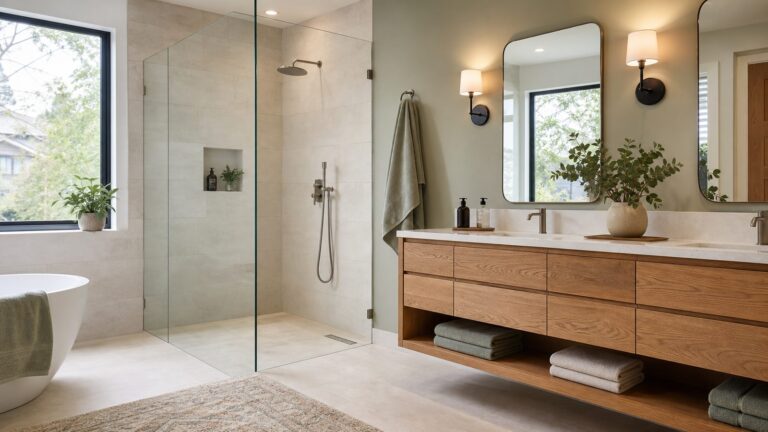
The colors that work best with red depend on its temperature, depth, saturation and how much of it you use. Crisp white creates graphic contrast; cream, tan and brown soften it; navy, denim, teal and pale blue cool it; greens provide complementary balance; and pinks, coral, orange, burgundy, plum and lavender create tonal or neighboring palettes. Use red as the focal color, add one supporting hue, then limit a third color or neutral to small accents.
How color relationships make red easier to combine
A 12-hue color wheel organizes the relationships designers use to build palettes. Complementary colors sit opposite one another; Sherwin-Williams uses red and green as the classic example. Analogous colors sit beside one another, such as red, red-orange and orange. Triadic palettes use three colors spaced evenly around the wheel. Adobe describes complementary, analogous and triadic relationships as foundations of color harmony, while Canva’s color-wheel tool also includes monochromatic and tetradic schemes.
These relationships are starting points rather than guarantees. The same red can look entirely different when it is blue-leaning crimson, orange-leaning scarlet, muted brick, deep oxblood or a light tint. Compare every pairing by temperature (warm or cool), value (light or dark), saturation (clear or muted) and proportion (dominant, supporting or accent).
21 colors that go with red
| Combination | Why it works | Best uses and control tip |
|---|---|---|
| Red + crisp white | High, clean contrast with a graphic edge. | Kitchens, logos, sneakers and holiday accents. Keep surfaces simple so the contrast does not become busy. |
| Red + warm cream | Preserves contrast while reducing white’s starkness. | Walls, cabinetry and upholstery in rooms that need warmth. Choose a cream with an undertone that agrees with the red. |
| Red + charcoal gray | Grounds red in a modern neutral without black’s severity. | Contemporary interiors, hardware and tailored clothing. Let charcoal occupy the larger area when the red is bright. |
| Red + black | Maximum drama and visual weight. | Graphic schemes, entry doors and evening looks. Make one color clearly dominant so the pairing does not feel heavy. |
| Red + navy | A confident warm/cool balance with classic authority. | Tailoring, nautical rooms and traditional branding. A lighter neutral can keep dark red and navy from closing in a space. |
| Red + denim blue | Relaxed contrast, especially convincing in casual textures. | Jeans, painted furniture and informal rooms. Washed denim suits clear reds; deep denim suits brick or burgundy. |
| Red + cobalt blue | Energetic primary-color contrast. | Expressive graphics and youthful rooms. Use tints, softened finishes or one dominant hue for control. |
| Red + teal | Blue-green cools red while keeping the palette lively. | Bathrooms, textiles and accent furniture. Muted teal makes the pairing easier to live with than equally bright shades. |
| Red + forest green | The traditional complementary direction. | Interiors and seasonal accents. Deepen or mute both colors to avoid an unintentionally festive look. |
| Red + sage green | A quieter, lighter interpretation of red’s complement. | Walls, upholstery and soft goods. Sage is especially useful when a vivid red needs a calm partner. |
| Red + olive | Earthy, restrained contrast. | Pair with terracotta, brick or rust reds in kitchens, studies and casual clothing. |
| Red + blush pink | Tonal harmony with a gentle shift in lightness. | Bedrooms, textiles and refined branding. Vary value enough that the two colors do not blur together. |
| Red + burgundy | Monochromatic depth from two red values. | Dining rooms, upholstery and winter clothing. Add a light neutral to separate the neighboring darks. |
| Red + coral | Warm analogous energy with a softened second hue. | Painted accents, graphics and summer fabrics. Keep either the red or coral less saturated. |
| Red + orange | Vivid analogous warmth. | Expressive graphics, fashion and statement pieces. Use carefully in large rooms because two hot hues compete for attention. |
| Red + mustard yellow | Warm, vintage-leaning contrast. | Upholstery, kitchens and retro-inspired rooms. Cream or brown settles the intensity. |
| Red + lavender | A playful red-violet/blue-violet direction with contemporary character. | Bedrooms, creative spaces and modern graphics. A muted red prevents the combination from looking sugary. |
| Red + plum | Rich neighboring depth. | Textiles, dining rooms and evening looks. Use a pale neutral or metallic accent for breathing room. |
| Red + tan or camel | An earthy neutral that lets red remain the focal point. | Leather, flooring, coats and living rooms. Camel works particularly well with brick and oxblood. |
| Red + chocolate brown | Warm, grounded combination with natural weight. | Woodwork, leather and rooms using brick, rust or oxblood reds. Add a light surface to prevent darkness. |
| Red + pale blue | High-versus-low temperature contrast that feels lighter than navy. | Nurseries, bedrooms, shirts and airy interiors. A muted red produces a calmer result than a pure scarlet. |
Choosing a red palette for a room
For a red couch
Let the couch remain the focal point. Cream, warm white, charcoal, tan, camel, pale blue and sage make practical wall or rug partners. Navy and forest green create a richer room, but keep one of them in smaller furnishings unless the red is muted. Add wood, metal or a pale neutral as the third element rather than introducing another saturated color.
#1 Best Overall
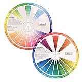
- This package include one Creative Color Mixing Board with one regular Color Wheel (9.25 inch).
- Easy-to-use tool that visually illustrates relationships between colors and demonstrates the results Features a grayscale, tints and tones, definitions of color terms, and illustrations of color.
- Color Wheel helps show which colors are complimentary, and how they go (or don't go) together.
- Some people know instinctively, and others need a visual tool to help them choose.
- Two sided wheel with indicators for complementary, split complementary and triad color schemes, how to tint and shade, primary, secondary and tertiary references, and more.
For red walls
Large red surfaces carry substantial visual weight. Balance them with cream, warm white, charcoal or pale blue on adjacent walls, trim, ceilings or large furnishings. If the red is deep, use lighter values elsewhere; if it is bright, choose muted companions such as sage, olive, denim or camel. Test the paint in the actual room before committing.
For red accents
Small red elements can tolerate stronger partners. White and black create a graphic statement; cobalt, teal, mustard or orange make an energetic scheme; blush, lavender and pale blue keep the effect lighter. Repeat the red at least once or twice so an isolated accent looks intentional.
Rank #2

- “The way it blocks out non-relevant colors so you can actually see the combination is genius.” Artists who paint, quilt, do interior decorating, or other crafts will consider this an especially useful tool.
- Painters, you will notice the colors typed around the rim of the wheel. Specific names are good to know for reference.
- Interior Designers, you will want to take this guide with you when choosing wall color, fabrics, and flooring. See the browns and grays? Even these are specified for your ease of selection.
- Quilters, as you hunt through your stash of fabrics, hold the color wheel up to them to get the right hues and neutrals for a lovely sewing project. Any fabric color which is not featured in the openings gets tossed aside! No arguments ;D
- Feedback: "I especially like having the reminder of where the different paint colors - Prussian Blue, Cobalt Blue, etc - fall in relation to one another on the wheel. I cannot recommend this product enough. " "The wheel is the only one of its kind I could find, excellent product and delivered promptly." "Finally, I'd been looking all over for a Munsell-type color wheel. This is it, very well executed. A huge help to my newest learning endeavor - painting. I would consider this a must have..."
Matching red clothing
For a dependable outfit, combine red with white, cream, charcoal, black, navy, denim, camel or chocolate brown. These neutrals and near-neutrals let the red lead. Forest, sage, olive, teal and pale blue introduce color contrast without requiring a full primary-color look. Burgundy, blush, coral, plum and lavender create tonal outfits; vary lightness, texture or finish so adjacent shades remain distinct.
Use red with cobalt, orange or mustard when you want an expressive statement. In that case, make one hue dominant and keep shoes, accessories or background pieces neutral. The red’s undertone matters: orange-red generally sits comfortably with camel, mustard and warm brown, while blue-red often looks sharper with navy, cobalt, lavender, charcoal or cool white.
Quick Recap
Best Value

- Creative color wheel-9.25"
- This item Belongs to craft supplies, arts-and-crafts-supplies
- This item is manufactured in United States
- No batteries required
Rank #4
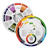
- Helps organise colours to make choices and combinations easier;Defines common terms and helps the artist to understand colour uses and interactions.
- Designed for all artists, including: Painters, crafters, interior, graphic, garden, and landscape designers;Perfect gift for creative people!
- Two-sided rotating wheel shows colour relationships;230mm diameter,2 packs Convenient and portable.
- UV coated to minimise fading and protect from moisture.Paper cover makes it;Paper evelope cover makes it difficult to break during transportation.
- Good for beginners to identify any of the colors easily and recognize the middle of the color simply.
Rank #3
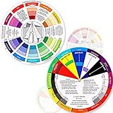
- Package include: 2 creative color wheel, 5.5 inch in diameter, the artist wheel helps show which colors are complimentary, and how they go (or don't go) together, suitable for learning how to color; Two identical color wheels, with different designs on the front and back
- Color mixing guide: the color wheel shows color, from basic principles and color mixing results on the front side; Spin around the paint wheel, then you will find the color mixture results in the windows, to learn the color theory in a fun way
- Color leaning tool: the backside of the color artist wheel that visually illustrates relationships between colors and demonstrates the results features a grayscale, and triad colors tints and tones, definitions of color terms, and illustrations of color, such as complementary colors, and triad colors
- Easy to use: this color mix guide consists of 3 layers, made of reliable cardboard with smooth surface and smooth rotation; And the size is moderate, easy to operate and carry
- Wide application: the relationship wheel is suitable to use when painting, quilting, interior design, having creative craft projects, and home decorating; Suitable for artists, teachers, kids, painters, designers, and tattoo learners
How to make red feel modern instead of overpowering
- Choose the red that suits the setting. Brick, rust, oxblood and softened crimson are easier to spread across a room than a fully saturated scarlet.
- Set a proportion. Start with the red item that must stay visible, choose one supporting color, and reserve a third hue or neutral for small accents. A 60-30-10 split can be a useful planning sketch, not a rule.
- Control value. Pair a dark red with a lighter companion or a bright red with a deeper anchor. Matching two equally dark colors can make a room feel smaller.
- Control saturation. If both colors are vivid, use them in small areas. Muting one side usually makes the combination more sophisticated.
- Use texture and finish. Matte paint, woven fabric, polished metal and natural wood change how the same color is perceived and can prevent a flat block of red.
- Balance warm and cool elements. Sherwin-Williams recommends combining warm and cool colors when you want variety and equilibrium. Navy, teal, sage or pale blue can cool a warm red; cream, camel and brown can warm a cooler red.
A reliable testing workflow
- Check the relationship. Use a physical artist color wheel to see whether your proposed pair is complementary, analogous, triadic or simply a neutral contrast.
- Collect real samples. Compare paint cards, sample pots, peel-and-stick swatches, fabric or flooring samples rather than relying on a screen.
- Place samples in context. Put them beside the red object, trim, countertop, flooring and fixed finishes. The surrounding colors can change the apparent undertone.
- View them at different times. Daylight and artificial light shift how red reads. Check morning, afternoon and evening, and note the room’s warm or cool bulbs.
- Adjust proportion before rejecting a palette. Try a smaller accent, a paler tint, a deeper shade or a more muted version of the companion color.
- Save digital variations. Adobe Color and Canva Color Wheel can generate and save palette variations before you buy materials, but confirm the final choice with physical samples.
Quick selection guide
- Clean and graphic: crisp white, black or charcoal.
- Soft and welcoming: warm cream, tan, camel or blush.
- Classic and tailored: navy, denim or chocolate brown.
- Natural and grounded: sage, olive, forest green or brick-red with brown.
- Bold and energetic: cobalt, teal, orange or mustard.
- Rich and atmospheric: burgundy, plum or oxblood with a light neutral.
- Light and contemporary: pale blue, lavender or muted teal.
Product prices and availability are accurate as of the date/time indicated and are subject to change. Any price and availability information displayed on Amazon at the time of purchase will apply.