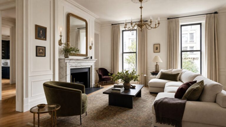
The best “regret-proof” kitchen cabinet colors are adaptable, not universally guaranteed. These 14 shades cover the most dependable options: warm and crisp whites, flexible greiges, restrained blues, muted blue-greens, organic sages, and deep contrast colors. Your final choice should coordinate with the countertop, backsplash, flooring, appliances, and lighting already in the kitchen.
“Never regret” should mean adaptable—not universally perfect. Kitchen cabinet color depends on your countertops, backsplash, flooring, natural light, and the undertones already in the room. The 14 colors below earn their reputation because they pair with a wide range of finishes, use restrained saturation, and can work in traditional, transitional, or modern kitchens.
As an Amazon Associate I earn from qualifying purchases.
Before committing, test a large sample on the actual cabinet surface or on a movable board. Benjamin Moore and Behr both caution that color can change significantly with daylight, artificial light, surrounding finishes, and screen settings. View your samples in the morning, afternoon, and evening before ordering paint.
At-a-glance: 14 adaptable kitchen cabinet colors
| Color | Color family | Best use | Pairs well with | Watch for |
|---|---|---|---|---|
| Benjamin Moore White Dove OC-17 | Warm soft white | Full cabinetry | Warm stone, wood, brass, cream, neutral counters | May look too warm beside icy whites |
| Benjamin Moore Chantilly Lace OC-65 | Clean bright white | Full cabinetry or modern kitchens | White tile, cool stone, crisp black accents | Can look stark in certain light |
| Benjamin Moore Simply White OC-117 | Warm-leaning white | Full cabinetry | Wood, warm metals, neutral and lightly colored surfaces | Sample beside existing whites |
| Benjamin Moore Seapearl OC-19 | Quiet off-white | Full cabinetry | Gray, blue-gray, white, and pale stone | Can read differently under cool lighting |
| Benjamin Moore Revere Pewter HC-172 | Classic greige | Full cabinetry or lowers | Wood, white, gray, stone, and aged metals | May shift between beige and gray |
| Benjamin Moore Edgecomb Gray HC-173 | Soft warm neutral | Full cabinetry | Natural wood, warm stone, cream, aged brass | Can feel warmer in rooms with little daylight |
| Benjamin Moore Hale Navy HC-154 | Deep navy | Island, lowers, or well-lit full kitchen | White, brass, wood, marble-look surfaces | Needs balancing light and contrast |
| Benjamin Moore Aegean Teal 2136-40 | Muted blue-green | Island or full cabinetry | Warm white, wood, light stone, brushed metals | Test for blue/green shift |
| Benjamin Moore Gloucester Sage HC-100 | Subdued sage | Full cabinetry or island | Natural wood, warm white, stone, organic finishes | Can look gray in low light |
| Benjamin Moore Kendall Charcoal HC-166 | Deep charcoal gray | Island, base cabinets, or bright kitchens | White, wood, polished stone, warm metals | May overpower a small, dark room |
| Sherwin-Williams Alabaster SW 7008 | Creamy white | Full cabinetry, especially smaller kitchens | Warm whites, wood, cream, beige, and soft metals | Can look yellow beside cool whites |
| Sherwin-Williams Sea Salt SW 6204 | Blue-green-gray | Island or full cabinetry | White walls, natural wood, light stone | Highly sensitive to warm and cool light |
| Sherwin-Williams Evergreen Fog SW 9130 | Green-gray | Full cabinetry or island | Warm white, oak, walnut, stone, aged metals | Can become more green or gray in different rooms |
| Sherwin-Williams Needlepoint Navy SW 0032 | Deep relaxed navy | Island, lowers, or classic full kitchen | White, natural wood, brass, and pale counters | Requires adequate light or a deliberate dark scheme |
The 14 kitchen cabinet colors you are least likely to tire of
1. Benjamin Moore White Dove OC-17
White Dove is a warm, soft white that is especially forgiving when a kitchen contains wood, warm flooring, cream-colored surfaces, or countertops with beige and taupe undertones. It supplies brightness without the blue cast that can make an icy white feel disconnected from the rest of the room.
#1 Best Overall

- COMPLETE 5-PIECE BRUSH SET FOR EVERY PAINTING TASK — Includes 1 Inch Flat, 1.5 Inch Angle, 2 Inch Flat, 2 Inch Angle Stubby, and 2.5 Inch Angle brush giving you every size professional painters use daily. Get all 5 for less than the price of a single brush from hardware store brands — professional grade performance at a fraction of the cost. Perfect for walls, trim, cabinets, doors, furniture, and detailed cutting-in work on any project.
- ZERO BRISTLE LOSS — GUARANTEED BY PRECISION ADHESIVE BONDING — Every bristle is locked in place with precision-set adhesive that keeps them in the brush — not in your paint job. The coated steel ferrule provides structural support while the adhesive bond ensures clean performance on every stroke. Premium SRT synthetic filaments load more paint and release it evenly for a smooth streak-free finish on walls, ceilings, and trim. Works with latex, oil-based paint, primer, sealer, and wood stain.
- INCLUDES THE ANGLE STUBBY MOST SETS LEAVE OUT — Professional painters know the 2 Inch Angle Stubby is the go-to brush for tight cabinet interiors, window sashes, inside corners, and detailed trim where standard angle brushes are too long. Combined with the 1.5 and 2.5 inch angle sash brushes you have precision cutting-in covered at every scale — baseboards, crown molding, door casings, and ceiling lines.
- FLAT BRUSHES FOR BROAD SMOOTH COVERAGE ON ANY SURFACE — The 1 and 2 inch flat brushes deliver even coverage on walls, furniture, shelving, doors, fences, decks, and wood surfaces. Ideal for applying primers, stains, varnishes, polyurethane, and specialty coatings. Solid wood handles provide all-day comfort and control for both professional contractors and weekend DIY homeowners tackling interior or exterior painting projects.
- TRUSTED BY PROFESSIONAL PAINTERS AND CONTRACTORS NATIONWIDE — Pro Grade delivers professional-grade results at a price that makes sense for crews who go through brushes on every job. Ideal for property managers, remodeling contractors, apartment turnover crews, maintenance teams, and commercial painting operations. Backed by thousands of verified reviews from working painters. Washable and reusable for multiple projects.
Use it for traditional, transitional, or relaxed-modern cabinetry. It is also a sensible choice when a sample of pure white looks gray or cold in your kitchen. Pair it with warm stone, natural wood, aged brass, or a backsplash that is white but not stark.
2. Benjamin Moore Chantilly Lace OC-65
Chantilly Lace is the crispest white in this group. It suits kitchens with clean white tile, cool stone, simple lines, and a deliberately high-contrast palette. With black hardware or dark windows, it can create a sharp contemporary look without introducing a strong hue.
Its main risk is excessive contrast. Against warm floors, cream walls, or yellow-toned lighting, a very bright white may look stark. Compare it directly with the backsplash and countertop rather than judging a small card in isolation.
3. Benjamin Moore Simply White OC-117
Simply White offers brightness with a little more softness than a hard, cool white. It is useful when you want white cabinets that feel welcoming rather than clinical, but do not want an obviously beige or creamy result.
It works with natural wood, warm metals, neutral counters, and many white backsplashes. If the kitchen already includes several different whites, place the sample beside each one: small undertone differences become much more visible when surfaces touch.
4. Benjamin Moore Seapearl OC-19
Seapearl is a quiet off-white that bridges white cabinetry and gray or blue-gray surfaces. It is less forceful than a bright white and can help a kitchen feel layered rather than stark.
Choose it when Chantilly Lace feels too sharp but a warm white would clash with the room’s cool stone or backsplash. Because the color can respond noticeably to lighting, inspect it under both daylight and the artificial lighting used after dark.
Recommended Free Tools
5. Benjamin Moore Revere Pewter HC-172
Revere Pewter is a classic greige: warmer than a conventional gray, but less committed to beige. That middle position is why it can coordinate with white, wood, gray, stone, and a variety of hardware finishes.
It is a strong candidate for full cabinetry in a kitchen that needs warmth without a distinctly cream or tan appearance. Its appearance can move between beige, gray, and off-white depending on the room, so a full-size sample is essential. A small online swatch cannot predict how it will look against your particular counter or floor.
Rank #2

- Elevate your painting precision with the Bates trim brush set, featuring three brushes in distinct sizes tailored for a diverse range of detailing and trim work needs.
- Every brush in the set boasts finely bristled ends, ensuring a consistently smooth application and masterful attention to every detail.
- With an ergonomic design, each brush offers a comfortable grip handle, allowing for extended painting sessions without the slightest hint of hand fatigue.
- Built for durability and excellence, these trim brushes are resistant to shedding, promising a flawless stroke every time without the worry of stray bristles.
- Suitable for both professionals and passionate DIY enthusiasts, this set ensures versatility and precision in painting, catering to a variety of tasks and finishes.
6. Benjamin Moore Edgecomb Gray HC-173
Edgecomb Gray is a soft, warm neutral for homeowners who want more color than white without creating a strong focal point. It avoids the institutional quality some cool grays can bring to a room.
It is particularly compatible with natural wood, warm stone, cream elements, and aged brass. In a kitchen with limited daylight or many warm finishes, it may look noticeably warmer than expected; test it beside the permanent materials before painting every door.
Quick wins for a faster PC:
Fix the driver behind crashes, sound loss and screen glitchesFind Drivers →Clear out junk files and repair common Windows errorsFree Scan →7. Benjamin Moore Hale Navy HC-154
Hale Navy is a deep, restrained navy that works especially well on an island or lower cabinets. Its classic character makes it easier to live with than a brighter, more saturated blue, while still providing meaningful contrast against white or pale cabinetry.
It can also cover all the cabinets in a kitchen with good natural or artificial light and enough visual relief. Balance it with a lighter backsplash, countertop, wall color, or ceiling. In a small, dim kitchen, using it only on the island may deliver the color without making the room feel enclosed.
8. Benjamin Moore Aegean Teal 2136-40
Aegean Teal brings blue-green personality while remaining muted and grounded. It is a good compromise for someone who wants color but does not want a vivid turquoise or highly saturated jewel tone.
Use it throughout a bright, balanced kitchen or limit it to an island against neutral cabinetry. Warm white walls, natural wood, light stone, and restrained metal finishes help it feel intentional. Sample it in place to determine whether your lighting brings out more blue or more green.
Free tools Windows power users keep installed
One-click scans. No signup required.
9. Benjamin Moore Gloucester Sage HC-100
Gloucester Sage is a subdued green that connects naturally with wood, stone, warm whites, and other organic materials. It adds character without demanding the attention of a bright or heavily saturated green.
It is flexible enough for full cabinetry, but it can also make an island feel custom without turning the island into a novelty feature. In a dark kitchen, the color may become grayer and flatter; compare samples near both the window and the shadowed areas of the room.
10. Benjamin Moore Kendall Charcoal HC-166
Kendall Charcoal supplies deep contrast without the absolute intensity of black. It is a practical choice for an island, base cabinets, or all cabinetry in a kitchen with enough light and lighter surrounding surfaces.
Rank #3

- COMPLETE 12-PC PROFESSIONAL SET:Includes 4" tray ×1, snap-fit handle ×1, reusable liners ×2, liner cover ×1, dual-brown microfiber sleeves ×4, white microfiber sleeves ×2, and 1.5" angled brush ×1. Perfect for walls, ceilings, trim, cabinets, and furniture
- SMOOTH FINISH WITH MICROFIBER SLEEVES:Dual-density roller sleeves (9mm nap for textured surfaces, 6mm nap for smooth walls) hold paint evenly, prevent drips, and deliver streak-free results. Microfiber fibers resist shedding for pro-grade coverage
- EASY COLOR CHANGE & CLEANUP WITH LINER:Reusable plastic liners snap into the tray for quick color swaps; the airtight cover stores paint overnight without drying. Save time and reduce waste
- NO-SPILL TRAY & COMFORT GRIP HANDLE:Deep tray design holds ample paint without leaks, while the ergonomic handle reduces fatigue during extended painting sessions. Ideal for DIYers and contractors
- VERSATILE FOR ALL SURFACES + DETAIL BRUSH:Tackle edges and corners with the 1.5" angled brush. Sleeves work flawlessly on drywall, wood, concrete, and more. Get professional results with minimal effort
Pair it with white or warm off-white walls, wood accents, pale stone, and hardware that gives the dark finish some definition. In a kitchen with limited daylight, use it selectively or confirm with a large sample that the room still has the visual brightness you want.
11. Sherwin-Williams Alabaster SW 7008
Alabaster is a creamy white for kitchens where a bright, cool white would feel severe. It can help a small kitchen feel open while retaining a softer, more settled appearance.
It pairs naturally with wood, cream, beige, warm stone, and soft metal finishes. Its warmth can become obvious beside a cool white wall or blue-white backsplash, so compare the sample with every nearby white before choosing it.
12. Sherwin-Williams Sea Salt SW 6204
Sea Salt is a muted blue-green-gray that can look calm and understated in one kitchen and noticeably blue or green in another. That variation is part of its appeal, but it makes sampling non-negotiable.
It complements white walls, natural wood, and light stone particularly well. Use it on an island for a controlled dose of color, or on all the cabinets when the rest of the palette is quiet and the room has sufficient light.
What’s actually slowing this PC down?
Pick the symptom - the matching free tool is one click away.
13. Sherwin-Williams Evergreen Fog SW 9130
Evergreen Fog is a restrained green-gray with an organic, settled quality. It is more atmospheric than a plain neutral but less demanding than a saturated forest or emerald green.
It works on full cabinetry or an island with warm white walls, oak or walnut, stone, and aged metal. The surrounding finishes will influence whether it reads greener, grayer, or warmer, so evaluate it against the actual floor and countertop rather than relying on a digital image.
14. Sherwin-Williams Needlepoint Navy SW 0032
Needlepoint Navy is a deep, relaxed navy that creates a classic high-contrast kitchen. It is well suited to islands and lower cabinets, and can support a full-cabinet application when the room has adequate light and a deliberate dark-color scheme.
White, pale counters, natural wood, and brass or other warm metals keep the result from becoming visually heavy. If the kitchen is already dark, start with an island sample before committing to every cabinet.
Windows Errors? Fix Them Before They Spread
Repair common Windows errors and clear accumulated junk for a smoother, more stable PC - no reinstall needed.Free scan · no reinstallOutdated Drivers Are Slowing You Down
One free scan finds every outdated or missing driver and matches the right update for your exact hardware.Free scan · exact hardware matchRank #4

- 【Professioanl Household Paint Brushes Kit】3 Pack includes 1x1", 1x1.5" and 1x2" flat paintbrushes. The assortment of sizes makes it handy for several large and small areas of interior and exterior painting projects.
- 【Premium Synthetic Bristles】✔️No shedding or clumpy, no brush streaks.✔️Thicker, flagged tip holds more paint and provides greater coverage.✔️Soft-to-firm bristles ensure a really smooth glide for even paint application, saving paint usage and painting time.
- 【Pressure Relief Rubber Handle】Made of solvent-resistant rubber for long-lasting use. Thumb groove and handle are designed with multiple non-slip holes/stripes for more stable control and comfy grip, relieving hand fatigue from long tedious work. Perfect length and weight make painting hard-to-reach areas easier than other flimsy and cheap brushes.
- 【Sturdy Stainless Steel Ferrule】Welded construction, no nails for less hiding dirt, simply rinse them with water to remove paint for reuse.
- 【Easy to Clean and Reuse】Practical hanging hole and handy holding slot is for easy drying and storage to prevent brush bristles from deforming.
How to choose the right color from the list
Start with finishes you cannot easily replace
Choose the cabinet color after considering the countertop, backsplash, flooring, appliances, and any large wood elements. These fixed finishes usually cost more and create more disruption to replace than paint.
- Warm countertop or wood undertones: Start with White Dove, Simply White, Alabaster, Edgecomb Gray, Gloucester Sage, or Evergreen Fog.
- Cool gray or blue-gray stone: Compare Chantilly Lace, Seapearl, Hale Navy, Aegean Teal, Sea Salt, or Needlepoint Navy.
- A mostly white kitchen: Add contrast with Hale Navy, Needlepoint Navy, Kendall Charcoal, Aegean Teal, or a muted green on the island.
- A small or low-light kitchen: Begin with White Dove, Simply White, Alabaster, or another carefully tested light neutral; reserve deep colors for selected cabinetry unless the dark scheme is intentional.
- A natural, organic palette: Consider Edgecomb Gray, Gloucester Sage, Sea Salt, Evergreen Fog, or a warm white with wood accents.
Identify the undertone instead of chasing a color name
“White,” “gray,” and “green” are broad families, not precise visual outcomes. Hold the sample next to the countertop and backsplash. If the cabinet color makes the fixed finish look pink, yellow, blue, or dingy, it may be exposing an undertone conflict rather than solving it.
Do not infer an exact undertone from an on-screen swatch. The display, sheen, neighboring colors, and room lighting can all distort what you see.
Decide whether the color belongs on every cabinet
A color that looks excellent on a small island sample may be overwhelming across a wall of cabinets. Deep navy, charcoal, and blue-green shades are often easier to use on an island or lower cabinets, while whites and restrained neutrals are generally more forgiving across the full kitchen.
The Tool Desk
Outbyte Driver Updater FREEScan for outdated or missing drivers - takes under a minuteDriver Scan →Outbyte PC Repair FREERepair Windows errors before they cause bigger problemsFix Now →That is not a rule. A well-lit kitchen with a coordinated dark palette can support full Hale Navy, Needlepoint Navy, or Kendall Charcoal cabinetry. The important question is how much visual mass the color creates in your particular room.
Sample the color correctly before you buy
- Use a large movable board or a removable cabinet door. A small paint chip is not large enough to show how a color will behave across a run of cabinets.
- Put the sample near the countertop, backsplash, and floor. Test the actual combinations, not the paint color by itself.
- Move it around the room. Check beside the window, under upper cabinets, near appliances, and in the darkest corner.
- View it at different times. Morning daylight, afternoon light, evening lamps, and under-cabinet lighting can produce different impressions.
- Compare adjacent whites together. A warm white can look yellow beside a cool white, while a cool white can look gray beside a warmer one.
- Wait before deciding. Look at the sample for at least a full day, and preferably through several lighting conditions.
Paint and preparation matter as much as the color
Even the best color can disappoint if the coating chips, fails to adhere, or shows brush marks. Ordinary wall paint should not be the primary choice for frequently handled kitchen cabinets. Cabinet projects need a coating formulated for adhesion, flow, leveling, durability, and repeated cleaning.
Benjamin Moore recommends Advance Interior paint for a hard, furniture-quality finish. Sherwin-Williams recommends Emerald Urethane Trim Enamel for cabinets, doors, and trim. Behr recommends its Cabinet, Door & Trim Enamel. These are manufacturer recommendations, not independent laboratory proof that one brand is universally better than another. Follow the label and product data sheet for the exact system you choose.
If you are comparing products, look for cabinet paint or cabinet enamel rather than selecting ordinary interior wall paint simply because the color is available in that line. Confirm that the product is appropriate for your cabinet substrate and application method.
A practical cabinet-painting preparation checklist
- Remove doors, drawers, and hardware; label each piece so reinstallation is straightforward.
- Protect floors, counters, appliances, and nearby walls.
- Degrease thoroughly, especially around handles, the range, and the dishwasher.
- Allow the surface to dry completely.
- Scuff-sand or degloss glossy surfaces so the new coating has a suitable mechanical bond.
- Repair dents, chips, and damaged edges before priming.
- Use a bonding primer when the substrate, existing finish, or chosen coating system requires it.
- Apply thin, even coats and respect the stated recoat time.
- Allow the paint to cure before reinstalling hardware or subjecting doors to normal abuse.
Grease, dust, moisture, and glossy residue are common causes of adhesion failure. Sherwin-Williams also emphasizes allowing sufficient drying time before reinstalling hardware. A bonding primer for cabinets and a cabinet-specific preparation system can be particularly useful on glossy, laminate, previously painted, or difficult surfaces; verify compatibility before applying it.
Best Value

- Get everything you need for any painting project with this all-in-one set: 1 sturdy 4-inch roller frame with a soft ergonomic handle, 1 durable magnetic paint tray, 2 tray liners, 5 high-density foam roller covers, 1 angle 2-inch paintbrush, and a drop cloth. Designed for easy use and cleanup, this kit is ideal for DIYers and professionals alike
- The innovative 4-inch paint tray, made from durable, recyclable PP material, supports up to 220 lbs (100 kg) without bending or deforming. Its built-in magnetic paint tray holder keeps your brush secure when not in use, while dual paint removal ridges ensure smooth application. A non-slip base adds stability, and the tray’s ergonomic design includes a curved spout for easy paint recycling and slots to hold the roller frame securely
- The upgraded roller frame features a soft, ergonomic rubberized handle, reducing hand fatigue during extended use. Its sturdy design provides reliable support for the roller and ensures smooth, even paint application, making every project more comfortable and efficient
- These high-density foam roller covers are perfect for water-based or oil-based paints, delivering smooth, streak-free finishes. Retain more paint with fewer trips to the tray, ensuring even coverage on walls, cabinets, doors, or trim. Achieve professional results every time with these durable foam rollers
- The included precision paintbrush with non-shedding bristles is ideal for cutting in edges and corners, delivering clean lines and a polished look. Paired with the sturdy roller frame and high-quality tray, these tools help you complete painting projects faster while simplifying cleanup with reusable tray liners
Choose the sheen deliberately
Satin, pearl, semi-gloss, and high-gloss finishes can all be suitable for cabinets, depending on the product line and the look you want. Satin or pearl is usually the easiest recommendation for a softer, furniture-like appearance with less pronounced reflection. Semi-gloss reflects more light and is often chosen when cleanability and a brighter finish are priorities. High-gloss emphasizes surface imperfections and can look highly reflective.
Do not compare color samples in one sheen and make the final decision in another. Sheen changes how much light the surface reflects and can alter the apparent depth of the color.
Safest choices by situation
| If you want… | Start by sampling… |
|---|---|
| A crisp, bright white | Benjamin Moore Chantilly Lace OC-65 |
| A warmer white that is less severe | Benjamin Moore White Dove OC-17, Benjamin Moore Simply White OC-117, or Sherwin-Williams Alabaster SW 7008 |
| A flexible neutral | Benjamin Moore Revere Pewter HC-172 or Edgecomb Gray HC-173 |
| A classic island blue | Benjamin Moore Hale Navy HC-154 or Sherwin-Williams Needlepoint Navy SW 0032 |
| A muted blue-green | Benjamin Moore Aegean Teal 2136-40 or Sherwin-Williams Sea Salt SW 6204 |
| A calm organic green | Benjamin Moore Gloucester Sage HC-100 or Sherwin-Williams Evergreen Fog SW 9130 |
| Dark contrast without using black | Benjamin Moore Kendall Charcoal HC-166 |
| A quieter off-white beside gray or blue-gray finishes | Benjamin Moore Seapearl OC-19 |
The most reliable choice is not the color that looks best in a catalog. It is the color that agrees with your permanent finishes, still works in the room’s worst lighting, and is applied with a cabinet-appropriate preparation and coating system.
Do these 3 things before closing this tab:
1Scan for outdated or missing drivers - takes under a minute2Clear out junk files and repair common Windows errors3Fix the driver behind crashes, sound loss and screen glitchesFrequently Asked Questions
What is the safest kitchen cabinet paint color?
For the broadest range of countertops, floors, and hardware, start by sampling Benjamin Moore White Dove OC-17, Benjamin Moore Simply White OC-117, Sherwin-Williams Alabaster SW 7008, Benjamin Moore Revere Pewter HC-172, or Benjamin Moore Edgecomb Gray HC-173. The best choice still depends on the undertones and lighting in your kitchen.
Which white is best for warm-toned kitchens?
White Dove, Simply White, and Alabaster are warmer whites that are less likely to feel icy or stark beside wood, cream, warm stone, and beige-toned finishes. Sample them beside your backsplash and countertop because a warm white can look yellow next to a cool white.
Can I use navy or charcoal on all my kitchen cabinets?
Yes, but dark colors usually need adequate natural or artificial light and lighter surrounding surfaces. Hale Navy, Needlepoint Navy, and Kendall Charcoal are often easier to balance on an island or lower cabinets before using them throughout the kitchen.
What type of paint should I use on kitchen cabinets?
Use a cabinet-specific enamel or another coating system designed for cabinet wear, adhesion, flow, leveling, and cleaning. Benjamin Moore Advance Interior, Sherwin-Williams Emerald Urethane Trim Enamel, and Behr Cabinet, Door & Trim Enamel are manufacturer-recommended examples; they are not presented here as independent comparative test winners.
The Tool Desk
Outbyte PC Repair FREEClear out junk files and repair common Windows errorsFree Scan →Outbyte Driver Updater FREEScan for outdated or missing drivers - takes under a minuteDriver Scan →How do I prevent painted cabinets from peeling?
Degrease first, remove hardware, scuff-sand or degloss glossy surfaces, repair damage, prime when required by the substrate or coating system, and follow the product’s recoat and curing instructions. Reinstalling hardware before the finish has cured can damage the new coating.
The Bottom Line
Bottom line: For the broadest compatibility, begin with White Dove, Simply White, Alabaster, Revere Pewter, or Edgecomb Gray. For controlled color, sample Hale Navy, Needlepoint Navy, Sea Salt, Aegean Teal, Gloucester Sage, or Evergreen Fog—often on an island first. Whatever you choose, test it in your kitchen at different times of day and prioritize preparation, primer compatibility, and curing over a color name alone.
Quick Recap
Product prices and availability are accurate as of the date/time indicated and are subject to change. Any price and availability information displayed on Amazon at the time of purchase will apply.