Quick wins for a faster PC:
Repair Windows errors before they cause bigger problemsFix Now →Fix the driver behind crashes, sound loss and screen glitchesFind Drivers →Clear out junk files and repair common Windows errorsFree Scan →White can still be the most sophisticated wall choice in 2026—but only when it is selected as a specific color, not treated as an absence of color. The right white responds to the room’s orientation, daylight, finishes and furnishings; the wrong one can look flat, blue, yellow or clinical.
Current forecasts do not prove that white is the dominant color people are putting on their walls. They show a mixed market: warm, nature-inspired shades are prominent, while Pantone has chosen a white and manufacturers continue to publish several white palettes. Sophistication, therefore, is a design result you can create deliberately, not a popularity statistic.
As an Amazon Associate I earn from qualifying purchases.
What makes a white room look sophisticated?
A sophisticated white room has layers. Walls provide a calm field, while timber, stone, metal, textiles, artwork and changing daylight supply variation. Because the walls are visually restrained, the eye notices proportion, craftsmanship and material quality rather than a loud color competing with them.
White also creates continuity. Using a related white through connected spaces can make a renovation feel intentional and can let door profiles, architraves, cabinetry and ceiling lines read clearly. That does not mean every surface must match exactly: a subtle difference in sheen or undertone can define trim without introducing a new competing hue.
#1 Best Overall
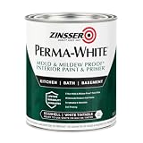
- Self-Priming formula - requires no sanding
- Mold & Mildew-Proof paint film - guaranteed for 5 years
- Resists dirt and moisture on film coating
- Finish is washable and scrubbable with soap and water
- Product contains a mildewcide to prevent the growth of mold and mildew on the paint film only
The sophisticated effect depends on editing. A white wall cannot disguise poor preparation, awkward transitions or a collection of unrelated finishes. It is a backdrop that makes decisions visible, so the construction and furnishing details need to be resolved.
“White” is a family of colors, not one swatch
Every paint white has an undertone. Warm whites can carry yellow, cream or red-brown influence; cool whites can lean gray, blue or violet; some appear comparatively neutral until they are placed beside a stronger color. Two whites that look identical on a small card can separate dramatically across a large wall.
| White character | Typical visual effect | Where it can work | Risk to check |
|---|---|---|---|
| Warm white | Soft, enveloping and compatible with warm timber, brass and earthy fabrics | Rooms with warm furnishings or a desire for a relaxed, residential feel | Can look yellow or creamy beside blue-gray tile, cool stone or daylight that emphasizes blue |
| Cool white | Crisp, clean and visually bright | Contemporary schemes with gray, black, stainless or cool-toned surfaces | Can read icy or slightly violet, especially in already cool light |
| Balanced or near-neutral white | Quiet background with less obvious color bias | Open plans where the wall must coordinate with several adjoining finishes | May still shift under different bulbs and orientations; “neutral” is not color-proof |
Sherwin-Williams’ guidance is to evaluate orientation and lighting before choosing. Its manufacturer guidance says north-facing rooms enhance cool-toned whites, while south-facing rooms enhance warm undertones. When the goal is balance, it suggests counteracting the room’s lighting with an opposing undertone—for example, considering a warmer white in a cooler-lit room or a cooler white where warm light is dominant. The examples and recommendation are design guidance from the paint maker, not an independent controlled study.
The Tool Desk
Outbyte Driver Updater FREEFix the driver behind crashes, sound loss and screen glitchesFind Drivers →Outbyte PC Repair FREEClear out junk files and repair common Windows errorsFree Scan →How orientation changes the decision
| Room condition | What the light may emphasize | Selection question |
|---|---|---|
| North-facing or predominantly cool daylight | Blue or gray qualities in a white | Do you want that crispness, or would a restrained warm undertone keep the room comfortable? |
| South-facing or strongly warm daylight | Yellow, cream or red-brown qualities | Would a cooler or more balanced white prevent the walls becoming overly creamy? |
| Mixed exposure, deep overhangs or limited windows | Artificial lighting and nearby finishes become more influential | Which white remains acceptable at the times the room is actually used? |
These are tendencies, not guarantees. Trees, neighboring buildings, glazing, curtains, reflective floors and LED color temperature can change the result. Look at the paint in the room rather than relying on a brand name such as “pure,” “classic” or “natural.”
What the 2026 color forecasts actually show
The evidence for 2026 is mixed, and it should be described accurately. The National Kitchen & Bath Association’s December 9, 2025 roundup of paint-company selections points toward warm, nature-inspired colors. Greens are prominent, with browns and creamy neutrals also represented. The same roundup reports that Pantone selected Cloud Dancer, a white hue. These announcements catalogue named forecasts; they do not measure the proportion of homes painted white.
Individual manufacturers are also emphasizing colors beyond white. Sherwin-Williams named Universal Khaki SW 6150 its 2026 Color of the Year and presents it as a warm, nature-associated midtone neutral. Benjamin Moore announced Silhouette AF-655 on October 16, 2025, describing a blend of espresso hues and charcoal; its accompanying palette includes Swiss Coffee OC-45. PPG’s 2026 selection is Warm Mahogany, supported by four thematic groupings in which neutrals, including Blank Canvas PPG1085-1, support more expressive shades.
Rank #2

- Use for a variety of indoor and outdoor project surfaces including wood, metal, plaster, masonry or unglazed ceramic
- Water-based acrylic formula is low odor, resist chips and provides long-lasting protection
- Covers up to 120 sq ft and dries to touch in 30 minutes for quick project completion
- Semi-gloss finish minimizes surface imperfections, goes on smoothly and provides excellent hide
- Prior to application sand surfaces with 180/200 grit sandpaper, then wash with a degreaser, allow the surface to dry and apply paint
At the same time, white remains an active part of major paint palettes. Behr’s 2026 Evolved Neutrals page lists Ultra Pure White, Nano White, White Moderne and Blank Canvas among its pale neutrals. The practical conclusion is not that white has won a popularity contest. It is that homeowners still have many white options, while the broader conversation is widening toward warmer and more nature-inspired color.
Why white remains a strong sophisticated choice
It lets architecture lead
In a well-proportioned room, a restrained wall color keeps attention on ceiling height, window rhythm, built-ins, stair details and joinery. This is especially useful when a project includes expensive materials that should remain legible rather than compete with a saturated wall.
It adapts as furnishings change
A carefully chosen white can accommodate a new sofa, artwork or rug more readily than a highly specific accent color. That flexibility is not an excuse to choose randomly; undertone still determines whether future pieces harmonize or clash.
It clarifies material contrast
White makes differences in texture apparent. A honed stone, rift-sawn timber, woven fabric and aged metal can each read distinctly when the wall is quiet. Sophistication comes from the contrast between surfaces, not from making every surface equally bright.
It supports visual continuity
In open-plan homes, a related white can connect kitchen, dining and circulation areas. The same family of color can make transitions feel calm, while changes in sheen or a slightly deeper trim color provide definition where needed.
PC Slower Than It Used to Be?
A free scan shows the junk files, broken settings and background clutter dragging Windows down - then fixes them in one click.Free scan · Windows 10 & 11Crashes, No Sound, or Screen Glitches?
Random freezes, missing sound and display glitches usually trace back to one bad driver. Find and replace yours safely.Free scan · under a minuteWhen white looks sterile, flat or unfinished
Sherwin-Williams cautions that white can appear sterile when the shade is poorly suited to its setting. Common causes include a cool white in a blue, low-light room; a warm white beside cool gray finishes; and a single untested color used across rooms with different exposures.
Rank #3
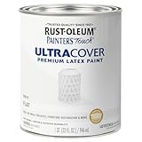
- Use for a variety of indoor and outdoor project surfaces including wood, metal, plaster, masonry or unglazed ceramic
- Water-based acrylic formula is low odor, resist chips and provides long-lasting protection
- Covers up to 120 sq ft and dries to touch in 30 minutes for quick project completion
- Flat finish provides a fresh new look for surfaces, goes on smoothly and provides excellent hide
- Prior to application sand surfaces with 180/200 grit sandpaper, then wash with a degreaser, allow the surface to dry and apply paint
- Flatness: Walls, trim and ceiling all have the same value and sheen, so architectural edges disappear.
- Color clash: Existing flooring, counters or tile carry an undertone that exposes the opposite bias in the wall.
- Patchiness: Inadequate surface preparation, repairs or uneven porosity show more readily against a light finish.
- Glare: Large bright planes reflect windows and fixtures, making the room uncomfortable even when the color is technically suitable.
- Disconnected rooms: A white selected for one exposure is carried into an adjoining room where the light changes its appearance.
The remedy is diagnosis, not a universal “best white.” Identify the existing undertones, observe the light, and test the finalists at full scale.
How to choose a white for your own room
- Inventory fixed finishes. Photograph or collect samples of flooring, stone, cabinetry, tile, countertops and large upholstered pieces. Look for yellow, red-brown, blue, violet or gray influence rather than naming the finish simply “neutral.”
- Record the room’s exposure. Note window direction, nearby buildings or trees, overhangs and the times the space is used. A home office judged only at midday may look different during an evening meal under LED lighting.
- Shortlist by undertone. Start with a warm, cool and more balanced candidate that could plausibly work with the fixed finishes. Do not begin with the largest number of swatches; begin with the right undertone families.
- Paint large sample areas. Apply each candidate on separate boards or large wall sections. Small paper chips are useful for elimination but cannot show how a color behaves across a broad plane.
- Move the samples. Check the same colors beside trim, flooring, cabinetry and the darkest furnishing. A white may appear different against a warm oak floor than against a cool stone floor.
- Observe several conditions. View the samples in morning, afternoon and evening light, with the normal electric lights on and off. Record what changes instead of trusting a single impression.
- Choose the finish separately from the color. Wall sheen, trim sheen and ceiling sheen affect reflection and edge definition. Confirm the intended finish with the paint specification and the surface condition before ordering materials.
- Approve the complete scheme. Decide how the selected white relates to doors, skirting, architraves, cabinetry and adjoining rooms. Keep the sample on site until the final surfaces and lighting are installed.
This process takes longer than selecting from a fan deck, but it prevents an expensive repaint and gives the contractor a clear, shared reference.
White compared with the leading 2026 alternatives
The alternatives named in current forecasts are not inherently less sophisticated. They create a different design emphasis. Compare them by warmth, lighting response, visual role and compatibility with the materials already in the building.
What’s actually slowing this PC down?
Pick the symptom - the matching free tool is one click away.
| Direction | Examples named for 2026 | Visual role | Best question to ask |
|---|---|---|---|
| White | Cloud Dancer; Ultra Pure White, Nano White, White Moderne and Blank Canvas are examples appearing in current palettes | Quiet backdrop that can make architecture and furnishings prominent | Which undertone and sheen support the room’s light and fixed finishes? |
| Warm midtone neutral | Universal Khaki SW 6150 | Grounding color with more visible warmth and presence | Will the room benefit from a defined envelope rather than a reflective backdrop? |
| Deep brown-charcoal | Silhouette AF-655 | Intimate, tailored focal color that increases contrast | Is there enough daylight and furnishing scale to carry a darker wall? |
| Warm, expressive brown | Warm Mahogany | Rich accent or immersive scheme with a stronger emotional signal | Which surfaces should remain quiet so the wall does not dominate? |
| Green and other nature-inspired shades | Greens highlighted in the NKBA roundup | Color-forward connection to landscape and organic materials | Does the hue support the view, planting and neighboring rooms throughout the day? |
| Creamy neutral | Cream-toned neutrals represented in the NKBA roundup | Soft alternative to bright white with a warmer envelope | Will the cream coordinate with existing whites, appliances and cool surfaces? |
These examples are brand forecasts and an association roundup, not performance rankings. None establishes which color will work best in a particular home.
Independent reader supportYour contribution helps us test, update, and keep practical guides available for everyone.Designing a sophisticated white scheme room by room
Living rooms
Use the wall as a quiet field and let upholstery, timber and artwork supply depth. If the room has a large warm floor, test whether a very cool white makes the floor look more yellow by comparison. If the furnishings are gray or blue, test a warm white for balance rather than assuming a colder white is automatically cleaner.
Kitchens and dining areas
Compare the wall with countertop edges, splashback tile, cabinet paint and appliance finishes. A white that works beside a natural stone sample may look different beside a bright manufactured surface. Keep adjacent whites close enough in undertone that the transition feels intentional.
Rank #4

- WATER-BASED & LOW ODOR Water-Based Interior Paint – Low-odor formula designed for everyday indoor painting and refresh projects. Creates a comfortable application experience while providing a clean matte finish for interior walls and ceilings.
- SMOOTH MATTE FINISH Smooth Matte Finish – Dries to a soft, even, non-reflective appearance for a clean and modern interior look. Available in White and Magnolia to complement a wide range of home décor styles.
- FOR WALLS & CEILINGS Made for Interior Walls & Ceilings – Suitable for bathroom, kitchen, bedroom, hallway and other indoor wall or ceiling refresh projects. Designed for properly prepared interior surfaces and previously painted areas.
- EASY BRUSH OR ROLLER APPLICATION Easy to Apply – Stir thoroughly before use and apply evenly with a brush or roller to a clean, dry and properly prepared surface. Touch dry in approximately 2–3 hours and recoat after approximately 4 hours under suitable conditions.
- EASY CLEAN-UP & MULTIPLE SIZES Soap & Water Clean-Up – Clean brushes, rollers and tools with warm soapy water after use. Available sizes for projects ranging from smaller wall refreshes to larger interior areas.
Bedrooms
Warm or balanced whites often support a restful palette of linen, timber and muted textiles. Check the color under the bedside and ceiling fixtures you will actually use; a wall that feels calm in daylight can become noticeably yellow or gray at night.
Recommended Free Tools
Bathrooms and utility rooms
Reflective tile, mirrors and artificial light can amplify undertones. Sample the wall white beside the grout, sanitaryware and metal finishes. A small room may need a softer white to avoid glare, even when a crisp white looked appealing on a card.
Pairing walls, trim and finishes without losing restraint
- Timber: Warm woods usually welcome a warm or balanced white; test against the exact species and finish because red or orange cast can be strong.
- Stone and tile: Identify whether the material leans blue-gray, beige, green or pink before selecting the wall undertone.
- Metals: Brass, bronze and copper often reinforce warmth, while chrome and stainless can emphasize coolness. The relationship matters more than following a fixed rule.
- Textiles: Curtains and rugs occupy large visual areas. Place samples beside them, not only against an empty wall.
- Trim: A related white with a different sheen can define profiles subtly. A starkly different trim color creates a graphic border and should be an intentional choice.
- Artwork: Bright white can sharpen high-contrast art; a softer white may sit more comfortably with vintage paper, muted photography or earthy paintings.
A practical handover checklist
- Confirm the exact color name, code and finish on the written specification.
- Keep an approved sample board on site for every connected space.
- Check that repaired areas are properly prepared before the final coat.
- Inspect walls under daylight and installed electric lighting.
- Review corners, ceiling lines, trim junctions and changes between adjoining whites.
- Photograph the completed color with the room’s permanent finishes so future touch-ups can be matched accurately.
Frequently asked questions
Does choosing white mean ignoring the 2026 color direction?
No. The 2026 announcements include warm neutrals, greens, browns and creamy shades as well as a white selection. White is a deliberate option within that wider palette, not proof that other colors are unfashionable.
Can I select a white from an online image?
Use online images to understand a palette, not to make the final selection. Screen settings, photography, daylight and surrounding finishes can all alter appearance. Approve a physical sample in the actual room.
Should every room in a house use the same white?
Not necessarily. A consistent family can improve flow, but rooms with different orientations or fixed finishes may need different undertones. Decide where continuity is valuable and where a separate, compatible white prevents a lighting problem.
Do these 3 things before closing this tab:
1Scan for outdated or missing drivers - takes under a minute2Repair Windows errors before they cause bigger problems3Fix the driver behind crashes, sound loss and screen glitchesIs a warmer white always more sophisticated?
No. Warmth is appropriate when it supports the room’s light and materials. In a room with cool surfaces or strong warm daylight, a balanced or cooler white may produce the more resolved result.
White remains sophisticated in 2026 when it is treated as a design decision with an undertone, a lighting context and a material strategy. Choose the color in the room, test it through the day, and use the restraint of the walls to reveal the quality of the construction and furnishings around them.
Quick Recap
Product prices and availability are accurate as of the date/time indicated and are subject to change. Any price and availability information displayed on Amazon at the time of purchase will apply.

