The most reliable way to mix bold color, pattern, and vintage furniture is to choose one visual lead, borrow a small palette from it, then vary pattern scale and intensity so the room has both energy and rest. A patterned rug, expressive fabric, or distinctive vintage chair can supply the starting point. Repeat selected colors or materials elsewhere, distribute prints instead of clustering them, and leave quieter surfaces for the eye. These are composition tools, not laws: a room can break them deliberately when the overall arrangement has a clear focus.
Start with one visual lead
Rooms become difficult to edit when every purchase is treated as a star. Pick the element that should establish the mood and let the other decisions respond to it. The lead might already be in the room—a tiled fireplace, an inherited cabinet, a rug you cannot stop thinking about—or it might be the first item you buy.
As an Amazon Associate I earn from qualifying purchases.
Choose an anchor with enough information
A useful lead contains more than one clue for later decisions. A multicolor rug offers several hues, a pattern vocabulary, and a sense of scale. A vintage chair may contribute an upholstery color, a wood tone, a curved or angular silhouette, and a patina. A large-scale fabric can establish whether the room feels botanical, geometric, graphic, or quietly textural.
Quick wins for a faster PC:
Fix the driver behind crashes, sound loss and screen glitchesFind Drivers →Repair Windows errors before they cause bigger problemsFix Now →- Use a patterned rug when you want the floor to organize seating and provide a broad palette.
- Use a striking fabric for curtains, a chair, or cushions when textiles are the main source of softness and pattern.
- Use a vintage furniture piece when its shape, finish, or history should be the first thing visitors notice.
Decide where the eye should land
Young Huh, identified by Benjamin Moore as a New York-based interior designer, advises deciding “where you want the drama to occur or the eye to first focus on.” That decision prevents a room from becoming a random collection of strong elements. If the lead is a chair, keep the wall behind it relatively calm. If the lead is a patterned wallcovering, select furniture silhouettes that can be read against it rather than competing with its outline.
#1 Best Overall

- Valued Carpenter Pencil Set: You will get 2 pcs solid carpenter pencils with 26 piece 2.8 mm refills, 1 replaceable sharpener, 1 plastic storage box.The complete carpenter pencils combination allows you to finish your work faster and more easily
- Deep Hole Marker Pencil: The deep-hole construction pencils adopts 45mm elongated tip design, which is more convenient to mark in the small hole or in other tight areas that other carpenter markers cannot reach
- Carpenter Pencils with Sharpener: The sharpener is screwed into the top of the work pencil, which won't get lost either. Built-in pencil sharpener that keep the lead with pointed and smooth to Improves line of sight in fine work
- Stronger Solid Lead: This work pencil is matched with a 2.8 mm thick lead , which is much thicker and stronger during the drawing process of construction work, it will not break or damage easily
- Marks on Various Surfaces: 3 colors solid construction pencil can marks on various surfaces,such as metal, plastic, wood, paper etc. Ideals for woodworkers, contractors, craftsmen, builders, merchants and masons
Before buying additions, stand at the room entrance and note the first object you see. Photograph the room from that viewpoint and mark the intended focal area. This simple check is especially useful during a renovation, when temporary materials and construction clutter can make every surface appear equally prominent.
Build a connected color palette
Once the lead is chosen, pull a few colors from it instead of inventing a new color for every item. Sherwin-Williams recommends choosing smaller patterns in a color from the lead pattern and distributing patterns through the space. The repeated color acts as a visual bridge even when the motifs are unrelated.
For example, a rug containing rust, olive, cream, and ink can support an olive-and-cream stripe on a cushion, an ink-colored lamp, and rust-colored art. The secondary pieces do not need to reproduce the rug. They only need a recognizable relationship to it.
Separate palette roles
Give each color a job so the room does not become a contest among equal-strength accents.
- Lead color: the hue that appears in the focal pattern or upholstery and carries the room’s identity.
- Supporting colors: one or two hues repeated in smaller amounts on textiles, painted surfaces, ceramics, or artwork.
- Quiet colors: wood, stone, off-white, gray, or a softened version of a saturated hue that allows the stronger colors to register.
This is a planning framework, not a required ratio. A small room may use a dark wall and pale upholstery; a large room may use several saturated colors. What matters is that the strongest colors have somewhere to stop.
Check color under the room’s real light
Look at fabric, paint cards, and finishes at morning, afternoon, and evening. A color that appears balanced beside a window can look heavier under warm lamps. If you are selecting finishes during construction, place samples beside the actual flooring, trim, and fixed surfaces rather than on a white sheet of paper. Keep the lead item present while you compare samples so the palette remains anchored to the object that started it.
Benjamin Moore describes its Color Portfolio app as a way to apply paint color to photos of a space. A digital mock-up can help you test broad relationships, but it cannot show the exact texture, sheen, or aging of a vintage finish. Treat it as a screening tool, then review physical samples.
Rank #2

- Ergonomically Designed: Work in tight areas with a compact design that gets into tough spots
- Both tools are designed to fit into difficult to reach spaces
- Complete a wide range of applications with a high-performance motor that delivers up to 300 UWO, and an impact driver delivering up to 1,400 in-lbs of torque
- Both the DEWALT impact driver and drill driver feature integrated LED work lights with a convenient 20-second delay, ensuring enhanced visibility in dimly lit or challenging work areas
- One-Handed Loading - Keep one hand free with a 1/4 in. hex chuck that accepts 1 in. bit tips
Mix pattern types without making a visual pileup
Pattern mixing works when motifs differ in character but share at least one connecting quality—often color, scale, or texture. Young Huh describes a useful group as “something organic, something geometric and a stripe or a solid.” Organic motifs can include leaves or irregular brush marks; geometric motifs include grids, diamonds, or crisp abstracts; stripes and solids provide structure and relief.
Use a pattern hierarchy
Assign each print a visual rank before placing it. A lead pattern has the largest motif, strongest contrast, or greatest area. Secondary patterns support it with smaller marks or lower contrast. A tertiary element may be a narrow stripe, tiny check, or textured solid that reads almost as a surface rather than a competing image.
| Pattern role | Typical visual behavior | Good uses |
|---|---|---|
| Lead | Largest scale, strongest contrast, or broadest coverage | Rug, sofa fabric, feature wall, or full-height curtains |
| Supporting | Smaller motif or related color with moderate contrast | Occasional chair, bench, duvet, or medium-size cushion |
| Quiet connector | Stripe, small check, solid, or tactile weave | Trim, lumbar cushion, lampshade, ottoman, or throw |
The table describes a way to compare visual demands, not a prescription for a fixed number of prints. If two items are equally large and equally contrasty, reduce one before adding another.
Change scale as you layer
Place a prominent motif beside smaller or quieter marks. A large botanical can sit with a narrow stripe; a bold geometric rug can be paired with a fine check on a chair. When every print has the same-sized repeat, the eye has difficulty deciding what is foreground and what is background.
Scale also includes the physical size of the object carrying the pattern. A tiny motif on a large sofa can look busier than the same motif on a cushion. Consider the viewing distance: a pattern that reads as a calm texture from across the room may reveal a lively detail close up.
Use texture as a pattern substitute
Not every layer needs a printed motif. Ribbed wool, cane, quilting, carved wood, hammered metal, and woven baskets create variation without adding another image. Texture is particularly useful beside a high-contrast print because it supplies depth while leaving the pattern’s silhouette legible.
Create breathing room and distribute attention
Spread patterns around the room rather than stacking every print in one corner. A patterned rug can be balanced by a printed cushion on the opposite side of the seating group and a small motif in artwork or a lampshade. The distribution should feel intentional, not mathematically equal.
Rank #3

- 【Great Compatibility】This Katerk 1/4 inch hex shank bit holder is specifically designed for 1/4 inch hex shank drill bits. It's compatible with most 1/4 fast hex handles, hex sockets, various electric screwdrivers, and handheld screwdrivers. The bit holder makes it a valuable addition for any handyman.
- 【Secure and Safe】Built with a secure backup nut design, each drill bit holder securely locks onto your bits, ensuring they stay firmly in place. Additionally, our bit holder incorporates a high-quality steel ball rolling design that holds up to several kilograms of weight, ensuring your various drill bits don't fall off.
- 【Easy One-Handed Operation】The bit holder for impact driver allows you to change bits single-handedly, simplifying your workflow. Its multi-color design further allows for quick identification of the drill bit you need.
- 【Compact and Convenient】Thanks to its compact size, this 1/4 inch bit holder is easy to carry around. The bit holder allows for easy attachment to various tools, making this a convenient addition to your construction accessories. The Katerk bit holder is cast from high-quality alloy material, promising a long product lifespan. Despite its rugged strength, the bit holder remains lightweight, making it portable.
- 【Cool Christmas Gift For Men Stocking Stuffers】 This screwdriver bit holder, driver bit holder, impact bit holder, can be given as a gift to your loved one, especially for anyone involved in construction or electrical work. It's a must-have for stocking stuffers for men and women, tools gifts for dad, tech gadgets for men, gifts for dad, gifts for him, gifts for husband, gifts for boyfriend, cool gadgets for men, and cool gifts for dad.
Build visual pauses
Solids, neutrals, and less saturated areas give the eye a place to rest. A plain wall can separate a patterned curtain from a patterned chair. An unprinted seat cushion can interrupt several decorative pillows. Open wood grain, a simple plaster surface, or a plain runner can perform the same function.
Recommended Free Tools
Huh cautions that “if everything is high octane, it’s going to be a little tiring on the eye.” When a room feels exhausting, first quiet one surface rather than changing every color. Remove a cushion, replace a busy lampshade with a solid one, or move a patterned object to a less prominent position.
Use adjacency deliberately
Two loud patterns can work when they are separated by a solid or by a difference in scale. Conversely, two patterns with similar scale and contrast may need distance even if their colors coordinate. Walk around the room and inspect the places where objects touch or overlap: the arm of a printed chair against a patterned curtain is more visually intense than either item viewed alone.
Make vintage furniture the character anchor
Vintage furniture adds a quality that new pieces often lack: a specific silhouette, aged surface, or evidence of use. Let that quality participate in the room’s existing language instead of treating the piece as an isolated prop.
If the vintage piece is the hero
Keep nearby elements quieter so its shape and patina can be read. A carved cabinet may need an uncluttered wall; a vividly upholstered chair may need a solid rug field beneath it. Repeat one restrained clue—perhaps its wood tone or a color in the upholstery—elsewhere so it belongs to the room without being copied.
Do these 3 things before closing this tab:
1Clear out junk files and repair common Windows errors2Fix the driver behind crashes, sound loss and screen glitches3Repair Windows errors before they cause bigger problemsIf the vintage piece is supporting the scheme
Echo one of its colors, materials, or forms in a secondary object. A walnut side table can relate to a walnut frame; a curved chair can be paired with a rounded mirror; a faded blue finish can reappear in a small textile. Keep the echo selective. Repeating every feature can make the room look staged rather than collected.
Assess what is visible before you commit
The available guidance supports using vintage furniture as a visual anchor, but it does not establish a condition, authenticity, or restoration checklist. Those questions still matter in a real purchase. Inspect joints, veneer, upholstery, odors, drawers, hardware, and evidence of repair according to the item and your tolerance for work. If a piece needs structural or finish treatment, account for that before making it the centerpiece of a room schedule.
Rank #4

- Long Nib and Deep Hole Marker: Our mechanical carpenter pencil with 45mm nib is designed for easy marking of deep holes or narrow areas. These construction pencils are the great choice for woodworking tools, construction tools, carpenter tools, contractor tools, wood carpentry tools and architect tools
- Extra Refills in 2 Colors for Versatile Marking: The construction mechanical pencil comes with 12 extra 2.8mm refills, including 6 red and 6 black refills. The black refill is suitable for light surfaces, while the red wax is perfect for dark surfaces. Our carpenter mechanical pencil makes sure that you'll have an ample supply for extended use
- Built-in Sharpener: Our construction pencil comes with a built-in sharpener to ensure the mechanical pencil tip is always sharp and ready for use. Never buy an extra pencil sharpener again. A great tool for any woodworker pencil, contractor pencils. The refill can easily be extended or retracted with a simple click of the pencils mechanical, allowing you to work more efficiently and accurately
- Portable Clip Design: Our deep hole construction pencil features a portable clip design, easy to carry and attach to your pocket or tool box, so that you can keep the carpenter pencils mechanical close at hand, making it a convenient tool to have on the go. Great gifts choice for carpenters
- Stronger Pencil Lead: The black refills are made of lead, sturdy and smooth. The red refills are made of wax, clear and light. These marking pencils are much thicker and stronger than normal pencils during the marking process of construction work, suitable for various surfaces, such as glasses, metal, boards, floors, walls, furniture, etc. The written marks can be easily wiped with a wet paper towel when needed
Plan the composition room by room
Living room
Start with the rug or sofa as the lead, then let chairs and cushions provide smaller pattern steps. Keep at least one large plane—such as a wall, curtain, or major upholstery surface—quiet if the rug is highly graphic. A vintage coffee table or cabinet can supply the material contrast that a fourth print would otherwise provide.
Bedroom
Use the bedcover or headboard as the dominant textile, then repeat one color in a smaller pillow or bench fabric. Because the bed occupies a large visual area, choose bedside pieces with simpler silhouettes if the bedding is bold. A vintage dresser can become the character element while the wall and window treatments remain calm.
What’s actually slowing this PC down?
Pick the symptom - the matching free tool is one click away.
Dining area
A patterned rug under the table can establish the palette, while vintage chairs introduce varied shapes or finishes. If the chairs are individually colorful, use a restrained table surface and limit additional prints to artwork or a single textile. Confirm that chair upholstery patterns remain readable when the chairs are pushed together.
Entry and circulation spaces
A runner, painted ceiling, or single piece of vintage furniture can provide a clear lead in a narrow area. Use smaller-scale motifs or solids on adjacent surfaces so the passage does not feel compressed. The entry can preview colors used in larger rooms without repeating every pattern.
Use a comparison grid before buying
When two possible pieces both appeal to you, compare the qualities that affect composition rather than choosing by color alone.
| Decision axis | Questions to ask | Why it matters |
|---|---|---|
| Visual scale | Is the motif or silhouette larger, smaller, or similar to the lead? | Different scales create hierarchy; matching scales can create competition. |
| Color relationship | Does the piece repeat a lead color, soften it, or introduce a deliberate contrast? | A repeated color connects; a contrast should have a clear purpose. |
| Pattern type | Is it organic, geometric, striped, checked, or solid? | Contrasting motif families can add rhythm when their intensity is controlled. |
| Texture | Does it add weave, grain, sheen, carving, or another tactile layer? | Texture can enrich the scheme without adding another print. |
| Attention demand | How quickly do you notice it from the doorway? | Several high-attention pieces make it harder to establish a focal point. |
Place a photo of the candidate beside a photo of the lead and view both at thumbnail size. If the candidate disappears completely, it may be too quiet to support the composition. If it dominates immediately, decide whether you are willing to move the focal point.
A practical sequence for assembling the room
- Pick the lead. Choose the existing or planned rug, textile, wall treatment, or vintage furniture piece that expresses the desired mood.
- Record its clues. List its main colors, secondary colors, motif type, scale, texture, wood or metal finish, and silhouette.
- Choose connections. Select smaller patterns or solid pieces that reuse at least one lead color or material.
- Change scale and type. Pair a prominent motif with a smaller mark, stripe, or solid. Add texture where another print would be too intense.
- Place pauses. Reserve some walls, upholstery, floors, or accessories for solids, neutrals, or lower saturation.
- Distribute the prints. Move related patterns around the room so the eye travels rather than stopping at one crowded cluster.
- Position the vintage piece. If it is the hero, quiet its surroundings. If it supports the room, echo one color, material, or shape elsewhere.
- Review from real viewpoints. Check the doorway, main seat, and evening lighting. Notice which element is seen first and which areas feel congested.
- Edit one thing at a time. If all surfaces compete, remove or quiet one element. If the room feels too matched, introduce a contrasting shape, pattern type, or texture.
The application of these steps to a vintage piece—especially deciding whether to quiet its surroundings or echo one of its qualities—is a composition strategy derived from the principles above, not a tested formula.
Best Value
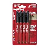
- Milwaukee Ink all Fine Point Marker, Black, 4 Per Pack
- 4 per pack Features Clog Resistant Marker Tip Writes through Dusty, Wet and Oily Surfaces Durable Marker Tip for Writing on Concrete, OSB and Rough Surfaces
- Clog resistant tip writes on dusty, wet and oily surfaces and is optimized for rough surfaces such as OSB, cinderblock and concrete
- Hard hat clip- attaches for easy access
- Quick dry time with reduced smearing and marking
When conventional mixing rules should be broken
Rules about matching motifs, limiting contrast, or reserving one focal point are useful defaults, but they are not universal laws. Cooper Hewitt’s account of George J. Sowden’s 1985 Memphis design describes a work with nine patterns and surface treatments that deliberately depart from common mixing conventions. The example shows that abundance can be intentional when the design has a coherent attitude and controlled placement.
To break a convention successfully, identify what you are choosing instead. You might accept many competing patterns to create exuberance, use clashing colors to emphasize a playful period reference, or repeat a motif so insistently that it becomes a graphic field. Make the decision visible in the whole room: random exceptions read as mistakes, while a consistent departure reads as a point of view.
Troubleshoot common problems
Everything looks loud
Find the item with the highest contrast or largest uninterrupted area and quiet it first. Swap a patterned throw for a solid, remove one decorative object, or repaint a small surface in a less saturated version of an existing color. Do not add another accent in an attempt to balance the noise.
Free tools Windows power users keep installed
One-click scans. No signup required.
The patterns coordinate but feel flat
They may share color and scale too closely. Introduce a different motif family—a stripe beside an organic print—or add texture through wood, woven fiber, or a tactile solid. A contrasting vintage silhouette can create the missing movement without another color.
The vintage piece looks unrelated
Check whether any of its qualities appear elsewhere. Repeat one upholstery color, wood tone, curve, or metal finish in a small, deliberate way. If the piece has an unusually strong shape, move competing silhouettes away from it rather than trying to disguise it with more decoration.
The room feels overly matched
Stop repeating the same motif. Keep the established palette but change the pattern type, finish, or shape. A geometric textile can sit with an organic artwork; a polished surface can be balanced by aged wood. The relationship should be recognizable without being literal.
The focal point is unclear
Photograph the room from the entrance and ask what you notice first. If several objects tie, reduce one object’s contrast or visual area. Huh’s advice to decide where the eye should focus is a practical editing test, not a requirement that every room contain only one interesting object.
Crashes, No Sound, or Screen Glitches?
Random freezes, missing sound and display glitches usually trace back to one bad driver. Find and replace yours safely.Free scan · under a minutePC Slower Than It Used to Be?
A free scan shows the junk files, broken settings and background clutter dragging Windows down - then fixes them in one click.Free scan · Windows 10 & 11Use the finished room as a composition, not a checklist
At the final review, ignore individual shopping victories and judge the room from a distance. The lead should announce the mood, repeated colors should connect unlike pieces, pattern scales should create a readable order, and quiet areas should prevent fatigue. Vintage furniture should contribute a specific character—through its finish, upholstery, or silhouette—rather than merely supplying an old-looking object.
Once those relationships work, you can leave room for the unexpected. A deliberately exuberant arrangement, such as the kind discussed in Cooper Hewitt’s account of Sowden, can be more convincing than a cautious room that follows every convention. The test is whether the choices look intentional from the doorway, hold together as you move through the space, and give the eye both a destination and somewhere to rest.
Quick Recap
Sources for further guidance
- Sherwin-Williams, “Incorporating Patterns Into Your Design” explains selecting a lead pattern, repeating a color, distributing prints, and mixing small and large scales.
- Benjamin Moore, “Layering Colors and Patterns in Interior Design: Young Huh on Creating Harmony with Pattern, Color and Texture” presents Huh’s guidance on organic, geometric, striped, and solid elements, visual rest, and focal points.
- Cooper Hewitt, Smithsonian Design Museum, “How To: Mix Prints” discusses George J. Sowden’s 1985 Memphis design and its intentional departure from conventional print mixing.
Product prices and availability are accurate as of the date/time indicated and are subject to change. Any price and availability information displayed on Amazon at the time of purchase will apply.

