Free tools Windows power users keep installed
One-click scans. No signup required.
Make navigation predictable before adding more signs: connect every arrival point to an obvious accessible route, use one consistent vocabulary for destinations, place readable signs at each decision point, and test the result with residents, visitors, and staff. Treat accessible-route geometry and legally required sign features as code questions for the facility and project type; treat dementia-friendly cues, lighting, benches, maps, and color choices as resident-centered design measures that need local testing.
The most reliable process is a route audit followed by targeted construction or facilities work. Walk the building from the approaches residents actually use, record every pause or wrong turn, correct physical barriers first, then install and maintain a coherent sign-and-orientation system.
As an Amazon Associate I earn from qualifying purchases.
Why navigation becomes difficult in senior living
A senior living campus can be physically familiar yet cognitively difficult to read. Residents and visitors may enter from parking, a drop-off lane, a public sidewalk, transit, or an internal courtyard. Once inside, they encounter similar-looking doors, intersecting corridors, elevators, dining rooms, activity spaces, and outdoor areas. A route that is technically available but hidden, indirect, poorly lit, or blocked by furniture still feels inaccessible.
Do these 3 things before closing this tab:
1Fix the driver behind crashes, sound loss and screen glitches2Repair Windows errors before they cause bigger problems3Scan for outdated or missing drivers - takes under a minuteNavigation also changes with the person and the moment. Someone with reduced contrast sensitivity may miss a sign in glare; someone with dementia may not recognize an abstract symbol or remember a multi-step instruction; a visitor may need spoken guidance even when signs are present. Design for several ways of finding the same destination rather than assuming that one map, one color, or one sign format will work for everyone.
#1 Best Overall

- Valued Carpenter Pencil Set: You will get 2 pcs solid carpenter pencils with 26 piece 2.8 mm refills, 1 replaceable sharpener, 1 plastic storage box.The complete carpenter pencils combination allows you to finish your work faster and more easily
- Deep Hole Marker Pencil: The deep-hole construction pencils adopts 45mm elongated tip design, which is more convenient to mark in the small hole or in other tight areas that other carpenter markers cannot reach
- Carpenter Pencils with Sharpener: The sharpener is screwed into the top of the work pencil, which won't get lost either. Built-in pencil sharpener that keep the lead with pointed and smooth to Improves line of sight in fine work
- Stronger Solid Lead: This work pencil is matched with a 2.8 mm thick lead , which is much thicker and stronger during the drawing process of construction work, it will not break or damage easily
- Marks on Various Surfaces: 3 colors solid construction pencil can marks on various surfaces,such as metal, plastic, wood, paper etc. Ideals for woodworkers, contractors, craftsmen, builders, merchants and masons
Use the following principles together:
- Legible routes: the path from each relevant arrival point to reception and major destinations should be apparent without a staff escort.
- Consistent language: the destination name on a sign should match the name on maps, directories, staff instructions, and visitor materials.
- Decision-point information: give people the information they need before a turn, not after they have passed it.
- Multiple cues: combine words, high-contrast visual information, simple pictures where appropriate, lighting, landmarks, and optional verbal orientation.
- Clear circulation: signs, benches, carts, décor, and equipment must not narrow or obstruct the route.
These are design and operational goals. Whether a particular measure is legally required depends on the building’s classification, jurisdiction, scope of work, and applicable accessibility code.
How can I make a senior living facility easier to navigate?
Begin at every arrival point
List all places a person may arrive: accessible parking, general parking, passenger drop-off, public sidewalks, transit stops, service entrances used by visitors, and connections between buildings. Walk each approach to the correct entrance. The U.S. Access Board explains that accessible routes should connect site arrival points with accessible facilities and should remain in or near general circulation paths rather than becoming obscure, remote detours. Review the guidance at the Access Board’s accessible-routes chapter.
At each approach, ask:
- Can a first-time visitor identify the public entrance without guessing?
- Is the accessible entrance the same entrance, or is a separate route clearly identified before the person reaches a dead end?
- Does the path lead naturally toward reception rather than to a service corridor?
- Are doors, ramps, lifts, and thresholds easy to distinguish and free of stored items?
- Does the route stay close to the path most people use?
If construction is planned, show arrival points and accessible routes on the site and floor plans. If the building already exists, mark the route on a field map and correct the most confusing or obstructed segments first.
Design around the decisions people must make
Wayfinding usually fails at choices: a corridor splits, two doors look alike, an elevator lobby has several exits, or a path changes level. Place directional information where a person must choose a direction. A sign installed only beside the destination cannot help someone decide which corridor to take.
Use a small set of destination terms. For example, choose either “Dining Room” or “Dining,” not both; choose one name for each activity area; and give each building, floor, and wing a stable identifier. Confirm the words with residents and frontline staff before ordering signs. Changing terminology later creates confusion and replacement cost.
Rank #2

- Ergonomically Designed: Work in tight areas with a compact design that gets into tough spots
- Both tools are designed to fit into difficult to reach spaces
- Complete a wide range of applications with a high-performance motor that delivers up to 300 UWO, and an impact driver delivering up to 1,400 in-lbs of torque
- Both the DEWALT impact driver and drill driver feature integrated LED work lights with a convenient 20-second delay, ensuring enhanced visibility in dimly lit or challenging work areas
- One-Handed Loading - Keep one hand free with a 1/4 in. hex chuck that accepts 1 in. bit tips
Keep the route readable and usable
Circulation space is part of wayfinding. A sign hidden behind a plant, a bench placed at a turning point, or a housekeeping cart parked in front of a landmark can make a clear plan unusable. Establish a daily check for furniture, equipment, deliveries, and temporary notices that block signs or reduce the usable path. During renovations, provide temporary route signs before closing a familiar corridor and remove contradictory old signs as soon as the new route opens.
What signs help seniors find their way?
Separate room identification from directions
Permanent room-identification signs and directional signs answer different questions. A room sign identifies the space at the doorway; a directional sign tells a person which way to go. Mixing these functions produces clutter and makes it harder to notice the information that matters at a decision point.
Quick wins for a faster PC:
Fix the driver behind crashes, sound loss and screen glitchesFind Drivers →Repair Windows errors before they cause bigger problemsFix Now →| Sign function | Use it for | Design and placement considerations |
|---|---|---|
| Permanent room identification | Identifying a resident room, restroom, office, dining room, or other fixed space at its entrance | Use a consistent location and naming convention. For covered new or altered facilities, verify applicable accessibility requirements for raised characters, Braille, visual contrast, finish, installation, and any pictograms. |
| Directional sign | Showing the route to a destination before a turn or at a corridor intersection | Use the same destination name used elsewhere; make the arrow and text clear from the approach; avoid glare and visual competition. |
| Directory or map | Explaining several destinations from a lobby or major junction | Keep orientation stable (for example, clearly identify “You are here”), use large, bold text, and update the map whenever rooms or routes change. |
| Temporary route sign | Guiding people around construction, a closed elevator, or a maintenance detour | Install before the obstruction, repeat it after each decision point, and remove it when the normal route returns. |
Apply accessibility requirements carefully
ADA.gov’s guide for places of lodging serving guests who are blind or who have low vision describes requirements for permanent room signs in newly constructed or altered covered facilities, including raised characters and Braille, installation provisions, visual contrast, and a non-glare finish; it also discusses pictograms where provided. That guide is written for places of lodging. A senior living community may fall under a different facility category or combination of categories, and state or local codes may add requirements. Confirm the building type, project scope, and governing code with the design professional or accessibility specialist before treating the guide as a legal checklist.
Even when a particular feature is not mandated for a project, consistent placement, strong contrast, non-glare surfaces, and readable type can make signs easier to use. Do not assume that a generic “large-print” product meets accessibility standards; check the complete sign specification and installation detail.
Make sign content unambiguous
- Use plain destination names instead of internal department jargon.
- Keep arrows visually subordinate to the destination name but unmistakable in direction.
- Repeat key destinations at long corridors and after turns rather than expecting people to remember a lobby directory.
- Remove obsolete signs, taped-over arrows, and competing handwritten notices.
- Use a consistent hierarchy: building or floor, destination, then optional room number or service detail.
How can dementia-friendly wayfinding work in assisted living?
Dementia-friendly design is not a single sign package and does not work identically for every resident. Abilities, visual preferences, language, and familiarity with the building differ. Involve residents, families, and care teams when selecting cues, and observe whether a cue actually helps the person who will use it.
Rank #3

- 【Great Compatibility】This Katerk 1/4 inch hex shank bit holder is specifically designed for 1/4 inch hex shank drill bits. It's compatible with most 1/4 fast hex handles, hex sockets, various electric screwdrivers, and handheld screwdrivers. The bit holder makes it a valuable addition for any handyman.
- 【Secure and Safe】Built with a secure backup nut design, each drill bit holder securely locks onto your bits, ensuring they stay firmly in place. Additionally, our bit holder incorporates a high-quality steel ball rolling design that holds up to several kilograms of weight, ensuring your various drill bits don't fall off.
- 【Easy One-Handed Operation】The bit holder for impact driver allows you to change bits single-handedly, simplifying your workflow. Its multi-color design further allows for quick identification of the drill bit you need.
- 【Compact and Convenient】Thanks to its compact size, this 1/4 inch bit holder is easy to carry around. The bit holder allows for easy attachment to various tools, making this a convenient addition to your construction accessories. The Katerk bit holder is cast from high-quality alloy material, promising a long product lifespan. Despite its rugged strength, the bit holder remains lightweight, making it portable.
- 【Cool Christmas Gift For Men Stocking Stuffers】 This screwdriver bit holder, driver bit holder, impact bit holder, can be given as a gift to your loved one, especially for anyone involved in construction or electrical work. It's a must-have for stocking stuffers for men and women, tools gifts for dad, tech gadgets for men, gifts for dad, gifts for him, gifts for husband, gifts for boyfriend, cool gadgets for men, and cool gifts for dad.
Use simple, recognizable cues
The National Institute on Aging’s Alzheimer’s home-safety guidance suggests bright signs or simple pictures to label rooms and advises avoiding complicated patterns. Treat these as design prompts rather than a facility-specific standard or a guarantee of improved outcomes. A simple image of a plate may support recognition of a dining area for some residents; another resident may respond better to a familiar word, a personal photograph, or a staff escort.
Recommended Free Tools
Test the cue from the approach, not just at arm’s length. A picture that looks clear in a design review may disappear among patterned flooring, artwork, glare, or a crowded bulletin board. Keep the cue stable over time so residents do not have to relearn it after every refurbishment.
Reduce visual noise
Avoid complicated floor and wall patterns near important routes, doors, and thresholds. Limit the number of competing posters and notices around reception, elevators, and dining entrances. Distinguish essential information from optional information through size, spacing, and placement instead of covering every surface with signs.
Support, do not replace, human orientation
Some residents will still need a familiar staff member, a short verbal prompt, or an escort. Train staff to use the same destination names and directional language shown on signs. Offer assistance without assuming incapacity: ask whether the person would like directions, an escort, or time to orient themselves.
How do lighting and vision affect navigation for older adults?
The National Institute on Aging notes that older adults may need more time to adjust when moving between different light levels. Its general vision guidance recommends brighter lighting, bold writing, and large-print labels. Read the recommendations at Aging and Your Eyes.
PC Slower Than It Used to Be?
A free scan shows the junk files, broken settings and background clutter dragging Windows down - then fixes them in one click.Free scan · Windows 10 & 11Crashes, No Sound, or Screen Glitches?
Random freezes, missing sound and display glitches usually trace back to one bad driver. Find and replace yours safely.Free scan · under a minuteRank #4

- Long Nib and Deep Hole Marker: Our mechanical carpenter pencil with 45mm nib is designed for easy marking of deep holes or narrow areas. These construction pencils are the great choice for woodworking tools, construction tools, carpenter tools, contractor tools, wood carpentry tools and architect tools
- Extra Refills in 2 Colors for Versatile Marking: The construction mechanical pencil comes with 12 extra 2.8mm refills, including 6 red and 6 black refills. The black refill is suitable for light surfaces, while the red wax is perfect for dark surfaces. Our carpenter mechanical pencil makes sure that you'll have an ample supply for extended use
- Built-in Sharpener: Our construction pencil comes with a built-in sharpener to ensure the mechanical pencil tip is always sharp and ready for use. Never buy an extra pencil sharpener again. A great tool for any woodworker pencil, contractor pencils. The refill can easily be extended or retracted with a simple click of the pencils mechanical, allowing you to work more efficiently and accurately
- Portable Clip Design: Our deep hole construction pencil features a portable clip design, easy to carry and attach to your pocket or tool box, so that you can keep the carpenter pencils mechanical close at hand, making it a convenient tool to have on the go. Great gifts choice for carpenters
- Stronger Pencil Lead: The black refills are made of lead, sturdy and smooth. The red refills are made of wax, clear and light. These marking pencils are much thicker and stronger than normal pencils during the marking process of construction work, suitable for various surfaces, such as glasses, metal, boards, floors, walls, furniture, etc. The written marks can be easily wiped with a wet paper towel when needed
Design transitions, not just rooms
Check the change from bright outdoors to a dim lobby, from a lobby to a darker corridor, and from a corridor into a brightly lit activity room. Reduce abrupt transitions where possible, provide even illumination at signs and thresholds, and avoid placing a bright fixture where it creates reflected glare on the sign face. A lighting designer can verify levels and contrast for the actual finishes and sources; do not solve every problem by simply increasing brightness, because glare can make information harder to read.
Make visual information resilient
- Use bold, large-print text for essential destinations.
- Choose strong contrast between lettering and background while avoiding glossy finishes that reflect fixtures or windows.
- Keep signs clear of shadows from overhangs, plants, and display cases.
- Check that floor patterns do not resemble steps, holes, or changes in level.
- Review signage at the time of day when residents most often travel, because daylight and artificial light can produce different glare conditions.
Where should benches, maps, and orientation points go?
Long routes should include places to pause, but seating must not reduce the accessible clear path or block a sign. A 2019 AARP Livable Communities account from the Town of Belchertown describes using resident feedback to inform directional signs, maps, and benches; it is a useful example of participatory improvement, not quantified proof that one arrangement works everywhere. See the project account.
Choose locations that support both rest and decisions
- Place seating near, but not in, a turning area so a person can pause without standing in the traffic path.
- Provide an orientation point after a long corridor, at an elevator lobby, or near a major junction.
- Keep the destination visible from the seat when possible, so the person can re-establish where they are.
- Use maps at major arrival and decision points, not on every wall.
- Check that furniture remains in its planned position; a moved bench can hide a sign or narrow the route.
How to audit a facility’s wayfinding step by step
Use a written route audit and repeat it with different users. Photograph conditions only according to the facility’s privacy policy; never include residents in images without appropriate consent.
- Map the arrival points. Mark parking, drop-off, sidewalks, transit, and inter-building connections. Identify the correct public entrance and any accessible entrance.
- Walk the first-time visitor route. Start outside and continue to reception without relying on staff knowledge. Record every point where you hesitate, backtrack, or need to ask a question.
- Trace essential destinations. Walk from reception to dining, activities, elevators, restrooms, resident rooms, and outdoor spaces. Include the routes residents commonly use at different times of day.
- Mark decision points. Note corridor splits, identical doors, level changes, elevator exits, and intersections where the next direction is not obvious.
- Inspect signs from the approach. Check wording, arrow direction, placement, contrast, finish, size, lighting, and whether furniture or notices hide the sign.
- Check route continuity. Confirm that signs repeat after turns, that maps agree with signs, and that temporary detours do not conflict with permanent information.
- Review cognitive and visual load. Look for complicated patterns, glare, abrupt lighting changes, crowded bulletin boards, and too many competing symbols.
- Ask users where they lose their way. Invite residents, families, visitors, reception staff, caregivers, housekeeping staff, and maintenance personnel to identify pauses, wrong turns, and frequently requested directions.
- Prioritize corrections. Rank each issue by safety risk, frequency, impact on independence, and ease of correction. A blocked accessible route comes before a cosmetic color change.
- Retest the same routes. Walk again with users after each significant change. Keep a dated record of what changed and whether the original problem remains.
How to prioritize construction and facilities fixes
Use a decision matrix so the most visible problem is not automatically treated as the most important. The following axes keep choices grounded in resident needs and project realities.
| Priority question | What to examine | Typical response |
|---|---|---|
| Accessibility and code fit | Does the route connect required arrival points and spaces? Does the sign package meet the provisions that apply to this facility and alteration? | Involve the architect, code consultant, or accessibility specialist before construction documents are finalized. |
| Recognition at decisions | Can a person identify the next turn, destination, and correct door from the approach? | Move or repeat a directional sign; simplify the destination name; improve lighting or contrast. |
| Vision and cognitive variation | Could glare, small type, patterns, or abstract symbols create a barrier? | Use bold, large-print information, simple cues, calmer backgrounds, and resident testing. |
| Resident preference | Do residents find the cue familiar, dignified, and easy to interpret? | Offer prototypes or temporary signs and gather feedback before ordering a full set. |
| Installation and maintenance | Will the sign remain visible, secure, clean, and up to date? | Specify durable, non-glare finishes; assign ownership for inspections and updates. |
| Unobstructed circulation | Will benches, displays, carts, or door swings narrow the route? | Coordinate furniture and equipment layouts with the route plan and keep a clear zone around signs and turns. |
How to incorporate wayfinding into a renovation or new build
Coordinate early
Wayfinding should appear in the same design conversations as floor plans, lighting, interior finishes, furniture, fire and life-safety systems, and operations. Identify sign locations on drawings rather than treating them as a late purchasing decision. Verify that a sign will not conflict with handrails, door hardware, artwork, sprinklers, or future equipment.
Best Value
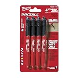
- Milwaukee Ink all Fine Point Marker, Black, 4 Per Pack
- 4 per pack Features Clog Resistant Marker Tip Writes through Dusty, Wet and Oily Surfaces Durable Marker Tip for Writing on Concrete, OSB and Rough Surfaces
- Clog resistant tip writes on dusty, wet and oily surfaces and is optimized for rough surfaces such as OSB, cinderblock and concrete
- Hard hat clip- attaches for easy access
- Quick dry time with reduced smearing and marking
Prototype before full fabrication
Install temporary samples at a lobby, corridor intersection, resident-room door, and elevator landing. Review them from wheelchair and standing eye levels, in daylight and evening light, and from the distance at which a decision is made. Ask residents and staff to find a destination using only the prototype system. Revise wording, arrow treatment, placement, or lighting before ordering the complete package.
Plan construction phasing
- Publish a temporary route map before closing a familiar corridor or elevator.
- Place detour signs before the closure and at every changed decision point.
- Keep accessible routes connected throughout each phase; if that cannot be done, provide a clearly identified alternative and communicate it directly to affected residents.
- Remove old signs as soon as they become inaccurate, while retaining any legally required permanent room identification.
- Rewalk the route after furniture, flooring, lighting, and doors are installed; each can change visibility and orientation.
How to maintain a navigation system after installation
Wayfinding is an operating system, not a one-time sign installation. Assign a person or team to own the destination list, map files, sign inventory, and inspection schedule. Add a wayfinding check to routine environmental rounds.
- Inspect signs for damage, dirt, fading, glare, and loose mounting.
- Confirm that room names, department names, maps, digital visitor instructions, and staff language still match.
- Check that furniture, carts, plants, decorations, and temporary notices have not hidden signs or narrowed routes.
- Review routes after room moves, service changes, construction, lighting replacements, or changes in resident needs.
- Track repeated requests for directions as operational data: a cluster of questions usually identifies a route or sign that needs attention.
- Reinvolve residents and frontline staff at planned intervals, not only after an incident.
What the legal and clinical guidance does—and does not—establish
The Access Board material establishes a standards-based principle for accessible routes: connect relevant arrival points and accessible facilities while keeping the route in or near general circulation paths. ADA.gov’s cited lodging guide explains sign provisions for covered new or altered lodging facilities, including raised characters, Braille, placement, contrast, non-glare finish, and pictograms where provided. Neither source, by itself, determines every requirement for every senior living community.
The Tool Desk
Outbyte Driver Updater FREEFix the driver behind crashes, sound loss and screen glitchesFind Drivers →Outbyte PC Repair FREERepair Windows errors before they cause bigger problemsFix Now →NIA’s recommendations about bright signs, simple pictures, avoiding complicated patterns, brighter lighting, bold writing, and large-print labels are practical prompts for supporting people with Alzheimer’s disease or age-related vision changes. They are not guarantees, universal clinical interventions, or substitutes for individualized care planning. Confirm the applicable building code and involve residents, care teams, design professionals, and accessibility specialists when decisions affect safety or compliance.
A practical standard for a navigable senior living building
A facility is easier to navigate when a resident can recognize the intended entrance, follow a route that stays near ordinary circulation, understand each decision point, read the information despite changing light, and pause without blocking others. Staff can reinforce that system with consistent language and respectful assistance. The final test is not whether the plan looks clear on a drawing; it is whether people who use the building can complete the route with fewer pauses, wrong turns, and requests for rescue.
Quick Recap
Product prices and availability are accurate as of the date/time indicated and are subject to change. Any price and availability information displayed on Amazon at the time of purchase will apply.

