The safest wall colors with dark green kitchen cabinets are soft white, warm off-white, creamy beige, and warm gray or stone. They provide enough contrast to keep the cabinetry prominent without fighting its depth. In a darker room, a warm mid-tone neutral can be more comfortable than brilliant white; in a bright room, a clean off-white can make the green look crisp.
There is no single universal winner. Countertops, backsplash, flooring, metal finishes, window light, and the green’s undertone all affect the result. If you are asking, “What color should I paint my kitchen walls with dark green cabinets?”, use the families below as a shortlist, then test physical samples beside the fixed finishes at different times of day.
As an Amazon Associate I earn from qualifying purchases.
The best wall-color families for dark green cabinets
Dark cabinetry already supplies visual weight. Wall paint usually works best when it supports that focal point rather than competing with it. The following families are dependable starting places, but each should be checked against the actual room.
Crashes, No Sound, or Screen Glitches?
Random freezes, missing sound and display glitches usually trace back to one bad driver. Find and replace yours safely.Free scan · under a minuteWindows Errors? Fix Them Before They Spread
Repair common Windows errors and clear accumulated junk for a smoother, more stable PC - no reinstall needed.Free scan · no reinstall| Wall-color family | What it does beside dark green | Best use | Named references |
|---|---|---|---|
| Soft white or off-white | Creates clear, bright contrast and keeps the room feeling open. | Well-lit kitchens, rooms with light counters, and schemes that need a clean backdrop. | Simply White OC-117 and Chantilly Lace OC-65 are listed by Benjamin Moore among popular kitchen wall colors. |
| Creamy beige | Softens the contrast and brings warmth to earthy green cabinetry. | Kitchens with wood, brass, cream stone, or other warm finishes. | Sherwin-Williams’ 2022 ColorMix lookbook recommends creamy beige, along with white and light gray, when cabinetry is the focal point. |
| Warm gray or stone | Provides a quieter, grounded backdrop without the starkness of a cool white. | Rooms with limited daylight or kitchens that already contain gray, stone, or concrete notes. | Benjamin Moore marketing director Helen Shaw specifically identifies stone, warm grays, and misty tones for kitchens with limited natural light in Ideal Home. |
| Pale green | Creates a low-contrast, nature-led envelope around the darker cabinets. | Readers who want a layered, organic scheme rather than a sharp light-dark contrast. | Dune Grass 492 and Fernwood Green 2145-40 are examples Benjamin Moore suggests for an earthy kitchen. |
| More dramatic color | Can produce a deliberately moody or highly designed room, but also magnifies undertone and lighting mistakes. | Only when the candidate shade has been tested against every major finish. | No source establishes one bold wall color that works universally with every dark green cabinet. |
These are color families, not guarantees. A warm white can look yellow beside some greens, while a gray that seems neutral on a card can turn blue or green in the kitchen. The fixed surfaces determine which version of each family is appropriate.
#1 Best Overall

- Valued Carpenter Pencil Set: You will get 2 pcs solid carpenter pencils with 26 piece 2.8 mm refills, 1 replaceable sharpener, 1 plastic storage box.The complete carpenter pencils combination allows you to finish your work faster and more easily
- Deep Hole Marker Pencil: The deep-hole construction pencils adopts 45mm elongated tip design, which is more convenient to mark in the small hole or in other tight areas that other carpenter markers cannot reach
- Carpenter Pencils with Sharpener: The sharpener is screwed into the top of the work pencil, which won't get lost either. Built-in pencil sharpener that keep the lead with pointed and smooth to Improves line of sight in fine work
- Stronger Solid Lead: This work pencil is matched with a 2.8 mm thick lead , which is much thicker and stronger during the drawing process of construction work, it will not break or damage easily
- Marks on Various Surfaces: 3 colors solid construction pencil can marks on various surfaces,such as metal, plastic, wood, paper etc. Ideals for woodworkers, contractors, craftsmen, builders, merchants and masons
Start with undertones, not the paint-card name
“Dark green” covers a wide range of cabinet appearances. Some greens look blue-leaning and cool; others read olive, yellow-green, gray-green, or nearly black. Wall paint should acknowledge that underlying character.
Compare the wall sample with the green itself
Place a large sample directly beside a cabinet door or a removable door front. A white with a cool blue cast may make an olive cabinet look yellower. A beige with strong yellow may exaggerate a warm green. A muted stone can bridge the two when the cabinet color is difficult to classify.
Do not judge the wall color from a tiny chip held in isolation. Color perception changes when the sample is surrounded by a large dark surface, reflective countertop, or contrasting backsplash. Benjamin Moore advises using existing room elements as color cues and coordinating countertop undertones; its guidance is available on the kitchen cabinet paint page.
Let the countertop lead when it is visually dominant
Countertops often occupy a broad horizontal area and may contain several colors. Identify whether the dominant background is warm cream, gray, taupe, white, or another hue. A wall that repeats one subtle countertop undertone usually feels more connected than a wall selected solely because it looks attractive on a display card.
Account for backsplash, floor, and hardware
Check the sample beside the backsplash tile or slab, the floor, and the largest metal accents. Warm brass and natural wood can support a warm-neutral wall; polished chrome, blue-gray stone, or very cool white surfaces may favor a cleaner or less yellow neutral. The goal is not to match every item exactly, but to avoid introducing a fourth competing undertone.
Choose according to the kitchen’s natural light
Light changes both the apparent depth of the cabinets and the wall color. Evaluate the room at morning, midday, late afternoon, and after the normal evening lights are switched on.
Rank #2

- Ergonomically Designed: Work in tight areas with a compact design that gets into tough spots
- Both tools are designed to fit into difficult to reach spaces
- Complete a wide range of applications with a high-performance motor that delivers up to 300 UWO, and an impact driver delivering up to 1,400 in-lbs of torque
- Both the DEWALT impact driver and drill driver feature integrated LED work lights with a convenient 20-second delay, ensuring enhanced visibility in dimly lit or challenging work areas
- One-Handed Loading - Keep one hand free with a 1/4 in. hex chuck that accepts 1 in. bit tips
Bright or south-facing rooms
Strong daylight can make pale walls look more intense and can expose yellow or pink undertones. A soft white or restrained off-white can give dark green cabinets a crisp outline. If the room already feels warm, choose an off-white with less cream rather than adding a strongly yellow beige.
Quick wins for a faster PC:
Scan for outdated or missing drivers - takes under a minuteDriver Scan →Clear out junk files and repair common Windows errorsFree Scan →North-facing or shaded rooms
Cooler, weaker daylight can make brilliant white appear flat or cold. Mid-tone stone, warm gray, or a misty neutral can add visual comfort without making the walls as dark as the cabinets. Helen Shaw of Benjamin Moore says, “Mid-tone neutrals such as stone, warm greys and misty tones work particularly well in kitchens with limited natural light”; the statement appears in Ideal Home’s guide to dark kitchens.
Kitchens that rely heavily on artificial light
LED temperature and fixture placement matter. A warm lamp can push beige and cream toward yellow, while a cooler lamp can make gray and white look bluer. Test the sample under the exact bulbs used after dark, not under a showroom’s lighting. If under-cabinet lights illuminate the backsplash, inspect the wall beside that reflected light as well as the wall away from it.
Decide how much contrast you want
Contrast is a design choice rather than a rule. Decide whether the walls should recede, blend, or participate in the color scheme.
High contrast: soft white or light off-white
This is the clearest way to make dark green cabinetry read as the room’s main feature. It suits kitchens where the cabinets are detailed, paneled, or visually substantial. Use a softer white when a brilliant white looks too sharp beside the counter or backsplash.
Do these 3 things before closing this tab:
1Scan for outdated or missing drivers - takes under a minute2Clear out junk files and repair common Windows errors3Fix the driver behind crashes, sound loss and screen glitchesModerate contrast: creamy beige, stone, or warm gray
A mid-light neutral reduces the jump between dark cabinets and pale walls. It is useful when the floor, counter, or adjacent living area already contains warm or muted tones. Because these colors carry more pigment than white, sample them at full wall scale before committing.
Rank #3

- 【Great Compatibility】This Katerk 1/4 inch hex shank bit holder is specifically designed for 1/4 inch hex shank drill bits. It's compatible with most 1/4 fast hex handles, hex sockets, various electric screwdrivers, and handheld screwdrivers. The bit holder makes it a valuable addition for any handyman.
- 【Secure and Safe】Built with a secure backup nut design, each drill bit holder securely locks onto your bits, ensuring they stay firmly in place. Additionally, our bit holder incorporates a high-quality steel ball rolling design that holds up to several kilograms of weight, ensuring your various drill bits don't fall off.
- 【Easy One-Handed Operation】The bit holder for impact driver allows you to change bits single-handedly, simplifying your workflow. Its multi-color design further allows for quick identification of the drill bit you need.
- 【Compact and Convenient】Thanks to its compact size, this 1/4 inch bit holder is easy to carry around. The bit holder allows for easy attachment to various tools, making this a convenient addition to your construction accessories. The Katerk bit holder is cast from high-quality alloy material, promising a long product lifespan. Despite its rugged strength, the bit holder remains lightweight, making it portable.
- 【Cool Christmas Gift For Men Stocking Stuffers】 This screwdriver bit holder, driver bit holder, impact bit holder, can be given as a gift to your loved one, especially for anyone involved in construction or electrical work. It's a must-have for stocking stuffers for men and women, tools gifts for dad, tech gadgets for men, gifts for dad, gifts for him, gifts for husband, gifts for boyfriend, cool gadgets for men, and cool gifts for dad.
Low contrast: pale green
A pale green wall can make the room feel enveloping and botanical. Keep the value difference between wall and cabinet large enough that doors, trim, and work surfaces remain legible. If the pale green is too close to the cabinet’s hue and depth, the cabinetry may lose definition.
Intentional drama
A deeper wall color can work in a large, well-lit kitchen or in a room designed for a moody effect. It is less forgiving in a small or poorly lit space because both the walls and cabinets absorb visual light. Since no single dramatic shade is established as universally suitable, choose it only after testing it beside the complete finish palette.
Use proven palette references without treating them as prescriptions
Named examples can help you understand the relationship between cabinet green and wall neutral, but they are reference points rather than instructions to buy a specific color.
The Tool Desk
Outbyte PC Repair FREERepair Windows errors before they cause bigger problemsFix Now →Outbyte Driver Updater FREEFix the driver behind crashes, sound loss and screen glitchesFind Drivers →Pewter Green with warm materials
Sherwin-Williams describes Pewter Green as capable of reading “as a deep green, soft olive, or moody neutral” depending on the lighting. That observation, quoted by Homes & Gardens, illustrates why a green cannot be judged independently of the room. The same article quotes designer Kelsey McGregor saying, “Pewter Green looks especially beautiful alongside natural wood tones and warm brass finishes.” If your cabinetry has a similar muted, gray-influenced character, natural wood and warm brass are useful material cues when selecting a creamy or stone wall.
Rosemary with Natural Linen
The Sherwin-Williams 2022 ColorMix lookbook pairs Rosemary (SW 6187) with Natural Linen (SW 9109) in a kitchen palette. This is a concrete example of a green cabinet direction with a warm neutral, but the guide is from 2022 and should be read as palette guidance, not proof of a current trend or a guarantee for every room.
A step-by-step method for selecting the wall color
- Record the fixed finishes. Photograph the cabinet door, countertop, backsplash, floor, sink, faucet, and light fixtures in daylight. Note whether each reads warm, cool, or mixed.
- Choose one sample from each practical family. Start with a soft white or off-white, creamy beige, warm gray or stone, and—if desired—a pale green. Include a candidate that is slightly lighter and slightly darker than your first choice.
- Use large physical samples. Paint sample boards or large primed boards rather than relying on a small paper chip. Move them between the main work area, dining edge, and any wall adjoining another room.
- Place samples beside every major finish. View each board against the cabinet, countertop, backsplash, floor, and hardware. A sample that works beside the cabinet may clash beside the counter.
- Observe several lighting conditions. Check morning, midday, late-day, and evening artificial light. Record which undertone appears at each time instead of choosing from one brief visit.
- Check the transition to adjacent rooms. Open-plan kitchens are seen from more than one angle. Make sure the wall does not create an abrupt color break with nearby flooring, trim, or living-space paint.
- Eliminate samples with a specific failure. Remove any shade that turns the green unnaturally yellow, makes the counter look dirty, appears icy under the room’s bulbs, or becomes too dark in the least-lit corner.
- Buy only after the finalists survive a full-day check. Keep the final two or three boards in place for at least one complete cycle of daylight and evening lighting, then confirm the selected paint line’s finish and application instructions.
This process follows the source guidance to use existing elements and lighting as color cues; the sources do not prescribe a particular board size, testing duration, or number of samples.
Rank #4

- Long Nib and Deep Hole Marker: Our mechanical carpenter pencil with 45mm nib is designed for easy marking of deep holes or narrow areas. These construction pencils are the great choice for woodworking tools, construction tools, carpenter tools, contractor tools, wood carpentry tools and architect tools
- Extra Refills in 2 Colors for Versatile Marking: The construction mechanical pencil comes with 12 extra 2.8mm refills, including 6 red and 6 black refills. The black refill is suitable for light surfaces, while the red wax is perfect for dark surfaces. Our carpenter mechanical pencil makes sure that you'll have an ample supply for extended use
- Built-in Sharpener: Our construction pencil comes with a built-in sharpener to ensure the mechanical pencil tip is always sharp and ready for use. Never buy an extra pencil sharpener again. A great tool for any woodworker pencil, contractor pencils. The refill can easily be extended or retracted with a simple click of the pencils mechanical, allowing you to work more efficiently and accurately
- Portable Clip Design: Our deep hole construction pencil features a portable clip design, easy to carry and attach to your pocket or tool box, so that you can keep the carpenter pencils mechanical close at hand, making it a convenient tool to have on the go. Great gifts choice for carpenters
- Stronger Pencil Lead: The black refills are made of lead, sturdy and smooth. The red refills are made of wax, clear and light. These marking pencils are much thicker and stronger than normal pencils during the marking process of construction work, suitable for various surfaces, such as glasses, metal, boards, floors, walls, furniture, etc. The written marks can be easily wiped with a wet paper towel when needed
Select a wall finish suited to kitchen conditions
Color and sheen are separate decisions. Kitchen walls encounter moisture, grease, fingerprints, and repeated cleaning. Benjamin Moore lists eggshell, satin or pearl, and semi-gloss among suitable kitchen finishes for durability and resistance to moisture, grease, and stains; see its kitchen cabinet guidance.
- Eggshell: A lower-sheen option when you want less reflection on broad walls.
- Satin or pearl: A practical middle ground with more cleanability and moderate light reflection.
- Semi-gloss: More reflective and often chosen for areas that need frequent wiping, though it can emphasize wall imperfections.
Exact performance depends on the paint product and substrate. Confirm the selected line’s technical data, recommended preparation, and cleaning instructions rather than assuming every eggshell or satin behaves identically.
Independent reader supportYour contribution helps us test, update, and keep practical guides available for everyone.Common problems and how to correct them
| What you see | Likely reason | Useful correction |
|---|---|---|
| The white wall looks cold and disconnected. | The room has limited daylight, or the white has a cool undertone against warm finishes. | Test a warmer off-white, stone, or warm gray beside the countertop and under evening lights. |
| The beige makes the kitchen look yellow. | The beige’s yellow or red undertone is stronger than the cabinet and counter can support. | Move toward a quieter cream, neutral stone, or less-yellow warm gray. |
| The gray looks blue or lavender. | Cool daylight or nearby cool surfaces are pulling out the gray’s undertone. | Compare a warmer gray or a muted stone sample in the same location. |
| The green cabinets lose definition. | The wall is too close in hue and value, particularly with a pale green-on-green scheme. | Increase the value contrast or select a neutral wall that separates the cabinet color from the backsplash. |
| The color works by day but fails at night. | Artificial bulbs change the appearance of both wall and cabinet. | Test under the installed bulbs and consider a neutral with less extreme undertone. |
| The wall matches the cabinets but clashes with the counter. | The countertop’s undertone was not included in the initial comparison. | Re-evaluate the finalists beside the largest countertop area and let that relationship guide the choice. |
| The chosen sheen highlights waves or patching. | Higher gloss reflects more light across surface irregularities. | Improve preparation or choose a lower sheen that still meets the room’s cleaning needs. |
Room situations and practical starting points
Dark green cabinets with white or pale countertops
Begin with a soft white or restrained off-white, then compare a warm gray if the room feels stark. The counter’s undertone should decide whether the white needs to be cleaner or creamier.
Dark green cabinets with wood countertops or wood flooring
Warm off-white, creamy beige, or stone can connect the cabinetry to the wood without copying its exact color. If the wood is orange or strongly red, test the wall against it before choosing a yellow-leaning beige.
Dark green cabinets with gray stone or concrete finishes
A warm gray or muted stone can make the palette feel intentional. A creamy beige may still work, but only if its warmth does not fight the countertop’s cooler cast.
Dark green cabinets in a compact kitchen
A light wall generally supplies more visual separation and keeps the cabinet mass readable. Avoid selecting a dark wall solely to create drama unless daylight, task lighting, and ventilation make the room comfortable.
Best Value
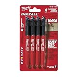
- Milwaukee Ink all Fine Point Marker, Black, 4 Per Pack
- 4 per pack Features Clog Resistant Marker Tip Writes through Dusty, Wet and Oily Surfaces Durable Marker Tip for Writing on Concrete, OSB and Rough Surfaces
- Clog resistant tip writes on dusty, wet and oily surfaces and is optimized for rough surfaces such as OSB, cinderblock and concrete
- Hard hat clip- attaches for easy access
- Quick dry time with reduced smearing and marking
Dark green cabinets in an open-plan layout
View the paint from the adjoining rooms. A wall that looks balanced inside the kitchen can appear unexpectedly yellow, gray, or green when seen against a neighboring neutral. Test the transition rather than evaluating the kitchen as an isolated box.
Should you paint every wall the same color?
Using one wall color throughout the kitchen is the simplest way to keep undertones consistent. An accent wall can work when it has a clear architectural purpose, such as defining a dining nook or highlighting a chimney breast, but it introduces another color relationship with the cabinets and backsplash. If you use an accent, test it in the exact area where it will be seen and keep the remaining walls coordinated with the fixed finishes.
What to buy before painting
Purchase sample quantities first, along with clean sample boards or suitable primed surfaces, painter’s tape, a quality brush, and a small roller. Protect counters and floors, clean grease from the wall, repair defects, and follow the selected product’s label for primer and drying times. Buying full quantities before the samples pass the daylight and artificial-light checks is the most avoidable source of waste.
What’s actually slowing this PC down?
Pick the symptom - the matching free tool is one click away.
For named colors and product availability, use the manufacturers’ current pages rather than assuming a color, sheen, or formula is unchanged. Benjamin Moore’s kitchen resources include kitchen wall color examples, while its broader cabinet color guidance provides additional coordination context.
A concise decision framework
- Need the safest contrast? Start with soft white or off-white.
- Have warm wood, brass, or cream stone? Test creamy beige and warm off-white.
- Have limited daylight? Put warm gray, stone, and misty neutrals ahead of brilliant white.
- Want a nature-led, enveloping room? Compare a pale green with enough value contrast to define the cabinets.
- Want a dramatic wall? Treat it as a custom scheme and require a full set of physical, all-lighting tests before committing.
The final color is the one that keeps the dark green intentional, supports the countertop and backsplash, and remains comfortable in the room’s actual light—not necessarily the one that looks best on a screen or isolated paint card.
Quick Recap
Product prices and availability are accurate as of the date/time indicated and are subject to change. Any price and availability information displayed on Amazon at the time of purchase will apply.

