The strongest 2025 paint color story is not that bold color disappeared. It did not. Deep reds, plums, and saturated accents still showed up in major color forecasts. The real shift is more practical: homeowners started moving bold color into controlled places and using muted earth tones as the main layer for walls, exteriors, trim combinations, and long-term resale-friendly updates.
For a construction company, that distinction matters. A paint color is not just a mood board decision. It has to work with the roof, brick, stone, flooring, cabinets, lighting, drywall condition, siding material, neighborhood rules, and maintenance plan. On our job sites, the colors that hold up best visually are rarely the loudest colors in the fan deck. They are the ones that make the fixed materials look intentional.
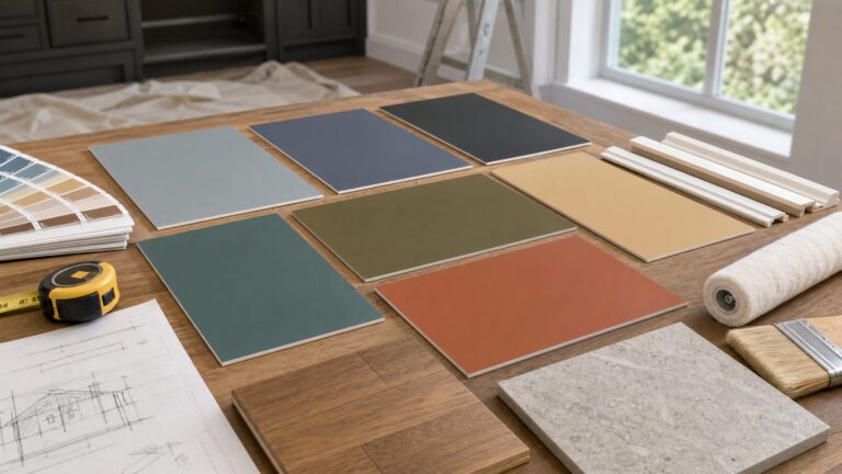
For 2025 and into 2026, that means clay, mushroom taupe, warm greige, sage, olive, ochre, sand, putty, dusty mauve, muted plum, camel, soft brown, and softened charcoal. These colors are warmer than the cool gray era, less sterile than bright white, and more forgiving than highly saturated accent walls. Used correctly, they can make a home feel current without making it feel dated two years later.
What Changed in the 2025 Paint Color Forecasts
The 2025 forecasts pointed in the same broad direction: softer, warmer, more grounded color. Benjamin Moore selected Cinnamon Slate 2113-40, a muted plum-brown, as its 2025 Color of the Year. Sherwin-Williams chose a nine-color Color Capsule that included grounded neutrals and softened shades such as Grounded SW 6089, Malabar SW 9110, Clove SW 9605, Sunbleached SW 9585, Rain Cloud SW 9639, and Mauve Finery SW 6282. HGTV Home by Sherwin-Williams named Quietude, a softened sage-blue, as its 2025 Color of the Year. Behr’s broader 2025 palette leaned into warm neutrals, camel and beige tones, grounded earth colors, and nature-inspired blues and greens.
What’s actually slowing this PC down?
Pick the symptom - the matching free tool is one click away.
#1 Best Overall
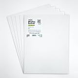
- PERFECT SAMPLES: These 12" x 9" white, styrene panels provide a smooth, warp-free surface for testing up to 5 color samples with paint, stain or other coatings.
- DURABLE MATERIAL: Made of sturdy styrene, these panels can withstand multiple coats and are non-absorbent so colors will stay true.
- CONVENIENT SIZING: At 12" x 9", the panels are just the right size for testing many common paint colors side by side before committing to a full project.
- PACKAGE INCLUDES: This value pack contains 5 white panels, enough for testing several color options on one purchase.
- VERY FLEXIBLE: Mighty Boards do not warp like foam core and you can bend them without breaking.
That does not mean every color got quiet. Behr’s Rumors and Glidden’s Purple Basil were both bold 2025 selections. The better read is that bold color became more deliberate. Instead of painting a two-story great room in a saturated shade, homeowners are using stronger colors on a front door, powder room, bathroom vanity, kitchen island, built-ins, laundry room, ceiling, or one well-contained accent area.
That is a smarter way to use trend color. A bold powder room can be repainted in a weekend. A bold exterior body color on 2,400 square feet of siding is a larger financial decision. A saturated kitchen island can be updated later without changing every wall in the house. The main walls and exterior body colors are where muted earth tones make sense because they carry more square footage and have to live with more materials.
What Counts as a Muted Earth Tone
Muted earth tones are colors that feel pulled from soil, stone, clay, bark, dried grasses, minerals, and weathered natural materials. They are usually lower in chroma than bright accent colors, which means they are softened with gray, brown, black, or beige. That softness is what makes them easier to use across a full room or exterior.
Good examples include mushroom taupe, warm beige, clay, terracotta, plaster, putty, sand, camel, ochre, olive, sage, muted brown, dusty mauve, muted plum, warm charcoal, and complex greige. The key word is muted. A clear orange is not the same as clay. A bright green is not the same as sage. A purple accent wall is not the same as a brown-plum neutral.
In the field, these colors usually succeed when they relate to something already in the house. A mushroom taupe may connect to limestone or concrete. A soft olive may pull from landscape and roof undertones. A clay color may work with terracotta tile, brick, or warm wood. A dusty mauve may soften a bedroom without reading pink. A warm greige may bridge old oak floors and newer white trim.
The mistake is treating earth tones as automatically neutral. They still have undertones. Taupe can lean pink, green, violet, or gray. Beige can lean yellow or orange. Sage can lean blue or yellow. Plum can lean brown or purple. Those shifts matter once the color is on 400 square feet of wall.
Why Earth Tones Work Better Than Stark White or Cool Gray in Many Homes
Stark white and cool gray had a long run because they looked clean in photos and felt safe during resale. The problem is that many existing homes are not built from cool white materials. They have warm brick, tan stone, oak floors, cream tile, beige carpet, brown roofing, bronze windows, or warm concrete. When a cool gray wall meets those finishes, the fixed materials can look older or yellower by comparison.
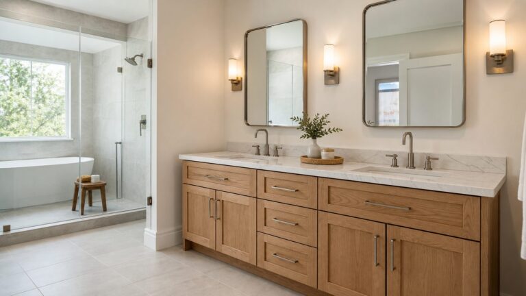
Muted earth tones are more forgiving because they acknowledge the warmth already present in many American homes. A warm greige can make honey oak less harsh. A mushroom wall can settle down busy stone. A sage exterior can look natural against landscaping. A clay or putty tone can make a stucco home feel warmer without becoming loud.
The Tool Desk
Outbyte PC Repair FREEClear out junk files and repair common Windows errorsFree Scan →Outbyte Driver Updater FREEFix the driver behind crashes, sound loss and screen glitchesFind Drivers →They also hide everyday wear better than pure white. In hallways, mudrooms, family rooms, and stairwells, we often see stark white show scuffs, fingerprints, drywall flaws, and dust quickly. A mid-light earth tone with the right sheen can disguise minor wear while still keeping the room bright enough for daily living.
Very dark saturated colors create a different issue. They can look sharp in a controlled photo, but they often reveal roller marks, drywall waviness, touch-up patches, dust, and fading. On exteriors, low-LRV colors can absorb more heat, and in high-sun climates they may fade faster or stress certain siding products. That does not make dark colors wrong. It means the material, exposure, and paint system need to be checked before committing.
Start With Fixed Finishes Before Choosing Paint
The most reliable color process starts with the things you are not changing. Paint is usually the most flexible finish in a home. Roof shingles, brick, stone, tile, countertops, flooring, windows, gutters, garage doors, and masonry are harder and more expensive to replace. Those fixed materials should lead the palette.
For interiors, look at flooring, cabinets, counters, backsplash, fireplace stone, carpet, stair rails, and existing trim. If the kitchen has blue-gray quartz, a yellow beige wall may look dirty. If the living room has orange oak floors, a cool green-gray may turn flat. If the bathroom has pink-beige tile, a trendy mushroom color with a pink undertone may either harmonize beautifully or make the room look more pink than planned.
Recommended Free Tools
For exteriors, choose the body, trim, front door, garage door, shutters, porch ceiling, and accent colors together. Do not pick the siding color in isolation. The roof may have brown, black, gray, green, or red undertones. Brick may be orange, burgundy, brown, cream, or purple-red. Stone may be warm beige, blue-gray, charcoal, or mixed. Gutters and windows may be white, bronze, black, almond, or mill finish. Earth tones work best when all of those parts are considered as one palette.
Rank #2

- suitable for various mailing and storage needs
- Soft and easy to use
- No batterries required
- No Assembly required
- Safe to use
On our exterior repaint projects, we also inspect for failing caulk, soft trim, moisture stains, stucco cracks, chalking paint, peeling coatings, and open joints before talking final color. New paint will not solve a water problem. It can hide it briefly, then fail early.
Use Light, Sheen, and Samples Before You Commit
Paint color changes with light. A warm taupe that looks calm in a south-facing room can look muddy in a north-facing room. A sage that looks refined in morning light can turn gray in the evening. A muted plum that looks rich on a sample card may feel heavy once it wraps four walls.
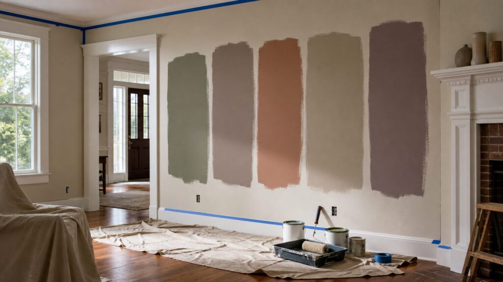
Use large samples on at least two walls before approving a whole room or exterior. A 12-inch by 12-inch sample is better than a tiny chip. A 24-inch by 24-inch sample is better still. Peel-and-stick samples or wet paint samples are usually a low-cost step, often under $10 each, and they can prevent a $2,000 mistake.
View samples in the morning, afternoon, and evening. Turn on the actual lighting used in the room. LED temperature matters. A 2700K warm bulb can make beige and clay colors richer. A 4000K cooler bulb can sharpen gray, green, and blue undertones. If the home has mixed bulb temperatures, correct that before judging paint.
Choose Sheen as Carefully as Color
Finish selection affects both appearance and durability. Flat and matte finishes hide drywall imperfections well, but they are usually less washable. Eggshell and satin are common for living areas, bedrooms, hallways, and family rooms because they balance softness with cleanability. Semi-gloss is typical for trim, doors, and moisture-prone areas where frequent wiping is expected.
Muted earth tones can look more refined in lower sheens because the color reads softer. However, high-traffic homes need durability. In a hallway with children, pets, backpacks, and handprints, a washable matte or eggshell from a quality line is often a better choice than a basic flat. In bathrooms and laundry rooms, ventilation and moisture resistance matter more than trend accuracy.
2026 Painting Costs: What Homeowners Should Budget
Paint color may be the fun part, but budget decides scope. In 2026, professional interior painting commonly runs about $2 to $6 per square foot for walls. The effective cost goes higher when the project includes ceilings, trim, doors, drywall repair, primer, premium coatings, stairwells, tall walls, heavy furniture moving, or major color changes.
Do these 3 things before closing this tab:
1Scan for outdated or missing drivers - takes under a minute2Repair Windows errors before they cause bigger problems3Fix the driver behind crashes, sound loss and screen glitchesFor one room, a 10 by 10 bedroom may land around $200 to $600 for basic professional wall painting. A larger 16 by 16 room may run about $515 to $1,540 depending on wall height, prep, coats, and trim. A whole-home interior repaint for a 2,000-square-foot single-family home commonly clusters around $4,000 to $10,000, with detailed homes exceeding $12,000 when ceilings, trim, cabinets, repairs, or high ceilings are included.
Exterior painting has wider variance because prep can dominate the job. National 2026 ranges commonly run about $1.50 to $4 per square foot, with many sources placing a typical exterior project around $1,800 to $4,500 and an average near $3,177. In practical contractor pricing, many 1,500 to 2,500 square foot homes land closer to $5,000 to $10,000 when there is substantial scraping, caulking, trim work, stucco repair, wood repair, primer, or access difficulty.
| Project Type | Typical 2026 Cost | What Moves the Price |
|---|---|---|
| DIY average room | $100-$300 in materials | Paint, primer, tape, plastic, rollers, brushes, patching compound, caulk, drop cloths, and sample testing |
| Professional 10×10 room | $200-$600 | Wall height, repairs, color change, number of coats, trim, ceilings, and furniture moving |
| Professional 16×16 room | $515-$1,540 | More paintable surface, higher walls, prep, doors, windows, and finish level |
| Whole-home interior, 2,000 sq ft | $4,000-$10,000+ | Ceilings, trim, stairwells, cabinets, repairs, high ceilings, occupied-home protection |
| Exterior repaint | $1.50-$4 per sq ft, often $3,177+ nationally | Stories, siding condition, scraping, sanding, caulking, rot repair, masonry, primer, lead-safe work |
| Prep-heavy exterior, 1,500-2,500 sq ft | $5,000-$10,000+ | Failed old paint, trim complexity, porches, shutters, scaffolding, stucco cracks, premium coatings |
Paint itself is only part of the invoice. Budget interior latex may run roughly $25 to $45 per gallon, mid-grade lines $45 to $70 per gallon, and premium or low-VOC specialty lines $70 to $90 or more per gallon. Exterior premium acrylics and masonry coatings can cost more. But on most professional jobs, labor and prep are the larger cost because surface preparation determines how long the finish lasts.
Interior Color Strategy: Where Muted Tones Work Best
For main living areas, choose calmer earth tones with enough light reflectance to keep the home open. Warm greige, mushroom, sand, putty, soft taupe, and pale olive can work well in living rooms, entries, hallways, and open kitchen-family spaces. These are the areas where resale risk is highest because buyers see them first and furniture styles vary.
Quick wins for a faster PC:
Repair Windows errors before they cause bigger problemsFix Now →Fix the driver behind crashes, sound loss and screen glitchesFind Drivers →Bedrooms can handle more personality. Dusty mauve, muted plum, soft brown, clay, and olive can create a more finished room without feeling loud. Dining rooms and offices can take deeper earth tones if the trim, lighting, and furnishings support them. In smaller rooms, darker colors can work when they are intentional, but they should not be chosen just because the room is already dark. Sometimes a dark room needs a cleaner mid-tone, better lighting, and a softer sheen, not a deeper paint color.
Kitchens require special discipline. Wall color has to work with cabinets, counters, backsplash, appliances, hardware, and flooring. If the kitchen already has warm wood cabinets, a muted green or mushroom may be better than stark white. If the cabinets are cool white and the counters are blue-gray, a sandy beige may fight the room. Test colors vertically near the cabinets and horizontally near the counters because undertones show differently depending on plane and light.
Rank #3

- Package Includes: this set includes 5 paint color test boards, allowing you to evaluate multiple color options at once, improving your color selection efficiency, and enabling you to choose colors for spaces such as the living room, bedroom, and kitchen
- Moderate Size: measuring about 12 x 9 inches, these paint sample boards provide a larger color display area, allowing you to judge the visual effect of paint on the actual wall surface, and can also be placed side by side for direct color comparison
- Quality Polystyrene Material: these color tester sample boards thickness about 1 mm crafted from polystyrene material, resisting warping after it dries, and you can use it multiple times
- Portable Design: after painting, you can place the sample in different rooms, on different walls, and facing different directions to observe it, helping you to evaluate the color effect under various lighting conditions
- Versatile Uses: except home painting projects, this polystyrene sheet is also an ideal paint sample board for artists who need a color tester sample board for practice; Use it to test color mixtures before applying to final canvases
For resale-oriented updates, keep the largest connected areas quieter and put bolder 2025 colors in reversible zones. A front door, powder room, vanity, island, built-in, laundry room, or ceiling can carry a stronger plum, red-brown, deep green, or smoky blue without making the entire house harder to sell.
Exterior Color Strategy: Make the Whole House Work Together
Exterior paint has less forgiveness than interior paint because the color is seen in full sun, shade, rain, and changing seasons. A color that looks muted on a chip can look much lighter outside. As a general rule, exterior colors often read brighter and cooler in direct daylight than they do indoors.
Crashes, No Sound, or Screen Glitches?
Random freezes, missing sound and display glitches usually trace back to one bad driver. Find and replace yours safely.Free scan · under a minutePC Slower Than It Used to Be?
A free scan shows the junk files, broken settings and background clutter dragging Windows down - then fixes them in one click.Free scan · Windows 10 & 11Start with the roof. A brown or weathered wood roof usually supports warm taupe, olive, clay, putty, and cream trim. A black or charcoal roof can support stronger contrast, including warm white trim, deep green, mushroom, or soft charcoal body colors. A red or orange brick home needs careful undertone matching. Many brick homes look better with warm putty, muted olive, taupe, or brown-black accents than with clean white and blue-gray.
Check the siding material before approving a dark earthy color. Vinyl, fiber cement, stucco, wood, brick, and masonry coatings have different requirements. Some siding manufacturers limit how dark a repaint can be because heat absorption can affect performance. In high-sun climates, very dark exterior colors may fade sooner, show chalking faster, or increase surface temperature. Low-LRV colors can be beautiful, but they require the right product and substrate guidance.
HOA rules also matter. Many neighborhoods require exterior color approval before work begins. Some municipalities do not require a permit for repainting like-for-like, but historic districts, exterior alterations, lead-safe work, right-of-way access, scaffolding, or repairs can trigger additional requirements. Before a contractor mobilizes, verify HOA approval, historic review rules if applicable, and any local requirements for exterior work.
When to DIY and When to Hire a Pro
A homeowner with patience can handle a small interior room, especially if the walls are in good condition and the color change is modest. A DIY bedroom, office, powder room, or laundry room is realistic when the ceiling is 8 to 9 feet high, the drywall needs only minor patching, and the trim does not require detailed repainting. Expect a full weekend for one average room if you include moving furniture, protection, patching, sanding, caulking, priming spots, cutting in, rolling two coats, cleanup, and reinstalling switch plates.
DIY materials for one average room often run $100 to $300, excluding ladders, sprayer rental, major repairs, or specialty tools. The savings are real, but so is the time. The most common DIY failures we see are poor wall prep, skipped primer over patches, rough cut lines, lap marks, paint on flooring, and using the wrong sheen for the room.
Hire a professional when the project involves two-story spaces, stairwells, extensive drywall repair, stained trim, cabinets, exterior work above one story, peeling exterior paint, stucco cracks, wood rot, masonry coatings, spray application, or tight timelines. Also hire a certified contractor when lead-safe rules apply. On occupied homes, a professional crew also brings containment, dust control, furniture protection, daily cleanup, and a predictable sequence.
Contractor Estimate Checklist
A good painting estimate should be specific enough that two bids can be compared line by line. Ask for paintable square footage or surface assumptions, wall height, repairs, primer, number of coats, product line, sheen, color changes, trim, doors, ceilings, cabinets if included, furniture moving, floor and fixture protection, lead-safe work if applicable, warranty, and cleanup. For exteriors, add siding type, scraping and sanding scope, caulking, wood repair, stucco repair, masonry primer, access equipment, shutters, porches, railings, and weather scheduling.
If one estimate is much lower, look for what is missing. It may exclude repairs, primer, trim, second coats, premium coatings, lead-safe setup, or cleanup. A muted earth tone will not compensate for weak prep.
Free tools Windows power users keep installed
One-click scans. No signup required.
Safety, VOCs, and Lead Paint Rules
Interior paint selection should include air quality, especially in bedrooms, nurseries, kitchens, and occupied remodels. Low- and no-VOC paints are widely available, and many premium interior lines now offer lower-emission options. VOC rules vary by jurisdiction, and some regions have strict architectural coating limits. Product labels, technical data sheets, and local rules should be checked when coating selection matters.
Low-VOC paint is not automatically odor-free, and tint color can affect VOC content. Darker or more saturated colors sometimes require more colorant. Good ventilation still matters. In occupied homes, we prefer controlled work zones, open ventilation when weather allows, clean drop cloths, dust control during sanding, and reasonable cure time before heavy use.
Lead paint is the larger safety issue in older homes. Federal lead-safe requirements apply to many renovation, repair, and painting activities in pre-1978 housing and child-occupied facilities. A key threshold is whether the work disturbs more than 6 square feet of interior painted surface per room or more than 20 square feet of exterior painted surface. When those thresholds are exceeded in covered pre-1978 properties, lead-safe practices and certified firms may be required.
Rank #4

- Core Color Matching: Paint color sample cards include 83 standard colors to support paint color sample cards, color matching cards for painting, and paint chips standard samples, helping users compare shades before selecting a final finish for floor paint, hardware, and other project needs
- Reliable Reference: Paint samples are made with color matching materials designed to support accurate color comparison, giving painters and DIY users a practical paint and paint color samples reference for selecting tones that fit the project surface and intended look
- Portable Format: Measuring 3.74 x 1.57 x 1.18 in and weighing 3.88 oz, this paint samples set is compact for a toolbox, work bag, or travel use, making it easier to carry color test card paint and check shades on site when planning paint work
- Wide Project Use: Paint sample cards are suitable for floor paint, paint hardware, and related color selection tasks, offering a useful paint chips samples reference for contractors, decorators, and home improvement users working on color coordination across different surfaces
- Simple Set Package: Each package includes 1 set of paint sample cards, giving users a straightforward paint sample standard cards option for daily work, project planning, and quick shade comparison when choosing among paint color cards and paint chips sample cards
Do not dry-sand, scrape aggressively, or power-wash old paint on a pre-1978 home without understanding the rule. Lead dust is the hazard, not just paint chips. If your home may contain lead-based paint, testing and proper containment should be part of the plan before the color conversation gets serious.
Common Mistakes With Muted Earth Tones
The first mistake is choosing from a phone screen. Digital color is unreliable because screens vary, photos are edited, and lighting changes everything. Always sample in the actual room or on the actual exterior surface.
The second mistake is ignoring undertones in fixed finishes. Pink-beige tile, orange brick, yellow oak floors, blue-gray counters, and cool stone can all make a fashionable taupe, sage, or clay look wrong. A color that looks neutral in the store may turn purple, green, yellow, or muddy at home.
The third mistake is going too dark outside without checking roof color, heat exposure, fading risk, HOA rules, and siding manufacturer guidance. Dark earth tones can be excellent on doors, shutters, trim accents, and some siding systems, but they are not universal.
The fourth mistake is skipping prep because the new color is muted. Earth tones still reveal bad patching, shiny old paint, drywall dust, failed caulk, nail pops, roller texture, and moisture damage. Prep quality is what separates a durable repaint from a cosmetic cover-up.
Crashes, No Sound, or Screen Glitches?
Random freezes, missing sound and display glitches usually trace back to one bad driver. Find and replace yours safely.Free scan · under a minuteWindows Errors? Fix Them Before They Spread
Repair common Windows errors and clear accumulated junk for a smoother, more stable PC - no reinstall needed.Free scan · no reinstallThe fifth mistake is using one color everywhere without adjusting sheen or depth. A whole house can share a palette without every surface being the same color. Walls, trim, doors, ceilings, cabinets, and exterior accents need hierarchy.
The Durable Takeaway for 2025 and 2026
The practical lesson from the 2025 paint forecasts is not that bold is dead. The better lesson is that grounded colors are becoming the base layer, while bold colors are being used with more control. That approach fits real homes better. It respects fixed finishes, reduces resale risk, and gives homeowners room to use personality where it is easier to change later.
Muted earth tones are not magic. They still need sampling, proper sheen, sound prep, compatible primers, and a contractor scope that matches the condition of the home. But when selected carefully, they solve several problems at once: they warm up sterile interiors, soften older materials, hide minor wear better than stark white, and make exteriors feel more connected to the site.
For homeowners planning a repaint in 2026, the best sequence is simple: fixed finishes first, light second, sheen third, sample fourth, contractor scope fifth. Follow that order and the color choice becomes less risky. You are no longer chasing a trend. You are building a palette that works with the house you actually own.
Frequently Asked Questions
What paint colors are replacing gray and white in 2025 and 2026?
Warm greige, mushroom taupe, clay, putty, sand, camel, sage, olive, dusty mauve, muted plum, soft brown, and warm charcoal are replacing many stark whites and cool grays. The shift is toward grounded, lower-chroma colors that work better with wood, brick, stone, and warm flooring.
Are muted earth tones good for resale value?
They can be, especially in main living areas and exteriors, because they are calmer than bold colors but warmer than plain white or cool gray. For resale, keep large connected spaces neutral and use stronger colors in easier-to-change areas such as a front door, powder room, island, vanity, or built-ins.
How much does it cost to repaint a room or whole house in 2026?
Professional interior painting commonly runs about $2 to $6 per square foot for walls. A 10×10 room may cost about $200 to $600, while a 16×16 room may run about $515 to $1,540. A 2,000-square-foot whole-home interior repaint often lands around $4,000 to $10,000, with detailed projects exceeding $12,000.
What should I know about lead paint before repainting a pre-1978 home?
Pre-1978 homes may contain lead-based paint. Federal lead-safe rules can apply when work disturbs more than 6 square feet of painted interior surface per room or more than 20 square feet on the exterior. Testing, containment, certified work practices, and dust control should be addressed before sanding, scraping, or power washing.
Which sheen should I use for earth-tone interior walls?
Flat or matte hides drywall imperfections but is less washable. Eggshell or satin is usually better for living rooms, bedrooms, halls, and family areas because it balances appearance and cleanability. Semi-gloss is commonly used for trim, doors, and moisture-prone areas that need frequent cleaning.
Are low-VOC paints worth it for interior projects?
Often, yes. Low- and no-VOC paints are useful for bedrooms, nurseries, occupied homes, and projects where odor and emissions matter. They still require ventilation, and the final VOC content can vary by product and tint, so check the label and technical data sheet.
Quick Recap
Product prices and availability are accurate as of the date/time indicated and are subject to change. Any price and availability information displayed on Amazon at the time of purchase will apply.