Free tools Windows power users keep installed
One-click scans. No signup required.
Some links on this page are affiliate links: if you buy through them we may earn a commission, at no extra cost to you.
Paint forecasts for 2026 point to five overlapping directions: warmer neutrals, complex browns, restorative greens, softened pastels and deep moody shades. They come from individual manufacturers’ forecasts—not a measured ranking of designer preferences—so use them as a useful starting map, then judge every color in your room’s actual light.
What paint colors are trending in 2026?
The major 2026 announcements share a move toward colors that feel grounded, tactile and livable, while still leaving room for both pale tints and dramatic darks. The table below identifies the named colors and the broader families they represent.

| Direction | Named 2026 examples | How the brands describe them |
|---|---|---|
| Warm, earthy neutrals | Universal Khaki SW 6150 (Sherwin-Williams) | Mid-tone neutral with a slight yellow undertone; Valspar’s neutral forecast emphasizes grounding warmth. |
| Espresso, mahogany and rich browns | Silhouette AF-655 (Benjamin Moore); Warm Mahogany PPG1060-7 (Glidden) | Silhouette is espresso with charcoal notes; Warm Mahogany is a rich, grounded red. |
| Restorative greens and blue-greens | Warm Eucalyptus 8004-28F (Valspar); Hidden Gem (Behr) | Valspar calls Warm Eucalyptus restorative and serene; Axios describes Hidden Gem as smoky jade. |
| Soft pastels and chalky color | Sherwin-Williams Frosted Tints family; Lemon Chiffon in secondary coverage of the forecast | Light, softened color that works alongside—not instead of—darker and earthier shades. |
| Deep, moody shades | Dark blues, charcoal-like shades and brown-charcoal Silhouette | A route to contrast, enclosure and visual depth within the wider forecasts. |
1. Warm, earthy neutrals
Sherwin-Williams selected Universal Khaki SW 6150 as its 2026 Color of the Year, describing a mid-tone neutral with a slight yellow undertone. That undertone keeps it from reading as a flat gray and places it in the warmer, more natural-looking end of the neutral range.
Valspar’s 2026 neutral story makes the same broader shift. Sue Kim, Valspar’s director of color marketing, says, “In the coming year, we will redefine our notion of neutral hues. Going beyond the classified color term, neutral refers to colors that set a grounding and inviting mood with the warmth that calms our senses.” That is a forecast statement from the brand, not a survey of designers.
#1 Best Overall
Where this direction works
- Living rooms, halls and open-plan areas that need a flexible background.
- Rooms with timber, woven materials and other natural finishes, where the warmth can feel intentional rather than stark.
- Spaces where a white trim color needs a gentler contrast than a cool gray would provide.
How to test it
Paint a large sample board and move it around the room. The yellow undertone can look restrained in a north-facing room and noticeably warmer in afternoon or artificial light. Sherwin-Williams offers color chips, peel-and-stick samples and paint samples; the company recommends its Emerald paint for using Universal Khaki.
2. Espresso, mahogany and other rich browns
Brown is appearing as a spectrum rather than one formula. Benjamin Moore announced Silhouette AF-655 on October 16, 2025, calling it espresso with charcoal notes. Glidden’s 2026 selection, Warm Mahogany PPG1060-7, is described on its trend page as a rich, grounded red. One leans brown-black and tailored; the other carries more red-brown warmth.
Rank #2

- Easily mix, match, and plan flawless color schemes with this expansive card deck featuring 200 colors
Benjamin Moore color marketing and design director Andrea Magno linked the choice to renewed interest in suiting, classic silhouettes and “the growing interest in the brown color family.” That explanation identifies the company’s design rationale, not independently measured demand.
Choosing between the brown variations
- Silhouette: choose it when you want near-black depth softened by espresso warmth.
- Warm Mahogany: choose it when you want brown with a clearer red, wood-like character.
- Intermediate browns: look for samples that sit between these extremes if a full dark wall feels too intense.
Benjamin Moore’s coordinating palette
Benjamin Moore lists seven supporting hues for Silhouette: Raindance 1572, Swiss Coffee OC-45, First Crush CSP-310, Batik AF-610, Narragansett Green HC-157, Southwest Pottery 048 and Sherwood Tan 1054. Treat these as the manufacturer’s suggested companions, then test the combination under your own lighting.
Rank #3

- Core Color Matching: Paint color sample cards include 83 standard colors to support paint color sample cards, color matching cards for painting, and paint chips standard samples, helping users compare shades before selecting a final finish for floor paint, hardware, and other project needs
- Reliable Reference: Paint samples are made with color matching materials designed to support accurate color comparison, giving painters and DIY users a practical paint and paint color samples reference for selecting tones that fit the project surface and intended look
- Portable Format: Measuring 3.74 x 1.57 x 1.18 in and weighing 3.88 oz, this paint samples set is compact for a toolbox, work bag, or travel use, making it easier to carry color test card paint and check shades on site when planning paint work
- Wide Project Use: Paint sample cards are suitable for floor paint, paint hardware, and related color selection tasks, offering a useful paint chips samples reference for contractors, decorators, and home improvement users working on color coordination across different surfaces
- Simple Set Package: Each package includes 1 set of paint sample cards, giving users a straightforward paint sample standard cards option for daily work, project planning, and quick shade comparison when choosing among paint color cards and paint chips sample cards
3. Restorative greens and blue-greens
Valspar named Warm Eucalyptus 8004-28F its 2026 Color of the Year and describes it as restorative and serene. Behr’s 2026 selection is Hidden Gem; Axios characterizes that color as smoky jade. The descriptions come from their respective brand announcement and secondary coverage, so they should not be read as a universal technical classification of either paint.
Why this family is versatile
Green-blue hues can bridge warm wood, off-white, stone and darker accent colors. A smoky version often changes substantially between daylight and evening lamps, making a physical sample especially important in kitchens, bedrooms and bathrooms.
Rank #4
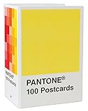
- PERFECT FOR PANTONE COLOR BOOK FANS: This charming postcard collection features a palette drawn from the Pantone Color Matching Systems.
- GRAPHIC DESIGN INSPIRATION: Each postcard in this set of 100 offers a different bold hue to brighten up the mail.
- COLOR MATTERS: Color as a form of communication is incredibly powerful. The art of Pantone makes this set of cards a brilliant way to connect.
- BLANK POSTCARDS: These high-quality cards are great for any occasion: birthdays, thank yous, sympathy, or just saying hello.
- DOUBLES AS DECOR: Postcards work wonderfully as miniature art pieces to display on the desk or bulletin board.
Practical sampling
Valspar provides a sample-cart and Lowe’s purchase route, although product and color availability can vary by retailer. Compare the sample beside flooring, counters and permanent fixtures rather than against a blank screen or white webpage.
What’s actually slowing this PC down?
Pick the symptom - the matching free tool is one click away.
4. Soft pastels and chalky color
Sherwin-Williams’ 2026 Colormix forecast, Anthology Volume Two, is organized into four palettes curated by its Trendsight Team for 2026 and beyond. Secondary coverage counts 48 shades in the overall forecast and highlights soft pastels, including Lemon Chiffon, alongside warm earthy and rich dark colors.
Best Value

- 365 Essential Color Chart Cards: Our paint sample cards offers 365 different colors, providing a comprehensive palette to inspire and fulfill any painting project. Size: 18.00X4.50X2.30cm/7.07X1.77X0.90in
- Superior Assurance: Our color cards are crafted to the highest standards, ensuring exceptional and reliability for use, making them a reliable tool for professionals and enthusiasts
- Versatile Application: Suitable for building color schemes, mixing paint, exploring palettes, and developing color charts for art, branding. our paint color matching tool are ideal for various fields. Explore endless possibilities and bring your to life
- Accurate Color Matching: Our paint color cards paint color matching tool are meticulously designed to provide precise color matching, meeting your exact requirements,suitable for professionals and DIY enthusiasts alike. Achieve the desired color results with confidence and accuracy
- Practical and Portable: Crafted with materials, our color paint cards are resistant to fading, and easy to carry. Experience the convenience of having a reliable color reference tool at your fingertips. This palette cards color card deck are ieal for artists and designers
The important point is coexistence: pale, chalky colors are not replacing browns, greens or dark blues. They provide a lighter intensity for ceilings, bedrooms, cabinetry, small rooms or adjoining spaces where a saturated shade would overwhelm.
How to keep pastels from looking sugary
- Check the undertone against flooring and upholstery; a yellowed pastel can turn unexpectedly green or beige beside existing finishes.
- Use a low-contrast trim or a related deeper shade to give the color structure.
- View the sample at morning, midday and nighttime, because high lightness exaggerates shifts in illumination.
5. Deep, moody shades
The same forecasts that include Frosted Tints also include dark blues and charcoal-like shades. Silhouette demonstrates how brown can supply that depth without becoming a pure black. Moody colors are therefore best understood as a contrast option within the 2026 story, not as a claim that every room should be dark.
Where dark paint earns its place
- Dining rooms, studies and media rooms where enclosure is desirable.
- Powder rooms and small spaces that can benefit from a deliberately immersive finish.
- Joinery, doors or one accent wall when four dark walls would reduce useful daylight.
Manage the risk
Dark paint magnifies surface defects and can make a low-light room feel smaller. Test the exact product sheen on a sample board, inspect it beside trim and note how much daylight the room receives before committing.
How to choose among the 2026 trends
- Identify the family and undertone. Decide whether you need yellow-warm khaki, red-brown mahogany, brown-charcoal depth, a smoky green-blue or a softened pastel.
- Set the intensity. Compare pale tint, mid-tone and saturated/dark options rather than judging color family alone.
- Test in the actual room. Put a large sample board on multiple walls and leave it in place through changing daylight and evening lighting.
- Compare permanent finishes. Check the sample against flooring, counters, cabinetry, stone, upholstery and trim.
- Buy the intended product. A color name or code does not guarantee identical appearance across brands, sheens or bases; use the manufacturer’s sample or paint route for the product you will apply.
On-screen swatches are not reliable final decisions. Benjamin Moore cautions that screen colors can differ from actual paint, and Glidden likewise notes that screen color may vary. Physical chips, peel-and-stick samples, paint samples or a reusable sample board give a more useful read.
What the forecasts do—and do not—establish
These five directions synthesize announcements from several paint manufacturers. A Color of the Year is each company’s editorial selection, not a neutral market ranking. No credible named statistic establishes how many designers prefer one of these trends, and no verified 2026 sales dataset shows that one color dominates every home. The practical value is comparative: the announcements give you a range of warmth, undertone and intensity to test against your own architecture and light.
Quick Recap
Product prices and availability are accurate as of the date/time indicated and are subject to change. Any price and availability information displayed on Amazon at the time of purchase will apply.


Leave a Reply